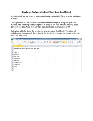
Transcription
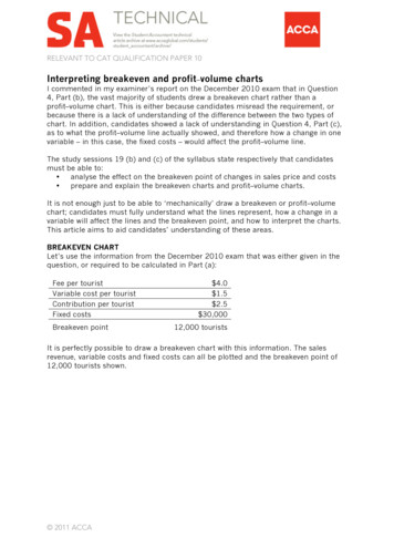
RELEVANT TO CAT QUALIFICATION PAPER 10Interpreting breakeven and profit–volume chartsI commented in my examiner’s report on the December 2010 exam that in Question4, Part (b), the vast majority of students drew a breakeven chart rather than aprofit–volume chart. This is either because candidates misread the requirement, orbecause there is a lack of understanding of the difference between the two types ofchart. In addition, candidates showed a lack of understanding in Question 4, Part (c),as to what the profit–volume line actually showed, and therefore how a change in onevariable – in this case, the fixed costs – would affect the profit–volume line.The study sessions 19 (b) and (c) of the syllabus state respectively that candidatesmust be able to: analyse the effect on the breakeven point of changes in sales price and costs prepare and explain the breakeven charts and profit–volume charts.It is not enough just to be able to ‘mechanically’ draw a breakeven or profit–volumechart; candidates must fully understand what the lines represent, how a change in avariable will affect the lines and the breakeven point, and how to interpret the charts.This article aims to aid candidates’ understanding of these areas.BREAKEVEN CHARTLet’s use the information from the December 2010 exam that was either given in thequestion, or required to be calculated in Part (a):Fee per touristVariable cost per touristContribution per touristFixed costsBreakeven point 4.0 1.5 2.5 30,00012,000 touristsIt is perfectly possible to draw a breakeven chart with this information. The salesrevenue, variable costs and fixed costs can all be plotted and the breakeven point of12,000 tourists shown. 2011 ACCA
2INTERPRETING BREAKEVEN AND PROFIT–VOLUME CHARTSAPRIL 2011Note how the axes are labelled – the vertical axis shows dollars ( ) and the horizontalaxis shows output/sales, which in this case is the number of tourists. It is importantthat candidates label the axes if they are drawing a chart in an exam question.Candidates need to be able to explain what will happen to the lines on the chart, andthe breakeven point, if costs or revenue change.What if fixed costs increase?If fixed costs increase by 7,000 as happened in Part (c) of this question in theDecember 2010 exam, the horizontal fixed cost line will move up to 37,000. This willhave a knock-on effect to the total cost line – its intersection with the vertical axis willnow start at 37,000, rather than 30,000. Note that there has been no change in thevariable cost per unit, so the slope or gradient of the variable cost line will not changeand, therefore, the slope or gradient of the total cost line will not alter, only the pointof intersection on the vertical axis. Revenue has not been affected, and so this line willnot change. 2011 ACCA
3INTERPRETING BREAKEVEN AND PROFIT–VOLUME CHARTSAPRIL 2011It is now possible to identify the new breakeven point of 14,800 units.It is worth checking whether this new breakeven point makes sense intuitively. Thebreakeven point has increased – ie we need to take more tourists in order to be in aposition of nil loss/nil gain. Does this seem reasonable? The answer is yes. The fixedcosts have risen, and Joe will need to take more tourists out on his boat to earn theextra contribution required to cover the increased fixed costs.It is always worth taking a minute in questions to see if the new breakeven pointmakes sense intuitively. By doing this, you should be able to spot if you have made asilly error either in your calculations or in drawing your graph.Let us look at what happens to the breakeven chart and point if other variableschange. (Note that I will always start with the data as per the original question as mybase position.)What if the sales price per unit had changed?In this case, all the cost lines would remain the same – only the total revenue linewould be affected, which would in turn affect the breakeven point.Before looking at the effect on the graph, let us think intuitively about what anincrease in sales price or, in this case, fee per tourist would mean to Joe. What if thefee per tourist went up to 5? Joe would earn more contribution per tourist ( 3.5) andwould therefore need to take fewer tourists out in order to cover his fixed costs of 30,000. 2011 ACCA
4INTERPRETING BREAKEVEN AND PROFIT–VOLUME CHARTSAPRIL 2011Again the new breakeven point of 8,571 can be read from the chart.It follows that if the sales price per unit had fallen, Joe would earn less contributionper tourist taken, and therefore have to take more tourists out on his boat in order tocover his fixed costs – ie the breakeven point would have risen.What if the variable cost per unit had changed?In this scenario, the gradient of the variable cost line would alter, which would thenaffect the total cost line and the breakeven point.Again, thinking intuitively, what would happen if Joe’s variable costs increased to 2.5per tourist? In this case, Joe would earn less contribution per tourist – only 1.5 ( 4 – 2.5) – and so he would have to take more tourists out in his boat in order to earn thecontribution to cover fixed costs of 30,000. 2011 ACCA
5INTERPRETING BREAKEVEN AND PROFIT–VOLUME CHARTSAPRIL 2011In the graph above, the new breakeven point is 20,000 units.PROFIT–VOLUME CHARTNow we will use the same information to consider profit–volume charts:Fee per touristVariable cost per touristContribution per touristFixed costsBreakeven point 4.0 1.5 2.5 30,00012,000 touristsIt can be argued that a profit–volume chart is easier to draw, as you only need to beable to plot two points in order to draw the profit–volume line. The two points can beany two of the fixed costs, the breakeven point, or a profit figure at a certain level ofoutput.Using the information above and plotting the fixed costs and breakeven point, theprofit–volume chart appears as follows: 2011 ACCA
6INTERPRETING BREAKEVEN AND PROFIT–VOLUME CHARTSAPRIL 2011Note how the axes are labelled for a profit–volume chart. The horizontal axis is still thenumber of tourists, but the vertical axis is now profit/loss in dollars ( ).The intercept on the vertical axis shows the level of fixed costs, and where the linecrosses the horizontal axis represents the breakeven point – ie where profit is zero.The gradient of the line represents the contribution per unit.Let us look at what happens to the profit–volume chart and if variables change. (Notethat I will again always start with the data as per the original question as my baseposition.)What if fixed costs increase?If the fixed costs increase to 37,000, the intercept on the vertical axis will change toreflect the increased costs (it will move to the new fixed costs of 37,000). However,neither sales revenue per unit (fee per tourist) or variable cost per unit have altered.The contribution per unit has not altered and, therefore, the gradient of the profit–volume line will not alter. It is therefore possible to draw on the new profit–volume lineby keeping the same gradient but changing the point of intersection on the verticalaxis. 2011 ACCA
7INTERPRETING BREAKEVEN AND PROFIT–VOLUME CHARTSAPRIL 2011The new breakeven point can be read from the chart as 14,800 units.What if the sales price per unit had changed?In this case the total fixed costs do not change, and therefore the intercept on thevertical axis will not change. However, the contribution per unit will change and,therefore, the gradient of the profit–volume line.We know intuitively that if the sales price goes up to say 5 per tourist, then thebreakeven point will decrease (see earlier), so this means that the intercept on thehorizontal axis will be nearer the origin. By how much though? Where is the newbreakeven point?You can either calculate the new breakeven as being 30,000/ 3.5 8,571 units, oryou can calculate the profit that will be earned at an output level. For example, theprofit earned if 10,000 tourists are taken out will be 10,000 x ( 5 – 1.5) – 30,000 5,000. Plot the 5,000 profit on your graph and then read off the new breakevenpoint. 2011 ACCA
8INTERPRETING BREAKEVEN AND PROFIT–VOLUME CHARTSAPRIL 2011What can be seen from the graph is that a change in sales price affects the gradient ofthe profit–volume line only – not the intercept on the vertical axis – because fixedcosts have not altered.What if the variable cost per unit had changed?The same is true if the variable cost per unit is altered. The intercept on the verticalaxis will not change because fixed costs have not altered, only the gradient of theprofit–volume line, as the contribution per unit has again altered.Using the figures we had earlier when we considered a change in variable cost per unitunder the breakeven section, the new contribution per unit was 1.5, so theprofit/(loss) at 10,000 units would be 10,000 x 1.5 – 30,000 ( 15,000). Knowingthe fixed costs and profit at 10,000 units allows the profit volume line to be plottedand the new breakeven point read off the graph. Again, it would have been possible tocalculate the new breakeven point as 20,000 units and plot this, along with the fixedcosts of 30,000, in order to draw the new profit–volume line. 2011 ACCA
9INTERPRETING BREAKEVEN AND PROFIT–VOLUME CHARTSAPRIL 2011CONCLUSIONIt is important that candidates understand how a chart – whether breakeven orprofit–volume – is constructed, what the lines represent, how a change in a variablewill affect the chart and the breakeven point, and therefore be able to interpret thecharts.Candidates must not draw the charts ‘mechanically’ but also think intuitively aboutwhether the graphs and the answers that they have given are reasonable.It is hoped that this article will help with some of these elements.Charlotte Bower is examiner for CAT Paper 10 2011 ACCA
variable - in this case, the fixed costs - would affect the profit-volume line. The study sessions 19 (b) and (c) of the syllabus state respectively that candidates must be able to: analyse the effect on the breakeven point of changes in sales price and costs prepare and explain the breakeven charts and profit-volume charts.