Transcription
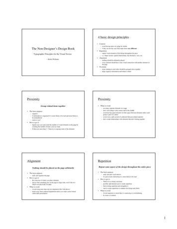
4 basic design principles Contrast– avoid having items on a page be similar– if they are not the same then make them very differentThe Non-Designer’s Design Book Repetition– repeat visual elements of the design throughout the piece– i.e. shape, texture, spatial relationships, line thickness, sizes, etc.Typographic Principles for the Visual Novice-- Robin Williams Alignment– nothing should be arbitrarily placed– every element should have some visual connection with another element onthe page Proximity– items relating to each other should be grouped close together– helps organize information and reduces clutterProximityProximityGroup related items together – too many separate elements on a page– don’t stick things in the corners and in the middle– avoid leaving equal amounts of white space between elements unless eachgroup is part of a subset– avoid even a split second of confusion between related material– don’t create relationships with elements that don’t belong togetherThe basic purpose:– organize– if information is organized it is more likely to be read and more likely tobe remembered– easier to use? What to avoid:How to get it:– Squint your eyes and count the number of visual elements on the page bycounting the number of times your eye stops.– If there are more than 3- 5 then try to regroup some of the elementsAlignmentRepetitionRepeat some aspect of the design throughout the entire pieceNothing should be placed on the page arbitrarily The basic purpose: How to get it:– Be conscious of where you place elements– always find something else on the page to align with, even if the twoobjects are physically far apart How to get it:––––What to avoid:– Avoid using more than one text alignment (like I did above)– break away from centered alighnment unless you want a more formal(often dull) presentationThe basic purpose:– unify and add visual interest– if a piece looks interesting it is more likely to be read– unify and organize the page Think of it as being consistentpossibly add elements just to create repetitionfind existing repetition and strengthen itstart to create repetitions to enhance the design and clarityWhat to avoid:– Avoid repetition so much that it is annoying or overwhelming– be aware of contrast1
ContrastIf two items are not the same then make them REALLY different Don’t be a Wimp! Don’t be afraid to create the design of your life with LOTS of blank spaceDon’t be afraid to be asymmetrical– often makes it stronger– it’s ok to do the unexpectedThe basic purpose:– create an interest on the page -- more likely to be read– organization of information Don’t be afraid to make words very large or very small Don’t be afraid to make graphics very bold of very minimal as long as theresult complements or reinforces your design or your attitude– both can be effective in the right placeHow to get it:– add contrast though typeface choices, line thickness, colors, shapes, sizes, space,etc.– most important thing is to be strong What to avoid:– Don’t be a wimp!– do it with strength– make them differentHow might the 4 basic design principles applyto software development? Proximity Alignment Repetition ContrastPrinciples of User Interface Design Organize– provide the user with a clear and consistent conceptual structure Economize– maximize the effectiveness of a minimal set of cues Communicate– match the presentation to the capabilities of the userVisual language Layout (formats, proportions and grids)Typography (typefaces and typesettings)Colour and textureImagery (signs, icons, and symbols)Animation (a dynamic or kinetic display)Sequencing (overall approach to visual storytelling)Sound (abstract, vocal, concrete, or musical cues, earcons)Visual identity (rules that lend to overall consistency of a userinterface)Organize Consistency–––– internal consistencyexternal consistencyreal world consistencywhen not to be consistentScreen layout– use a grid structure– standardize the screen layout– group related elements Relationships– Establish clear relationships by linking related elements and disassociatingunrelated elements Navigability– provide an initial focus for the viewer’s attention, direct attention toimportant, secondary or peripheral items, and assist in navigation2
EconomizeCommunicate“doing the most with the least” Simplicity Clarity Distinctiveness– design all components so their meaning is not ambiguous– distinguish important properties of essential elements EmphasisLegibility– design individual characters, symbols, and graphic elements to be easilynoticeable and distinguishable– must select visualization techniques appropriate to the output display– include only those elements that are essential for communication– be as unobtrusive as possible Readability– the display in comprehensible (easy to identify and interpret)– display is inviting and attractive Typography– characteristics of individual elements (typefaces and typestyles) and theirgroupings (typesetting techniques)– Typesetting– make the most important elements salient (easily perceived)– de-emphasize non-critical elements– minimize clutter adjust point size, word spacing, paragraph indentation, and line spacing toenhance the readability and to emphasize critical informationBasic Typesetting RecommendationsCommunicate (continued) Maximum of three typefaces and three sizeslines of text should be max. 40-60 characterstext should be set in appropriate formats– text flush left, numbers flush right, avoid centered text in lists, avoid shortjustified lines – icons, symbols, charts, maps, diagrams– must be carefully selected and refined to communicate the desiredcontents Multiple views– provide multiple perspectives on the display of complex structures andprocessesuse variable width font– fixed width can slow reading by 12 percent Symbolism use upper and lower case characters– all capitals can slow reading by 12 percent multiple forms of representationmultiple levels of abstractionsimultaneous alternative viewslinks and cross referencesColor– very complex, powerful communication toolWhy use colour? Colour displays are attractive to users and can often improvetask performance Benefits:––––––various colours are soothing or striking to the eyecan improve an uninteresting displayfacilitates subtle discriminations in complex displayscan emphasize the logical organization of informationcan draw attention to warningscan evoke more emotional reactions of joy, excitement, fear, orangerDANGER!Inappropriate use of colour can bedisasterous to the application3
Colour Dimensions Hue, Intensity and Saturation– hue is the spectral wavelength composition of a colour thatproduces it’s perception of being blue, orange, green, etc. blue short, green medium, red long average human can discriminate approx. 150 hues– intensity is the relative amount of lightness or darkness of thecolour in a range from black to white (also known as value)– saturation is the purity of the colour in a scale from gray to the mostvivid variant of the perceived colour (also known as chroma)Hue, Shade and Tint hue is what we call colour in itspurist form shade of a colour is what thatcolour would look like if the lightwere shaded from it, or blackadded to it, tint is what we get when a colouris diluted with white.Colour DimensionsColour terminology RGB (Red, Green, Blue) CIE (International Commission on Illumination)– responsible for maintaining color standards, based on the conceptof a standard observer. This standard observer is in turn based ona model of the human rods and cones. However, the model doesnot take adaptation or simultaneous contrast into account which iswhy the CIE system has little to do with the appearance of colors.Brightness– subjective reaction to levels of light– affected by luminance Luminance– luminance is the amount of light emitted by and object– dependent on the amount of light falling on the object’s surface andits reflective properties Contrast– a function of the luminance of the object and the luminance of itsbackground4
Colour Guidelines Color Graphics -- Blessing or Ballyhoo (Excerpt)– G. Murch– textbook 442-442 Physiological guidelines:#1 avoid simultaneous display of highly saturated, spectrally extremecolours reds, oranges, yellows, and greens can be viewed together withoutrefocusing cyan and blues cannot easily be viewed simultaneously with red avoid extreme colour pairs such as red and blue or yellow and purple desaturating spectrally extreme colours will reduce the need forrefocusingPhysiological Guidelines#2 avoid pure blue for text, thin lines and small shapes our visual system has trouble with detailed, sharp, short-wavelengthstimulihowever, makes a good background colour and is perceived easilyin the peripheryPhysiological Guidelines#3 avoid adjacent colours, differing only in the amount of blue– edges will appear indistinctGood Background ColourPhysiological Guidelines#4 older viewers need higher brightness levels to distinguish coloursPhysiological Guidelines#6 magnitude of a detectable change in colour varies across the spectrum– small changes in extreme reds and purple are more difficult the detectthen small changes in other colours such as yellow and blue-green#5 colours change appearance as ambient light level changes– displays change colour under different types of light(fluorescent, incandescent, or daylight)– appearance also changes as light level is increased or decreased– change occurs because of an increased or decreased contrast anddue to the shift in the sensitivity of the eye5
Physiological Guidelines#7 difficulty in focusing results from edges created by colour alone– multi-coloured images should be differentiated on the basis ofbrightness as well as colourPhysiological Guidelines#9 opponent colours go well together– good: red/green or yellow/blue– bad: red/yellow or green/bluePhysiological Guidelines#8 avoid red and green in the periphery of large-scale displays– due to the insensitivity of the retinal periphery to red and green, thesecolours in saturated form should be avoided, especially for small symbolsand shapes– yellow and blue are good peripheral coloursPhysiological Guidelines#10 for colour deficient observers, avoid single colour distinctions– colour blindness is a lack of perceptual sensitivity to certain colours– colour blindness comes as a result of a lack of one or more of the types ofcolour receptors– most colour perception defects are for red or green or both– about 10% of males have a colour perception defect, but this is rare infemales– red-green colour blindness is a result of a lack of red receptors– yellow-blue is the second most common form, but it's extremely rare.Perceptual Guidelines#11 not all colours are equally discernible– perceptually we need a large change in wavelength to perceivecolour difference in some portions of the spectrum and a small onein other portions6
Perceptual Guidelines#12 luminance does not equal brightness– two equal-luminance but different hue colours will probably appearto have different brightness– deviations are most extreme for colours towards the end of thespectrum (red, magenta, blue)Perceptual Guidelines#14 lightness and brightness are distinguishable on a printed hardcopy, but not on a colour display– the nature of a colour display does not allow lightness andbrightness to be varies independentlyPerceptual Guidelines#16 hues change with intensity and background colour– when grouping elements by colour, make sure thatbackgrounds or nearby colours do not change the hue of anelement– limit the number of colours and make sure they are widelyseparated in the spectrumPerceptual Guidelines#13 different hues have inherently different saturation levels– for example, yellow always appears less saturatedPerceptual Guidelines#15 not all colours are equally readable or legible– extreme care should be taken with text colour relative to backgroundcolours– there is a loss in hue with reduced size– there is inadequate contrast when the background and text coloursare similar– general rule: darker, spectrally extreme colours such as red, blue,magenta, brown, etc. make good background colours brighter, spectrally-centered, and desaturated hues producemore legible textPerceptual Guidelines#17 avoid the need for colour discrimination in small areas– hue information is lost in small areas– human visual system produces sharperimages with achromatic colours for fine detail it is best to use black and whiteand grey use chromatic colours for larger panels or forattracting attention7
Cognitive GuidelinesCognitive Guidelines#18 do not overuse colour– benefits of colour as an attention getter, information grouper,and value assigner are lost if too many colours are used– limit displays to about six clearly distinguishable colours9 different colours#19 be aware of non-linear colour manipulation in video and hardcopy– algorithms do not exist for translating the physical colours ofan imaging device into a perceptually structured colour set– video or hard copy systems cannot match human perceptionand expectations5 different coloursCognitive Guidelines#19 group related elements by using a common background colour– a successive set of images can be shown to be related by using thesame background colourCognitive Guidelines#21 brightness and saturation draw attentionCognitive Guidelines#20 similar colours connate similar meanings– can convey the message through the degree in similarity of hueCognitive Guidelines#22 link the degree of colour change to event magnitude8
Cognitive Guidelines#23 order colours by their spectral positionCognitive Guidelines#24 warm and cold colours should indicate action levels– red, orange, yellow, green, blue, indigo, violetColour is preattentive– warm (long wavelength) signify an action or the requirement of aresponse– cool signify status or background osperityFertility,strengthVirtue, faith,truthEvilHCI Guidelines for ColourHCI Guidelines for Colour Use colour conservativelyLimit the number of coloursrecognize the power of colour as a coding techniqueensure that colour coding supports the taskhave colour coding appear with minimal user effortplace colour coding under user controldesign for monochrome firstconsider the needs of colour-deficient usersuse colour to help in formattingbe consistent in colour codingbe alert to common expectations about colour codesHonor,royalityWhiteBlueArabicJoy, festiveoccasionsSafe, Sour,Criminality(France)Masculinity,sweet, calm, VillianityauthorityDeath,Death,Purity, virtue mourning 8922659865986554897689269898Japanese ChineseBe alert to problems with colour pairingsuse colour changes to indicate status changesuse colour in graphic displays for greater information density9
The Non-Designer's Design Book Typographic Principles for the Visual Novice-- Robin Williams 4 basic design principles Contrast - avoid having items on a page be similar - if they are not the same then make them very different Repetition - repeat visual elements of the design throughout the piece