Transcription
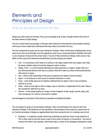
Elements andPrinciples of DesignWhat You May Have Missed from Art ClassMaybe you didn’t study art formally. If not, you’re probably only, at best, casually familiar with some ofthe basic tenants of good design.You’ve no doubt heard visual judges in the past make reference to the elements and principles of design,and if you’ve never really fully understood what they meant, this article is for you.The first component to study are the seven elements of design. These are the basic building blocks of anypiece of art, and can be thought of as the ingredients used in your visual presentation. Whether well doneor not, all pieces of visual art will contain most, if not all, of these elements of design. Some sources maydiffer on their exact list of elements and definitions, but this will get you started. Line – is a continuous mark made on a surface or the edge created when two shapes meet. Maybe actual, implied, vertical, horizontal, diagonal, and/or contour. Shape / Form – is a self-contained defined area, either geometric or organic. Shape refers to atwo-dimensional element with area on a plane, while form refers to a three-dimensional elementwith volume in space. Size – refers to the relationship of the area occupied by one shape to that of another. Space – is the distance or area around or between elements in a work. Color – is the visible spectrum of radiation reflected from an object. Color is also sometimesreferred to as hue. Value – refers to how light or dark an object, area, or element is, independent of its color. Value isalso sometimes referred to as tone. Texture – is the surface quality of a shape, or how it appears to feel: rough, smooth, spiky, soft,hard, and glossy, etc. Texture can be real or implied.See the diagrams at the back of this article for examples and additional details.The next aspect to study are the principles of design. These can be thought of as what we do to theelements of design. If the elements are the ingredients, the principles are the recipe for a good work ofart. How the principles of design are applied determines how successful one is in creating a work of art. Emphasis – is created by visually reinforcing something we want the viewer to pay attention to.This is often used to train the viewer’s eyes on the center of interest, or a focal point – the area ofinterest the viewer’s eye naturally, instinctively skips to. Some of the strategies employed to createWGI Percussionwgi.org/educationrev. 3/2/16
degrees of importance are contrast of values, use of color, placement, variation, alignment,isolation, convergence, anomaly, proximity, size, and contrast. Balance – is the distribution of interest or visual weight in a work. A balanced work will have allthe elements arranged such that the work will have a sense of visual equilibrium or stability.Balance can be symmetrical, asymmetrical, or radial. Objects, values, colors, textures, shapes, etc.can be used in creating balance in a composition. Contrast – is the juxtaposition of opposing elements (opposite colors, value light / dark, directionhorizontal / vertical). The greater the contrast, the more something will stand out and callattention to itself. Repetition – of elements in regular or cyclic fashion creates interest. Repetition strengthens adesign by tying together individual elements and bringing a sense of consistency. It can createrhythm (regular, alternating, flowing, random, progressive) and patterns. Variation introduced torepetition increases the level of interest. Movement – is a visual flow through the composition. In some works, movement is implied by theuse of static elements to suggest motion and direct a viewer’s eye along a path through the work.In a still image, aspects such as lines, diagonals, unbalanced elements, placement, and orientationcan play the role of active elements. In others, movement can be real, giving some elements theability to be moved or move on their own. Harmony – brings together a composition with similar, related elements (adjacent colors, similarshapes, etc.). Harmonious elements have a logical relationship, connection, alignment, orprogression. They work together and complement each other. Unity –is created by using harmonious similarity and repetition, continuance, proximity, andalignment. It is the visual linking of various elements of the work. This allows the disparateelements and principles to create a unified whole that can be greater than the sum of its parts.For examples of some of the elements and principles of design in action, please take a look at thefollowing links: art-and-principles-of-design nciples-of-art-presentation -of-design-252201 https://www.youtube.com/playlist?list PLiOil1qP-cMURN 8baOr3QWfySmIjqKIjThe above definitions and examples only scratch the surface of the elements and principles of design.Hopefully this serves as a primer, and as something to whet your appetite to learn more about the tenetsof good visual design. For those looking to expand their knowledge and understanding there arecountless websites, books, and courses dedicated fully to the subjects introduced above.A good place to start would be the resources used to compile this article and the posters found on thefollowing pages.WGI Percussionwgi.org/educationrev. 3/2/16
Works pecial thanks to the team at paper-leaf.com for the beautiful, free quick-reference posters on thefollowing pages.WGI Percussionwgi.org/educationrev. 3/2/16
The next aspect to study are the principles of design. These can be thought of as what we do to the elements of design. If the elements are the ingredients, the principles are the recipe for a good work of art. How the principles of design are applied de
