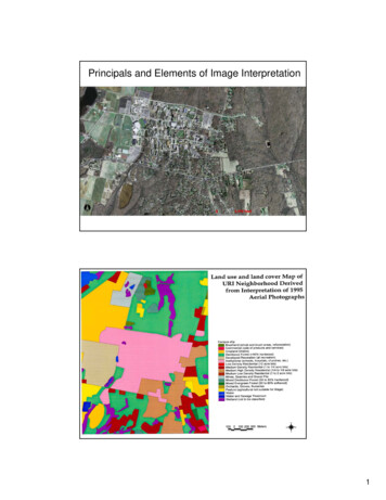
Transcription
Control Chart Rules and InterpretationControl charts are a valuable tool for monitoring process performance.However, you have to be able to interpret the control chart for it to be ofany value to you. Is communication important in your life? Of course it is– both at work and at home. Here is the key to effectively using controlcharts – the control chart is the way the process communicates with you.Through the control chart, the process will let you know if everything is“under control” or if there is a problem present. Potential problemsinclude large or small shifts, upward or downward trends, pointsalternating up or down over time and the presence of mixtures.This month’s publication examines 8 rules that you can use to help you interpret what your control chartis communicating to you. These rules help you identify when the variation on your control chart is nolonger random, but forms a pattern that is described by one or more of these eight rules. Thesepatterns give you insights into what may be causing the “special causes” – the problem in your process.In this issue: Variation ReviewControl Chart ReviewThe 8 Control Chart RulesPossible Causes by PatternSummaryQuick LinksVariation ReviewWe have covered variation in 11 publications over the years. Here is an excerpt from one:"I used to, now and then, spill a glass of milk when I was young.Our table slanted toward where my mother sat. So, the milkalways headed in her direction. And she usually had some choicewords when this happened. Of course, I was at fault. I needed tobe more careful. Or was that really true? If you understandvariation, you will realize that most of the problems you face arenot due to individual people, but to the process -- the way it wasdesigned and the way it is managed on a day-to-day basis.Variation comes from two sources, common and special causes. Think about how long it takes youto get to work in the morning. Maybe it takes you 30 minutes on average. Some days it may take alittle longer, some days a little shorter. But as long as you are within a certain range, you are notconcerned. The range may be from 25 to 35 minutes. This variation represents common causevariation --- it is the variation that is always present in the process. And this type of variation isconsistent and predictable. You don't know how long it will take to get to work tomorrow, but youknow that it will be between 25 and 35 minutes as long as the process remains the same.1 2016 BPI Consulting, LLCwww.spcforexcel.com
Now, suppose you have a flat tire when driving to work. How long will it take you to get to work?Definitely longer than the 25 to 35 minutes in your "normal" variation. Maybe it takes you an hourlonger. This is a special cause of variation. Something is different. Something happened that was notsupposed to happen. It is not part of the normal process. Special causes are not predictable and aresporadic in nature.Why is it important to know the type of variation present in yourprocess? Because the action you take to improve your processdepends on the type of variation present. If special causes are present,you must find the cause of the problem and then eliminate it fromever coming back, if possible. This is usually the responsibility of theperson closest to the process. If only common causes are present, youmust FUNDAMENTALLY change the process. The key word isfundamentally -- a major change in the process is required to reducecommon causes of variation. And management is responsible forchanging the process.It has been estimated that 94% of the problems a company faces are due to common causes. Only6% are due to special causes (that may or may not be people related). So, if you always blameproblems on people, you will be wrong at least 85% of the time. It is the process most of the timethat needs to be changed. Management must set up the system to allow the processes to bechanged."Control Chart ReviewThe only effective way to separate common causes from special causes of variation is through the use ofcontrol charts. A control chart monitors a process variable over time – e.g., the time to get to work. Theaverage is calculated after you have sufficient data. The control limits are calculated – an upper controllimit (UCL) and a lower control limit (LCL). The UCL is the largest value you would expect from a processwith just common causes of variation present. The LCL is the smallest value you would expect with justcommon cause of variation present. As long as the all the points are within the limits and there are nopatterns, only common causes of variation are present. The process is said to be "in control."Figure 1 is an example of a control chart using the driving to workexample. Each day the time to get to work is measured. Thedata are then plotted on the control chart. The average iscalculated. The average is 26.2 – which means it takes onaverage each day 26.2 minutes to get to work. The control limitsare then calculated. The UCL is 41.9 minutes. This is themaximum time it will take to get to work when only commoncauses are present. The LCL is 10.6 minutes. This is the minimumtime it will take to get to work when only common causes arepresent. As long as all the points are within the control limits andthere are no patterns, then process is in statistical control.2 2016 BPI Consulting, LLCwww.spcforexcel.com
Figure 1: Control Chart Example555045UCL 41.9Time (Minutes)403530Avg 26.2252015LCL 10.610123456789 10 11 12 13 14 15 16 17 18 19 20 21 22 23 24 25Day NumberThere is one point beyond the UCL in Figure 1. This is the first pattern that signifies an out of controlpoint – a special cause of variation. One possible cause is the flat tire. There are many other possiblecauses as well – car break down, bad weather, etc.Special causes of variation are detected on control chartsby noticing certain types of patterns that appear on thecontrol chart. The point beyond the control limits is onesuch pattern. You might see a pattern of 7 consecutivepoints above the average. This pattern indicates thatsomething has happened to cause your process averagego up – a special cause is present. Recognizing patterns –and what they mean in your process – is one key tofinding the reason for special causes. All of the controlchart rules are patterns that form on your control chart toindicate special causes of variation are present.Some of these patterns depend on “zones” in a control chart. To see if these patterns exits, a controlchart is divided into three equal zones above and below the average. This is shown in Figure 2.Zone C is the zone closest to the average. It represents the area from the average to one sigma abovethe average. There is a corresponding zone C below the average. Zone B is the zone from one sigma totwo sigma above the average. Again, there is a corresponding Zone B below the average. Zone A is thezone from two sigma to three sigma above the average – as well as below the average.3 2016 BPI Consulting, LLCwww.spcforexcel.com
Figure 2: Control Chart Divided into Zones555045UCL 41.9Time (Minutes)40ZONE A35ZONE B30ZONE CAvg 26.225ZONE C20ZONE B15ZONE ALCL 10.610123456789 10 11 12 13 14 15 16 17 18 19 20 21 22 23 24 25Day NumberThe 8 Control Chart RulesIf a process is in statistical control, most of the points will be near the average, some will be closer to thecontrol limits and no points will be beyond the control limits. The 8 control chart rules listed in Table 1give you indications that there are special causes of variation present. Again, these represent patterns.Table 1: Control Chart RulesRule12345678Rule NameBeyond LimitsZone AZone BZone CTrendMixtureStratificationOver-controlPatternOne or more points beyond the control limits2 out of 3 consecutive points in Zone A or beyond4 out of 5 consecutive points in Zone B or beyond7 or more consecutive points on one side of the average (in Zone C or beyond)7 consecutive points trending up or trending down8 consecutive points with no points in Zone C15 consecutive points in Zone C14 consecutive points alternating up and downIt should be noted that the numbers can be different depending upon the source. For example, somesources will use 8 consecutive points on one side of the average (Zone C test) instead of the 7 shown inthe table above. But they are all very similar. Figures 3 through 5 illustrate the patterns. Figure 3 showsthe patterns for Rules 1 to 4.4 2016 BPI Consulting, LLCwww.spcforexcel.com
Figure 3: Zone Tests (Rules 1 to 4)Points beyond thelimitsUCLZone B TestAvgZone A TestZone C TestLCLRules 1 (points beyond the control limits) and 2 (zone A test) representsudden, large shifts from the average. These are often fleeting – a one-timeoccurrence of a special cause – like the flat tire when driving to work.Rules 3 (zone B) and 4 (Zone C) represent smaller shifts that are maintainedover time. A change in raw material could cause these smaller shifts. Thekey is that the shifts are maintained over time – at least over a longer timeframe than Rules 1 and 2.Figure 4 shows Rules 5 and 6. Rule 5 (trending up or trending down) represents a process that istrending in one direction. For example, tool wearing could cause this type of trend. Rule 6 (mixture)occurs when you have more than one process present and are sampling each process by itself. Hencethe mixture term. For example, you might be taking data from four different shifts. Shifts 1 and 2operate at a different average than shifts 3 and 4. The control chart could have shifts 1 and 2 in zone Bor beyond above the average and shifts 3 and 4 in zone B below the average – with nothing in zone C.Figure 5 shows rules 7 and 8. Rule 7 (stratification) also occurs when you have multiple processes butyou are including all the processes in a subgroup. This can lead to the data “hugging” the average – allthe points in zone C with no points beyond zone C. Rule 8 (over-control) is often due to overadjustment. This is often called “tampering” with the process. Adjusting a process that is in statisticalcontrol actually increases the process variation. For example, an operator is trying to hit a certainvalue. If the result is above that value, the operator makes an adjustment to lower the value. If theresult is below that value, the operator makes an adjust to raise the value. This results in a saw-toothpattern.5 2016 BPI Consulting, LLCwww.spcforexcel.com
Figure 4: Rules 5 and 6Trends up anddownUCLAvgMixtureLCLFigure 5: Rules 7 and 8UCLOver-controlStratificationAvgLCL6 2016 BPI Consulting, LLCwww.spcforexcel.com
Rules 6 and 7, in particular, often occur because of the way the data are subgrouped. Rationalsubgrouping is an important part of setting up an effective control chart. A previous publicationdemonstrates how mixture and stratification can occur based on the subgrouping selected. These rulesrepresent different situations – patterns on a control chart. It should be noted that not all rules applyto all types of control charts. Table 2 summaries the rules by the type of pattern.Table 2: Rules by Type of PatternPattern DescriptionLarge shifts from the averageSmall shifts from the les1, 23, 45678Possible Causes by PatternIt is difficult to list possible causes for each pattern because special causes (just like common causes) arevery dependent on the type of process. Manufacturing processes have different issues that serviceprocesses. Different types of control chart look at different sources of variation. Still, it is helpful toshow some possible causes by pattern description. Table 3 attempts to do this based on the type ofpattern.Table 3: Possible Causes by PatternPattern DescriptionLarge shifts from the averageRules1, 2Small shifts from the average3, ible CausesNew person doing the jobWrong setupMeasurement errorProcess step skippedProcess step not completedPower failureEquipment breakdownRaw material changeChange in work instructionDifferent measurement device/calibrationDifferent shiftPerson gains greater skills in doing the jobChange in maintenance programChange in setup procedureTooling wearTemperature effects (cooling, heating)More than one process present (e.g. shifts, machines,raw material.)More than one process present (e.g. shifts, machines,raw materials)Tampering by operatorAlternating raw materials7 2016 BPI Consulting, LLCwww.spcforexcel.com
Table 3 provides some guidance on what you should be thinking about as you try to find the reasons forspecial causes. For example, if Rule 1 or Rule 2 is violated, you should be asking “what in this processcould cause a large shift from the average?”. Or if Rule 6 occurs, you should be asking “what in thisprocess could cause there to be more than one process present?” These type of questions can helpguide brainstorming sessions to find the reasons for the special cause of variation. The type of patterncan guide your analysis of the out of control point.SummaryThis publication took a look at the 8 control chart rules for identifying the presence of a special cause ofvariation. The rules describe certain patterns of variation that will give you insights on where to look forthe special cause of variation. No one table can give you the reasons for out of control points in yourprocess. You have to use your own knowledge (and that of those closest to the process) to discover thereason.Quick LinksVisit our home pageSPC for Excel SoftwareSPC TrainingSPC ConsultingSPC Knowledge BaseOrdering InformationThanks so much for reading our publication. We hope you find it informative and useful. Happy chartingand may the data always support your position.Sincerely,Dr. Bill McNeeseBPI Consulting, LLC8 2016 BPI Consulting, LLCwww.spcforexcel.com
The 8 Control Chart Rules If a process is in statistical control, most of the points will be near the average, some will be closer to the control limits and no points will be beyond the control limits. The 8 control chart rules listed in Table 1 give you indications that there are specia