Transcription
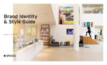
Brand Identity& Style GuideVersion 1.0 – April 2018
Contents1BRANDMESSAGES2OUR VISUALIDENTITY3PHOTOGRAPHYGUIDELINES1.1 Introduction2.1 Visual elements overview3.1 Image types1.2 Our brand manifesto2.2 Our logo3.2 Products and the environment2.3 Brand colours3.3 Customers4ADDITIONALDOCUMENTS2.4 Typography2.5 Components2.6 Product naming2.7 Layout2.8 Dual brandingBrand Identity & Style Guide V1.0 – April 20182
01BrandMessagesBrand Identity & Style Guide V1.0 – April 20183
1.1 – INTRODUCTIONBrand Consistency“DETAILS ARE NOTTHE DETAILS. THEYMAKE THE DESIGN.”– CHARLES EAMES.Brand Identity & Style Guide V1.0 – April 2018Great brands are built through the consistentdelivery of the brand and it’s messages throughall touch-points – a strong, unified messagereinforces not only who we are and why we exist,it also drives recognition, trust, success, and ofcourse, ultimately, business growth.This document is a guide to how we visuallyrepresent Spaces to our customers.It covers all our key brand elements, and should beused as a rulebook and a compass to navigate usthrough all the visual touchpoints of the brand.4
1.2 – OUR BRAND MANIFESTOOur BrandManifestoCreative workspaceswith a uniqueentrepreneurial spirit.We believe work is about people and ideas. Our Spacesare inhabited by forward thinkers, innovators andgame changers who are confident in achieving theirgoals. Whether you are a small business, entrepreneuror a corporate intrapreneur, at Spaces we help ourcommunity to expand their horizon.By creating dynamic workspaces with a unique andentrepreneurial spirit we help you think, create andcollaborate while our friendly team sees to all of thebackground logistics and services. At Spaces we makesure that our community can focus on driving theirbusiness forward.Our free-spirited vibe attracts an energetic communityof positive and open-minded business thinkerswho love to meet new people. The full program ofprofessional events and hospitality services, andthe inspiring sophisticated European design of ourbusiness clubs, involves people in the buzz and energyof Spaces, and make them feel at home.Brand Identity & Style Guide V1.0 – April 20185
02Our VisualIdentityBrand Identity & Style Guide V1.0 – April 20186
2.1 – VISUAL ELEMENTS OVERVIEWVisual Elements OverviewIn BriefA snapshot of the visual elementsthat form our brand nterstateWeb BackupOverpassPresentations BackupArialBrand Identity & Style Guide V1.0 – April 2018Example of a Spaces location with people7
2.2 – OUR LOGOThe Brand IdentityMaster LogoThis is the Spaces primary logo. It is set in SpacesRock Grey. Always apply on a white or cleanbackground without clashing colours or compleximagery. Always set the total height of the logo asthe minimum spacing around all edges (see ClearSpace on the next page).Logo VariationsIf required, you can also apply the logo in reverse:Figure 2: on Spaces Dark Grey background.Figure 1Figure 2Brand Identity & Style Guide V1.0 – April 20188
2.2 – OUR LOGOClear SpaceSize & PositioningAlways ensure a minimum spacing of the logoheight to all edges. i.e. If a logo is 5mm high, ensurea 5mm minimum space on all edges. Never makelogo smaller than 12mm or 50px.Brand Identity & Style Guide V1.0 – April 20189
2.2 – OUR LOGOMisuseLogo MisuseDo not use the Spaces logo in any way thatdamages the brand, including but not limited to:removing or altering the hexagon symbol orfull-stop, changing the typography or applying anoff-brand colour (see page 8).Brand Identity & Style Guide V1.0 – April 2018Do not change logo colourDo not use a different fontDo not remove full stopDo not move the hexagonDo not place on complex imageryDo not use this logo10
2.2 – OUR LOGOPlacementNEWBottom RightThe majority of the time the Spaces logo will sit inthe bottom right corner of the creative.ExceptionsWhere creative is used or executed in such a waythat logo placement in the bottom right corner isnot suitable, alternative positions are allowed.WRITE DOWNTHE FIRSTTHING THATCOMESTO MIND.SPACES LOCATION IS OPENING.An inspiring, high-end work environment where ideasdevelop, businesses build, and relationships evolve. A placewhere you can get down to business, check emails and holdmeetings, all this while you can enjoy a great cup of coffeeand a healthy lunch.YOU’VE GOT TOTASTE OUR SNACKS.Extra luxe sandwiche 4.00Luxe sandwiche 2.95Budget sandwiche 2.50D.I.Y. sandwiche 2.00Salad bare 5.25Chef’s saladWrite it.Scribble it.Doodle it.Examples of bottom right logo placementsBrand Identity & Style Guide V1.0 – April 2018e 5.95Soup of the daye 2.75Egge 0.50Fruite 1.00Tostie 3.25Tosti speciaale 3.75Warm snackDaily rateYOUR PLACE TO WORK.spacesworks.comExamples of alternative placements11
2.3 – BRAND COLOURSCore ColoursCore ColoursRock should be used primarily in all designs alongwith white. Gold is used as ahighlight colour. Pearl isused in backgrounds.Brand Identity & Style Guide V1.0 – April 2018White.Rock.Pearl.Gold.#333333C69 M63 Y62 K58R51 G51 B51#F0F0F0C5 M3 Y3 K0R240 G240 B240#E4B23AC4 M33 Y90 K0R228 G178 B58Main colour,replaces black.Main web colour,used in backgrounds.Main highlight colour,replaces orange.12
2.3 – BRAND COLOURSSecondary ColoursSecondary ColoursFor special use only,not in core communications.Red.Green.Blue.Pink.#E33C45C277 M60 Y69 K0R51 G51 B51#009A8AC81 M14 Y53 K1R0 G154 B138#AECCDEC27 M0 Y0 K16R174 G204 B222#F4C6C0C0 M28 Y19 K3R244 G198 B192Supporting,Preffered Use.Supporting,Preffered Use.Supporting,Minimal Use.Supporting,Minimal Use.Brand Identity & Style Guide V1.0 – April 201813
2.3 – BRAND COLOURSApplicationNEWSplit90% Rock & White10%SPACES LOCATION IS OPENING.An inspiring, high-end work environment where ideasdevelop, businesses build, and relationships evolve. A placewhere you can get down to business, check emails and holdmeetings, all this while you can enjoy a great cup of coffeeand a healthy lunch.Brand Identity & Style Guide V1.0 – April 201814
2.3 – BRAND COLOURSMisuseColour MisuseOnly Rock can be used for text and theSpaces logo for legibility issues.Do not use Pearl in everyday applicationsDo not use Gold in everyday applicationsBrand Identity & Style Guide V1.0 – April 201815
2.4 – TYPOGRAPHYTypography WeightsInterstateSpaces uses one font family which is Interstate. Weuse three weights, black, bold and light. Each weighthas rules around how it should be used - this shouldbe followed carefully to ensure the Spaces identityis consistently represented.Brand Identity & Style Guide V1.0 – April opqrstuvwxyz1234567890(,.;:?! &*)Interstate tuvwxyz1234567890(,.;:?! &*)Interstate uvwxyzInterstate Black1234567890(,.;:?! &*)16
2.4 – TYPOGRAPHYSupporting typefacesOverpassWhen interstate cannot support a languagescript we use the typeface Overpass - a free fontdeveloped by Google. You can download Overpasshere: https://fonts.google.com/specimen/OverpassDevice reliant fontsFor applications where you rely on system fontssuch as email campaigns we use Arial, which is acommon system font on both Mac and PC.Brand Identity & Style Guide V1.0 – April opqrstuvwxyz1234567890(,.;:?! &*)Overpass tuvwxyz1234567890(,.;:?! &*)Overpass uvwxyz1234567890(,.;:?! &*)Overpass Black17
2.4 – TYPOGRAPHYTypography StylesThree StylesSpaces Heading One style always uses all-caps, inblack weight. It should be set in optical and -50. Inweb, this may not be possible. Heading Two can beused in sentence case only in bold, where as BodyCopy is set in light. This dramatic contrast betweenhierarchy allows for the bold Spaces look with alight, playful offset.Brand Identity & Style Guide V1.0 – April 2018HEADINGONE ISSET ININTERSTATEBLACK.Heading two is setin Interstate bold.Sentence case only.Body copy is set in Interstate light. Sentence case only.Bold is allowed when highlighting a word or phrasewithin the body copy. Otherwise an underline is alsosuitable when used sparingly. Bullets, numbering andall other styles can be applied to body18
2.4 – TYPOGRAPHYUsage ExamplesHeading OneEnsure, where always possible, a line is used inthe lockup for Heading One. As a general rule, useHeading One only once in a design, if additionalheadings are required then use Heading Two.WRITE DOWNTHE FIRSTTHING THATCOMESTO MIND.YOU’VE GOT TOTASTE OUR SNACKS.Extra luxe sandwiche 4.00Luxe sandwiche 2.95Budget sandwiche 2.50D.I.Y. sandwiche 2.00Salad bare 5.25Chef’s salade 5.95Soup of the daye 2.75Egge 0.50Fruite 1.00Tostie 3.25Tosti speciaale 3.75Warm snackDaily rateExamples of Heading One use, with the line at the bottom.Brand Identity & Style Guide V1.0 – April 201819
2.4 – TYPOGRAPHYUsage ExamplesHeading Two & BodyHeading Two should be used following a HeadingOne application, for example, on the back side of aflyer (see right examples). Body copy is always setin light. If attention is needed on a particular phraseor sentance Bold is applied (see examples). Thismethod should not be overused. Light-only bodycopy is always preferred in Spaces applications.Examples of Heading Two and Body Copy useBrand Identity & Style Guide V1.0 – April 201820
2.4 – TYPOGRAPHYMisuseTypography MisuseOnly use Heading One in all-caps, never use inlowercase or sentence case. Never use HeadingTwo in any other style than sentence case. Bodycopy can be altered in different weights to highlightphrases or words, but do not overuse this effect.Brand Identity & Style Guide V1.0 – April 2018Don’t use H1 in sentenceDon’t use H1 in lowercaseDon’t use H1 in alternate stylesDon’t use H2 in all-capsDon’t use H2 in lowercaseDon’t use H2 in alternate styles21
2.4 – TYPOGRAPHYExample Usage WebsiteBrand Identity & Style Guide V1.0 – April 201822
2.4 – TYPOGRAPHYExample Usage StationeryYOUR PLACE TO WORK.Letterheadspacesworks.comBusiness cardBrand Identity & Style Guide V1.0 – April 201823
2.4 – TYPOGRAPHYExample Usage PresentationsBrand Identity & Style Guide V1.0 – April 201824
2.5 – COMPONENTSHeadline LockupHeading OneHeading One should always be used with a lineapplication sitting underneath. This lockup shouldbe used as a base lockup for all Spaces collateral.JUST LIKEGLASSES OFWINE, AGESHOULD NEVERBE COUNTED.Example of Heading One lockup with a line.Brand Identity & Style Guide V1.0 – April 201825
2.5 – COMPONENTSIconsProduct IconsSpaces utilises a handful of core icons across it’scommunications. These icons encapsulate the mainproducts on offer from Spaces. Dedicated Desk,Membership, Office Space and Meeting Room.Brand Identity & Style Guide V1.0 – April 201826
2.5 – COMPONENTSPatternsCore PatternThe Spaces brand uses one core pattern in allrelevant communications. The core Spaces patternuses the same degree angle as the top right side ofthe Spaces hexagon.Brand Identity & Style Guide V1.0 – April 201827
2.5 – COMPONENTSOutdoor PatternOutdoor Use OnlySpaces utilises a large scale window pattern forsignage purposes only. This pattern should not beused in small scale designs, if a pattern is needed insmall scale designs, use the core pattern featuredon the previous page.Brand Identity & Style Guide V1.0 – April 201828
2.5 – COMPONENTSIllustrationsBuilding IllustrationsSpaces utilises a specific set of locationillustrations. These can be used to supportnew location openings or location specificcommunications.ApplicationAll Illustrations should appear in r Rock with a whitefill colour. These illustrations can be applied on aWhite background.Spaces AmstelBrand Identity & Style Guide V1.0 – April 201829
2.6 – PRODUCT NAMINGProduct NamingTitle CaseWhere possible, the product names should be setin Heading Two and in Title Case. When productnames appear in Body Copy, apply in Title Case andbold, this helps offset the product name againstthe general body copy. Avoid listing the productnames in Heading One style, unless used in singularproduct mention context i.e. “.Coworking.”.Heading TwoCoworkingSet in Title CaseDedicated DesksSet in Title CaseOfficesSet in Title CaseMeeting RoomsSet in Title CaseBrand Identity & Style Guide V1.0 – April 2018Body CopyCoworkingSet in Bold, Title CaseDedicated DesksSet in Bold, Title CaseOfficesSet in Bold, Title CaseMeeting RoomsSet in Bold, Title Case30
2.7 – LAYOUTExamples: PrintNEWCOFFEESPACES IS COMING TO[LOCATION].BROKERBENEFITSAn inspiring, high-end work environment whereideas develop, businesses build, and relationshipsevolve. A place where you can get down to business,check emails and hold meetings, all this while youcan enjoy a great cup of coffee and a healthy lunch. 10% commission forthe initial term. Paid within 21 daysvia ACH. Be as involved in thedeal as you want to.Why not stop by and visit us?Give us call on XXX XXX or book atour via spacesworks.com/locationREFRESHMENTFruit smoothiee 2.50Fruit smoothiee 2.50Orange juicee 2.50Orange juicee 2.50Milk / buttermilke 1.50Milk / buttermilke 1.50Yoghurt drinke 1.50Yoghurt drinke 1.50Schulp juicee 2.50Vitamin watere 2.75MineralwatereFruit smoothiee 2.50Fruit smoothiee 2.50Orange juicee 2.50Orange juicee 2.50Milk / buttermilke 1.50Milk / buttermilke 1.50Yoghurt drinke 1.50Schulp juicee 2.50Vitamin watere 2.75MineralwatereFruit smoothiee 2.50Fruit smoothiee 2.50Orange juicee 2.50Orange juicee 2.50Milk / buttermilke 1.50Milk / buttermilke 1.50Yoghurt drinke 1.50Yoghurt drinke 1.50OTHER2.102.10NON COFFEEHOT TEAITALIAN SODAFruit smoothiee 2.50Fruit smoothiee 2.50Orange juicee 2.50Orange juicee 2.50Milk / buttermilke 1.50Milk / buttermilke 1.50Yoghurt drinke 1.50Yoghurt drinke 1.50SIGNAUTURESchulp juicee 2.50Vitamin watere 2.75MineralwatereFruit smoothiee 2.50Fruit smoothiee 2.50Orange juicee 2.50Orange juicee 2.50Milk / buttermilke 1.502.10WRITE DOWNTHE FIRSTTHING THATCOMESTO MIND.Offices, Coworking, Meeting Rooms.Brand Identity & Style Guide V1.0 – April 201831
2.8 – DUAL BRANDINGLogo LockupsCo-Branding PrimaryYou will often need to use the spaces logoalongside another logo or multiple other logos.When this is called for, try to match all logos withtheir cap height (height of a capital letter) and aminimum spacing between each logo of the heightof the hexagon.Co-Branding SecondaryIf the logo we are co-branded is a portrait orsquare layout or has a large shape around it, itmay make more sense to align it to the heightof the Spaces logo times three, this includes thehexagon. As shown below, the complex logo wouldnow hold similar visual weight to the Spaces logo.Brand Identity & Style Guide V1.0 – April 2018LOGOLOGOLOGO32
03OurPhotographyBrand Identity & Style Guide V1.0 – April 201833
3.1 – IMAGE TYPESOur ImageryHero The LocationThe aim is to always hero the location, andshowcase the inspiring workspace, and ourcommunity members using them. Images withpeople should always focus on them workingor on the move. This helps to make them lessrecognizable. We use different focus techniquessuch as shallow depth of field or motion blur toachieve this.Brand Identity & Style Guide V1.0 – April 201834
3.2 – PRODUCTS AND THE ENVIRONMENTCustomers and Our ProductsPhotographing PeopleSpaces photographyshould always represent adiverse mix of people with a blend of male, femaleand different ethnicities. All faces should beblurred out, either with exposure settings or in postproduction. Capturing people interacting with theenvironment is key. The overall feeling and emotionshould be warm and inviting.Brand Identity & Style Guide V1.0 – April 201835
3.3 – CUSTOMERSAuthentic PeoplePhotographing PeopleNo matter which area you are photographing,Spaces should use authentic people in authenticsituations, but this should not be the focal point.The overall photograph should always focus on thewider interior space, not the people.Brand Identity & Style Guide V1.0 – April 201836
3.3 – CUSTOMERSShowcasing our SpacesWe want photographs like thisLocation imagery showcasing our products.Brand Identity & Style Guide V1.0 – April 201837
3.3 – CUSTOMERSShowcasing our SpacesWe do not want photographs like thisThis does not convey the feeling of space and is asimple architectural study.Brand Identity & Style Guide V1.0 – April 201838
3.3 – CUSTOMERSCompositionsWe want photographs like thesePhotos that tell a story, shot in an interesting way.Brand Identity & Style Guide V1.0 – April 201839
Brand Identity& Style GuideVersion 1.0 – April 2018
Brand Identity & Style Guide V1.0 – April 2018 8 2.2 – OUR LOGO The Brand Identity Master Logo This is the Spaces primary logo. It is set in Spaces Rock Grey. Always apply on a white or clean background without clashing colours or complex imagery. Always set the total height of th