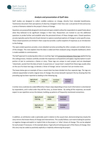
Transcription
Tables, Graphs, Dashboards, & Reports:Data Visualization Best PracticesDATA VISUALIZATION BEST PRACTICESFundamental Best PracticesWhen to Use a Graph or a Table: Graphs and tables display data for different purposes.Use a TABLE to: Look up specific valuesCompare specific valuesDisplay precise valuesCommunicate more than one unit of measureTable ChecklistOrganization/Categorization Data are ordered following standardized healthcare data classification systems (taxonomies), such as TNMtumor classification or the International Classification of Diseases (ICD). Data is categorized in the most effective manner to communicate the story, such as by ranked results, byareas requiring attention (not meeting goal) versus others, by geographic region, or by medical service. If users need to perform a simple look-up, data are arranged alphabetically or numerically. This is best fordata with no underlying order. Calculated columns are arranged in a logical manner reflecting how they were calculated. For example,numerator (column A) divided by denominator (column B) equals percentage or rate (column C); value(column A) minus value (column B) equals difference (column C).Copyright 2017 HealthDataViz. May not be reproduced without written permission.
Non-Data-Ink All gridlines are eliminated, or as many as possible. White space or light highlighting is used to differentiate rows and columns of data. Graphs are used in lieu of color-coded cells. Highlighting techniques, such as bolding or italics to highlight important data, are used sparingly.Fonts Non-proportional sans serif fonts, such as Arial, are used to ensure values have equal space on the page.Number Alignment and Formatting All numbers are right justified to ensure values are aligned. Commas are used for numbers with more than three digits (for example, 1,000). Zeros are eliminated whenever possible (for example, 1,000,000 displayed as 1m). Minimal numbers are included after a decimal point to convey value and context to the data. Negative values are indicated by parentheses, a minus sign, or red font (examples: (65), -65, -65).Labels Columns and rows are described in plain language. Units are shown, such as dollars ( ), percent (%), count (#), days, hours, or minutes. Labels are layered to allow for better descriptions. For example:Average Days for New Patient AppointmentsClinic A Clinic B Clinic C Clinic D Summary calculations are included to help users understand the data being displayed. If possible, theirdefinitions are incorporated into the labels so that footnotes have been eliminated or greatly reduced.(For example, the summary metric “total available operating room time that has been adjusted to accountfor room turnover times” could be labeled as “Available OR Minutes (less turnover)”. Labels are oriented horizontally. If table rows flow across pages, column headers are repeated on each page.Copyright 2017 HealthDataViz. May not be reproduced without written permission.2
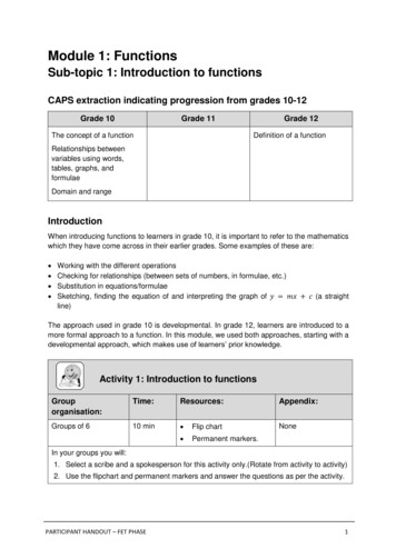
Use a GRAPH to: Show patternsShow trendsShow exceptionsReveal relationships among multiple valuesChart Types: Just six chart types can create nearly all the dashboards and reports that tell the stories in our data: PointsVertical barsVertical boxesLinesHorizontal barsHorizontal boxesSource: Show Me the Numbers, 2012, S. FewThe following pages summarize the seven most common relationships in graphs. They relate the ways in whichthese six chart types may be used to display data visually.Copyright 2017 HealthDataViz. May not be reproduced without written permission.3
The Seven Most Common Relationships in Graphs*RelationshipDescriptionEncoding Methods/Chart Types1. NominalComparisonComparison of thecategoricalsubdivisions of oneor more measures inno specific order. Horizontal or vertical bars.2. Time-SeriesMultiple instancesof one or moremeasures taken atequidistant points intime. Lines to emphasize overallpattern. Bars to emphasize individualvalues. Points connected by lines toshow individual values whilestill highlighting the overallpattern of the data. Time is always on thehorizontal X axis.3. RankingCategoricalsubdivisions of ameasure ordered inascending ordescending size. Horizontal or vertical bars. Sorting data in:o Descending orderhighlights high values.o Ascending orderhighlights low values.4. Part-toWholeMeasures ofindividual categoricalsubdivisions as ratiosto the whole. Horizontal or vertical barsonly. Use stacked bars only whenyou must display measures ofthe whole as well as theparts.Example* Adapted from Stephen Few, Show Me the Numbers: Designing Tables and Graphs to Enlighten. Second edition. June 2012.Copyright 2017 HealthDataViz. May not be reproduced without written permission.4
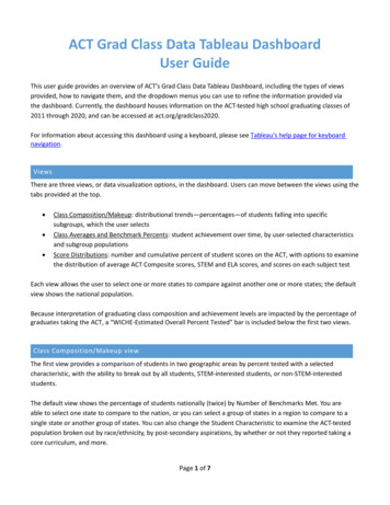
RelationshipDescriptionEncoding Methods/Chart Types5.DeviationCategoricalsubdivisions of ameasure compared toa reference measure,expressed as thedifference betweenthem. Lines to emphasize the overallpattern only when displayingdeviation and time-seriesrelationships together. Points connected by lines toslightly emphasize individualdata points while alsohighlighting the overall patternwhen displaying deviation andtime-series relationshipstogether. Bars to emphasize individualvalues, but limit to vertical barswhen a time-series relationshipis included. Always include a reference lineto compare the measures ofdeviation against.6.DistributionCounts of somethingper each subdivisionof an interval scale Vertical bars to emphasizeindividual values (histogram). Lines to emphasize the overallpattern (frequency polygon).ExampleOrThe distribution ofvalues for each ofmultiple categoricalsubdivisions. Vertical or horizontal bars(range bars or boxes) toencode the full range from thelow to the high value, or someportion of the range (e.g., oneor two standard deviations). Points or lines to encodemeasures of center (e.g.,mean, median).Copyright 2017 HealthDataViz. May not be reproduced without written permission.5
Relationship7.CorrelationDescriptionEncoding Methods/Chart TypesComparison of twopaired sets ofmeasures todetermine if theycorrelate and, if so,how strongly.Example Points and a trend line in ascatter plot. Bars may be used in lieu of ascatter plot, arranged as apaired bar graph or acorrelation bar graph.Copyright 2017 HealthDataViz. May not be reproduced without written permission.6
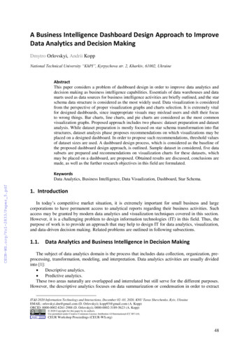
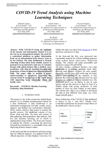
What is a Data Dashboard?The term dashboard is used to describe all types of data displays – often incorrectly. So, what is a data dashboard?A dashboard is a high-level summary, displayed on one computer screen or printed page, that helps viewersmonitor performance and quickly identify potential opportunities for further analysis and/or improvement.The key to creating an effective dashboard is to understand the people who will be using it, and the decisionsthey need to make. Armed with this knowledge, you will be able to design dashboards that deliver an overview ofwhat is happening that empowers your viewers to quickly identify what needs action.Here are two prototype dashboard designs which illustrate these attributes.Example Prototype DashboardsCEO DashboardThis dashboard considers the current environment in which hospital CEOs must navigate, one shaped by ValueBased Purchasing (VBP) and public reporting, and where financial, clinical, information technology, and patientsatisfaction results are all inextricably linked.Copyright 2017 HealthDataViz. May not be reproduced without written permission.7
Hospital Occupancy and Financial IndicatorsThe upper left panel of the dashboard displays industry-standard metrics on the hospital’s occupancy rate andaverage daily census along with high-level financial results (revenue and expenses). Up- and down-arrow icons areused to alert the CEO to specific areas that may require further inquiry. Deviation graphs show the direct varianceof actual performance compared with budget for the preceding 12 months.The next set of bar charts allows the CEO to easily monitor any changes in payer mix between the previous andcurrent year. Presenting the information this way makes it easy to see any significant changes in measures whichinform many of the financial management decisions made by a hospital.Hospital Quality and Patient SatisfactionThe hospital’s quality and patient satisfaction results for mandated performance measures are displayed by a blackvertical line for each measure and include a target or goal encoded by the vertical line. This information isimportant not only as a measure of the quality of care, but also because a hospital must achieve specific targets toreceive full reimbursement from third-party payers. This type of information display of this type allows a CEO tounderstand how well the staff is performing and where to focus improvement efforts.Quality and patient safety results, along with hospital mortality rates, are now being reported on public websitesto help consumers make informed decisions about where to receive their care. Given such free and publiccirculation of these crucial benchmarks, the CEO cannot afford any surprises about her/his hospital’s performance,and must have a fast, easy, and accessible way to continually monitor it. Displaying risk-adjusted mortality rateswith accompanying confidence intervals over time allows a CEO to discuss them with clinicians in a direct,accurate, and useful way.Strategic ProjectsHospital CEOs must also monitor Electronic Health Record (EHR) compliance, not only because these records holdthe promise of improved patient care, but also because the federal government offers significant financialincentives to hospitals that can demonstrate their Meaningful Use (MU). When EHR compliance by sub-specialty isranked in a horizontal bar graph that includes a target compliance rate, a CEO can easily and quickly see whereattention and resources need to be focused regarding EHR use.Copyright 2017 HealthDataViz. May not be reproduced without written permission.8
State Public Health DashboardThis prototype state public health dashboard allows viewers to see the rate of diabetes throughout the State ofIdaho with the use of a choropleth map. Viewers can consider underlying factors that may need to be addressed indeveloping policies and resource allocations, such as uninsured populations and the availability of primary carephysicians in different regions of the state.State MapIn choropleth maps, higher saturations of color are used to display higher rates of the variable or outcome ofinterest – such as diabetes rates – and less saturated colors are used to show lower rates. This varied colorsaturation makes it easy for a viewer to quickly and easily see how rates differ across a region or area of interest. Asmall key defining the rates and associated darkening color is included directly on the display.TableTables are often a great way to display summary statistics of interest. Dashboard developers frequently fall intothe trap of thinking that they need to display everything using a graph. However, as the dashboard above shows,tables offer a simple way to display the rates of diabetes and other contextual data such as population size,uninsured rates, and rates of primary care physicians per 100,000 residents.Ranked Rates by CountyUsing a combination of a ranked table and points to display the rates of diabetes in each county makes it easy forviewers to see the details displayed in the Choropleth map. Because some of the rates are so similar, the use of theblue points helps us visualize the small differences in the rates for each county much more easily then the figuresCopyright 2017 HealthDataViz. May not be reproduced without written permission.9
alone can. Additionally, we can see the Public Health Region in which each county is located (displayed in themiddle column).Quadrant DisplaysThe bottom row of the dashboard displays two quadrant displays. The first displays diabetes rates for the differentPublic Health Regions (PH) on the Y axis and uninsured rates on the X axis. The second displays the diabetes ratesand PCP’s per 100,000 residents. By placing this information side by side, the viewer can consider and furtherexplore the impact these factors may have on diabetes rates and study these factors and any opportunities toimprove them.ResourcesUnleash Your Inner Healthcare Data – Free monthly newsletter about the best practices of data visualization andanalysis for health and healthcare professionals. Written by Katherine S. Rowell, M.S., M.H.A.http://www.healthdataviz.com/blog/Stephen Few. Show Me the Numbers: Designing Tables and Graphs to Enlighten. Second edition. June 2012.Stephen Few. Information Dashboard Design: Displaying Data for At-a-Glance Monitoring. Second edition.August 2013.Edward R. Tufte. Visual Explanations: Images and Quantities, Evidence and Narrative. February 1997.Edward R. Tufte. The Visual Display of Quantitative Information. Second edition. January 2001.Copyright 2017 HealthDataViz. May not be reproduced without written permission.10
The bottom row of the dashboard displays two quadrant displays. The first displays diabetes rates for the different Public Health Regions (PH) on the Y axis and uninsured rates on the X axis. The second displays the diabetes rates and PCP’s per 100,000 residents. By placing this information