Transcription
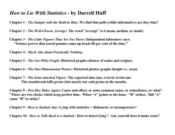
How to Lie With Statistics - by Darrell HuffChapter 1 - The Sample with the Built-in Bias: We find that polls (while informative) are they bias?Chapter 2 - The Well-Chosen Average: The word "average" is it mean, median, or mode)Chapter 3 - The Little Figures That Are Not There: Independent laboratory says:"Science proves that tossed pennies come up heads 80 per cent of the time."Chapter 4 - Much Ado about Practically Nothing:Chapter 5 - The Gee-Whiz Graph: Distorted graphs (choices of scales and origins).Chapter 6 - The One-Dimensional Picture: Distorted picture graphs (height vs. area).Chapter 7 - The Semi attached Figure: The reported data may even be irrelevant.This mouthwash kills germs (but maybe not cold germs in the mouth).Chapter 8 - Post Hoc Rides Again: Cause and effect, or some common cause, or coincidence, or what?”There are two clocks which keep perfect time. When “A” points to the hour. “B” strikes. Did “A”cause “B” to strike?Chapter 9 - How to Statistic late: Lying with statistics dishonesty or incompetence?Chapter 10 - How to Talk Back to a Statistic: How to detect lying ? Ask yourself does it make sense?
Well Chosen Average
Explanation of Neighborhood ExampleScenario 1: The "Upper Class" NeighborhoodSo just how is it possible that one person can claim the average income in the neighborhood is 150,000 while another can claim it is only 35,000?Both are "honest" people who are using legitimate statistics, but they are using differentdefinitions for "average.”Neighborhood IncomesGarnett 1,000,000Jackson 225,000Nelson 80,000Olson 60,000Smith 40,000Jones 30,000Howard 20,000Johnson 20,000Hamlin 15,000D’Amario 10,000Mean 150,000Median 35,000Mode 20,000
Income Chart 1,200,000 1,000,000Income 800,000 600,000 400,000 200,000 01234567Neighborhood8910MeanMedianMode
Income Chart - revisited. 90,000 80,000 70,000 60,000 50,000 40,000MeanMedianMode 30,000 20,000 10,000 012345678The Garnett & Jackson households are quite wealthy (outlier)If they did not live here; the mean, median, and mode would be 34,375, 25,000, & 20,000 respectively).Lessons to learn:1. The word "average" is meaningless unless you know whether it refers to the "mean", "median", or "mode."2. A few outliers can greatly skew the summary statistics. The mean is usually more sensitive to outliers thanthe median or mode.
Gee Whiz Graph
What does this information tell us?Notice that the age ranges are not constant.What relevance do the size of the matches have?
Oregon SAT scores again second in nation“Oregon's SAT class of 2004 again scoredsecond in the nation on the SAT amongthe 23 states that had at least 50 percentof their high school graduates tested.”Why 23 states not 50 states“Washington, a Northwest rival in SAT testperformance, outperformed Oregon bythree points on the math section and onepoint on the verbal section of the test. “Is three points significant ?Is it possible?Oregon improved by one point over lastyear’s score on the math section of the testfor a total of 528.Source: Oregon School Board Association 2204Look at the reports fromthe College BoardsThey gained another point over last year’sscore on the verbal test, posting a 527.The 2004 national average SAT scoreswere 518 for math and 508 for verbalWhat is the mean?What is the standard deviation?Can you create an accurate graph?Why is the scale 495-530? The scoreare from 200-800.
One Dimensional Picture
Look what a few changes can do?
Leading Economic Indicators for the U.S -1993The data for the first five months of the year are as follows: January - 0.04 February - 0.03 March - 0.01 April - -0.01 May - 0.09 Let’s graph itWell, that doesn't show much, does it?
Instead of using a 0-100% scale, why don'twe reduce the top end of the scale to 1% andextend the bottom of the scale to -.1%.Let’s add a little visual interestNow, we are cookingBut what conclusions can Ireach from this data ?Do we have a story ?Looking at the graph -- the change from April to May was not that great.
Post Hoc Rides:Cause and effect, or some common cause, orcoincidence, or what?”There are two clocks which keep perfecttime. When “A” points to the hour. “B”strikes. Did “A” cause “B” to strike?”
The Semi attachedFigure:The reported data may even be irrelevant.This mouthwash kills germs (but maybe not cold germs in themouth).
How to Statistic late:Lying with statistics dishonesty or incompetence?
The USA Today web site:Computers seem to be taking over the world these days and no where do they seem as important as in ourschools. But the availability of computers in the schools is spotty at best. Some of the lowest computer tostudent ratios are in the West.Some of the highest are in the East.The headline seems to indicate that thepercentages represent the number ofstudents per computer in the respectiveschool districts.Wyoming will have 7.0 students percomputer (an average we assume).A problem: What is 0.6 of a student?
Improved Graphics
Source Envisioning Information by Edward Tufte
Source Envisioning Information by Edward Tufte
Source Envisioning Information by Edward Tufte
Source Envisioning Information by Edward Tufte
How to Lie With Statistics - by Darrell Huff Chapter 1 - The Sample with the Built-in Bias: We find that polls (while informative) are they bias? Chapter 2 - The Well-Chosen Average: The word "average" is it mean, median, or mode) Chapter 3 - The Little Figures That Are Not There: Independent laboratory says: "Scien