Transcription
How toSwing Trade(Figures and Tables)A Beginner’s Guide to Trading Tools, MoneyManagement, Rules, Strategies and Routinesof a Swing Trader Brian Pezim, BSc, MBAPreface by Andrew Aziz, Ph.D.Traders at Bear Bull Traderswww.bearbulltraders.com
DISCLAIMER:The author and www.BearBullTraders.com (“the Company”), including itsemployees, contractors, shareholders and affiliates, are NOT an investment advisoryservice, registered investment advisors or broker-dealers and does not undertake toadvise clients on which securities they should buy or sell for themselves. It must beunderstood that a very high degree of risk is involved in trading securities. TheCompany, the author, the publisher and the affiliates of the Company assume noresponsibility or liability for trading and investment results. Statements on theCompany's website and in its publications are made as of the date stated and aresubject to change without notice. It should not be assumed that the methods,techniques or indicators presented in these products will be profitable nor that theywill not result in losses. In addition, the indicators, strategies, rules and all otherfeatures of the Company's products (collectively, “the Information”) are provided forinformational and educational purposes only and should not be construed asinvestment advice. Examples presented are for educational purposes only.Accordingly, readers should not rely solely on the Information in making any tradesor investments. Rather, they should use the Information only as a starting point fordoing additional independent research in order to allow them to form their ownopinions regarding trading and investments. Investors and traders must alwaysconsult with their licensed financial advisors and tax advisors to determine thesuitability of any investment.
Chapter 2 – How Swing Trading WorksFigure 2.1 - A chart of LFIN going up like a rocket and illustrating how being shortcan be much more risky (chart courtesy of StockCharts.com).Figure 2.2 - A chart of SPY showing stairs up and the window down (chart courtesyof StockCharts.com).
Figure 2.3 - A chart of SHOP after a negative report from Citron (chart courtesy ofStockCharts.com).
Chapter 4 – Financial Instruments for Swing TradingFigure 4.1 - Charts of the Biotechnology ETF LABU versus PUMA showing howimportant, especially in the biotechnology sector, diversification can be (chartscourtesy of StockCharts.com).
Some Select Sector ETFsETF Symbol and NameFocus of ETFSPYS&P 500 IndexXLU Select Sector SPDRUtilitiesXLE Select Sector SPDREnergyXLRE Select Sector SPDRReal EstateXLP Select Sector SPDRConsumer StaplesXLY Select Sector SPDRConsumer DiscretionaryXLV Select Sector SPDRHealth CareXLI Select Sector SPDRIndustrialXLB Select Sector SPDRMaterials (commodities)XLK Select Sector SPDRTechnologyXLF Select Sector SPDRFinancialTable 4.1 - A list of Select Sector ETFs available to trade.Some Popular Direxion FundsETF SymbolFocus of ETFTNARussell 2000 Small Cap Bull 3xTZARussell 2000 Small Cap Bear 3xNUGTGold Miners Index Bull 3xDUSTGold Miners Index Bear 3xLABUS&P Biotech Bull 3xLABDS&P Biotech Bear 3xSOXLSemiconductor Bull 3xSOXSSemiconductor Bear 3xTable 4.2 - A list of Direxion leveraged ETFs available to trade.
Figure 4.2 - Charts illustrating the performance of the XLK Technology Select SectorSPDR Fund versus the performance of MU during the same period (charts courtesyof StockCharts.com).
Chapter 5 – Risk and Account ManagementFigure 5.1 - A chart of XBI illustrating a very good risk to reward ratio for a longtrade setup (chart courtesy of StockCharts.com).Figure 5.2 - A chart of XLV after some negative tweets by US politicians about thepharmaceutical and health care industry (chart courtesy of StockCharts.com).
Chapter 6 – Fundamental AnalysisFigure 6.1 - RIOT announces news on October 2 nd, 2017 regarding their shift toblockchain technology (chart courtesy of StockCharts.com).Figure 6.2 - A chart of KODK following its blockchain news announcement inJanuary 2018 (chart courtesy of StockCharts.com).
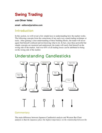
Chapter 7 - Technical Analysis – Charting BasicsFigure 7.1 - Candlestick examples showing an increasing price and a decreasingprice for a single period of time. The color of the candle body can be defined by thechart user to differentiate between a period where the price increases compared toa period where the price decreases.
Figure 7.2 - Bar chart examples showing an increasing price and a decreasing pricefor a single period of time. To help differentiate the bar’s direction during a timeperiod, most charts have options that allow the user to define a color for periodswhere the price increases and a different color for periods when the price decreases.For example, I use green for a price increase and red for a price decrease.
Figure 7.3 - An illustration showing 2 bullish candlesticks. The candlestick on theright is more bullish in comparison to the one on the left. The figure also shows thevolume bars underneath the candlesticks with the tall bar representing a largernumber of shares traded in comparison to the smaller bar.
Figure 7.4 - An illustration showing bearish candlesticks. The candlestick on theright is more bearish compared to the one on the left. The figure also shows thevolume bars underneath the candlesticks with the tall bar representing a largernumber of shares traded in comparison to the smaller bar.
Figure 7.5 – Two illustrations showing a bullish engulfing candlestick and a bearishengulfing candlestick.
Figure 7.6 - A chart of TZA showing an engulfing candle associated with a change intrend. In addition, the chart shows a harami cross, which also indicates a potentialchange in stock price direction (chart courtesy of StockCharts.com).Figure 7.7 - An illustration of doji candlesticks with long and short tails.
Figure 7.8 - An illustration of a bullish and bearish harami cross.Figure 7.9 - An illustration of gravestone and dragonfly doji candlesticks.
Figure 7.10 - A chart of PFE showing both gravestone and dragonfly dojicandlesticks with corresponding stock price reversal action (chart courtesy ofStockCharts.com).Figure 7.11 - An illustration showing examples of a gap up and a gap down betweentrading sessions.
Figure 7.12 - A chart of NETE showing the gap up and follow through for severaldays, followed by a gap and fill (chart courtesy of StockCharts.com).
Chapter 8 - Technical Analysis – Indicator ToolsFigure 8.1 - A chart of SPY that shows both support and resistance levels fromFebruary through to April 2018 (chart courtesy of StockCharts.com).Figure 8.2 - A chart of SLF that shows how levels of support and resistance wererespected a number of times in the past (chart courtesy of StockCharts.com).
Figure 8.3 - A chart of AMZN in a long-term uptrend with a break in trend at the endof March 2018 (chart courtesy of StockCharts.com).Figure 8.4 - A chart of FEYE showing how you could have used levels of support andresistance for entries and exits (chart courtesy of StockCharts.com).
Figure 8.5 - A chart of MU showing the stock price crossing the 20-day SMA and thenthe 20-day SMA providing support as the price trends higher (chart courtesy ofStockCharts.com).Figure 8.6 - A chart of MU that shows the difference in signals between the 20-daySMA and the 20-day EMA (chart courtesy of StockCharts.com).
Figure 8.7 - A chart of XLP showing a golden cross event where the 50-day SMAcrosses the 200-day SMA (chart courtesy of StockCharts.com).Figure 8.8 - A chart of DDD showing how the RSI reflects future price movementswhen an overbought signal is given by the indicator (chart courtesy ofStockCharts.com).
Figure 8.9 - A chart of the ETF XLP with the MACD and RSI indicators showing apending price reversal (chart courtesy of StockCharts.com).
Figure 8.10 – A chart of MU showing price action and corresponding changes in theATR indicator (chart courtesy of StockCharts.com).
Chapter 9 - Technical Analysis – PatternsFigure 9.1 - A chart of MU showing a double bottom pattern and a double toppattern, both of which indicate a reversal in price action (chart courtesy ofStockCharts.com).Figure 9.2 - An illustration of a bull flag with various options for entry and stop-losspoints shown.
Figure 9.3 - An illustration of a bear flag with various options for entry and stop-losspoints shown.Figure 9.4 - A chart of CAT with both bull and bear flags giving you some options toenter and exit a position in this stock (chart courtesy of StockCharts.com).
Figure 9.5 - An illustration of a bull pendant pattern.Figure 9.6 - A chart illustrating how a pendant trade on DDD would have worked(chart courtesy of StockCharts.com).
Figure 9.7 - An illustration of 2 ABCD patterns (bearish and bullish).Figure 9.8 - A chart of AMD illustrating an ABCD pattern (chart courtesy ofStockCharts.com).
Figure 9.9 - A chart of AMD illustrating a head and shoulders pattern with neckline(chart courtesy of StockCharts.com).Figure 9.10 - A chart of CAKE illustrating an inverted head and shoulders bottomwith neckline (chart courtesy of StockCharts.com).
Chapter 11 – Swing Trading RulesFigure 11.1 – A screenshot of the Estimize website calendar page showing upcomingnews releases.
Chapter 12 - Swing Trading StrategiesFigure 12.1 - A screenshot of the Finviz site showing the overall market indicators.Figure 12.2 - A screenshot of the Finviz Groups tab showing which sectors are infavor and which are out of favor over multiple time frames.
Figure 12.3 - Charts comparing the performance over the same period of time of 2ETFs, the XLU versus the XLK. Being invested in the right sector can help your tradesbe profitable (charts courtesy of StockCharts.com).
Figure 12.4 - Finviz site Screener page used to filter out stocks for review.Figure 12.5 - A screenshot of the results of a scan on Finviz. This also illustrates howa chart of each result can be quickly revealed for further examination.
Figure 12.6 - A screenshot of a more detailed analysis of a filtered stock.SOME EXAMPLE SEARCHESSearch typeStrong uptrendingstockFiltersStock price above 20-day,50-day and 200-day SMAsStrongdowntrending stockStock price below 20-day,50-day and 200-day SMAsReversal trenddown to upOther potential filtersEPS greater than 20%,increasingRSI not over 70(overbought)EPS negative anddecreasingRSI not under 30 (oversold)Float short greater than20%Dragonfly candle patternGravestone candle patternFloat short less than 5%Stock price above 20-day,below 50-day and 200-daySMAsReversal trend up to Stock price below 20-day,downabove 50-day and 200-daySMAsReversal trendDouble bottom, engulfingRSI under 30down to up*candle up, or dragonfly dojiReversal trend up to Double top, engulfing candle RSI over 70down*down, gravestone dojiTable 12.1 - A table of options for scanning the market for trading setups.Note *: some scanning tools have the ability to look for a variety of patterns. Finvizhas several pattern scans with more available if you subscribe.
Figure 12.7 - A screenshot illustrating the ChartMill.com web page for scanning andfiltering stock trading opportunities.Figure 12.8 - A chart of WMT showing gaps in price from a close one day to the openon the following trading day (chart courtesy of StockCharts.com).
Figure 12.9 - A chart of WEED.TO illustrating how money poured into the shares ofthis company associated with a new hot sector (chart courtesy of StockCharts.com).Figure 12.10 - A chart of ACB.TO illustrating another hot sector marijuana play(chart courtesy of StockCharts.com).
Chapter 13 - The Entry and the ExitFigure 13.1 - A chart of TTD illustrating how a scaling technique could have workedout profitably (chart courtesy of StockCharts.com).Chapter 14 – The Routine of a Swing TraderFigure 14.1 - An example of a spreadsheet based trade journal that you can use torecord and review trades.
Swing Trade (Figures and Tables) A Beginner’s Guide to Trading Tools, Money Management, Rules, Strategies and Routines of a Swing Trader Brian Pezim, BSc, MBA Preface by Andrew Aziz, Ph.D. Traders at Bear Bull Traders www.bearbulltraders.com