Transcription
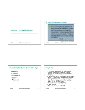
UI Hall of Fame or Shame?Lecture 11: Graphic DesignSource: Interface Hall of ShameFall 20046.831 UI Design and Implementation1Guidelines for Good Graphic Design 6.831 UI Design and Implementation6.831 UI Design and Implementation2Simplicity “Perfection is achieved not when there isnothing more to add, but when there isnothing left to take away.” (Antoine de StExupery) “Simplicity does not mean the absence of anydecor It only means that the decor shouldbelong intimately to the design proper, andthat anything foreign to it should be takenaway.” (Paul Jacques Grillo) “Keep it simple, stupid.” (KISS) “Less is more.” “When in doubt, leave it out.”SimplicityContrastWhite spaceBalanceAlignmentFall 2004Fall 20043Fall 20046.831 UI Design and Implementation41
Techniques for Simplicity: ReductionTechniques for Simplicity: Regularity Remove inessential elementsFall 20046.831 UI Design and Implementation Use a regular pattern Limit inessential variation amongelements5Fall 20046.831 UI Design and Implementation6Contrast & Visual VariablesTechniques for Simplicity: Double-Duty Combine elements for leverage Contrast encodes information alongvisual dimensions– Find a way for one element to play multiplerolesvaluescrollbar thumbhuetextureshapepositionorientationsizetitle barhelp promptFall 20046.831 UI Design and Implementation7Fall 20046.831 UI Design and Implementation82
Characteristics of Visual VariablesAttention Scale kinds of comparisons possible Recall the spotlight metaphor– Nominal ( )– Attention spotlight moves serially from oneinput channel to another– All stimuli within spotlighted channel areprocessed in parallel All variables– Ordered ( , ) Ordered: position, size, value, texture granularity Not ordered: orientation, hue, shape– Quantitative (amount of difference) Quantitative: position, size Not quantitative: value, texture, orientation, hue, shape Input channel one or more visualvariables Length number of distinguishable levels––––Shape is very long (infinite variety)Position is long and fine-grainedOrientation is very short ( 4 levels)Other variables are in between ( 10 levels)Fall 20046.831 UI Design and Implementation– e.g., position, hue9Fall 20046.831 UI Design and Implementation10Selectivity Selective perception: can attention befocused on one value of the variable,excluding other variables and values?NMM K– Selective: position, size, orientation, hue,value, texture– Not selective: shapeZMKFall 20046.831 UI Design and ImplementationNKKNZMZMNZKNKKMKNZNNKMNNZM KZMZMNKZM113
Associativity Associative perception: can variable beignored when looking at othervariables?NM– Associative: position, hue, value, texture,shape, orientation– Not associative: size, value6.831 UI Design and ImplementationKZNKKKZMNZ MNKZKMNNZKNM Small size and low value interfere with ability toperceive hue, value, texture, and shapeFall 2004MNKNKZMMKZMNZMNKZM13Techniques for ContrastRecall the Stroop Effect Choose appropriate visual variables Use as much length as possible Sharpen distinctions for easierperceptionGreenOrangeRedBlackPinkBlue– Multiplicative scaling, not additive– Redundant coding where needed– Cartoonish exaggeration where needed Use the “squint test”Fall 20046.831 UI Design and Implementation15Fall 20046.831 UI Design and Implementation164
Choosing Visual Variables for a DisplayFall 20046.831 UI Design and ImplementationDesigning Information Displays17Contrast in Publication Styles18maxHeading75%This is body text. It’s smaller than the heading, lighter in weight, and longerin line length. We’ve also changed its shape to a serif font, because serifsmake small text easier to read. Redundant encoding produces an effectivecontrast that makes it easy to scan the headings and distinguish headings frombody text.150%25%Figure 1. This is a caption, which issmaller than body text, and set off byposition, centering, and line length.Fall 20046.831 UI Design and ImplementationSimplicity vs. ContrastTitle1ThisFall 2004minTukeyTufte #1Tufte #2is a footnote. It’s even smaller, and positioned at the bottom of the page.6.831 UI Design and Implementation19Fall 20046.831 UI Design and Implementation205
White SpaceContrast Problems Use white space for grouping, instead oflines Use margins to draw eye around design Integrate figure and ground– Object should be scaled proportionally toits backgroundSource: Interface Hall of Shame Don’t crowd controls together– Crowding creates spatial tension andinhibits scanningFall 20046.831 UI Design and Implementation21Crowded DialogFall 20046.831 UI Design and Implementation22Using White Space to Set Off Labels(b)(a)Source: Mullet & Sano, p. 96Source: Mullet & Sano, p. 110Fall 20046.831 UI Design and Implementation23Fall 20046.831 UI Design and Implementation246
The Gestalt Principles of GroupingWhite Space Avoids Visual Noise Gestalt principles explain how eye creates a whole(gestalt) from 10closureFall 2004area6.831 UI Design and Implementation100symmetryWinter25Balance & SymmetryFall 2004SpringSummerFall0Winter6.831 UI Design and ImplementationSpringSummerFall26Symmetry Example Choose an axis (usually vertical) Distribute elements equally around theaxis– Equalize both mass and extentFall 20046.831 UI Design and Implementation27Fall 20046.831 UI Design and Implementation287
AlignmentGrids Are Effective Align labels onleft or right Align controls onleft and right– Expand as needed Align text baselinesSource: Mullet & Sano, p. 165Fall 20046.831 UI Design and Implementation29Fall 20046.831 UI Design and Implementation308
6 Fall 2004 6.831 UI Design and Implementation 21 Contrast Problems Source: Interface Hall
