Transcription
VISUAL STYLE - DOCUMENATION1
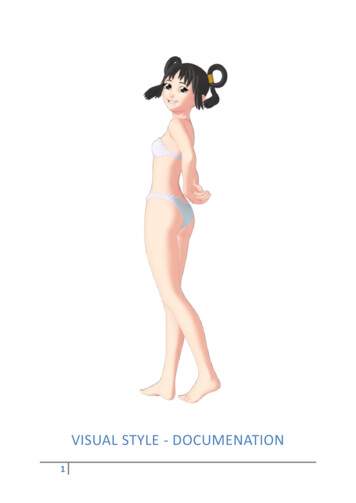
INTRODUCTIONWelcome, and thank you for purchasing Visual Style for Daz Studio 4. This versatile toon shader was developedto be able to replicate the style of art commonly seen in Japanese Visual Novel games and Dating Sims.However, it is capable to achieving a wide range of effects, if you’re willing to experiment. This documentationwill walk you through the various features of the shader so that you can learn how it works, so that you canstart experimenting with coming up with your own style.THE SHADERDIFFUSEACCEPT SHADOWS(1) Accept Shadows turned ON. (2) Accept Shadows turned OFF.This option effects whether the surface in question will accept shadows or not. By default, this option is turnedon; the surface will receive shadows from any lights which cast shadows. Turning this option off will removeany shadows from this surface.2
SHADING – START & SHADING – END(1) Start – 0.00, End – 1.00. (2) Start – 0.50, End – 1.00. (3) Start – 0.00, End – 0.50. (4) Start – 0.50, End – 0.51.These two options affect the style of the cel-shading used. This is done by adjusting the start and end points ofthe shading. Typical diffuse shading starts at the darkest point (0.00), and ends at the brightest point (1.00),creating a soft transition in between the two points. By altering the start and end positions of the shading, wecan achieve many different effects.By increasing the value of the Shading – Start parameter, we can make the darkest points of the figurestronger, making the scene appear darker.By decreasing the value of the Shading – End parameter, we can make the lightest points of the figurestronger, making the scene appear brighter.3
As the two values get closer to each other, the transition between the two becomes sharper. Having the twovalues be the same or essentially next to each other (e.g 5.00 and 5.10), you can achieve the sharp type of celshading common in cartoons.DIFFUSE – DARKThis is the colour of the applied cel-shading. A common choice for this would be a darker variant of the basecolour. However, you can achieve some pretty nice effects by being creative with your colour choices. Forexample, using darker and redder colours can make a scene feel warm and forboding, while using lighter andblue tinted colours can make a scene feel cooler and calmer.DIFFUSE – LIGHTThis is the base colour of your object, the colour that is shown where the light is brightest. This is also thecolour/texture that you will see in your preview window.4
OPACITYSPECULAR THROUGH OPACITY(1) Specular Through Opacity turned ON. (2) Specular Through Opacity turned OFF.This option affects how specular is applied to objects with transparency. With this option turned on, thevisibility of the specular will be the same as the transparency of an object (if an object is completelytransparent, there will be no specular). With this option turned off, the specular will remain the sameregardless of how transparent the object is.A good rule of thumb for this is to have it turned on for things like textured hair, and turned off for things likewindows, water, and most things made of glass.OPACITY – LEVELThis controls how opaque or transparent a surface is. 0.00 is completely transparent, 1.00 is completelyopaque, and anything in-between is semi-transparent. This value also accepts texture maps.5
OUTLINEOUTLINE – START & OUTLINE – END(1) Start – 0.00, End – 1.00. (2) Start – 0.50, End – 1.00. (3) Start – 0.00, End – 0.50. (4) Start – 0.50, End – 0.51.This works very similarly to the Shading – Start and Shading – End values from before, except instead of goingfrom the darkest point to the lights point, this is instead starting from the edge of the surface (0.00) to theabsolute middle of the surface (1.00). The outline is one of the most important features of toon shading, andthe type of outline you use can have a dramatic affect on how the final image looks.By increasing the value of the Outline – Start parameter, we can make the outline effect stronger (coveringmore of the diffuse shading).By decreasing the value of the Outline – End parameter, we can make the outline effect weaker (covering lessof the diffuse shading).6
It is typically good practice to have the Outline – Start parameter set to 3.00 or above, as anything less ends upwith an outline too thin to be noticeable. Still, I encourage you to play around with these settings to find thethickness you’re looking for.Also, just like before, the closer these two values are, the sharper the outline becomes. Having the two valuesbe the same or essentially next to each other, you can achieve a sharp outline common in both cartoons andcomic books.OUTLINE – DARK & OUTLINE - LIGHT(1) Outline – Dark. (2) Outline – Light.These two parameters affect the colour of the toon outline depending on the lighting in the scene. Any areasthat are well lit will use the Outline – Light to colour the outline, and any sections with little to no lighting or inshadow will use the Outline – Dark to colour the outline. This allows for some interesting effects, and makes itmuch easier to mimic particular styles. Changing both of these parameters into the same colour (such assetting both to black) will give you a much more traditionally styled outline.7
AMBIENT OCCLUSIONOCCLUSION – STRENGTH(1) Strength at 1.00. (2) Strength at 0.00.This parameter controls the strength of the ambient occlusion. At its highest (1.00), the Ambient Occlusion isat its strongest. At its weakest (0.00), the Ambient Occlusion is not calculated, thus increasing rendering speed.However, this is not the recommended way to disable Ambient Occlusion.The way that Ambient Occlusion works on most typical 3D suites, is that they’ll start with a white object andadd the shadow to it. The way that Ambient Occlusion works in Daz Studio 4, is that they’ll start with a blackobject and add the light to it. This means that although setting the strength to 0.00 stops any AmbientOcclusion from being calculated, it will also flood the Diffuse – Light and Diffuse – Dark areas with whatevercolours you set as Occlusion – Light and Occlusion – Dark, essentially making the surface appear darker thanintended.It is recommended that you don’t fiddle with this parameter unless you’re an advanced user. If you wish todisable the Ambient Occlusion effect, please look at the next parameter.8
OCCLUSION – MAX DISTANCE(1) Max Distance at 1000. (2) Max Distance at 0.This setting controls the distance an object can be and still cast Ambient Occlusion shadows. At its default(1000.00), you get near realistic Ambient Occlusion shading. Decreasing this value will make the calculatedshadows weaker and less pronounced.Setting this value to 0.00 will remove the Ambient Occlusion shadows completely, increasing rendering speed.This is the recommended way to disable the Ambient Occlusion effect. The increase in speed is the same assetting Occlusion – Strength to 0.00, except you will retain the diffuse colours as intended.OCCLUSION – CONE ANGLE(1) Cone Angle at 0.00. (2) Cone Angle at 65.00. (3) Cone Angle at 180.00.This setting controls how much the Ambient Occlusion shadows spread out. At its lowest (0.00), the AmbientOcclusion shadows are very sharp. At its highest (180.00), the Ambient Occlusion shadows fan out to covernearly the entire surface. The default setting is 65.00.9
OCCLUSION – SAMPLES(1) Samples at 1. (2) Samples at 20.This parameter affects the quality of the Ambient Occlusion shadows. Increasing this parameter will producehigher quality shadows, but increase rendering time. Decreasing this parameter will make renders faster, butwill produce lower quality, speckled shadows. The default value is 20.OCCLUSION – BIAS(1) Bias at -1.00. (2) Bias at 0.00.It is recommended that you don’t play around with this parameter unless you are an advanced user. Havingthis parameter set to 0.00 will cause banding and other graphical glitches across the surface, while setting thisparameter too high will cause shadows to detach themselves from the surface. The default (andrecommended) value is -1.00.10
OCCLUSION – DARKAmbient Occlusion can happen across the entirety of the surface regardless of whether the area is lit or not. Assuch, separate Ambient Occlusion colours can be provided depending on if the surface in question is in light orin shadow. This parameter affects the colour of any Ambient Occlusion shadows appearing in shaded areas.OCCLUSION – LIGHTThis parameter affects the colour of any Ambient Occlusion shadows appearing in lit areas.11
BUMPBUMP – STRENGTHThis parameter affects how strong the bump mapping is. At 0.00, there will be no effect. At 1.00 you will getthe full effect. At -1.00, the effect will be reversed.BUMP – MIN & BUMP – MAXThese two parameters affect how deep the bump mapping appears to be. For example, setting Bump – Min toa negative value while keeping Bump – Max at 0.00 will give the impression of there being deep cuts that sinkinto the surface. On the other hand, setting both Bump – Min and Bump – Max to positive numbers will givethe impression of indents and bumps that are further away from the surface.As bump mapping does not affect the shape of the surface, only the shadows, it is recommended not to go toowild with these as you may end up with unpredictable results.BUMP – MAPThis parameter affects the appearance of the bump mapping effect. It is recommended to use a grayscaletexture here, with black being the lowest point and white being the highest point. Many outfits and hairstylesthese days come with bump maps in order to add extra detail to the shading (such as strands of hair, or wovenfabric) without increasing rendering times.DISPLACEMENTDISPLACEMENT – STRENGTHThis parameter affects how strong the displacement effect is. At 0.00, there will be no effect. At 1.00 you willget the full effect. At -1.00, the effect will be reversed.DISPLACEMENT – MIN & DISPLACEMENT – MAXThese two parameters affect the inward and outward effect of the displacement. For example, setting theDisplacement – Min to a negative number and Displacement – Max to 0.00, the displacement will only createcrevices and holes going into the surface, the highest point being the exact same as the original surface. This isgood for something such as tiled flooring, where raising the tiles up would cause them to poke through thecharacter’s feet.Inversely, setting the Displacement – Min to 0.00 and Displacement – Max to a positive figure will cause thedisplacement effect to only move outwards, with the lowest point being the exact same as the original surface.This is good for effects such as fur or grass.Unlike bump mapping, Displacement mapping affects the shape of the surface it’s applied to, but only in thefinal render. You will not see this effect in the viewport, so you may need to tweak the positioning of particularprops or figures using this effect to ensure there’s no pokethrough I the final render.12
DISPLACEMENT – MAPThis parameter affects the appearance of the displacement effect. Just like bump mapping, it is recommendedto use a grayscale texture, with black being the lowest point and white being the highest point. Many productscome with displacement mapping in order to add much more noticeable detail than what can be achieved witha bump map, such as fur, bark, bricks, rocks and caves, and various organic surfaces, all without having to addadditional polygons (though typically with increased rendering times).SPECULARSPECULAR – GLOSSINESS(1) Glossiness at 0.00. (2) Glossiness at 0.75.This parameter affects how glossy the specular is by changing the size of the shine itself. At its lowest (0.00),the specular is quite large, which is good for most organic surfaces. At its highest (1.00), the specular becomesso small it’s hard to see. Higher values (such as 0.75) are good for glossy surfaces such as metal and latex.Higher values can also be good for make surfaces look wet or oily.13
SPECULAR – STRENGTH(1) Strength at 0.00. (2) Strength at 1.00.This parameter affects how strong the specular is. The higher the parameter, the brighter the shine. Settingthis value to 0.00 removes the shine completely.SPECULAR – SHARPNESS(1) Sharpness at 0.00. (2) Sharpness at 1.00.This parameter affects how sharp the specular is. At its lowest (0.00), the specular will have very soft edges. Atits highest (1.00), the specular will have very harsh edges. The latter is good for most typical toon renders.Increasing the sharpness while also increasing the glossiness can make certain surfaces appear extra shiny.14
SPECULAR – COLOURThis parameter affects the colour of the specular. It is typically good practice to use colours that are lighterthan the base colour, though it is possible to use any colour whatsoever should you want to.SHADER PRESETSThis pack comes with a series of presets so that you may quickly start making beautiful toon renders right outof the box. These include skin presets, hair presets, and presets for generic colours. There are however somespecial presets you need to know about. Specifically, the texture presets.VISUAL SKIN – TEXTUREThis is a preset with a white diffuse alongside muted colours. This preset was specifically made to work withwhatever skin texture you throw at it. Regardless of whether the skin texture is light, dark, or somethingfantastical, it will work. All you need to do is, after applying the preset, reapply the skin texture to the Diffuse –Dark, Diffuse – Light, Outline – Dark, Outline – Light, Occlusion – Dark, and Occlusion – Light. If you find thespecular effect to be too strong with the texture you’re using, simply adjust the Specular – Strength until itlooks as desired.VISUAL HAIR – TEXTUREJust like the previous preset, this also has a white diffuse alongside muted colours, and is intended to be usedwith whatever hair textures you wish to use. This is only necessary when using coloured hair textures. Whenusing grayscale hair textures (such as the ones included with Jasmin and Jason for Genesis), you should be ableto use them with any of the existing Visual Hair colours. To use the Visual Hair – Texture preset, simply followthe same instructions as before using the hair texture you wish.VISUAL TEXTURE – [COLOUR][#]Just like before, these presets (e.g Visual Texture – Red 1) have a white diffuse alongside muted colours, andare intended to be used with textures (namely cloth and scenery). There are 9 colours, each with a lowcontrast (1) and high contrast (2) version, the high contrast version being good for darker textures.15
“Hold on, those ‘Red’ ones look blue.”The names of these presets don’t reflect the colours used, but the colour of the texture you’re using. The redpresets are designed to work well with textures that are predominantly red, and likewise the green presets aredesigned to work well with textures that are predominantly green. To use, simply apply the preset you need,and then reapply the textures.NOIR PRESETSIncluded are 12 bonus noir presets, inspired by noir comics such as Sin City. These come in 4 shading variations(white, black and shiny, inverted, inverted and shiny) with an additional 2 colour variations (red and blue).When doing noir renders it’s recommended to use the red and blue variations sparingly to make them pop outmore.VISUAL STYLE PRESET SCRIPTSo, you’ve had a good play around with the shader, and you’ve saved yourself some awesome presets.Perhaps you want to share those presets with your friends on the Daz Studio forums?“I sure do mister!”Woah there sonny Jim, it ain’t as easy as that. Because of the way that Shader Mixer works, it’s not possible toredistribute a preset without redistributing the shader too. But don’t worry, DraagonStorm has the solution!Script – Create Visual Style PresetThis script right here allows you to create a Visual Style preset you can redistribute without any worries. Thecreated presets can only be used by those who already own Visual Style, and best of all it’s easy to use.CREATING PRESETS FOR REDISTRIBUTIONTo create a Visual Style preset for redistribution, simply select the surface you wish to save, run the script,choose a place to save the file, and then you’re done! Simply give it a nice thumbnail, wrap it up in a .zip file,and share! It’s as easy as that.USING A VISUAL STYLE PRESETTo use a Visual Style preset that you’ve downloaded, simply select the surface you wish to apply it to, apply anofficial preset first (such as Visual Style Base), and then apply the preset you downloaded. The preset requiresthat the shader already be applied before it can be used, hence why we apply an official preset first.16
TROUBLESHOOTING“The viewport doesn’t update when I apply a preset or change a colour.”This is a general problem with Daz Studio 4, and isn’t specific to Visual Style. Sometimes the viewport will takea few seconds to show any changes you’ve made to a surface. Sometimes all you need to do is just wiggle themouse over the viewport to force it to update.“I’m using BelBel/Aiko3/Aniko/ChibiBel, and I’m seeing artifacts all over the figure.”This is a rare issue caused by the bump mapping feature. Even when with the strength set to 0.00, it causesartifacts in certain figures. Fixing it is simple; all you need to do is convert the figure to SubD (SubDividedmesh). Even when the SubDivision level is set to 0, the issue will be fixed; all that matters is that the MeshResolution needs to be set to High Resolution.“How do I use tiling textures/procedural textures?”Visual Style doesn’t support these by default, however it’s easy to add these yourself. Because Visual Style wasdeveloped using Shader Mixer, owners of Daz Studio 4 Advanced and Daz Studio 4 Pro can import Visual Styleinto Shader Mixer and view its entire structure. Everything is labeled clearly, so it’s easy to find what you’relooking for. This way, you can edit the shader to include anything you need, such as replacing a normal Imagenode with a procedural texture.“The shader replaces the textures on my figure, even when I tell it to ignore the textures.”This is an unfortunate side-effect of all shaders produced with Shader Mixer. You will need to manually reapplythe textures you want.17
texture here, with black being the lowest point and white being the highest point. Many outfits and hairstyles these days come with bump maps in order to add extra detail to the shading (such as strands of hair, or woven fabric) without increas

