Transcription
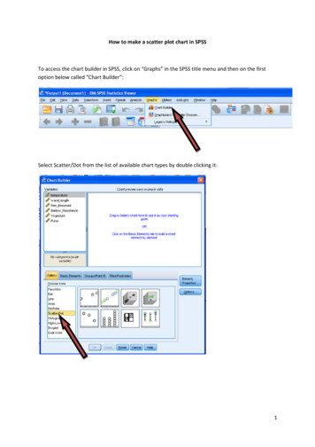
How to make a scatter plot chart in SPSSTo access the chart builder in SPSS, click on “Graphs” in the SPSS title menu and then on the firstoption below called “Chart Builder”:Select Scatter/Dot from the list of available chart types by double clicking it:1
Drag the variable “temperature” onto the x-axis and the variable “wand length” onto the y-axis ofthe chart:Click “OK”. This will present the scatter plot in the SPSS output box (the same place that any outputfrom statistical calculations are presented):2
Once the scatter plot has been displayed in the SPSS outbox box, the scatter plot can be edited bydouble clicking on it. This will present the Chart Editor box, which looks like this:From here the scatter plot can be edited so as to match APA guidelines.First, to add the line of fit described by the regression analysis, right click on the chart and select“Add fit Line at Total”, which is towards the bottom of the listed options. This will add the line to thescatter plot. You can close the “Properties” box that is displayed after you have added this line.Next, to make the background of the chart white, double click on the chart, which will now display adifferent “Properties” box. Make sure the “Fill and Border” tab is selected and select the “Fill”option:3
Now select transparent option (setting to the background.) from the list of colours available. Click on “Apply” to apply thisNow, we need to remove the black border from around the chart but retain the lines on the axes. Todo this, follow the same procedure above except we’re going to select the “Border” option, locatedunderneath:This again needs to be changed to the transparent option (Click “Apply” to add this selection to your chart.) from the list of colours available.Next, the font on the axis needs to be changed to the same font used in the lab report (Times NewRoman). Exit the current Properties box and then double click on one of the axes. This should revealanother Properties box with more options. From the tabs listed, select the “Text Style” tab andchange the font. If you can’t see this option it means you haven’t double-clicked on the correct areaof the chart:4
Click on “Apply” to make this change. This procedure also needs to be followed to change the fonton the other axis. Once applied, you need to exit the Chart Editor to return to the SPSS output page.From here you right-click once on the chart and select “copy”. This can now be pasted straight into aMicrosoft Word document and will look like this:5
Once applied, you need to exit the Chart Editor to return to the SPSS output page. From here you right-click once on the chart and select “copy”. This can now be pasted straight into a Microsoft Word document and will look like this: Title: Microsoft Word - Guidel