Transcription
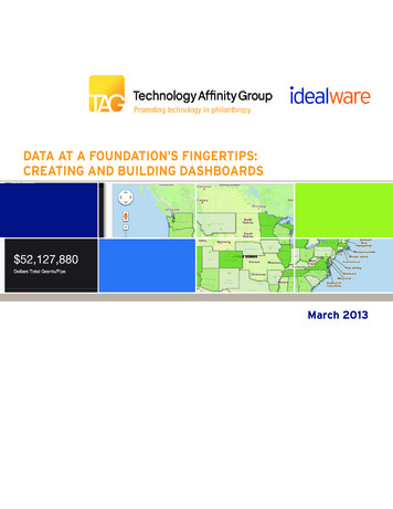
Data at a Foundation’s Fingertips:Creating and Building DashboardsMarch 2013
Table of ContentsIntroduction. 3Case StudiesBill & Melinda Gates Foundation. 8Community Foundation for Southeast Michigan.10The Energy Foundation. 11Ford Foundation. 13Gaylord and Dorothy Donnelly Foundation.15The Kresge Foundation. 17Surdna Foundation.20W.K. Kellogg Foundation. 22About TAG. 24About Idealware. 24PAGE 2 Data at a Foundation’s Fingertips: Creating and Building Dashboards March 2013
creating and building dashboardsMuch like the gauges on your car’s dashboard, which keepcritical information within immediate reach, dashboardspresent an organization with data related to its operation,performance, well-being, and overall health. Generallyspeaking, dashboards gather, organize, and presentinformation in a friendly way to help organizations moreeffectively measure, monitor, and manage the way theywork.This is straightforward in concept, but in practice thereare nearly as many different types of dashboards as foundations implementing them. Some foundations createdashboards with an operational focus, looking at day-today level data like the number of requests in the pipelineor metrics to track the efficiency of their process. The vastmajority include program spend information to see themoney allocated compared to budgeted for a program,and a few have created dashboards to track indicators ofprogram impact.To further confuse the issue, dashboards can be built insuch common tools as Microsoft Excel or Access, they canbe run as reports from a grants management system, theycan be created using off-the-shelf Business Intelligencetools, or they can be custom-built—and the dashboardsthemselves can be anything from quick one-page spreadsheets to sophisticated systems that offer trend analysis,forecasting, and drill-down capabilities.Despite the wide range of variety, there is some overlapamong foundations using dashboards—mostly in thegoals they’re hoping to get from them. A dashboard canconsolidate foundation information in a way that’s accessible and easy to understand, even for those not involvedwith data on a day-to-day basis. Those who need theinformation can get it when they need it—without delay,and without needing to bother line staff to extract itfrom the system. Dashboards can also facilitate decisionmaking by summarizing information so that everyone onstaff has the same data.Can your foundation benefit from dashboards? Mostlikely, yes—simply compiling information and making itmore accessible can be a useful exercise for an organization of any size. But how do you decide what informationA dashboard canconsolidate foundationinformation in a waythat’s accessible andeasy to understand,even for those notinvolved with data ona day-to-day basis.to include? And how do you define and implementsomething that will work well for you? In this report,we combine insights from conversations with 10different foundations with our previous research onmethods for thinking about data-based decision making to offer a step-by-step process to design and createyour own dashboard. To help you learn from theexperiences of those foundations that have gone beforeyou, we also include eight detailed case studies offoundations that have created their own dashboards.1. Define Who and What YourDashboard Is ForThe term “dashboard” means different things todifferent people. For some foundations it implies anoperational task list for line staff to use in day-to-daywork. Others see it as a friendly way to let staff whodon’t regularly work with data access core metrics andinformation. Some envision a dashboard as a way topresent key indicators—like efficiency metrics or thoseabout program impact—to executives, the board, oreven the general public.PAGE 3 Data at a Foundation’s Fingertips: Creating and Building Dashboards March 2013
Before you dive in to dashboards, it’s critical to definewhat they mean to your organization. Ask yourself: Who will be the highest priority users of thedashboard, and will there be additional users? Will non-staff members, like the board or thepublic, be able to see your dashboard? Is your goal to centralize a set of core metrics tokeep everyone on the same page, or to let each staffmember see the metrics that will most help them?Or maybe a balance of those two goals? Do you want to increase the ability of programstaff or executives to look up the information theywant as a way to decrease the volume of requestson your grants team?Work with the executive team and organizationalsponsors to define what a successful dashboard wouldaccomplish. It’s often also useful to define what itwon’t accomplish. After all, a dashboard that attemptsto be all things to all people is unlikely to handleeverything well—that is, if the whole dashboardproject doesn’t completely crash and burn under theweight of too many expectations.2. Understand What Your UsersWant From the DashboardWith your general goals and audiences defined, makesure you understand what your audience will finduseful. What type of information do they want to see?What specific metrics would help them. What featuresare they likely to use?One-on-one discussions or meetings with smallgroups are likely the best ways to understand theneeds and desires of your users. Ask them how they’recurrently looking at the relevant pieces of information—if they’ve created an Excel spreadsheets orhand-created reports, for instance, that shows a needotherwise being unmet. See what they would defineas the most desirable pieces of information. Onegood way to do this is to ask staff to create a “magicdashboard” that shows what they’d ideally like to see ifanything was possible. Don’t be surprised to find thatyour staff’s “blue-sky” desires are, in fact, quite basicand well within your reach.A dashboard thatattempts to be allthings to all peopleis unlikely to handleeverything well—that is, if the wholedashboard projectdoesn’t completelycrash and burn underthe weight of too manyexpectations.Based on the needs highlighted by your staff, try todetermine the following: Is a simple summary of key data likely to behelpful? Sometimes just being able to see somebasic sums and averages by category can make a bigdifference. Does it seem useful to define more complexindicators to be able to better visualize yourorganization’s process or success? For instance,creating a display of the number of days on averagea request spends in each of your grant stages couldbe very useful for some organizations, but is likelyto require more time than a simple tally of currentdata. Is it important to let staff tailor their owndashboard of indicators? It can be helpful for staffto be able to define which metrics they want touse in their day-to-day work, but this will also addcomplexity.PAGE 4 Data at a Foundation’s Fingertips: Creating and Building Dashboards March 2013
Before it makes senseto start thinking aboutthe format of thecharts you’ll display orthe tools you’ll use tomake them, you needto define the specificmetrics you’ll use—andwhere the data willcome from. Is it important for staff to be able to drilldown into details? Allowing staff to see the bigpicture and then click through to see more detailcan help them to put everything in context, butsuch dashboards are likely to be more complex tosupport than simple, static ones. Is it important to allow for scenario planning?Some organizations find it useful for staff to dohypothetical “what-if ” analysis to see the impact ofa potential grant on budgets and projections. Thisrequirement may be hard to balance with others,though, as it will likely require staff members toenter data directly into the dashboard as opposedto simply navigating data pulled from other places.If you find that you’re juggling a lot of needs anddesires, summarize them all into a requirementsdocument and give each a priority. As with a typicalrequirements definition process, balance the criticalneeds with “nice-to-haves” to define a dashboardproject that is both useful and reasonably achievable.3. Map Metrics to Your NeedsAt its heart, any dashboard is based on information.Before it makes sense to start thinking about the for-mat of the charts you’ll display or the tools you’ll useto make them, you need to define the specific metricsyou’ll use—and where the data will come from.This process is rarely trivial. Defining the right metricsrequires a balancing act of two important factors: What metrics will answer your specific questions? Finding them might take an hour, or severalyears of strategy sessions. If you’re planning adashboard that focuses on supporting day-to-daywork, the right metrics are likely to be made clearduring conversations with your staff. But if you’rehoping to look at such things as process efficiencyor program effectiveness, simply getting yourstakeholders to agree on what data will create anaccurate picture may require a lengthy, in-depthfacilitation process.Simply getting yourstakeholders to agreeon what data willcreate an accuratepicture may requirea lengthy, in-depthfacilitation process. Where will the data come from, and how?Defining the absolutely perfect metric is uselessif you don’t have the data to back it up. Similarly,some metrics will be much easier to calculate basedon your current system, but that doesn’t meanthey’ll be useful in decision-making. Consider theamount of work required to pull the data fromyour systems.Don’t underestimate the metric design process.Many of the organizations we spoke to found it bothtime-consuming and critical to their success. As onepotential process, you could convene your stakeholders in a series of meetings to define first what specificPAGE 5 Data at a Foundation’s Fingertips: Creating and Building Dashboards March 2013
What technologyshould you useto support yourdashboard? Theoptions vary widely,largely because“dashboard” doesn’timply a singletechnology.decisions you’d like to support, and then the best wayto determine metrics to help from the data you have.A consultant could be very helpful in this process—heor she could bring some useful outside perspective,and an outside person often has more success innavigating the often complicated politics aroundsomething as sensitive as the metrics by which youmeasure your success.Be cautious about planning to collect additionaldata you don’t already have as part of the process forthe first phase of a dashboard. Designing a new datacollection process is time-consuming itself, and couldwell derail your dashboard project. It’s likely to makemore sense to design something that will help staff usethe data you already have and plan to iterate it as youcollect more data and better understand what will beuseful.4. Choose Your DashboardPlatformWhat technology should you use to support yourdashboard? The options vary widely, largely because“dashboard” doesn’t imply a single technology.Dashboards can be out-of-the-box tools that sit ontop of a grants management system and integrate itsdata, reporting tools that pull information from varioussystems, or even just complex Excel spreadsheets.We’ve identified four core options: Excel. While it may sound alarmingly basic, anExcel dashboard can be a good fit for certain applications—primarily static dashboards updatedonly periodically. Someone with substantial Excelexperience can build a sophisticated spreadsheetwith tabs designed to receive data from existingsystems—which makes it straightforward for usersto update the data—and then one or more summarytabs that format that raw data into chart, graphs,and other displays. The file can then be shared as aread-only visualization. Your existing grants management system. Ifyour dashboard relies only on data tracked in yourgrants management system, it may be possible touse existing reporting tools to create it. This has thebenefit of simplicity; you don’t have to move datafrom one place to another, and at least some staffwill be familiar with the tool. It may substantiallylimit your options on formatting, however, andmight require high-level staff to access a system theydon’t currently use. A plug-in reporting or dashboard tool. It couldmake sense to use a reporting tool designed to mapto your data and create custom reports, especiallyif your data is coming from only a few systems.This could be an ad-hoc reporting tool like CrystalReports, a tool designed specifically to createdashboards like iDashboards, a graphical analysisenvironment like Tableau, or a high-end businessanalysis tool like Cognos. (Idealware has moreinformation on its website about these types oftools at eporting) A custom-built dashboard. If you need to pullmany different kinds of data from many differentsystems, it might be as straightforward to use existing ETL (Extract, Translate, and Load) tools andweb platforms to build your dashboard as it is tomap a plug-in tool. Microsoft Business Intelligencealso offers a platform to build your custom dashboard using a set of tools that includes SharePoint.PAGE 6 Data at a Foundation’s Fingertips: Creating and Building Dashboards March 2013
5. Design Charts and DisplaysSelecting a tool for your dashboards and decidingwhat information to include is part of the challenge—so is designing dashboards that will truly be useful toyour staff. Visual appeal is a key aspect of what makesa dashboard friendly to a large audience, but makesure your visuals actually convey substantial information. It’s easy to get carried away with visual gimmicksthat don’t help your staff to really understand the data.Working with someone who has information designexperience can be very helpful in maximizing theusefulness of your dashboard. This skill set is a combination of graphic design and data visualization, and isgeared around the desire to show data in a clear, cleanway that’s easy to read.Visual appeal is a keyaspect of what makesa dashboard friendlyto a large audience,but make sure yourvisuals actuallyconvey substantialinformation.6. Implement and Roll Out YourDashboardWith all of the many design considerations behindyou, you still need to actually map your data andcreate your dashboard. This could be a matter of acouple of weeks for a straightforward implementation,or could easily span months for a more complex one.When it’s finally up and running, don’t forget theneed to roll it out in a way that will encourage staff tobuy-in to using it. Make sure people know it exists,and what it’s capable of. A demo will show them howeasy it is to get information—and if it’s not so easy orif the system is particularly complex, training could bevery helpful.As with any system, it can be useful to enlist organizational “champions” to advocate for the system andhelp their peers understand how it can help them.7. Plan to IterateOnce you’ve implemented the dashboards, rememberthat they’re not locked into place. Plan to adaptthem to better meet demands or changing needs.Dashboards are particularly challenging to define anddesign to be optimally useful the first time around, asyour staff will often have little experience themselveson the type of metrics and charts that would really beuseful for their needs.Lean on your staff—the people using the dashboards—to find out where they’re succeeding andwhere they’re not, and go into the process expectingthat more than one phase will be needed to makethe most of your dashboard. “Go into it more openminded,” said the Gaylord and Dorothy DonnellyFoundation’s Susan Clark. “If you think you’re goingto do something one way, be open to it changing.”So What Does This Mean For YourFoundation?Building effective dashboards to meet all of yourfoundation’s needs is a long-term process with a lot ofmoving parts. Finding the right approach takes time,strategy, and most likely, a lot of work with your staffto define the right data, metrics, and displays.Reading through the case studies of these foundationswill give you a better sense of what they’re doing, andhow and why they’re doing it. But their examples canalso provide encouragement—take heart in the factthat you’re not alone in what you’re facing.Don’t be afraid to try something. A first attempt islikely to be very helpful in defining what’s needed,even if you don’t hit the nail on the head the firsttime.PAGE 7 Data at a Foundation’s Fingertips: Creating and Building Dashboards March 2013
Case StudiesBill & MelindaGates FoundationSeattle, WATaking a thoughtful approach tobuilding a dashboard, foundationstaff work to earn buy-in and support as part of the developmentprocess.When Director of Business Intelligence Eleanor Bellleft a data-driven organization to join the Bill &Melinda Gates Foundation, she found that her neworganization had no dashboards to speak of. That’sslowly changing as the foundation moves up thelearning curve.The foundation’s entirestaff has access to thatdashboard, generatingabout 3,000 pageviews each month.“We’re more integrated, more sophisticated, usingmore apps that pull data from different systems andserve it up to decision-makers so they know wherethey are and what they are doing,” she said.The Bill & Melinda Gates Foundation is using avariety of tools to inform and build the dashboards,including Microsoft Technical Business Intelligenceand Tableau.Using Technology to Meet StaffDemandsEleanor said the foundation uses a dashboard that letsuser drill down.“It shows all of our strategies and integrates textdata—information about a problem statement, whatthe problem we’re trying to solve is, high-level stuff—PAGE 8 Data at a Foundation’s Fingertips: Creating and Building Dashboards March 2013
“Technology is cool,but technology can’tlead. It’s good to knowsomething is possible,but it has to be verywell-grounded inbusiness need.”and the amount of money we’re allocating towardthat strategic goal,” she said. “You can drill in all theinitiatives and sub-initiatives and see the actual grantsinvested toward that goal.”The foundation’s entire staff has access to thatdashboard, generating about 3,000 page views eachmonth—mostly inside the president’s office andexecutive and director level, she said. The foundationis also developing another dashboard that’s morefinancial-specific.“It captures all the thinking about how we meetpayout but not go over budget and tracking all thegrants in our pipeline and when they’re going to behitting,” Eleanor said. “It lets people think aboutwhat’s comi
About.Idealware.24 taBle oF Contents. PAGE 3 Data at a Foundation’s Fingertips: Creating and Building Dashboards March 2013 Creating anD BuilDing DashBoarDs . be run as reports from a grants management system, they can be created using off-the-shelf Business Intelligence


