Transcription
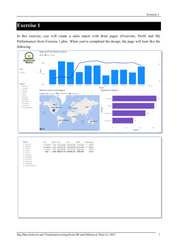
Exercise 1Exercise 1In this exercise, you will create a sales report with three pages (Overview, Profit and MyPerformance) from Exercise 1.pbix. When you've completed the design, the page will look like thefollowingBig Data Analysis and Visualization using Power BI and Tableau @ Peter Lo 20211
Exercise 1Big Data Analysis and Visualization using Power BI and Tableau @ Peter Lo 20212
Exercise 1AnswerPage 1: Overview1. Select File Open Report, and open Exercise 1.pbix. Start on a blank report page and renameas Overview.2. To add the logo, on the Insert tab, from Elements group, click Image.3. Select the AdventureWorksLogo.jpg file. Then reposition and resize it at the top-left corner.4. To add a slicer, select Slicer in the Visualizations pane, and select the Date Year in theFields pane.Big Data Analysis and Visualization using Power BI and Tableau @ Peter Lo 20213
Exercise 15. To convert the slicer from a list to a dropdown, at the top-right of the slicer, click thedown-arrow, and then select Dropdown. Resize and reposition the slicer so it sits beneath theimage, and so it is the same width as the image.6. In the Year slicer, select “FY2020”, and then collapse the dropdown list. The report page is nowfiltered by year FY2020.7. Create a second slicer, based on the Region Region field. Leave the slicer as a list, and thenresize and reposition the slicer beneath the Year slicer.Big Data Analysis and Visualization using Power BI and Tableau @ Peter Lo 20214
Exercise 18. To format the slicer, beneath the Visualizations pane, open the Format pane. Expand theSelection Controls group. Set the Show "Select All" Option to On. In the Region slicer, noticethat the first item is now “Select All”.9. Click the Line and Stacked Column Chart visual type in the Visualizations pane. Drag thefollowing fields from Field pane into the visual: Assign Date Month into Shared AxisAssign Sales Sales into Column Value Assign Sales Profit Margin into Line ValuesBig Data Analysis and Visualization using Power BI and Tableau @ Peter Lo 20215
Exercise 110. Notice that the visual has 11 months only. The last month of the year, 2020 June, does not haveany sales. By default, the visual has eliminated months with blank sales. In the visual fieldspane, in the Shared Axis well, for the Month field, click the down-arrow, and then select ShowItems With No Data.11. Notice that the month 2020 June now appears.Big Data Analysis and Visualization using Power BI and Tableau @ Peter Lo 20216
Exercise 112. Click the Map visual type in the Visualizations pane. Resize and reposition the visual so it sitsbeneath the column/line chart, and so it fills half the width of the report page. Add the followingfields to the visual wells: Assign Region Country into LocationAssign Product Category into Legend Assign Sales Sales into Size13. Click the Stacked Bar Chart visual type in the Visualizations pane. Resize and reposition thevisual so it fills the remaining report page space. Add the following fields to the visual wells: Assign Product Category to AxisAssign Sales Quantity to ValueBig Data Analysis and Visualization using Power BI and Tableau @ Peter Lo 20217
Exercise 114. Open the Format pane, expand the Data Colors group, and then set the Default Color propertyto Purple (#744EC2).15. Set the Data Labels property to On.Big Data Analysis and Visualization using Power BI and Tableau @ Peter Lo 20218
Exercise 1Page 2: Profit1. Click the [ ] icon at the bottom-left to create a new page, and rename the page to “Profit”.2. Add a slicer based on the Region Regions Region field. Resize and reposition the slicer soit sits at the left side of the report page, and so it is about half the page height.3. Use the Format pane to enable the "Select All" option (in the Selection Controls group).Big Data Analysis and Visualization using Power BI and Tableau @ Peter Lo 20219
Exercise 14. Add a matrix visual, and resize and reposition it so it fills the remaining space of the report page.Then add the Date Fiscal hierarchy to the matrix Rows well.5. Add the following five Sales table fields to the Values well: Assign Sales Counts Orders to Value Assign Sales Sales to Value Assign Sales Cost to ValueAssign Sales Profit to Value Assign Sales Profit Margin to ValueBig Data Analysis and Visualization using Power BI and Tableau @ Peter Lo 202110
Exercise 16. From the Fields pane, drag the Product Category field into the Filters on this Page well inthe Filters pane.7. Add each of the following Product table fields to the Filters on this Page well, collapsing each,directly beneath the Category card: Product Subcategory Product ProductProduct ColorBig Data Analysis and Visualization using Power BI and Tableau @ Peter Lo 202111
Exercise 1Page 3: My Performance1. Click the [ ] icon at the bottom-left to create a new page, and rename the page to “MyPerformance”.2. To simulate the row-level security filters during report design and testing, drag the Salesperson(Performance) Salesperson from the Fields pane to the Filters pane, inside the Filters onthis Page well.3. In the filter card, scroll down the list of salespeople, and then check Michael Blythe.Big Data Analysis and Visualization using Power BI and Tableau @ Peter Lo 202112
Exercise 14. To add a slicer, select Slicer in the Visualizations pane, and select the Date Year in theFields pane. Then resize and reposition it so it sits at the top-left corner of the page.5. To convert the slicer from a list to a dropdown, at the top-right of the slicer, click thedown-arrow, and then select Dropdown. Resize and reposition the slicer so it sits beneath theimage, and so it is the same width as the image.6. In the slicer, select FY2019.Big Data Analysis and Visualization using Power BI and Tableau @ Peter Lo 202113
Exercise 17. Add a Multi-row Card visual, and then resize and reposition it so it sits to the right of the slicerand fills the remaining width of the page.8. Add the following four fields to the visual: Assign Sales Sales to Field Assign Targets Target to Field Assign Targets Variance to FieldAssign Targets Variance Margin to FieldBig Data Analysis and Visualization using Power BI and Tableau @ Peter Lo 202114
Exercise 19. In the Data Labels group, increase the Text size property to 28pt.10. In the Background group, set the Color to a light gray color (#E6E6E6).Big Data Analysis and Visualization using Power BI and Tableau @ Peter Lo 202115
Exercise 111. Add a Clustered Bar Chart visual, and then resize and reposition it so it sits beneath themulti-row card visual and fills the remaining height of the page, and half the width of themulti-row card visual.12. Add the following fields to the visual wells: Assign Date Month to Axis Assign Sales Sales to ValueAssign Targets Target to ValueBig Data Analysis and Visualization using Power BI and Tableau @ Peter Lo 202116
Exercise 113. To create a copy of the visual, press [Ctrl] [C], and then press [Ctrl] [V]. Position thecopied visual to the right of the original visual.14. To modify the visualization type, in the Visualizations pane, select Clustered Column Chart.Big Data Analysis and Visualization using Power BI and Tableau @ Peter Lo 202117
Big Data Analysis and Visualization using Power BI and Tableau @ Peter Lo 2021 12 Page 3: My Performance 1. Click the [ ] icon at the bottom-left to create a new page, and rename the page to “My Performance”. 2. To simulate the row-level security filters during report design and testing