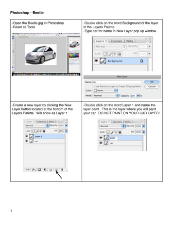
Transcription
RShiny Bean Beetle Microbiome TutorialBeanBeetleMicrobiome is an RShiny app designed for community analysis of level-5 (family-level)datasets they have produced in DNA Subway. Although this app was designed for community analysis ofdata from the Bean Beetle Microbiome Project, it could be used for community analysis of any level-5data. Before running the app, remove any unidentified taxa, chloroplasts, and mitochondria data fromthe level-5 spreadsheet. The level-5 file must be formatted with the first column as the taxa and thesubsequent columns as samples with unique sample identifiers. Also, prepare a metadata file with thefirst column as sample names and the second column as treatments. Both files must be in .csv format.The order of the samples (i.e., rows in the spreadsheets) must be the same for the level-5 file and themetadata file.Preparing files for analysisCreating the metadata fileThis metadata file is similar to the one created for DNA Subway, but only has the sample IDs and thetreatment data.To create the metadata file:1. Open a new spreadsheet. The first column should have the header name “SampleID”. Thecells in the first column should then have all the ID’s of the different samples that were runthrough DNA Subway. The Second column should have the header name “Host”. All thecells under the Host column should contain the treatment data for the samples. In ourexample dataset, the treatments where the different host diets on which the beetles wereraised. Your new file should look something like this:2. After modifying your file, save your file as a comma-delimited file (.csv)3. It is important to note that the metadata file can have only a single treatment column.Editing the level-5 fileIn DNA Subway, you process raw data that is generated through sequencing of microbial communitysamples. Before using the BeanBeetleMicrobiome app for microbial community analyses, you need toformat your taxonomy file generated in DNA Subway.1. Once you have your taxonomy file (level-5.csv), open it in Microsoft Excel. It should looksomething like this, with sample id’s in the first column (rows) taxonomic names as the
headers of all the other columns. The numbers in each cell represent the “counts” for eachbacterial type within each sample.2. In Excel, change the header title “Index” in cell A1 and replace it with the name “sampleID”3. Use your mouse to scroll all the way to the last column of your table. For example, in the tablebelow we scrolled to column CU.4. You will see that there are extra columns that contain information from your metadata file. Wewant to delete these columns because they do not count sequence count data. So, deletethese columns entirely by highlighting all columns from the metadata file. Then right click todelete the columns. Your sheet may now look something like this:5. Save your file so as to not lose what you have done up to this point.6. Create a new Excel worksheet by clicking on File, then New.7. A new spreadsheet should appear right in front of the spreadsheet you had just been working8.9.10.11.12.on.Click on the level-5 spreadsheet (which might be located behind the new spreadsheet) to bringit back to the front so you can continue working with it.Then, select all of the data and copy it.Next, click on the new spreadsheet you created (should be located behind your originaltaxonomy spreadsheet) to bring it back to the front.Click on the first cell A1 of your spreadsheet so that the first cell in outlined in green.Paste a transposed version of the table that you just copied into this new spreadsheet.Different versions of Excel do this different. Regardless of the method you use, the final tableshould look like the photo below. Make sure that the label for Column A is “sum.taxonomy”asshown.
13. Notice that this table contains the same information as our original taxonomy table, but it istransposed, meaning that the Sample ID’s are now column headers, and the taxonomic namesof the bacterial types are now located as rows.14. Hover your mouse to the border between cell A and cell B on the spreadsheet. Click and dragthe cell wall border to the right to expand the column, allowing you to view the contentswithin the cells in column A.BeforeAfter expanding column A15. At this point it may be a good idea to save your file to avoid losing any changes. Click on File,then on Save As. Save the files as a comma-delimited file (.csv).16. Now, read through your taxonomy names. There are few rows that must be deleted from ourdataset.17. Go to Edit and select the Find option. In the Find What field, type “Unassigned”. These are sequences that could not be assignedto a taxa at any level, so we want to remove them from our data sheet.
Then Click Find Next. If there are any “unassigned” sequences found, select the entire row for each one found,right click, and select delete row Make sure to delete every row that contains unassigned bacteria. Repeat the process to remove the following types:o Archaea: The primers that we use are more specific to bacteria, so we have notcompletely sampled all the Archaea.o Chloroplast: Since chloroplasts are really bacterial symbionts of plants, they getsequenced in Mi-Seq. Adult bean beetles retain some bean material in their gut, whichis where the chloroplast sequence is from. Since they are not really part of the beetlemicrobiome, we want to delete these rows from our file.o Mitochondria: Similar to chloroplasts, mitochondria are bacterial symbionts of plantsand are sequenced in Mi-Seq. Make sure to delete every instance of unassigned, archaea, chloroplast, and mitochondria18. Save your file by clicking the Save button and now your files are ready to import into theBeanBeetleMicrobiome app. Remember, this file must be in CSV format19. If you are using Excel, save an Excel format copy of this file using Save As and selecting the .xlxsextension so you can perform community analysis in the excel spreadsheet to calculate theAlpha Diversity values (see section on Alpha Diversity).Community Analysis with the BeanBeetleMicrobiome app Go to ome/From the Welcome! Homepage, you will see a series of tabs. Each of these tabs performdifferent steps of community analysis and should be visited in sequential order.Step 1: Import your data into the BeanBeetleMicrobiome appClick on the Data Upload tab. Using the Browse buttons, select your transposed level-5taxonomy file and metadata file that you created in the previous steps. Then, click the Run Appbutton. Your files will upload and display. Double check the tables to make sure that they lookcorrect before proceeding.Step 2: Core taxaClick on the Core taxa tab. Core taxa are taxa that are found in all samples. The table generatedin this tab shows the core taxa found in all samples listed in descending order from the most toleast abundant. The values are the abundances of the core taxa found in each sample. The lastcolumn is the abundance across all samples. The caption at the top of the table tells you howmany core taxa there are relative to the total number of taxa. You can select the taxonomic levelof interest using the dropdown menu on the left.Questions1. How many taxa are in the core taxa at each taxonomic level?
2. Does the proportion of the taxa that are core taxa change with taxonomic level? Why?3. Which taxa are the most abundant taxa in the core taxa?Step 3: Unique taxaClick on the Unique taxa tab. Unique taxa are those taxa found only in a single treatment. Thetables generated in this tab show the unique taxa found in particular treatments. The caption atthe top of the table tells you how many unique taxa there are relative to the total number oftaxa. You can select the taxonomic level of interest using the dropdown menu on the left. Ifthere are fewer tables than treatments, this is because some treatments might not containunique taxa.Questions1. How many taxa are unique to each treatment at each taxonomic level?2. Are there particular taxonomic groups that tend to be found in one treatment and not theothers?Step 4: RarefactionClick on the Rarefaction tab. Taxa accumulation curves will be displayed, showing the number ofdifferent taxa as a function of the number of sequences evaluated. In the context ofmicrobiome community analysis, rarefaction relates to sampling depth or the number ofsequences in a particular sample. Differences in the number of sequences might not be due todifferences in the abundance of bacteria in a sample, but due to differences in DNA extractionand sequencing. Because the number of taxa increases with the number of sequences, up to apoint, we might want to standardize the data to a constant number of sequences. Typically, thedata are standardized to the minimum number of sequences across all samples, which is what isrepresented in the bottom graph. Rarefaction is done by random sampling of the data. Somescientists argue that rarefaction is a bad idea when comparing samples. Because only a sub-setof the data collected is analyzed, you may be losing important information. Other scientistsargue that certain statistical methods that are used to help us compare differences betweensamples produce biased results when the samples being compared contain different number oftotal sequences. Because there are arguments for and against rarefactions, in all subsequenttabs, you can select whether to use the raw data or the rarified data.Using the dropdown menus on the left, you can select the taxonomic level of interest andwhether to plot the data by sample or treatment.
Questions1. How does treatment affect microbiome richness in the bean beetle? For example, whichtreatment resulted in higher richness in your dataset? Which resulted in lowest richness?2. Does the number of total sequences per sample differ between treatments? For example,does one treatment tend to have higher sequence counts than another? If so, how mightthis affect whether you choose to analyze raw or rarefied data in subsequent analyses?Step 5: Taxonomy Bar GraphsClick on the Taxonomy Bar Graphs tab. The stacked bar graphs show the abundance of differenttaxa for each sample separated by treatment. Using the dropdown menus on the left, you canselect the taxonomic level of interest, whether to use raw or rarified data, and whether to plotthe absolute or relative abundances.Questions1. Compare bar graphs at different taxonomic levels (Phylum, Class, Order, Family). Arereplicate samples similar in terms of thea. taxa present?b. their relative abundances in each replicate sample?2. What is the most dominant taxa in each treatment type?3. Do your conclusions change depending on whether you consider absolute or relativeabundance?4. Do your conclusions change depending on whether you consider raw or rarified data?Step 6: Taxonomy HeatmapsClick on the Taxonomy Heatmaps tab. Another way to visualize and compare taxon abundancesacross samples is with a heat map. Abundance is observed as a color gradient with lighter colorsrepresenting greater abundance. The taxa are ordered with the most abundant taxa at the topof the heatmap. When there are a large number of taxa, you might need to scroll down to seeall of the taxa. Using the dropdown menus on the left, you can select the taxonomic level ofinterest and whether to use raw or rarified data.Questions1. Compare heatmaps at different taxonomic levels (Phylum, Class, Order, Family). Arereplicate samples similar in terms of thea. taxa present?b. their relative abundances in each replicate sample?2. What is the most dominant taxa in each treatment type?3. Do your conclusions change depending on whether you consider raw or rarified data?Step 7: Alpha Diversity
Click on the Alpha Diversity tab. Alpha diversity is a measure of diversity within a particularsample. A diversity index is a mathematical measure of the diversity in a given community.Richness is a count of the number of taxa present in a given community. For example, thenumber of different families in each microbiome sample. While counting the number ofdifferent taxa is a first step in characterizing the diversity of a community, it is also important toexamine the abundances, or the number of individuals (or sequence reads, in this case),belonging to the different taxa. This tab allows you to consider the Simpson’s (specifically thecomplement of the Simpson Index, 1-D) and the Shannon’s diversity indices. Both indicesincorporate richness and evenness (how evenly taxa are represented in a particular community).The Simpson index is more sensitive to the influence of the dominant, or highly abundant taxa,as compared to the Shannon index. Box plots are used to summarize the data for eachtreatment and either a t-tests or an ANOVA tests for significant differences in diversity betweentreatments. In each graph, the median value for each treatment (the mid-point of the data) isindicated by the dark horizontal line in the box plot. Using the dropdown menus on the left, youcan select the taxonomic level of interest, whether to use raw or rarified data, and whatdiversity measure to use.You may calculate the raw data median values (shown in the box plots) for each of the alphadiversity indices by using the Excel spreadsheet of the level-5 data that you saved in excelformat (when you were preparing a clean csv file for the RShiny app. Open the Excel file, selectthe entire datafile, open a new worksheet, click in cell A1 and Paste Transposed. This will returnthe clean dataset to a form in which the rows are the individual microbiome samples and thecolumns are the taxa (Families). Now you may perform the same alpha diversity calculationsyou performed when you did the Colony Phenotype Analysis and the Colony Sequence Analysis.Calculate the bacterial cell (sequence) abundance for each microbiome. Then calculate theFamily richness for each microbiome and then the median richness for each treatment in yourstudy. Calculate Simpson’s Index and the Inverse Simpson’s Index for each microbiome, thencalculate the median value of the Inverse Simpson’s Index for each treatment. Finally, calculateShannon’s index for each microbiome and the median values for each treatment.Questions1.2.3.4.Do the treatments differ significantly in terms of diversity?Do your conclusions change depending on taxonomic level you consider?Do your conclusions change depending on whether you consider raw or rarified data?Do your conclusions change depending on what measure of diversity you consider?Step 8: Beta DiversityClick on the Beta Diversity tab. Beta diversity is a measure of diversity between samples.Measures of beta diversity include the identity of taxa in each taxa and in some cases theabundance of those taxa. Samples might have the same alpha diversity (e.g., richness) but bevery different communities if they have different taxa. Measures of beta diversity capture thisdifference. This tab includes three different distance measures (i.e., measures of beta diversityor how different communities are) – Jaccard, Bray-Curtis, and Morista-Horn. Jaccard justconsiders the presence and absence of taxa and ignores the abundance of those taxa. Both
Bray-Curtis and Morista-Horn incorporate the identity of taxa and the abundances of the taxa.Bray-Curtis is the most commonly used measure of beta diversity in research on insectmicrobiomes. Morista-Horn is preferred in ecological studies in which communities might beincompletely sampled. Incomplete sampling would be indicated by a taxa accumulation curvethat did not become horizontal in either the raw data or the rarefied data. This tab also allowsyou to visualize the data in two ways – Non-metric Multidimensional Scaling (NMDS) andPrincipal Coordinates Analysis (PCoA). PCoA has traditionally been used in studies of microbialcommunities. However, NMDS is gaining in popularity. In these visualizations, communities thatare more similar are closer together on the graph. In the PCoA plots, the numbers in brackets onthe axes tell how much of the variation is explained by that axis. In the NMDS plots, a “stress”value is given below the plot. This is a measure of how well the data are explained in a reducednumber of dimensions. Lower values of stress are better. A stress value below 0.1 suggests thatthe NMDS does a very good job of explaining the data in two dimensions. If you graph bytreatment group, confidence ellipsoids will be shown for each treatment. Below the graphs, theresults of PERMANOVA are displayed. A PERMANOVA is similar to ANOVA but with communitydata as the response variable.Questions1.2.3.4.5.6.Do the microbial communities differ significantly between the treatments?How variable are the communities within a particular treatment?Do your conclusions change depending on taxonomic level you consider?Do your conclusions change depending on whether you consider raw or rarified data?Do your conclusions change depending on what distance measure you use?Do your conclusions change depending on what ordination method you use?Synthesis questions1. Why might particular bacteria be core taxa that are common to all treatments?2. Why might particular bacteria be unique to certain treatments?3. In general, considering the results of your various analyses, what might explain the differencesbetween your treatments, if they exist?Using Images from the BeanBeetleMicrobiome appThe graphs produced in the BeanBeetleMicrobiome app may be inserted in slides (for anoral presentation) or a text document (for a written report). On a MacOS computer,you may click and drag an image from the BeanBeetleMicrobiome app to the window ofthe application in which you wish to insert that image. Alternatively, a selective screenshot will work. On a Windows computer, right click on an image to select it and copy,then paste it in a slide or text document.
RShiny Bean Beetle Microbiome Tutorial . BeanBeetleMicrobiome is an RShiny app designed for community analysis of level -5 (family-level) datasets they have produced in DNA Subway. Although this app was designed for community analysis of data from the Bean Beetle Microbiome Project, it could be used for community analysis of any level -5 data.