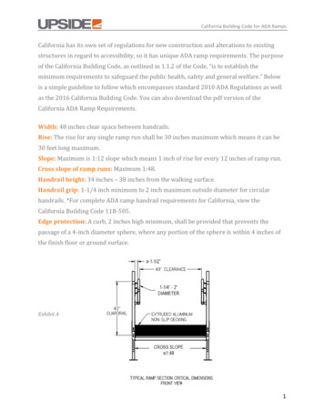
Transcription
How toMake GreatLanding Pages(With Crazy High Conversions)HOW TO MAKE GREAT LANDING PAGES (WITH CRAZY HIGH CONVERSIONS)1
IntroductionYour PPC landing page is the page a visitor arrives at on your website after clicking your ad, whetherit’s a text ad in the Google search results or a banner ad placed on the display network. Inexperiencedmarketers often direct all of their PPC traffic to their homepage, but this is a gigantic mistake. Specificlanding pages tailored to different offers are essential for providing a quality experience for visitors anddriving conversions with a targeted message that matches each user’s need.Still, it’s not enough to just check off received best practices. What makes a great landing page? Howcan you make awesome landing pages that boast off-the-chart conversion rates? We’ll walk you throughwhat you need to know to make it happen, including: Questions to ask before you get started The key traits of high-converting landing pages 7 examples of awesomely successful landing pageLet’s go!Before You Build a Landing PageBefore creating your landing page, first ask yourself 1. What is the goal? In an ideal world, what would visitors do upon reaching your landing page?Would they buy something? Fill out a form? Sign up for a newsletter? Download an ebook?Toss aside their keyboard, break out a harmonica, and play a sweet blues rift? The first stepfor any strategy is determining goals. (You have to define conversions before you can trackconversions.)2. Who am I competing against? Really it’s three questions: Who am I competing against, howare they succeeding, and how can I copy their success? Imitation is the sincerest form offlattery, so if your competitors are doing something that works, you should go ahead and followlikewise. They’ll thank you for it (although that’s not a promise )!3. Who is my audience? And what are their hopes, dreams, and aspirations? As silly as thatsounds, it’s true to some degree – the better you understand your audience, the more you cancater to their wants and needs. So get in your audience’s head.The better you understand your audience, the moreyou can cater to their wants and needs.HOW TO MAKE GREAT LANDING PAGES (WITH CRAZY HIGH CONVERSIONS)2
4. How did they get to my landing page? Consider changing your message depending onwhere your users come from – a different message might be appropriate for users who arrivedat your landing page coming from Google vs. Twitter or Facebook. Businesses with morelanding pages (30 ) generate 7x more leads than those with only a handful, so there’s nodenying their value. Ideally you want a tailored landing page for each ad group, but that’s apretty hefty operation, so start where you can. Try beginning with one custom landing page percampaign, and add from there for individual ad groups when resources allow.Businesses with more landing pages (30 ) generate 7x moreleads than those with only a handful.How to Make Great Landing PagesThat ConvertNow that we’ve covered the fundamental pre-landing page questions, let’s discuss how you can makeawesome landing pages. Great landing pages Are short, sweet, and uncluttered. A landing page should offer all the necessary information, but not somuch as to overwhelm (and as a result, drive away) the visitor. Provide the essential info that will interestyour audience and nothing more.Provide high-quality content that inspires confidence. We just discussed how you don’t want toinformation-smother visitors, but this isn’t to say you should be cheap with your content – on thecontrary, provide rich, useful content, so long as it is relevant. Confident copy inspires trust.Have all roads lead to Rome. Great landing pages keep careful note of all pathways entering andleaving their page. It’s important that you limit exit points (in this case, hyperlinks) leaving your page.The goal is to funnel visitors down a desired pathway, and if links serve as points of departure from thefunnel, they should be used sparingly.Make it easy to convert. The goal is to make it as easy as possible for visitors to convert, providing aslittle distance and as few barriers as possible between points A and B. The next step should always beobvious. This strategy varies depending on what your desired conversion is. If it’s form submissions,make that form a piece of irresistible eye candy. If it’s downloads, make a button that is begging to beclicked.Have a flawless design. Information architecture comes into play here, as it’s important for a landingpage to have a clear, crisp design that leaves all questions answered without inspiring any new ones.Navigation should be obvious and simple, all required information should be provided, and nothingshould come between the visitor and the conversion (aka no pop-ups!) If at all possible, visitors shouldbe able to convert in one click.HOW TO MAKE GREAT LANDING PAGES (WITH CRAZY HIGH CONVERSIONS)3
Have a clear call to action. Calls to action can be present in the headline text as well as the button text(for example: “buy now” or “download your free marketing guide”). There should be no question as towhat next steps are necessary – tell your visitors exactly what you want them to do in big, bold text.For Kajabi, changing their button text from “See Plans and Pricing” to “Get Started Today” increasedconversions by 252%!Create eye-catching headlines. Most good landing pages use the main headline to confirm the offerand use a subheading for more explanation or value proposition (aka why your offer is awesome). Anexample might be, “Free Facebook Marketing E-book” (headline), “Learn how to get more Facebookfollowers, likes, and engagement from our marketing gurus” (subheading). You’ll see plenty of greatlanding page headlines in our examples below, and you’ll see that some invert this so that the valueproposition is the headline.Contain engaging copy. Kiss Metrics suggests using specific “hypnotic” words to entrance visitors.Using the word “you” makes your copy feel personal to visitors and allows for intimate conversation. Theword “imagine” encourages readers to visualize using your product and increases desire. Including theword “because” explains to visitors why they should take a specific action. Try these mind-bending wordson your landing page.Make it about the visitor. Don’t bore the visitor by talking too much about yourself (this rule can apply toso many areas of life). The truth is, visitors don’t care about your goals or your aspirations. They’re onlylooking out for #1. Showcase what you can do for them and how you can improve their life. We are selfishcreatures after all.Have an awesome offer. The easiest way to get conversions is to simply have an offer that is incredible.In other words, don’t try to trick people into converting. Make sure your offer is enticing to users and thatit is something they actually desire. Then broadcast why your offer rocks and you’re good to go.HOW TO MAKE GREAT LANDING PAGES (WITH CRAZY HIGH CONVERSIONS)4
Most good landing pages use the main headline to confirmthe offer and use a subheading for more explanation or valueproposition (aka why your offer is awesome).Are easy to scan at a quick glance. It’s absolutely vital that you visitors can capture the essence ofyour offer with a quick glance. It’s estimated that you have about 8 seconds to convince users to stay onyour page, so the value proposition needs to be quick and convincing. Make your page easy to scan byhighlighting your main point in the headline while using subheadings and bullet points for added info.Use fonts and colors to indicate information hierarchy. Your page visitors are wild, frantic animals lookingfor a quick meal, so serve it up fast!Contain relevant, quality images. Bright, eye-catching images make for a more attractive page and abetter user experience overall. Consider adding visual cues to clue the visitor in to what they should donext. You can go the obvious route with arrows, or try something more subtle such as making a brightbutton the focal point of the page.Look gorgeous and act classy. Looks may not beeverything, but they do count for something in landingpage design. Why is it that an attractive man can hit itoff with a woman using the same line that might dub aless aesthetically pleasing guy a “creeper”? The truth isthat, despite what we teach children, appearance altersperception. Your landing page should not come off ascreepy.Match the corresponding ad text. Great landingpages use the same keywords from the PPC ad text –the connection should be obvious and the continuityreassures visitors that they’re on the right path. Don’t sendsomeone to a page about camping tents if your ad wasabout sleeping bags. And don’t send them to a genericpage and make them search for the product they werelooking for.Only ask for the information they need. The more fields you ask visitors to fill out in your form, the lesschance you have of them completing your offer. If your conversion requires a form, get the bare minimumof what you need – you can always ask for more info on the thank-you page once the deed is done.While most users don’t have a problem providing their name and email address, asking for info aboutphone numbers and date of birth can cause your drop off rate to skyrocket to 50%. The rule of thumb isnot to include more than seven fields in your lead gen form.HOW TO MAKE GREAT LANDING PAGES (WITH CRAZY HIGH CONVERSIONS)5
Use color to their advantage. Any Intro to Art student canexplain the power of color in swaying human perception.Picasso didn’t go through a blue phase because he was sucha happy-go-lucky guy. Interior design books will often suggestdifferent colors for various rooms and moods – energizing redfor a dining room to inspire dynamic conversation, yellow fora cheerful, relaxed kitchen. This same color theory should beimplemented into your site design. Many marketers claim thatcertain button colors like green or red increase landing pageconversions, but ultimately you want to focus on the contrastof the button color in relation to your background color. PaulOlyslager has a nice guide on CTA buttons worth checking out.Test various colors, placements, and sizes to see what works!Have clickable share buttons. Many people are more thanhappy to post about a recent purchase or share a resourcethey have found helpful. Adding share buttons increases yourchances of getting your content shared across the social space,and great landing pages make generous use of these buttons.It’s also smart to add social buttons to the thank-you page,since users will be more likely to share your great offer withothers after they’ve signed up themselves. As an added bonus,showing your “likes” and follows can also serve as a word-ofmouth endorsement.Does this look like a painting bysomeone who is loving life?HOW TO MAKE GREAT LANDING PAGES (WITH CRAZY HIGH CONVERSIONS)6
Adding share buttons increases your chances of gettingyour content shared across the social space, and greatlanding pages make generous use of these buttons.Show raving testimonials. Word-of-mouth has been and always will be a driving force of success.Virtual word-of-mouth comes in the form of Likes, 1s, and online testimonials (preferably from trustedsources like big brand names). If your business has received some shining compliments in the past, besure to showcase them.Are mobile-friendly. Having a site that plays nice with mobile devices can double your conversions. Ifyou want to learn more, check out our guide to creating mobile-friendly websites.Follow-up with a thank-you page. The thank-you page is a great way to guide visitors to other relatedmaterial on your website that they may be interested in. Providing this added info in the initial landingpage would have been distracting and could have led visitors away from making a conversion. However,now that you’ve sealed the deal, the thank-you page is the perfect place to suggest related products,guides and information your audience may find helpful, or links to other parts of your site, such as yourcompany blog. This can even nurture your lead a little farther down the funnel.Broadcast their trust signals. Trust signals, like logos of well-known companies you’ve done businesswith, awards you’ve won, and associations you are a member of, build trust in the mind of the visitor. Agreat landing page puts its best foot forward to comfort and reassure visitors so they can convert withconfidence.HOW TO MAKE GREAT LANDING PAGES (WITH CRAZY HIGH CONVERSIONS)7
Are fast as Ferraris. Speed is essential, as loading times have a tremendous effect on bounce rates. Anexcellent landing page is built like a bullet, so get out your stop watch and get your landing page movingat a healthy clip. Reduce load times by not making your images files any larger than they have to be,using cache tools and a speedy web host (some are a lot faster than other).Have been through many rounds of A/B testing. Testing and correction is how we learn and betterourselves. A/B testing your landing page (tweaking individual elements and seeing how they performagainst the previous setup) is probably the most powerful tool in creating excellent landing pages. Notsure where to start? Signal vs. Noise provides a nice example of good A/B testing that’s an easy read.There are always things you can do to improve, so don’t ever stop testing!Treat visitors like wild animals. It sounds crazy but it’s true – your page visitors are frantic creatureslooking for a quick and easy meal. The key is to make your page easily scannable with your main point inyour headline while using subheadings, bullet points, and various fonts and colors to indicate informationhierarchy.Have conversion tracking turned on. At WordStream we talk a lot about the importance of conversiontracking, and it’s one of the best practices we advocate in our new Landing Page Grader. Make sure youare properly set up to track how your pages are performing. Otherwise you’ll be spending money in thedark.7 Examples of Awesome Landing PagesHere are some examples of great landing pages to better illustrate what makes a successful landingpage that drives conversions.HOW TO MAKE GREAT LANDING PAGES (WITH CRAZY HIGH CONVERSIONS)8
Short Stack helps companies organize and manage Facebook promotions and other custom Facebookcontent. Let’s see what looks good here. Colors are bright and work well together. This page is clean and uncluttered with minimal text, while still explaining the valueproposition. Contains clickable video for a longer explanation of Short Stack.Gift Rocket is another site with a strong landing page. What is Gift Rocket doing right? Strong graphic element grabs attention. Header explains, in a few short words, what Gift Rocket is all about. Smaller bulleted information pieces below header can be easily scanned. Button CTA is clear and easy to click. Social buttons are present. More information can be found by scrolling below the fold. Trust signals and testimonials below the fold, as shown below.HOW TO MAKE GREAT LANDING PAGES (WITH CRAZY HIGH CONVERSIONS)9
HOW TO MAKE GREAT LANDING PAGES (WITH CRAZY HIGH CONVERSIONS)10
Kiss Metrics has a custom landing page for visitors interested in their marketing tools bundle. What’sworking here? Clear heading that explains offer and value proposition. Minimalist form only asking for email address. Colorful bright button. A host of trust signals.Sprout Social (featured in our guide to social media management tools) is another example of apowerful landing page. It has a few elements that are really working in its favor, such as: Strong heading that explains what Social Sprout is, with no nonsense. Visually attractive design that highlights the aesthetics present within the software itself viascreenshots. Testimonials present in the bottom green bar. Green trial button is centered and dominates the page, with an enticing CTA and a “no creditcard required” note below the button for added encouragement.HOW TO MAKE GREAT LANDING PAGES (WITH CRAZY HIGH CONVERSIONS)11
With software similar to Sprout Social, HootSuite is another website that has a strong landing page,although it takes a different approach. It works well because it: Promotes the ability to log in to HootSuite with other trusted networks, which means thatvisitors won’t have to fill out as many form fields, as most info is provided by logging in. Highlights that the software is free to get started with. It has trust signals and testimonials that are very obvious and noticeable.HOW TO MAKE GREAT LANDING PAGES (WITH CRAZY HIGH CONVERSIONS)12
Pinterest’s approach is different in that they don’t spend much time explaining what Pinterest is, sincethey can assume most people have already heard of them. Instead, a different example of Pinterest’svalue is shown with each visit to the site, with a broader explanation of Pinterest (find and save all thethings that inspire you) that sits below the main headline. What is Pinterest doing right here? Easy to get started – just click one of two buttons. Pinterest highlights how easy it is to sign up, saying that it takes only 45 seconds. Uses user base as a trust factor. Any site with 25 billion pieces of user-generated contentmust be doing something right!Airbnb makes it easy to rent homes or rooms from people all over the world amidst an increasinglyshare-oriented economy. What looks good here? Alluring photos that immediately get visitors excited about the prospect of traveling Short, simple form inputs that let visitors immediately discover places to stay This page doesn’t have a lot going on besides the destination/check-in search function, sovisitors won’t get lost or overwhelmedABOUT WORDSTREAMWordStream is on a mission to make online advertising easy. The WordStream Advisor platform helps businesses of all sizesmaximize the results of their online advertising by giving advertisers powerful tools to easily build, manage and optimizeHOW TO MAKE GREAT LANDING PAGES (WITH CRAZY HIGH CONVERSIONS)campaigns across ad networks like Google Ads, Bing, Instagram, Facebook—and more!13
CAPTURE &CONVERTMORE LEADSImprove Quality Score, convert more leads, and make themost of your budget with WordStream’s CRO Toolkit.START YOUR FREE TRIALwww.wordstream.com/ppc-free-trialHOW TO MAKE GREAT LANDING PAGES (WITH CRAZY HIGH CONVERSIONS)14
awesome landing pages. Great landing pages Are short, sweet, and uncluttered. A landing page should offer all the necessary information, but not so much as to overwhelm (and as a result, drive away) the visitor. Provide the essential info that will interest your audience and nothing more. Provide high-quality content that inspires confidence.
