Transcription
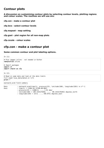
Contour plotsA discussion on customising contour plots by selecting contour levels, plotting regionsand colour scales. The routines we will use are:cfp.con - make a contour plotcfp.levs - select contour levelscfp.mapset - map settingcfp.gset - plot region for all non-map plotscfp.cscale - colour scalescfp.con - make a contour plotSome common contour and plot labeling options.In [1]:# Plot images inline - not needed in Python%matplotlib inline# Import packagesimport cfimport cfplot as cfpIn [2]:# Read in some data and look at the data limitsf cf.read('ncas data/data1.nc')[7]print feastward wind field summary--------------------------Data: eastward wind(time(1), pressure(23), latitude(160), longitude(320)) m s**-1Axes: time(1) [1964-01-21T00:00:00Z]: pressure(23) [1000.0, ., 1.0] mbar: latitude(160) [89.1415176392, ., -89.1415176392] degrees north: longitude(320) [0.0, ., 358.875] degrees east
In [3]:# Make a contour plot of the zonal mean of this datacfp.con(f.collapse('mean','longitude'))In [4]:# A blockfill plot is used to show the actual limits of the datacfp.con(f.collapse('mean','longitude'), blockfill True, lines False)
In [5]:# We can thicken the zero contour line with the zero thick parametercfp.con(f.collapse('mean','longitude'), blockfill True, zero thick 3.0)
In [6]:# Labeling plots with different tick marks and axis labelsxticks [-60,0, 60]xticklabels ['south', 'equator', 'north']yticks [1000, 600, 100]yticklabels ['low', 'medium', cks xticks, xticklabels xticklabels,yticks yticks, yticklabels yticklabels,xlabel 'x-axis', ylabel 'y-axis')cfp.levs - make custom contour levelsIn [7]:# cfp.levs takes a min, max, step to generate a set of levelscfp.levs(min -30, max 30, step 5)# We can see the levels generated as they are store in a Python variableprint cfp.plotvars.levels[-30 -25 -20 -15 -10-5051015202530]In [8]:# The min, max step are in positional order so we could have usedcfp.levs(-30, 30, 5)print cfp.plotvars.levels[-30 -25 -20 -15 -10-5051015202530]In [9]:# We can use a floating point values as wellcfp.levs(6, 12, 0.2)print 69.11.46.89.211.67.9.411.87.29.612. ]7.49.87.610.7.810.28.10.48.210.6
In [10]:# We can set our own values as needed with the manual keyword.# Note: values need to be in ascending order.cfp.levs(manual [-30, -20, -10, -5, -1, 1, 5, 10, 20, 30])print cfp.plotvars.levels[-30, -20, -10, -5, -1, 1, 5, 10, 20, 30]In [11]:# A further parameter called extend selects the behaviour of the colorbar extension# This is the triangle on the end of the colorbar to indicate that all values above# or below the end labelled value are coloured in with this colour.# extend takes the values ’neither’, ‘both’, ‘min’, or ‘max’ with 'both' being the default.In [12]:# cfp.levs parameters are persistent so you don't have to set them before each contour plot# To reset the contour levels to the default call levs with no parameterscfp.levs()print cfp.plotvars.levelsNonecfp.mapset - Setting the mapIn [13]:# cfp.mapset defaults to the cylindrical projection# The default is -180 to 180 in longitude and -90 to 90 in latitudef cf.read('ncas data/data1.nc')[7]cfp.con(f.subspace(pressure 500))
In [14]:#cfp.mapset takes four positional values for the default cylindrical projectioncfp.mapset(lonmin -90, lonmax 90, latmin -30, latmax 30)# This can be simplified tocfp.mapset(-90, 90, -30, 30)cfp.con(f.subspace(pressure 500))In [15]:# To use the polar stereographic projection use proj 'npstere' or proj 'spstere' parameterscfp.mapset(proj 'npstere')cfp.con(f.subspace(pressure 500))
In [16]:# Additional parameters the the polar stereographic plots are# boundinglat - set the edge of the viewable latitudes# lon 0 - centre of desired map domain# So to look at Antarcticacfp.mapset(proj 'spstere', boundinglat -60, lon 0 180)cfp.con(f.subspace(pressure 500))In [17]:# As with contour levels, mapping is persistent between plots.# To reset to the default pass no parameters to cfp.mapsetcfp.mapset()In [18]:# Other projections available include:# Lambert Conformal, Mercator, Mollweide, Orthographic and Robinson projections.# See the Basemap documentation at http://matplotlib.org/basemap/users/mapsetup.html for calling parameters.cfp.gset - Setting the plotting region for non-map plots
In [19]:cfp.f cf.read('ncas tude'))In [20]:cfp.gset(xmin 0, xmax 90, ymin 500, ymax 0)# orcfp.gset(0, 90, 500, 0)cfp.con(f.collapse('mean','longitude'))
In [21]:# gset also takes the xlog and ylog keywords# Log axes cannot span or include zero in themcfp.gset(-90, 90, 1000, 1, ylog True)cfp.con(f.collapse('mean','longitude'))In [22]:# To reset to the defaults call gset with no parameterscfp.gset()cfp.cscale - Colour scalesA colour scale is automatically selected based on the data:'scale1' - blue-red - divergent colour scale contour levels which include zero in the levelse.g. zonal wind'viridis' - blue-green-yellow - perceptually uniform colour scale contour levels without a zero value in the levels e.g. temperaturein KelvinSee End of the rainbow rainbow rainbow) for a good discussion on colour scale selection.Around 140 colour scales are available in cf-plot - http://ajheaps.github.io/cf-plot/colour scales.html (http://ajheaps.github.io/cfplot/colour scales.html) It is also very easy to add your own colour scalencols - number of coloursabove - number of colours above the midpoint of the original scalebelow - number of colours below the midpoint of the original scalewhite - change these colour indicies to be whitereverse - reverse the colour scaleuniform - make the colour scale uniform for different numbers of below and above coloursOnce you change the colour scale you have full control of the colours but care is required to match the contour levels and coloursto your data.
In [23]:# contour plot of the zonal mean temperature in Celsiusf cf.read('ncas data/data1.nc')[2]f.Units - 273.15cfp.con(f.collapse('mean','longitude'))In [24]:# Change levels and colour scale# The red-blue division isn't around zero as we would expect it to becfp.levs(-80, 20, 10)cfp.cscale('scale16', ncols 12)cfp.con(f.collapse('mean','longitude'))
In [25]:# Select the correct colours for above and below zerocfp.cscale('scale16', below 9, above 3)cfp.con(f.collapse('mean','longitude'))In [26]:# Add the uniform keywordcfp.cscale('scale16', below 9, above 3, uniform True)cfp.con(f.collapse('mean','longitude'))
In [27]:# Reverse the colour scale - intuitively this looks better# Care is needed when selecting an appropriate colour scalecfp.cscale('scale16', below 9, above 3, uniform True, reverse True)cfp.con(f.collapse('mean','longitude'))
In [28]:#####Setting your own colour scaleColour scales are defined as red green and blue values for each colour.range from 0 to 255 and have one defined colour per lineRed would be 255 0 0Blue would be 0 0 255The intensities# We will make a green-red colour scale by saving values to a file and then loading them into the# cscale routine.with open('myscale.rgb', 'w') as file:file.write('51 0 102\n')file.write('229 204 255\n')file.write('255 204 204\n')file.write('102 0 0\n')# Load and use new colour scalecfp.levs(-80, 20, 10)cfp.cscale('myscale.rgb', below 9, above 3, uniform ng data fom arrayscf-plot plotting routines will accept data from arrays for plottingHere we make a map plot using numpy arrays
In [32]:cfp.reset()from netCDF4 import Dataset as ncfileimport numpy as npnc ncfile('./ncas data/data4.nc')lons nc.variables['lon'][:]lats nc.variables['lat'][:]temp nc.variables['tas'][0,:,:]print 'x shape', np.shape(lons)print 'y shape', np.shape(lats)print 'field shape', np.shape(temp)x shape (96,)y shape (73,)field shape (73, 96)In [33]:# Make a contour plotcfp.con(f temp, x lons, y lats)
In [34]:#######We have passed data arrays to cf-plot and the package has no way of knowing that the data is a map plotWe can indicate this with the ptype parameterptype 1 - longitude - latitude plotptype 2 - latitude - height plotptype 3 - longitude – height plotptype 4 - longitude - time plotptype 5 - latitude - time plotcfp.con(f temp, x lons, y lats, ptype 1)In [ ]:
cfp.levs - make custom contour levels In [7]: # cfp.levs takes a min, max, step to generate a set of levels cfp.levs(min -30, max 30, step 5) # We can see the levels generated as they are store in a Python variable print cfp.plotvars.levels In [8]: # The min, max step are in positional order so we could have used cfp.levs(-30, 30, 5)