Transcription
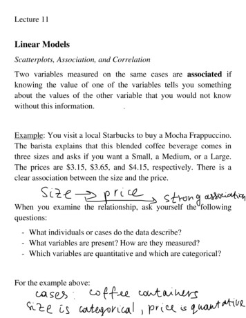
Lecture 11Linear ModelsScatterplots, Association, and CorrelationTwo variables measured on the same cases are associated ifknowing the value of one of the variables tells you somethingabout the values of the other variable that you would not knowwithout this information.Example: You visit a local Starbucks to buy a Mocha Frappuccino.The barista explains that this blended coffee beverage comes inthree sizes and asks if you want a Small, a Medium, or a Large.The prices are 3.15, 3.65, and 4.15, respectively. There is aclear association between the size and the price.When you examine the relationship, ask yourself the followingquestions:- What individuals or cases do the data describe?- What variables are present? How are they measured?- Which variables are quantitative and which are categorical?For the example above:
New question might arise:- Is your purpose simply to explore the nature of therelationship, or do you hope to show that one of the variablescan explain variation in the other?Definition: A response variable measures an outcome of a study.An explanatory variable explains or causes changes in theresponse variable.Example: How does drinking beer affect the level of alcohol in ourblood? The legal limit for driving in most states is 0.08%. Studentvolunteers at Ohio State University drank different numbers ofcans of beer. Thirty minutes later, a police officer measured theirblood alcohol content. Here,Explanatory variable:Response variable:Remark: You will often see explanatory variables calledindependent variables and response variables called dependentvariables. We prefer to avoid those words.
Scatterplots:A scatterplot shows the relationship between two quantitativevariables measured on the same individuals. The values of onevariable appear on the horizontal axis, and the values of the othervariable appear on the vertical axis. Each individual in the dataappears as the point in the plot fixed by the values of bothvariables for that individual.Always plot the explanatory variable, if there is one, on thehorizontal axis (the x axis) of a scatterplot. As a reminder, weusually call the explanatory variable x and the response variable y.If there is no explanatory response distinction, either variable cango on the horizontal axis.Example: More than a million high school seniors take the SATcollege entrance examination each year. We sometimes see thestates “rated” by the average SAT scores of their seniors. Forexample, Illinois students average 1179 on the SAT, which looksbetter than 1038 average of Massachusetts students. Rating statesby SAT scores makes little sense, however, because average SATscore is largely explained by what percent of a state’s students takethe SAT. The scatterplot below allows us to see how the meanSAT score in each state is related to the percent of that state’s highschool seniors who take the SAT.
Examining a scatterplot:In any graph of data, look for the overall pattern and for strikingdeviations from that pattern.You can describe the overall pattern of a scatterplot by the form,direction, and strength of the relationship.An important kind of deviation is an outlier, an individual valuethat falls outside the overall pattern of the relationship.Clusters in a graph suggest that the data describe several distinctkinds of individuals.
Two variables are positively associated when above-averagevalues of one tend to accompany above-average values of the otherand below-average values also tend to occur together.Two variables are negatively associated when above-averagevalues of one accompany below-average values of the other, andvice versa.The strength of a relationship in a scatterplot is determined byhow closely the points follow a clear form.For the example above:
CorrelationWe say a linear relationship is strong if the points lie close to astraight line, and weak if they are widely scattered about a line.Sometimes graphs might be misleading:We use correlation to measure the relationship.
Properties of Correlation:- Correlation makes no use of the distinction betweenexplanatory and response variables. It makes no differencewhich variable you call x and which you call y in calculatingthe correlation.- Correlation requires that both variables be quantitative, so thatit makes sense to do the arithmetic indicated by the formula.- Because r uses the standardized values of the observations, rdoes not change when we change the units of measurement ofx, y, or both. The correlation itself has no unit ofmeasurement; it is just a number.- Positive r indicates positive association between the variables,and negative r indicates negative association.- The correlation r is always a number between -1 and 1. Valuesof r near 0 indicate a very weak linear relationship. Thestrength of the relationship increases as r moves away from 0toward either -1 or 1. The extreme values r -1 and r 1occur only when the points in a scatterplot lie exactly along astraight line.- Correlation measures the strength of only the linearrelationship between two variables. Correlation does notdescribe curved relationships, no matter how strong they are.- Like the mean and standard deviation, the correlation is notresistant: r is strongly affected by a few outlying observations.Use r with caution when outliers appear in the scatterplot.
Here is how correlation r measures the direction and strength of alinear association:
Simple Linear Regression ModelSimple linear regression studies the relationship between aresponse variable y and a single explanatory variable x. Thestatistical model has two important parts:- The mean of the response variable y changes as x changes.The means all lie on a straight line:- Individual response values of y with the same x vary accordingto a Normal distribution.Note: These Normal distributions all have the same standarddeviation.
Data for Simple Linear Regression:The data for a linear regression are observed values of x and y.Each x is fixed and known, the response y is a random variable,which is Normally distributed with means and standard deviationdescribed by our regression model. They will have to be estimatedfrom the data.Example: Computers in some vehicles calculate various quantitiesrelated to the vehicle’s performance. One of these is the fuelefficiency, or gas mileage, miles per gallon (mpg). Another is theaverage speed in miles per hour (mph). For one vehicle equippedin this way, mpg and mph were recorded each time the gas tankwas filled, and the computer was then reset. How does the speed atwhich the vehicle is driven affect the fuel efficiency? There are234 observations available. We will work with a simple randomsample of size 60.
What to do if the relationship is not linear?Thestatisticalmodel for linear regression consists ofand a description of the variation of y about theline.The deviations represent “noise”, or, variation in y due to othercauses that prevent the observed values (x, y) from forming astraight line.
Given n observations of the explanatory variable x and theresponse variable y,()()the statistical model states that the observed responseexplanatory variable takes value iswhen thewhereis the mean response when, and thedeviations are independent and Normally distributed with mean0 and standard deviation .Thus, we have three parameters that we shall need to estimate:, and .Assumptions and Conditions:1. Linearity Assumption.2. Independence Assumption.
3. Normal Population Assumption.For the example above:
ResidualsDefinition: A residual is the difference between an observed valueof the response variable and the value predicted by the regressionline. That is,̂Because the residuals show how far the data fall from ourregression line, examining the residuals helps assess how well theline describes the data.Definition: A residual plot is a scatterplot of the regressionresiduals against the explanatory variable. Residual plots help usassess the fit of a regression line.If the regression line catches the overall pattern of the data, thereshould be no pattern in the residuals.
Estimating Regression Parameters: Method of Least SquaresDefinition: The least-squares regression line of y on x is the linethat makes the sum of the squares of the vertical distances of thedata points from the line as small as possible.
We can show thatandare unbiased estimators ofand.
The remaining parameter to be estimated is .Note: The less scatter around the line, the smaller the residualstandard deviation, the stronger the relationship between x and y.Back to our example:in regression: The square of the correlation, , is the fractionof the variation in the values of y that is explained by the leastsquares regression of y on x.
Confidence Intervals and Significance TestsA 100()% confidence interval for interceptis,wherebetweenA 100(is the value for theanddensity curve with area , and (̅))% confidence interval for slopeis.,whereis as above, andTo test the hypothesis , compute the test statisticIn terms of a random variable T having thevalue for a test ofagainstis (.)distribution, the P-
is (isFor)()the test is the same,For our example:
Example: Storm Data is a publication of the National ClimaticData Center that contains a listing of tornadoes, thunderstorms,floods, lightning, temperature extremes, and other weatherphenomena. Table below summarizes the annual number oftornadoes in the US between 1953 and 2005.
What is the 95% CI for the average annual increase in the numberof tornadoes?Confidence Interval for Mean ResponseFor any specific value of x, say x*, the mean of the response y isgiven byA 100()% confidence interval for the mean responsewhen x takes the value x* iŝwhereis as before and̂,̂ ( (̅)̅).
Let’s derive the formula for̂.
Prediction Intervals (PIs)The predicted response y for an individual case with a specificvalue x* of the explanatory variable x isPI for a future observation:A 100()% prediction interval for a future observation on theresponse variable y when x takes the value x* iŝwhereis as before, and̂,̂ ( (̅)̅).
Back to the fuel efficiency example:Figure below shows the upper and lower confidence limits on agraph with the data and the least-squares line. The 95% confidencelimits appear as dashed curves. For any x*, the confidence intervalfor the mean response extends from lower dashed curve to theupper dashed curve. The intervals are narrowest for values of x*near the mean of the observed x’s and widen as x* moves awayfrom ̅ .Let x* 30 mph.
Conclusion:If we operated this vehicle many times under similar conditions atan average speed of 30 mph, we would expect the fuel efficiencyto be between 18.7 and 19.3Note: These CI’s do not tell us what mileage to expect for a singleobservation at a particular average speed such as 30 mph.Prediction intervals for fuel efficiency: Figure below shows theupper and lower prediction limits, along with the data and theleast-square line. The 95% prediction limits are indicated by thedashed curves.
Note that the upper and lower limits of the prediction intervals arefarther from the least-squares line than are the confidence limits.Conclusion:If we operated this vehicle a single time under similar conditions atan average speed of 30 mph, we would expect the fuel efficiencyto be between 17.0 and 21.0.Tests on CorrelationSuppose we want to know whether X and Y are independent.We can test whether.Recall:if X and Y increase together, anddecreases as X increases.if Y
Recall:can be interpreted as the proportion of the total variationin the ’s that is explained by the variable x in a simple linearregression model.Example: (#11.53) The correlation coefficient for the heights andweights of 10 offensive backfield football players was determinedto be r 0.8261.(a) What percentage of the variation in weights was explainedby the heights of the players?(b) What percentage of the variation in heights was explainedby the weights of the players?(c) Is there sufficient evidence at thelevel to claimthat heights and weights are positively correlated?Solution:
Data for Simple Linear Regression: The data for a linear regression are observed values of x and y. Each x is fixed and known, the response y is a random variable, which is Normally distributed with means and standard deviation described by our regression model. They will have to be estimated from the data.