Transcription
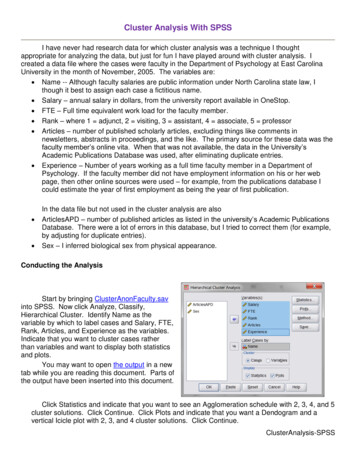
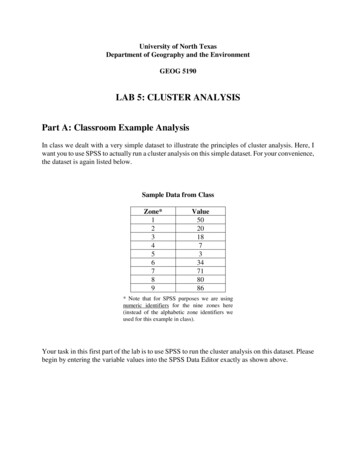
University of North TexasDepartment of Geography and the EnvironmentGEOG 5190LAB 5: CLUSTER ANALYSISPart A: Classroom Example AnalysisIn class we dealt with a very simple dataset to illustrate the principles of cluster analysis. Here, Iwant you to use SPSS to actually run a cluster analysis on this simple dataset. For your convenience,the dataset is again listed below.Sample Data from ClassZone*123456789Value5020187334718086* Note that for SPSS purposes we are usingnumeric identifiers for the nine zones here(instead of the alphabetic zone identifiers weused for this example in class).Your task in this first part of the lab is to use SPSS to run the cluster analysis on this dataset. Pleasebegin by entering the variable values into the SPSS Data Editor exactly as shown above.
In SPSS, choose Analyze Classify Hierarchical Cluster. This will bring up the dialogue boxbelow. Enter the “Value” variable into the analysis. Set Cluster to “Cases”.Then select the Method button from the dialogue box above to specify the details of the analysis.In your cluster analysis, use the nearest neighbour (single linkage) method of clustering withEuclidean distances, as shown in the method dialogue box below. Click continue.
Use the Statistics and Plots buttons on the main Hierarchical Cluster Analysis dialogue box toset your output preferences as follows. For Statistics , set the analysis to give you an“agglomeration schedule” and a “proximity matrix”:For Plots , set the analysis to bring up a “dendrogram” and an “icicle plot” of all clusters:With all of these values set, click on “Continue” to go back to the main cluster analysis dialogue andclick “OK”.Questions for Part A:Question 1. Do you come up with the same basic form of dendrogram as you saw in class forthis dataset?
Question 2. What practical insight does the dendrogram give you that you would not have fromjust looking at the original dataset?Question 3. What does the proximity matrix add that is not represented in the dendrogram?Question 4. How do you (or could you) benefit from having the kind of insight provided bycluster analysis?Part B: Denton County AnalysisIn lab 4 (factor analysis), you were provided with a file that contains information on DentonCounty’s census tracts. In this lab, your goal is to complete a cluster analysis of the census tracts inthis same file. Please use the lab 4 census tract data file again in this part of lab 5.In your write-up for this section, please provide answers for any text printed in bold in thequestions below. Please label your responses using the step number associated with each of thebolded questions – Step 2, Step 17, and Step 18. Please note that many of the steps below do notrequire a written answer, although you will still need to complete every step to finish the analysis. Donot include a written answer for any step where a written answer is not required.Steps and Questions for Part B:Step 1. Open the Denton County census tract dataset for use in SPSS.Step 2. An important step in completing any cluster analysis is standardization of the data. Recall ourdiscussion in class about this issue. Since most of the census tract data categories are in percentages,this is for the most part not an issue. Are there any variables where standardization is an issue?What could happen to your analysis if you used these variables without standardization?Step 3. Using the “Analyze Classify Hierarchical Cluster ” menu options you used in Part A, startthe cluster analysis. Enter into the “Variables” box all available variables except for Tract, County,and State (as in the graphic below).
Step 4. Place the “Tract” variable into the “Label Cases by” box (to give meaningful labels for thecluster analysis output). Also, under “Cluster”, make sure “Cases” is selected (as in the diagrambelow).Step 5. Under “Statistics”, select “Agglomeration Schedule” only (make sure the other options arenot checked), then click “Continue”.
Step 6. Under “Plots”, select “Dendrogram” only (“Icicle” should be set to “None”).Step 7. Under “Method”, we’ll do two different kinds of analysis.a. For the first analysis,Under “Cluster Method” select “Nearest Neighbour”Under “Measure” and “Interval” select “Euclidean Distance”b. For the second analysis,Under “Cluster Method” select “Between Groups Linkage”Under “Measure” and “Interval” select “Euclidean Distance”For both runs, standardize (transform) your data values by variable using Z scores. This will lookafter the data issues you already identified in Part B. Print the results for each of your two runs.
Before you respond to the final questions required for this lab, you will need to map the results of thecluster analysis from your SPSS output. Please refer to the Denton County Census Tract map belowas a reference for this mapping task.Map: Denton County Census Tracts and Census Tract Code Numbers
To complete the SPSS results mapping, you will use the Maptitude GIS software installed on allCSAM lab computers. Maptitude is an alternative to Esri GIS software that has a broad user base inthe human and business geography communities in particular (my business geography consultingfirm has used Maptitude as one analytical tool for over 20 years). If you have previously used otherGIS packages, you should pick up on Maptitude very quickly. If you have not used GIS packagesbefore, you should find Maptitude to have an intuitive user interface and many powerful featuresworthwhile of consideration for your research needs.To do your Maptitude GIS mapping, note you have access to some key Maptitude resources via the“Class” folder on your CSAM lab computer desktop. Find and click on this icon on your desktop:Inside this class directory, go to the “5190” directory, where you can go inside the “Lab 5” directory.In this “Lab 5” directory, you will find: “Lab 5 Data Files”: A directory containing all census tract data and worksheet files need tocomplete lab 5“Maptitude Census Tract Files”: A directory containing census tract boundary files inMaptitude GIS formatStep 8. If you are not familiar with the Maptitude GIS system, please view the “Maptitude Basics”video you will find at the link itude-basics-video/maptitude-basics-video.htmlThis video provides a user-friendly, overall introduction to the Maptitude GIS system user interface.When you have viewed this video, start the Maptitude program on your CSAM computer and withinMaptitude open up the “Denton Census Tract” boundary file located in the “Maptitude Census TractFiles” directory.
Step 9. With this census tract file open in Maptitude, you should see a display similar to the below.The illustration below labels key parts of the Maptitude user interface.Menu BarFile & AnalysisToolbarZoom & PanToolbarMap & DataviewDisplay AreaMap LegendLabel & SymbolToolbarDisplayManagerLayer SelectionSet ToolbarYou will notice that the main map window includes many elements in addition to the census tractboundaries you opened. These are helpful for geographic orientation, but they make the census tractboundaries themselves a little difficult to see.You may further customize your map to better emphasize the census tract boundaries. The “DisplayManager” labelled above makes it possible to change the color and line type you use for theseboundaries. In the “Display Manager”, locate the Denton Census Tract Layer at the bottom of thelayer list. Clicking on the dotted rectangle (immediately to the left of the “Denton Census Tract”label) brings up a further dialogue box that allows you to customize the census tract border.Click on this
Step 10. The census tract boundary layer dialogue box should look something like the below.I recommend you change the border color to a thicker, black line style to make the border layer morevisually apparent. Click “OK” when you are done with this change. Doing this will create a new maplooking something like the below:
Step 11. With the census tract boundaries drawn on your Maptitude map, right-click on the “DentonCensus Tract” label in the Display Manager” to reveal a layer menu. In this menu, select “NewDataview” to bring up a spreadsheet view of the data associated with the census tract layer.The census tract dataview that opens up should look something like the partial screen shot here:
Step 12. Now we’ll switch for a minute to using Excel. Keeping Maptitude open on your machine,find and open the “Lab 5 Cluster Worksheet” Excel file from the “Lab 5 Data Files” directory. Youshould find this cluster file has the three fields shown below:Note that the “Cluster Code” field in this worksheet is empty to start.Step 13. Referring back to your “nearest neighbour” SPSS cluster output, create a cluster code foreach cluster identified in your SPSS cluster analysis (this will involve some judgment on your partrelated to the “cut line” concept we discussed in class, which impacts the number and size of clustersyour analysis identifies). Identify each census tract associated with each cluster you have just created,and enter the cluster number for each census tract to fill the cluster code field in the “Lab 5 ClusterWorksheet”. When this step is complete, your “Cluster Code” column should be filled with clustervalues: each tract should have a cluster code. Once you are satisfied that this process is done, please Save this Excel file on your computer as “Nearest Neighbor Clusters.XLSX”, thenClose Excel.Step 14. Now you need to bring your cluster code data from Excel into Maptitude for use with yourcensus tract boundary files. To learn how to do this, view the “Maptitude Joining Data” tutorialvideo linked eo.htmlThis tutorial provides instructions on the general process you will use to join the data in the “NearestNeighbor Clusters” Excel file you just created with the census tract boundary file you already haveopen in Maptitude. Follow the process you see in this video to complete this join. Note, you will need to use the “Tract” field found in both the Excel file and the Census Tractfile as your connection between these two files. When this join is complete, Maptitude willshow a joined dataview including data from both files. You are now ready to map the resultof your cluster analysis
Step 15. One more step is necessary to map the census tract clusters in Maptitude that you identifiedin SPSS. To learn how to do this, view the “Maptitude Selections and Filters” tutorial tions-and-filtersvideo.htmlThis tutorial shows the process you need to use to select all census tracts from each cluster as aspecific color code/fill pattern. For example, in your selection and on your map you might representall census tracts in: Cluster 1 with a red, solid fill color Cluster 2 with a blue, striped fill color Cluster 3 with a green, dotted fill color Etc.Feel free to use your best judgment to assign fill colors to census tract clusters for maximumusefulness/visual appeal (you do not need to use the color/pattern suggestions above).Step 16. When you have assigned distinctive fills to each cluster (and every census tract has anassociated fill), finalize and save your map on your CSAM computer in Maptitude map format as“Nearest Neighbor Cluster” (use a flash drive for this save if you want to be able to come back to thismap later). For lab submission purposes, please also save this map as a JPG file (use the “NearestNeighbor Cluster.JPG” file name for this graphic image). Please close all Maptitude files after youhave completed the above.Step 17. To conclude your GIS work, repeat steps 8-15 with your “Between Groups Linkage” SPSSresults. Use appropriate file names (i.e. incorporate “Between Groups Linkage” in your file names)for your Excel and Maptitude files in this next cycle of file and map creation.Step 18. Using and referring to both your SPSS cluster output and your Maptitude cluster maps,explain in your own words what each of the clustering methods has done. To do this, pleaseprovide:(A)a description for each clustering method in your own words (I am asking herefor a discussion of the objectives of each method in general, along the lines of thebrief descriptions we provided for selected methods in class), and(B)a comparison between the actual results of the two clustering methods as you seethem in the SPSS output.
Step 19. Looking at your entire set of cluster analysis results (SPSS and Maptitude), is thereanything that is different from what you expected? What’s the same as you would haveexpected?Aside: See if the maps you have created help you identify any neighbourhood clusters thatyou think either make sense or don’t make any sense at all. Perhaps based on your knowledge of Denton County (if you are at all familiar withthe county) there are communities in the county that you would expect to beidentified by the cluster analysis as similar to each other. So your answer to step 18could explore the question “Does the cluster analysis do what you would expect itto?” However, even with no knowledge of Denton County, you can tell me whether youthink the clusters produced by the analysis tend to be geographically dispersed across the map, geographically concentrated in certain areas of the map, or “randomly arranged” on the mapLastly, please do not attempt any kind of spatial autocorrelation analysis here, although in thereal word you could indeed continue this work to combine spatial autocorrelation measureswith a cluster analysis to gain more insights into your results.Please understand: what I’m asking for here is that you give your best effort to thediscussion for this question. Include as many insightful comments as you can about what theanalysis provides. If you don’t know Denton County that well, or you find the map doesn’thelp you much, you can still look for opportunities to make some comment on the clusterpatterns you see in your results.Please remember to include a copy of your SPSS outputin your written report.Please email graphic images of your two Maptitude maps (only) torice@unt.eduLastly, feel free to also integrate selected tables from the SPSSoutput in your answers above if you think that could be helpful.
should find this cluster file has the three fields shown below: Note that the "Cluster Code" field in this worksheet is empty to start. Step 13. Referring back to your "nearest neighbour" SPSS cluster output, create a cluster code for each cluster identified in your SPSS cluster analysis (this will involve some judgment on your part