Transcription
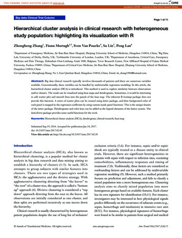
View metadata, citation and similar papers at core.ac.ukbrought to you byCOREprovided by UDORA - University of Derby Online Research ArchiveBig-data Clinical Trial ColumnPage 1 of 11Hierarchical cluster analysis in clinical research with heterogeneousstudy population: highlighting its visualization with RZhongheng Zhang1, Fionn Murtagh2,3, Sven Van Poucke4, Su Lin5, Peng Lan61Department of Emergency Medicine, Sir Run-Run Shaw Hospital, Zhejiang University School of Medicine, Hangzhou 310016, China; 2Big DataLab, University of Derby, Derby, UK; 3Goldsmiths University of London, London, UK; 4Department of Anesthesia, Critical Care, EmergencyMedicine and Pain Therapy, Ziekenhuis Oost-Limburg, Genk 3600, Belgium; 5Liver Research Center, First Affiliated Hospital of Fujian MedicalUniversity, Fuzhou 350005, China; 6Department of Critical Care Medicine, Sir Run-Run Shaw Hospital, Zhejiang University School of Medicine,Hangzhou 310016, ChinaCorrespondence to: Zhongheng Zhang. No 3, East Qinchun Road, Hangzhou 310016, China. Email: zh zhang1984@hotmail.com.Abstract: Big data clinical research typically involves thousands of patients and there are numerous variablesavailable. Conventionally, these variables can be handled by multivariable regression modeling. In this article, thehierarchical cluster analysis (HCA) is introduced. This method is used to explore similarity between observationsand/or clusters. The result can be visualized using heat maps and dendrograms. Sometimes, it would be interestingto add scatter plot and smooth lines into the panels of the heat map. The inherent R heatmap package does notprovide this function. A series of scatter plots can be created using lattice package, and then background color ofeach panel is mapped to the regression coefficient by using custom-made panel functions. This is the unique featureof the lattice package. Dendrograms and color keys can be added as the legend elements of the lattice system. ThelatticeExtra package provides some useful functions for the work.Keywords: Hierarchical cluster analysis (HCA); dendrogram; clinical research; heat mapSubmitted Sep 19, 2016. Accepted for publication Jan 18, 2017.doi: 10.21037/atm.2017.02.05View this article at: ionHierarchical cluster analysis (HCA), also known ashierarchical clustering, is a popular method for clusteranalysis in big data research and data mining aiming toestablish a hierarchy of clusters (1-3). As such, HCAattempts to group subjects with similar features intoclusters. There are two types of strategies used inHCA: the agglomerative and the divisive strategy. Withagglomerative clustering directing from “the leaves” to“the root” of a cluster tree, the approach is called a “bottomup” approach (4). Divisive clustering is considered a “topdown” approach directing from the root to the leaves. Allobservations are initially considered as one cluster, andthen splits are performed recursively as one moves downthe hierarchy.Clinical research is usually characterized by heterogeneouspatient populations despite the use of long list of inclusion/ Annals of Translational Medicine. All rights reserved.exclusion criteria (5,6). For instance, sepsis and/or septicshock are typically treated as a disease entity in clinicaltrials. However, there are significant heterogeneities inpatients with sepsis with respect to infection sites, coexistingcomorbidities, inflammatory responses and timing oftreatment (7,8). Traditionally, these factors are considered asconfounding factors and can be addressed by multivariableregression modeling (9). However, such a method primarilyfocuses on prediction and adjustment, and fails to classify amixed population into a more homogeneous one. Clusteringanalysis aims to classify mixed population into morehomogenous groups based on available features. Each clusterhas its own signature for identification (10,11). For instance,investigators may be interested in how physiological signalspredict differently on the occurrence of subacute events (e.g.,sepsis, hemorrhage and intubation) in intensive care unit(ICU). For instance, physiological signatures of hemorrhagewere found to be similar in patients from surgical and medicalatm.amegroups.comAnn Transl Med 2017;5(4):75
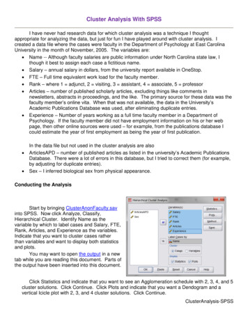
Zhang et al. HCA in clinical researchPage 2 of 11Table 1 Methods to calculate distance between two observationsNamesEquationsEuclidean distance( a a ) (b b )2xi x j i2Manhattan distanceji2jxi x j ai a j bi b j1Maximum distance{xi x j max ai a j , bi b j Mahalanobis distance(x x )Tij}S 1 ( xi x j ) , where S is the covariance matrix and xi and x j are variable vectors of xi and x jxi and xj are ith and jth observations, where i and j are indices. a and b are feature variables.ICU, indicating similarity between these two subgroups (12).In this article, we aim to provide some basic knowledge onthe use of HCA and its visualization by dendrograms andheat maps.Understanding HCASuppose the data consists of four observations (x1 to x4) andeach contains two feature variables (a, b). df -matrix(c(1,2,4,3,2,1,7,9),nrow 4) rownames(df) -c("x1","x2","x3","x4") colnames(df) -c("a","b") dfabx112x221x347x439The matrix df is consistent with the output of acase report form (CRF) where each row represents anobservation, and a column represents a variable (features).To facilitate a clear understanding, we assigned twodimensional features to the observations. During the firststep, the distance between the observations is calculated. 8.062258x3The dist() function calculates the distance between eachpair of observations. There exist a variety of methods tocalculate the distance (Table 1) (13,14). By default, dist()function uses Euclidean distance, and this can be modifiedusing the method argument. Next, Euclidean distance ischecked between x2 and x3:x2 x3 2 ( a2 a3 ) ( b2 b3 ) 22( 2 4 ) (1 7 ) 226.32 , [1]which is exactly the value displayed in the above tabularoutput.From the dist() output table, it appears that x1 and x2 arethe closest to each other and they are merged at the firststep, leaving clusters {x1, x2}, {x3} and {x4} to be mergedfurther. At each step, clusters/observations with the shortestdistance are merged. Distance between clusters should bedefined. Additionally, there are different methods (alsocalled linkage criteria) to define the distance between twoclusters (Table 2). The default method in hclust() functionis the complete linkage clustering, in which the distancebetween two clusters is the distance between those twoelements (one in each cluster) that are farthest away fromeach other (15). The minimum distance between theremaining set of observations/clusters was the one betweenx3 and x4 (d 2.24). The distances between other pairs ofobservations/clusters are: d({x1, x2}, x3) is 6.32, d({x1, x2},x4) is 8.06. After combination of x3 and x4, there are onlytwo clusters {x1, x2} and {x3, x4}, and they are merged asthe latest. The results can be visualized with generic plot()function. plot(hclust(dist(df)))2.236068 Annals of Translational Medicine. All rights reserved.The height axis displays the distance betweenatm.amegroups.comAnn Transl Med 2017;5(4):75
Annals of Translational Medicine, Vol 5, No 4 February 2017Page 3 of 11Table 2 Methods to calculate distance between two clustersNamesEquationsMaximum (complete linkage clustering)Max {d ( a, b ) , a A, b B}Minimum (single linkage clustering)Min {d ( a, b ) , a A, b B}Mean linkage clustering1A BCentroid linkage clusteringcs ct where cs and ct are the centroids of clusters s and t, respectively. d ( a, )a A b Ba and b are elements belonging to clusters A and B, respectively.categorize patients into different subgroups.8Cluster dendrogram7 nvar 54 5x4x3}x2data[[paste("x",i,sep "")]] -rnorm(250)x12 3 for (i in 1:nvar) {1Height6 data -data.frame(diag oisoning"),50)))dist(df)hclust (*, "complete")Figure 1 A simple cluster dendrogram. The height axis displaysthe distance between observations and/or clusters. The horizontalbars indicate the point at which two clusters/observations aremerged. For example, x1 and x2 are merged at a distance of 1.41,which is the minimum one among all other distances. Also, x3 andx4 are merged at the value of 2.24. Finally, {x1, x2} and {x3, x4} aremerged and their distance is 8.06.observations and/or clusters (Figure 1). The horizontal barsindicate the point at which two clusters/observations aremerged. For example, x1 and x2 are merged at a distanceof 1.41, which is the minimum distance among all otherdistances. Observations x3 and x4 are merged at the valueof 2.24. Finally, {x1, x2} and {x3, x4} are merged by adistance of 8.06. This easy example has illustrated the basicprinciples underlying HCA.Worked exampleTo illustrate how to perform HCA using R, we simulateda worked example. In the example, there are five variables(x1 to x5) represented by columns. Each row representsa patient. There is a factor variable named “diag” to Annals of Translational Medicine. All rights reserved. attach(data) data y -3*x1 2*x2-2*x3 x3 2-x4 x5 3-2*x5 detach()In real clinical research, the variables x1 to x5 can beany continuous variable such as blood pressure, heartrate, temperature and laboratory measurements. Theyare centered by mean and scaled by standard deviation,resulting in a normal distribution. The variable y can be anoutcome variable such as cost, length of stay in ICU andhospital. If the outcome variable is binary, transformation toan appropriate scale is required, e.g., the logit scale.Statistical quantityA variety of statistical quantities can be explored. In itsoriginal design, HCA analyzes at individual level. Eachpatient takes one row and each column represents onefeature variable. Such analysis provides information on thesimilarity between individual patients. However, in big datamining, typically thousands of patients are involved and itis more feasible to explore features in subgroups. Summarystatistics such as median, mean, variance, correlation andregression coefficients can be explored. In the presentexample, suppose we are interested in the regressioncoefficient of each feature variable for the outcome y. Weatm.amegroups.comAnn Transl Med 2017;5(4):75
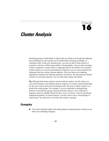
Zhang et al. HCA in clinical researchPage 4 of 11do not attempt to adjust these models. As a result, we needto fit regression models for each combination of featurevariables and subgroups (5 5 25). Fitting these modelsone by one would be time-consuming and error-prone,therefore an R syntax is needed that is able to repeat thesame regression model function. In R, it is not wise to useloop functions, instead the lapply() can apply a user-definedfunction across variables. Let’s see how it works.d3heatmap to create interactive heat maps, fheatmap to plothigh quality, elegant heat map using ‘ggplot2’ graphics,heatmap.plus to allow non-identical X- and Y-dimensions,heatmap3 to provide more powerful and convenient features,and pheatmap to offer more control over dimensions andappearance. In this case we use heatmap.2() functioncontained in gplots package. It provides good control overannotations and labels, and also draws a color key to mapdata values to colors. library(lme4) coeff -lapply(data[,2:6],function(x) { library("gplots")coef(lmList(y x diag,data data.frame(x x,y data y,diag data diag)))[2] heatmap.2(coefficient,ColSideColors rainbow(ncol(coefficient)),RowSideColors rainbow(nrow(coefficient)),srtCol 45)})While the lapply() repeats the regression functionacross variables x1 to x5, lmList() is employed to performregression analysis across subgroups (16). Note that thefirst formula argument of lmList() allows a grouping factorspecifying the partitioning of the data according to whichdifferent lm fits will be performed. The data argumentspecifies the data frame containing the variables named inthe formula. Here we vary the data argument in each cycle,ensuring each lm fit employs different feature variables.The index [2] extracts regression coefficient of lm models.Because the lapply() function returns a list, we need totransform it into a data frame for further analysis. coefficient -t(as.data.frame(coeff)) varlist -names(data[,2:6]) row.names(coefficient) -varlistAlso, the t() function is used to transpose the data frame,making the rows represent variables and the columnsrepresent the subgroups. Next, we rename the row namesby using x1 to x5.Heat mapA heat map is a graphical representation of data where theindividual values contained in a matrix are representedas colors (17). The orders of columns and rows arereordered to facilitate better presentation of dendrograms.Dendrograms are used to describe the similarity betweenclusters and/or observations. There are a variety of heatmap packages in R. heatmap() is a base function shippedwith R installation. Other heat map packages include Annals of Translational Medicine. All rights reserved.The heatmap.2() function first takes a numericmatrix of the values to be plotted. The method usedto calculate distance can be specified using distfun fordistance (dissimilarity) between both rows and columns,and hclustfun for computing the hierarchical clustering.Suppose one attempts to use “minkowski” method fordistance calculation and “mcquitty” method for computingclustering, the following code can do the task: od "minkowski"),method "mcquitty"),ColSideColors rainbow(ncol(coefficient)),RowSideColors rainbow(nrow(coefficient)),srtCol 45)ColSideColors argument takes a character vector oflength ncol(x) containing the color names for a horizontalside bar that may be used to annotate the columns of x.Here we used the rainbow color style for annotating thecolumns. RowSideColors is used for vertical side bar withthe same usage as that of ColSideColors. srtCol argument isused to control the angle of column labels in degrees fromhorizontal. The result is shown in Figure 2. As indicatedby the color key, more negative values are represented bymore dark red color and positive values are represented bylight yellow. The histogram shows the number of values ineach color strip. The dendrogram shows the dissimilaritybetween columns and rows. The results show that surgeryand poisoning patients are the most similar subgroups.Variable x3 is negatively correlated with y across subgroupsatm.amegroups.comAnn Transl Med 2017;5(4):75
Count0 2 4 6Annals of Translational Medicine, Vol 5, No 4 February 2017Color keyand histogramPage 5 of 11 library(lattice) library(reshape2)-2 0 2value m.data -melt(data, id.vars c("diag", "y")) x1-0.39371662AECOPD 4MODS-0.2088301x10.10377785Poisoning 870CAEMODSngisonigeryPoSuSepsisx3diagFigure 2 Heat map produced by heatmap.2() function with colorkey. The light blue solid lines in the heat map correspond to thevalue of coefficient. The dashed lines were the reference valuezero. There is a histogram in the color key showing the numberof coefficient values within each color bar (i.e., one color barrepresents a range of coefficient values). The orders of rows andcolumns are rearranged to avoid intersecting of dendrogram lines.It appears that surgery and poisoning patients are the most similarsubgroups.and x1 is positively correlated with y.Add scatter plot to the heat mapTo better illustrate how variables correlate with outcomey, it would be interesting to visualize scatter plots inheat map. However, the aforementioned heat mappackages do not provide this function. One approach isto draw each scatter plot within a panel with the latticepackage (18). Then background of each panel is filledwith colors corresponding to coefficient values. Also,the dendrogram can be passed to the legend of xyplot()function using dendrogramGrob function (19). The orderof lattice panels should be rearranged to the order thatis consistent with HCA. Finally, the strip labels can bemoved to the left and top of the plot. Next, let’s take aclose look at how each step is carried out and readerscan adapt these codes into their own needs.Firstly, the data frame needs to be reshaped to be utilizedby the xyplot() function. The reshape2 package can do thistask perfectly. Because we change the wide format to longformat, only the melt() function is used. Annals of Translational Medicine. All rights reserved.Note that the variables x1 to x5 disappear and theirvalues are stacked on the value column. A new variablenamed “variable” is created to denote the original variablename x1 to x5. ID variables diag and y remain unchanged.Next, we define the order of rows and columns accordingto the HCA. With the help of the dist() and hclust()function, this task can be easily done with several lines ofcode. Furthermore, the users can visualize the dendrogramsand compare them with the results produced by heatmap.2()function. dd.row - as.dendrogram(hclust(dist(coefficient))) row.ord - order.dendrogram(dd.row) dd.col - as.dendrogram(hclust(dist(t(coefficient)))) col.ord - order.dendrogram(dd.col) par(mfrow c(2,1)) plot(dd.row) plot(dd.col)Note that the dd.row and row.order correspond to thevariables x1 to x5, and the dd.col and col.ord correspond tothe subgroups (Figure 3). This is important for reorderingrows and columns of the coefficient data frame. The nextcode reorders the rows and columns according to the HCAorder. The data frame coeff.order is then rescaled to ensurethat its values are integers. Such values can help to mapthemselves to colors as defined by palette. coeff.order -coefficient[row.ord,col.ord] scale.coef -as.vector(round((coeff.order-min(coefficient))*10 1))One attractive feature of heat map is the use of colorsatm.amegroups.comAnn Transl Med 2017;5(4):75
Zhang et al. HCA in clinical researchPage 6 of 11 par(mfrow c(3,2)) palette(rainbow(10)) barplot(rep(1,10), yaxt "n",main "rainbow", col 1:10)x2x1x5x4 palette(rainbow(10,start 0,end 0.7))x30 2 4 6 8dd.row barplot(rep(1,10), yaxt "n",main "rainbow (0-0.7)",col 1:10) sMODS palette(terrain.colors(10))AECOPD0 1 23 4 barplot(rep(1,10), yaxt "n",main "heat colors",col 1:10)Figure 3 Dendrograms for rows and columns of the coefficient dataframe. Note that dd.row corresponds to the variables x1 to x5, anddd.col corresponds to the subgroups.RainbowHeat colorsTopo colors barplot(rep(1,10), yaxt "n",main "terrain colors",col 1:10) palette(topo.colors(10)) barplot(rep(1,10), yaxt "n",main "topo colors",col 1:10) palette(topo.colors(10,alpha 0.7)) barplot(rep(1,10), yaxt "n",main "topo colors (alpha 0.7)", col 1:10)Rainbow (0–0.7)Terrain colorsTopo colors (alpha 7)Figure 4 Illustration of how palette works in R, by varying colorstyles and relevant parameters such as range of hue and alpha.to highlight differences between individual elements.Therefore, the color style is important to make the heat mapattractive and informative. In R colors can be representedby index into palette, color name and hex constant. Whena col argument is assigned a vector of numeric index, eachnumeric value represents one color in the vector of colorsdefined by palette. To help readers better understand howpalette works in R, a series of simple examples are used byvarying color styles and some relevant arguments. Annals of Translational Medicine. All rights reserved.The output is shown in Figure 4. There are a variety ofcolor styles to select. In the figure we show rainbow, heat,terrain and topo colors. The start and end arguments areused to define the range of hue. The alpha argument takesa number in between 0 and 1 to specify the transparency.With the understanding of palette colors, we proceed todefine the palette for our heat map. cient))*10) 1,start 0,end 0.7))In the example, rainbow color is added to the palette.The number of colors is determined by the range ofcoefficients. A numeral 1 is added to make sure that theminimum value refers to the first color in the palette.At this stage, it is well prepared to draw a heat map withscatter plot in each panel. We need another package called“latticeExtra” which provides several new high-levelfunctions and methods, as well as additional utilities such aspanel and axis annotation functions. Figure 5 is produced bythe following codes. library(latticeExtra) plot -xyplot(y value variable diag,data m.data,par.strip.text list(cex 0.6),atm.amegroups.comAnn Transl Med 2017;5(4):75
Annals of Translational Medicine, Vol 5, No 4 February 2017Page 7 of 11 2 0 2Surgery20100 10 20Sepsis20100 10 20x4 2 0 2x5x1x220100 10 20Poisoning20100 10 20AECOPD20100 10 20MODSy 3.6 3.2 2.8 2.4 2 1.6 1.2 0.8 0.400.40.81.21.622.42.83.2x3 2 0 2 2 0 2 2 0 2X valueFigure 5 Heat map produced by xyplot() function, with background color of each panel mapping to coefficient values. For instance, theregression coefficient of x3 is 3.57 in the subgroup Surgery, thus the background color of the first panel (x3 and Surgery) is red. One cancheck the link between colors and values on the left legend.key list(space "left",panel function(x, y,col,mycolors) {lines list(col ) 1,4),lwd 4,size 1),panel.fill(col mycolors[panel.number()])text ent)-min(coefficient))*10) 1,4)1)/10 min(coefficient),1)))panel.loess(x, y, col "black",lwd 2)),legend list(right list(fun dendrogramGrob,args list(x dd.col, ord col.ord,side "right",size 10)),top list(fun dendrogramGrob,args list(x dd.row,side "top",type "triangle"))),mycolors scale.coef, Annals of Translational Medicine. All rights reserved.panel.xyplot(x, y,cex 0.2,col "black")},index.cond list(row.ord,col.ord),xlab "x value") useOuterStrips(plot)The first argument of xyplot() is a formula indicatingthat plots of y (on the y-axis) versus value (on the x-axis)will be produced conditioned on variables variable anddiag. Remember that variable and diag are factor variablesindicting x variables and subgroups, respectively. Thisformula produces one panel for each unique combinationof these two factor variables. The data argument passesa data frame containing values for any variables in theformula. Here, m.data contains all variables specified in theformula. The size of strip text can be controlled with par.strip.text argument. Key takes a list that defines a legend tobe drawn on the plot. In the example, we want the key toatm.amegroups.comAnn Transl Med 2017;5(4):75
Zhang et al. HCA in clinical researchPage 8 of 11show the corresponding coefficient values of colors, andthis key is displayed on the left. The key is composed oflines and texts, where each line has a color and each textrepresents the coefficient value corresponding to the linecolor in the same row. The legend argument allows theuse of arbitrary “grob”s (grid objects) as legends. Herewe use the dendrogramGrob function to create a grob(a grid graphics object) that can be manipulated as such.The first argument of dendrogramGrob should be anobject of dendrogram. Recall that dd.col corresponds to thesubgroups and thus we assign it to the right argument. Ordargument takes col.ord. By default, dendrogram is displayedin that a child node is joined to its parent as a “stair” withtwo lines (“rectangle”). If one wants to join child nodeto parent directly with a straight line, the type should beassigned “triangle”, as we have done for top dendrogram.A panel function is defined to allow for customized output.In the example, we need to display lowess smooth lines,scatter points and background in each panel. Of note, thebackground of each panel is different, which is determinedby the coefficient values. Here, panel.number() is used toextract corresponding index number of mycolors. Eachnumeric value of the vector mycolors refers to a color inthe palette that has been defined previously. By default,the xyplot() function ranges panels alphabetically by levelsof each conditioning variable. In order to avoid lines ofdendrograms intersecting with each other, we need toreorder the panels. This is done by the use of index.condargument. In our example, the index.cond is a list. It is aslong as the number of conditioning variables, and the i-thcomponent is a valid indexing vector for levels(g i), whereg i is the i-th conditioning variable in the plot. The secondcomponent of of index.cond list is col.ord which correspondsto the second conditioning variable diag. row.ord[1] 3 4 5 1 2As shown above, the order of row.ord is {3, 4, 5, 1, 2},which is consistent with the order of x variables in Figure 5{x3, x4, x5, x1, x2}. The last line uses useOuterStrips functionfrom the latticeExtra package, which moves strips to the topand left boundaries when printed, instead of in every panelas usual. When there are two conditioning variables, itseems redundant to display strips in every panel. Annals of Translational Medicine. All rights reserved.With binary outcome variableIn clinical research, there are more situations whenresearchers have to deal with binary outcome variables suchas occurrence of event of interest, and mortality. As such,we can display probability of outcome in the vertical axisand the values of x on the horizontal axis. Here we created anew binary variable y.bin data y.bin 1/(1 exp(-data y)) 0.5Again we need to extract coefficients of logistic regressionmodels for every unique combination of subgroups anddiagnosis. Here, a string “binomial” indicating the errordistribution is assigned to the family argument, and the linkfunction is “logit”. This is the standard argument for logisticregression model. Coefficient obtained in this way has no directclinical relevance, but its exponentiation gives the odds ratio. coeff.bin -lapply(data[,2:6],function(x) {coef(lmList(y x diag,family binomial(link "logit"),data data.frame(x x,y data y.bin,diag data diag)))[2]}) coeff.bin -as.matrix(as.data.frame(coeff.bin)) colnames(coeff.bin) -varlist heatmap.2(coeff.bin,ColSideColors rainbow(ncol(coeff.bin)),RowSideColors rainbow(nrow(coeff.bin)),srtRow 45)Here, we created a heat map with similar argument tothat displayed in Figure 2, except that values are coefficientsestimated from logistic regression models. models -lapply(data[,2:6],function(x) {lmList(y x diag,family binomial(link "logit"),data data.frame(x x,y data y.bin,diag data diag))})atm.amegroups.comAnn Transl Med 2017;5(4):75
Annals of Translational Medicine, Vol 5, No 4 February 2017Then, the predicted probability can be estimated usingpredict.lmList() function. The function returns a vectorwhose order should be given more attention. If one intendsto build also the confidence interval, the se.fit argumentshould be “TRUE” to allow estimation of standard error ofeach point estimate.Page 9 of 11 n))*10) 1,start 0,end 0.7)) plot.bin -xyplot(prob value variable diag,data data.pred,par.strip.text list(cex 0.6),key list(space "left",lines list(col seq(1,round((max(coeff.bin)-min(coeff.bin))*10) 1,2),lwd 4,size 1), prob -as.vector(NULL) for (i in 1:5) {text n)-min(coeff.bin))*10) 1,2)-1)/10 min(coeff.bin),1)))prob -c(prob,predict(models[[i]]))}),Because the order of melted data.bin and prob arenot consistent, we need some lines of code to arrangethem. Alternatively, one may save predicted probabilityand standard error as a data frame, and the order can bedifferent. Users can try it.legend list(right list(fun dendrogramGrob,args list(x dd.col.bin, ord col.ord.bin,side "right",data.bin -melt(data[,-7], id.vars c("diag", "y.bin"))size 10)), diaglist -data[1:5,] diagtop data.sort -data.bin[0,]list(fun dendrogramGrob, for (var in varlist) {args for (dia in diaglist) {list(x dd.row.bin,data.sort -rbind(data.sort,side "top",data.bin[data.bin variable var&data.bin diag dia,])type "triangle"))),}} data.pred -cbind(data.sort,prob)The following codes are similar to that described in theabove example with minor adaptations. dd.row.bin - as.dendrogram(hclust(dist(coeff.bin))) row.ord.bin - order.dendrogram(dd.row.bin) dd.col.bin - as.dendrogram(hclust(dist(t(coeff.bin)))) col.ord.bin - order.dendrogram(dd.col.bin) coeff.order.bin -coeff.bin[row.ord.bin, col.ord.bin] scale.coef.bin )*10 1)) Annals of Translational Medicine. All rights reserved.colors.bin scale.coef.bin,panel function(x, y,col,colors.bin) {panel.fill(col colors.bin[panel.number()])panel.xyplot(x, y,cex 0.2,col "black")panel.loess(x, y, col "black",lwd 1)},index.cond list(col.ord.bin, row.ord.bin),xlab "x value",ylab "probability") useOuterStrips(plot.bin)The output is shown in Figure 6. This time the verticalaxis represents the probability of the binary outcome. Theblack dot is the predicted probability, and thus each x valuecorresponds to one probability value.atm.amegroups.comAnn Transl Med 2017;5(4):75
Zhang et al. HCA in clinical researchPage 10 of 11 2 0 2 2 0 40.20.0SepsisProbability 1.5 1.3 1.1 0.9 0.7 0.5 0.3 0.60.40.20.0 2 0 2 2 0 2 2 0 2X valueFigure 6 Heat map produced by xyplot() function, with vertical axis representing the estimated probability of outcome events.AcknowledgementsNone.FootnoteConflicts of Interest: The authors have no conflicts of interestto declare.References1.2.3.4.Muntaner C, Chung H, Benach J, et al. Hierarchicalcluster analysis of
Hierarchical cluster analysis (HCA), also known as hierarchical clustering, is a popular method for cluster analysis in big data research and data mining aiming to establish a hierarchy of clusters (1-3). As such, HCA attempts to group subjects with similar features into clusters. There are two types of strategies used in