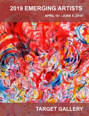
Transcription
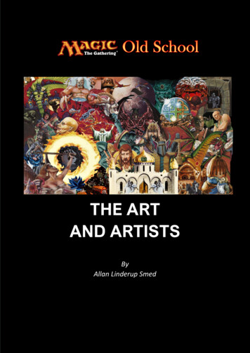
THE ARTAND ARTISTSByAllan Linderup Smed
ForewordBack in 1993, Wizards of the Coast commissioned 25 artists to give Magic: The Gathering cardstheir now-iconic pieces of artwork. The artwork from these 25 original artists resulted in the releaseof the first limited Alpha card.The 25 original artists are:Amy WeberAndi RusuAnson MaddocksBrian SnoddyChristopher RushCornelius BrudiDameon WillichDan FrazierDaniel GelonDouglas ShulerDrew TuckerFay JonesJeff A. MengesJesper MyrforsJulie BarohKev BrockschmidtMark PooleMark TedinMelissa A. BensonQuinton HooverRichard ThomasRob AlexanderRon SpencerSandra EveringhamTom WänerstrandSeveral of the artists have explained that in the early days of MTG, the artists were given almostno information - pretty much just a subject item such as "Angel", "Paladin", or "Mountain". Theydid not even get the titles of the cards. This allowed the artists an incredible range of freedom.They were told by Jesper Myrfors – the art Director of Wizards of the Coast - that the images wouldbe printed about the size of a postage stamp. The only three design guidelines given where: Keepthe colors bright, the compositions simple, and the backgrounds very plain.Jesper Myrfors’ success criteria was, that the cards needed to be recognized from a good distanceaway, so that observers of a game could tell which card was which without seeing the titles andtext. So it was imperative that the images should be strong and iconic. Several of the artists tookthis instruction extremely literal, which is why, so many of the art pieces in the first Alpha set havelittle or no background and use very bold colors.
As the sets continued to be released, the details given increased more and more, with the artistgetting card titles next, then details such as card color, and eventually some extremely detailedpackets of art direction, complete with concept art and extensive notes about races, creatures, andcultures.From the interviews conducted throughout the years, it can be derived, that many of the artists donot have any single favorite piece. There are different things they like about different images -some work better than others, and some are more special to them than others, but it is more of aspectrum with no single favorite. Things the artist like about a piece can often be different fromwhat others think, as they are looking more at the art, technical details and perhaps the storyaround how it came about. This can differ specially compared to players, as their perspectives tendto be biased based a bit more on the game mechanics and the power of the card.Even if there are several of the artists that did play magic (a few still does – while other have nottried the game at all) – most of them are first and foremost artists by interest and by trade.It is also important to remember that most of them were young people just finishing the art studiesin Seattle at the time Jesper Myrfors onboarded them into the small start up company calledWizards of the Coast. They were invited to sit in Peter Adkinson’s (CEO of WoTC) garage andpaint getting paid 50 USD per piece (today WoTC pays over 1,000 USD per MTG artwork).Being professional artists most of them today have had a long career in parallel or after MTG creating lots of other artwork for various customers and purposes. Apart from this many of them isstill today mainly recognized from their status as being one of the first 25 original artist on the firstset for Magic the Gathering.It could easily have turned out differently for these people as, according to Jesper Myrfors, theoriginal plan Wizards of the Coast had, was to use secondary rights art for Magic cards, usingfamous book covers and famous record albums. However, Jesper Myrfors convinced the company,that he could get original art (from students from the Cornish College of Art in Seattle) that had notbeen used anywhere else, and it would cost less in the short term, and in the long term, it wouldtake these artists and their career along with the growth, so everybody would win. The companyagreed and this idea became the famous original 25 .Last it is important to state that this document does not by any means try to be an artbook and Ihave no special art expertise or background that makes me an expert in commenting artwork. Thissmall document has been consolidated by researching available interviews with the original artists,that has been published on the net. The comments are derived from these interviews and conveysthe artists’ own explanations. The document does not (yet) cover all the 25 artists. The purpose ofthis, is to give the reader the chance to have a combined overview of some of the fun facts andstories behind the amazing artwork in the first sets of Magic the Gathering. In addition, to providesome insight to the artists’ work. Where it has made sense for illustrating or explaining the work orapproach of an artist, artwork from cards after the 1993-1994 period has been included. However,the focus for the document has been collecting background information for the art in the first sets inMTG history.Happy readingAllan Linderup Smed, 20 March 2021
Jesper MyrforsHonorable card mentions:Dual lands (Bayou, Scrubland, Tropical Island, Tundra)ArmageddonAtogIfh-Bíff EfreetBad MoonWill-o-the-whispElves of Deep ShadowWord of CommandEvil Eye of Orms-by-GoreLand EquilibriumCosmic HorrorBasalt MonolithPhantom MonsterEater of the DeadNotes: Jesper Myrfors was born in Stockholm in 1964, his father was an officer in the RoyalSwedish Navy, his mother is also from Sweden, and she ran a Swedish newspaper here inthe states for many years. The family moved to Washington State when he was two yearsold but have kept his Swedish citizenship. Jesper Myrfors graduated from Cornish College of the Arts with a BFA in illustration and isa two-time winner of the GAMA award for graphic design and art direction. Late in lifeJesper Myrfors has been tested at the University of Washington Autism Clinic and gotconfirmation of that the is actually an autistic. Jesper Myrfors way into fantasy and gaming was through Dungeons and Dragons in 1979.Later in 1993 Jesper played a game called Talislanta, which was a fantasy role playinggame, and Wizards of the Coast had bought the rights to it. He contacted them with his artportfolio, but WoTC wanted something else. So, he did two new pieces over the weekendand they liked it, and that is how he got started. WoTC subsequently asked for more andinvited him to become part of the company. Jesper Myrfors had met Richard Garfield before Magic the Gathering. Richard Garfieldbrought another game idea to the company called “Roborally” and Jesper Myrfors was artdirecting it and Phil Foglio (another MTG artis) was illustrator. Together with Christopher Rush, the most important and influential artist for the creative artdesign of magic the Gathering in his formal role as Art Director for Magic the Gathering. Heis also the Set Director for The Dark set.
Jesper Myrfors’ style is incredibly varied. He also confirmed in an interview that he liked totry different approaches and techniques. The quite different artistic styles he has workedwith can be seen by comparing for example Elves of the Deep Shadow with Living Lands,Cosmic Horror, Wormwood Treefolk, Evil Eye of Orms-by-Gore and Land Equilibrium.Looking at these it could look like they have been painted by different artists.Elves of Deep ShadowWormwood TreefolkLiving LandsCosmic HorrorEvil Eye of Orms-by-GoreLand Equilibrium About different artistic styles Jesper Myrfors has said in an interview that originally his goalwas to give artists as much freedom as possible. His thinking was that if they had 25 or socreative people working, why not use their input to come up with things and thereby makethe world a richer place. Jesper Myrfors’ himself painted in different styles simply becausehe could and that he loves to experiment and to try new things. He believes the moment anartist stops trying to grow, they die as an artist. Then it becomes just work. The famous Hurloon Minotaur was named by Jesper Myrfors. Wizards of the Coast had toget a magazine advertisement out and it was late, nobody else was in the office, and thecopy for the advertisement absolutely had to be done by morning. So Jesper wrote up theflavor text for the Hurloon Minotaur, and that is how that whole thing about their name andtheir long low moans came to be.Flavor text from Hurloon Minotaur
Art on Tropical Island in the Alpha set is incorrectly credited to Mark Poole but is in factdone by Jesper Myrfors. In an interview Jesper Myrfors has claimed that there is a pictureof himself hidden in the artwork on the Tropical Island card. He claims he is standing in thecenter of the island, but so far, the author of this document has not been able to confirm byown sight if this is true.Tropical Island In an another interview Jesper Myrfors has stated that the inspirational sources for theartwork on Demonic Hordes are Scandinavian fairy tales and aboriginal art. This cansomewhat be seen in the “stick figure style” when comparing to some of the oldestaboriginal art in the world – the paintings from the legendary Quinkan Rock Art in Australia.Demonic Hordes Quinkan Aboriginal Rock ArtThe art printed on Serendib Efreet in Revised set is done by Jesper Myrfors - but it is thewrong illustration used, as this art is from the Ifh-Biff Efreet from Arabian Night set done byJesper Myrfors. The original art on Serendib Efreet is also from the Arabian Night Set butdone by Anson Maddocks
Serendib Efreet (ARN)Anson Maddocks Ifh-Bif (ARN)Jesper MyrforsSerendib Efreet (Revised)Jesper MyrforsArt on Word of Command was decided by a coincidence. The illustration was just a casualtexture painting made by Jesper Myrfors. It was in the bag that he carried around and heshowed it to Richard Garfield. Jesper Myrfors told him, that he was thinking of using it for abackground, and he had drawn two stupid little eyes on it as a joke, and that's whenRichard Garfield said he really liked it, and had a card for it.Word of Command Atog is an anagram for “Goat”. Jesper Myrfors was not aware of this when he painted it,and he feels stupid about that name, now knowing this today. Jesper Myrfors told in aninterview that it took many years after this card was published before a player noticed thatthe Atog was on a boat. According to Jesper Myrfors the reason for this might be that whenthe Atog card was released with the Antiquities set, people hated the card mechanic, andthey also hated the artwork – so probably did not spent a lot of time looking at the artwork.Jesper Myrfors also got a lot of mean comments on this artwork. Nowadays the card andartwork it has become kind of iconic. Jesper Myrfors goal in designing the image was tocome up with a destructive creature that did not look outright evil. He wanted somethingfriendly and sort of silly looking. The story in his mind was, that the creature was capturedfor transport to a rich buyer, when the creature escaped and ate most of the ship,disappearing into the wild to cause trouble in a new land.
Atog On the Witch Hunter artwork, Jesper has stated that the intention of the scene - from thehunters view in the painting, is of people being burned alive inside their home. That has notbeen common knowledge and has not been disclosed by Jesper Myrfors before much later.The reason was that Wizards thought it would be too controversial if it came out what thepainting was really about and if it was confirmed - this would be regarded by public as a tohorrifying for a Magic card.Witch Hunter The Fallen artwork has a special background story from his youth, that Jesper Myrfors hasshared in an interview:“A bunch of us decided to take a drive to the peninsula to go to Fort Wordon, a 19th centurycoastal military fort that looks like a dwarven fortress. Amy Weber was there, as was mygirlfriend at the time Kristin Bishop who painted the War Elephant card for Arabian Nights.Most of the fort is charming and peaceful feeling but there are two parts that are just scary.Really scary. One is an underground room that has been burned out so everything is black,blacker than you can imagine, it is very unsettling. But another area is an undergroundbunker one can only get to by climbing down a rusty ladder. It is the only way in or out,once in the bunker is quite big and has one long main corridor covered in satanic graffiti. Allthe doors down the hall have been partially smashed and hang broken from their rustyhinges. The entire place has a real “Get Out!” vibe. Anyway, at the base of that ladder Isnapped a quick photo of Sandra and forgot about it. Later I was looking for some goodlighting reference for hair and I remembered the photo, so I started a painting using it forreference. Before I knew it, I had painted “The Fallen”. It was not the painting I set out topaint, but that is what came out. It freaked me out a bit how easily it was created, almost asif it created itself. Given the bad mojo of the place I took the reference I always wondered if
there was something more to this piece than I want to admit. For the record it looks nothinglike Sandra, Sandra is very attractive, the fallen is an abomination. The artwork as alwaysmade me feel uneasy, and this is from someone who loves to paint creepy stuff.”Looking at the The Fallen it is indeed one of the most frightening artworks in the game.The Fallen Jesper Myrfors was the set Director for The Dark set. According to Jesper Myrfors the set isabout religious intolerance, which is a theme he had returned to often. It was the horror ofpuritanical America. It was also heavily inspired and influenced by H.P. Lovecraft (not hisracism – but his artistic style). In The Dark set, Jesper Myrfors wanted a chance to do darkbrooding artwork, the type he loves to paint. He had been doing a lot of work for Vampireas well as Magic and his love of light and shadow was really growing as a result. He hadalso had requests at that time, from other MTG artists, that they wanted to do darker work. Lovecraftian influences in the early years of Magic can be seen from several of the MTGartists like Anson Maddocks and Ron Spencer. In Jesper Myrfors work nightmarish cardssuch as Phantom Monster, Elder Spawn and Eater of the Dead or ominous, surreal thingslike Basalt Monolith and Season of the witchPhantom MonsterBasalt MonolithSeason of the WitchElder SpawnEater of the Dead
Sunken City is actually directly inspired by H.P Lovecraft and his description of “Y'ha-nthlei”– the Undersea city of the Deep OnesSunken City According to an interview Jesper Myrfors says that his art has always divided people. Onetime he was listed on the internet as “The worst artist in MTG”, but almost at the same timethe Elves of Deep Shadow artwork was voted the best illustration in the game at that time.The model used by Jesper Myrfors to draw the elf is a friend of his named Amber Bird, whois the singer in the punk/rock band Varnish. The resemblence is easy to see.Elves of Deep Shadow Amber BirdJesper Myfors also made the artwork for he only card among the Beta set that was madeon a computer. This card was Circle of Protection: Black.Circle of protection: BlackThe artist for the card bailed at the last moment, so the original Magic art director, JesperMyrfors, quickly whipped up an illustration on the computer. In the confusion of this lastminute rush, Circle of Protection: Black was inadvertently left out of Alpha set.
Jesper Myrfors has been asked about what his favorite art is from MTG during his time asArt Director for Wizards of the Coast. He has stated he really likes:- Hurloon Minotaur by Anson Maddocks- Dandân by Drew Tucker- Chaos Orb by Mark Tedin- Underground Sea by Rob Alexander- All work by Quinton Hoover. In Jesper Myfor’s oppinion Quinton Hoover was an amazing artist. The very first time hesaw Quinton’s work, he knew it was a cut above the rest of the artists at that time. Jesperhas always loved art nouveau, and in his oppinion Qiunton Hoover had the style doneperfectly (see under Quinton Hoover for art examples).
Dan FrazierHonorable card mentions:5 Moxen (Mox Jet, Mox Ruby, Mox Emerald, Mox Sapphire and Mox Pearl)BerserkSedge TrollDisrupting ScepterJade StatueMahamoti DjinnApprentice WizardHealing SalveSacrificeForcefieldAladdin’s RingJandor’s RingAzure DrakeGloomIce StormNotes: Born September 28, 1945. He received his BFA at the University of Colorado andremained there teaching Art in the public schools for 20 years. Leaving the teachingprofession, he started illustration in the Gaming industry in 1990. With the support of hiswife Kathy, he managed to acquire enough work to soon become a full-time illustrator. Danlearned Classical Academic Painting with oil in the manner of the Renaissance masters. Dan Frazier illustrated the original cover for the Vampire: The Masquerade role-playinggame before White Wolf replaced it with a photograph of a rose. His Dungeons & Dragonswork includes Book of Artifacts (1993) and Races of the Dragon (2006). He also releasedthe cover artwork of 2014 album Space Police: Defenders of the Crow Now, he is a happy artist who works out of the dining room in a new house that “Magic”built. He loves his life and is taking time to explore fine arts. In Alpha series Sedge Troll incorrectly credited Jeff A. Menges as the artist. The right artistis Dan Frazier.Sedge Troll
Dan Frazier is known for using same canvas for several artwork pieces – with the mostnoticeable being the abstract curly red background. This can clearly be seen in the artworkfor Berserk, Disrupting Scepter, Healing Salve, Sacrifice and Apprentice WizardBeserkDisrupting ScepterSacrifice Healing SalveApprentice WizardMox Jet and Forcefield even have been painted as two almost connected pieces of art fromthe same canvas.Mox JetForcefield (rotated 90 degrees)
Dan Fraizer’s use of an abstract background pattern is a common characteristic in several ofhis early MTG artworks as well. Examples of this can be seen in the art for Jandor’s Ring,Aladdin’s Ring, Mox Ruby, Mox Sapphire, Blue Ward and Iron Star. Jandor’s RingMox SapphireAladdin’s RingBlue WardMox RubyIron Star
Anson MaddocksHonorable card mentions:Urza’s Mine setSerendib EfreetFalling AngelMaze of ithCyclopean TombLlanowar ElvesElvish ArchersAnimate DeadLiving WallSengir VampireParalyseGuardian AngelHurloon MinotaurDrop of HoneyNotes: Anson Maddocks grew up in Sitka, Alaska, where he taught himself how to draw along withhis friend – another famous MTG artist - Mark Tedin He has studied Graphic Design at Cornish College of the Arts in Seattle. It was when afellow student and friend, Andi Ruso (also one of the original 25 MTG artists), introducedhim to Jesper Myrfors, who was also attending Cornish. Jesper was the Art Director forWizards of the Coast. Anson Maddocks was one of the more productive artists of the 25-original artist in theAlpha set as he has made the art on 10% of the cards in the set. In an interview Anson stated that it is extremely difficult for him to single out a favorite artpiece, but he has always been happy with the art he created for Cyclopean Tomb, DemonicTorment, Spinal Villain, Armor of Faith and Combat Medic.Armor of FaithDemonic Torment
Combat Medic In an interview Anson has said that out of the art he has done on MTG – he is least happyabout how Pyrotechnics or Lifetap came out.Pyrotechnics Spinal VillainLifetapHurloon Minotaur art is the first iconic illustration that Magic used as “face” in their earlymarketing as it was featured on the front of both on Revised display/starter and gift box aswell on 4th edition booster packs. In 1994 a MTG Hurloon Minotaur promo metal pin wasalso released. For a short time in 1994 a lead miniature done with Hurloon Minotaur wasalso marketed.1994 Lead miniature1994 Promo metal pinThe Tattoos and symbols covering the creature’s face and horns make this illustration veryimpactful and rememberable.
Hurloon Minotaur Anson has strived to create MTG art that also depicts something unexpected, somethingthe viewer might not be likely to come up with on their own. For the artwork for Llanowar elves Anson Maddocks was determined to produce an imageof an elf that was unexpected, something which the viewer would not have likely imaginedon their own, To Anson, this was something he felt was his responsibility as a fantasyillustrator and to him this meant no “Tolkien-like” elves. The Llanowar Elves were neversupposed to be a pretty. Anson Maddocks had a very elaborate back story which hecreated in his head before doing the illustration. It involved vampires trying to take over theforest and the Llanowar Elves being a sort of a half-breed elf-vampire which the forestinitially was not sure what to do about. The forest decides to utilize the Llanowar Elvesagainst the vampires. Therefore, the art depicts a sort of a pale, gritty, punk rock elf. Theyhave been rejected and do not quite fit in and so they are fierce and have a grudge, whichmakes them great warriors and defenders. When the art for Llanowar Elves first waspublished, Wizards of the Coast received numerous letters protesting to the look of thisartwork, due to not resembling what they believed an Elf should look like.Llanowar Elves Hidden in the art for Maze of Ith you can see the outline of a humanoid body that appearsto be trapped in the membrane sphere.
Maze of Ith Similar hidden in the art of Living Wall - If you look hard you can see the outline of a fetus ofan unborn child that appears to be living inside the Living wall.Living Wall The inspiration for Cyclopean Tomb is steeped in sexual undertones. A Cyclops is a oneeyed monster, which can be a euphemism for the male phallus. The figure inside of theeye, has no face to speak of, only one eye. And "the Tomb" of which the figure is inside,(the eye itself), is a Yonic representation. Knowing this it is hard to unsee again.Cyclopean Tomb There is an ongoing story that Guardian Angel and Paralyze are two connected pieces ofart – connected via the light beam shooting from the Guardian Angel’s hands onto the chestof the creature on Paralyze. In an interview Anson Maddocks said that this is notintentional, but he has been asked about it several times.
Guardian Angel (top) and Paralyze (Bottom) In an interview Anson says that – if only mentioning one factor - Nature has been thebiggest influence for his art: observing how things are put together, how systems worktogether or even oppose each other, the movements of an animal, the geology of a rockformation; all these things combined have had a big impact on his work. Hurloon Minotaur art was 1 out 4 art pieces that was used to print on the first originallyMTG T-Shirts that was sold by WoTC in 1994 (Vesuvan Doppelganger, Nightmare andArmageddon Clock were the others)The 1994 original T-shirt The Hurloon Minotaur T-shirt was not put up for external sale. It was created only foremployees at WoTC as the Hurloon Minotaur was the unofficial company mascot in theearly years of Magic.
Douglas ShulerHonorable card mentions:Serra AngelDemonic TutorProdigal SorcererIcy ManipulatorForce of NatureHypnotic SpecterPsionic BlastUnholy StrengthContract from belowNorthern PaladinFrozen ShadeDwarven WarriorsGlasses of UrzaIsland of Wak WakCandelabra of TawnosFalling StarNotes: Throughout the late 80's and early 90's, Douglas Shuler regularly attended gamingconventions and pass out portfolios, trying to get his work in front of art directors.Eventually, he started getting his work into some of the very games he loved playing, suchas Dungeons and Dragons, the Star Wars RPG, Ars Magica, GURPS, Champions, andothers. Douglas Shuler been an active RPGer since high school and he was doing art forgames mostly for the love of the industry. In the end it paid off, as WoTC onboarded him for working on the Alpha set for Magic theGathering based on this portfolio. The artists last name was misspelled “Schuler” on the cards in the limited Alpha and Betaseries One of the big issues facing Wizards of the Coast when it came to complaints about Magicwas imagery pertaining to devils and unholy rituals. This was a huge problem with the blackcards, as those commonly saw themes related to death and bloodshed. Back in 1993-1994parents and schools across America had let their concerns be known to Wizards of theCoast, which convinced them to tone down the imagery on the black Magic cards. One wayin which this happened was the removal of pentagrams from certain cards, as these areoften associated with Satanism. The most obvious case of censorship happened to UnholyStrength, which originally depicted a man standing in front of a burning pentagram. Theoriginal pentagram in the background on the card Unholy Strength was removed in 1995reprint to reduce this tension.
Unholy Strength 1993 Beta versionUnholy Strength 1995 4th edition version In an interview Douglas Shuler said that he does not have a definite favorite MTG artwork,or expansion, although he has enjoyed the silly expansions such as Unglued quite a bit. Serra Angel and Prodigal Sorcerer art is some of the first iconic illustrations that Magicused in their early marketing for a short time in 1994 lead miniatures done with Serra Angeland Prodigal Sorcerer was also marketed.Serra Angel Prodigal SorcererJesper Myrfors encouraged the artists to keep the backgrounds plain, the colors bold, andthe characters simple for MTG illustrations. Douglas Shuler made a conscious choice touse high contrast in his art so that the characters would 'pop'. Good examples of this areSerra Angel, Prodigal Sorcerer, Drain Life, Icy Manipulator, Unholy Strength, BenalishHero, Northern Paladin, Psionic Blast and Ring of Renewal. What makes Douglas Shuler'searliest illustrations for Magic so great is how simple and recognizable they are.Drain LifeIcy ManipulatorBenalish Hero
Northern PaladinPsionic BlastDrain Power WeaknessGlasses of UrzaThe background on Candelabra of Tawnos artwork and Tawnos’s Wand seem to besharing the same (or similar) background canvas or art. This is likely to emphasize the twoartifacts having same owner or origins from the same place.Tawnos’s Wand Ring of RenewalCandelabra of TawnosDouglas Shuler is also the artist behind Contract From Below. This card is the mostpowerful card in the game but was also among the first cards ever banned for its use of the“ante” mechanic.Contract from below art and its powerful effect
Quinton HooverHonorable card mentions:Vesuvan DoppelgangerPreacherWrath of GodDarkpactBrine hagBall LightningDrownedEarthbindFeedbackLesser WerewolfNettling ImpHymn to TourachWyluli WolfRegenerationMeekstonePixie QueenNotes: Quinton worked as an illustrator for many other card games including Middle-earthCollectible Card Games, and role-playing books, including Dungeons & Dragons bookssuch as Monster Manual II (2002) and Book of Vile Darkness (2002). He was the co-creatorof the comic Morgana X. Quinton was born in Fruita, Colorado in 1964[2] and lived inOklahoma City, Oklahoma. He was married with four grown children. He died on April 20,2013 Hoover drew over 70 pieces for the Magic: The Gathering collectible card game. As a favorto Richard Garfield, Quinton Hoover was the artist that made the special made Magic card"Proposal" which creator Richard Garfield used to propose to his then-girlfriend (and futurewife), Lily Wu. According to Mark Rosewater, it took three games before Richard drew thecard and as was able to play it. Lily, of course, said yes.Proposal card art and description Speaking about Richard Garfield’s wife, the card Wyluli Wolf is an anagram for RichardGarfield’s wife – Lily Wu. The artwork is done by Susan Van Camp
Wyluli Wolf Illustrations often include incredibly beautiful and stunning backgrounds details utilizing thefull illustration space of the card. Examples of this can be seen on Vesuvan Doppelganger,Darkpact and Preacher, Nettling Imp, Grave Robbers, Wrath of God and Lesser Werewolf.PreacherNettling ImpLesser Werewolf Wrath of GodGrave RobbersHis illustrations are bright, sharp and leaps off the cards. One of the skills Quinton usedwas making each illustration of a particular color hum in that border. His color schemesblended fearlessly with the frames. Pixie Queen, Darkpact, and Vodalian Mage leave littledoubt their color origins
Darkpact Voldalian MageFrom a gaming perspective some of the lesser used artworks from Quinton Hoover stilldeserve credit for being amazing artwork. This goes for Regeneration, HeadlessHorseman and Emerald Dragon FlyRegeneration Pixie QueenHeadless HorsemanEmerald Dragon FlyThe art for the card feedback was partly inspired by an old movie from 1981. The skullhugging helmet of the Wizard in the artwork was – according to Hoover - inspired by thecharacter Merlin in the “Excalibur” movieFeedbackActor Nicol Willamson as Merlin in movie “Excalibur” 1981
Vesuvan Doppelganger art was 1 out 4 art pieces that was used to print on the firstoriginally MTG T-Shirts that was sold by WoTC in 1994 (Armageddon Clock, Nightmareand Hurloon Minotaur were the others).Vesuvan DoppelgangerThe 1994 original T-shirt
Mark PooleHonorable card mentions:Birds of ParadiseBasic IslandsBalanceCounterspellAncestral RecallLibrary of AlexandriaUrza’s Towers setAmnesiaAli from CairoBronze HorseAshnod’s Battle gearFestivalHowling MineHowl from beyondDeath WardCrusadeNotes: Poole was born on August 31, 1963 in Goldsboro, North Carolina. He graduated fromUniversity of South Carolina in 1986 with a BFA in fine arts and design. Mark Poole worksmostly in acrylic, oil and digital media. He has also worked for companies such as White Wolf Publishing (Vampire TCG), World ofWarcraft, Dungeons and dragons, Sony Online Entertainment, Upper Deck and ZigguratGames. His work was featured at Fantasy Con in July 2014 I
the artists' own explanations. The document does not (yet) cover all the 25 artists. The purpose of this, is to give the reader the chance to have a combined overview of some of the fun facts and stories behind the amazing artwork in the first sets of Magic the Gathering. In addition, to provide some insight to the artists' work.