Transcription
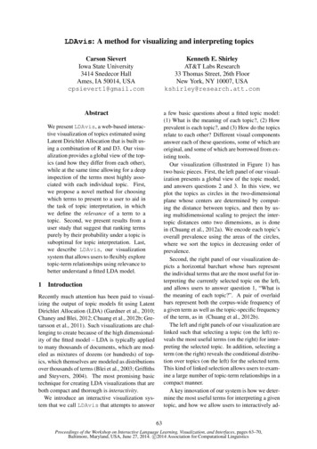
LDAvis: A method for visualizing and interpreting topicsCarson SievertIowa State University3414 Snedecor HallAmes, IA 50014, USAcpsievert1@gmail.comKenneth E. ShirleyAT&T Labs Research33 Thomas Street, 26th FloorNew York, NY 10007, USAkshirley@research.att.comAbstracta few basic questions about a fitted topic model:(1) What is the meaning of each topic?, (2) Howprevalent is each topic?, and (3) How do the topicsrelate to each other? Different visual componentsanswer each of these questions, some of which areoriginal, and some of which are borrowed from existing tools.Our visualization (illustrated in Figure 1) hastwo basic pieces. First, the left panel of our visualization presents a global view of the topic model,and answers questions 2 and 3. In this view, weplot the topics as circles in the two-dimensionalplane whose centers are determined by computing the distance between topics, and then by using multidimensional scaling to project the intertopic distances onto two dimensions, as is donein (Chuang et al., 2012a). We encode each topic’soverall prevalence using the areas of the circles,where we sort the topics in decreasing order ofprevalence.Second, the right panel of our visualization depicts a horizontal barchart whose bars representthe individual terms that are the most useful for interpreting the currently selected topic on the left,and allows users to answer question 1, “What isthe meaning of each topic?”. A pair of overlaidbars represent both the corpus-wide frequency ofa given term as well as the topic-specific frequencyof the term, as in (Chuang et al., 2012b).The left and right panels of our visualization arelinked such that selecting a topic (on the left) reveals the most useful terms (on the right) for interpreting the selected topic. In addition, selecting aterm (on the right) reveals the conditional distribution over topics (on the left) for the selected term.This kind of linked selection allows users to examine a large number of topic-term relationships in acompact manner.A key innovation of our system is how we determine the most useful terms for interpreting a giventopic, and how we allow users to interactively ad-We present LDAvis, a web-based interactive visualization of topics estimated usingLatent Dirichlet Allocation that is built using a combination of R and D3. Our visualization provides a global view of the topics (and how they differ from each other),while at the same time allowing for a deepinspection of the terms most highly associated with each individual topic. First,we propose a novel method for choosingwhich terms to present to a user to aid inthe task of topic interpretation, in whichwe define the relevance of a term to atopic. Second, we present results from auser study that suggest that ranking termspurely by their probability under a topic issuboptimal for topic interpretation. Last,we describe LDAvis, our visualizationsystem that allows users to flexibly exploretopic-term relationships using relevance tobetter understand a fitted LDA model.1IntroductionRecently much attention has been paid to visualizing the output of topic models fit using LatentDirichlet Allocation (LDA) (Gardner et al., 2010;Chaney and Blei, 2012; Chuang et al., 2012b; Gretarsson et al., 2011). Such visualizations are challenging to create because of the high dimensionality of the fitted model – LDA is typically appliedto many thousands of documents, which are modeled as mixtures of dozens (or hundreds) of topics, which themselves are modeled as distributionsover thousands of terms (Blei et al., 2003; Griffithsand Steyvers, 2004). The most promising basictechnique for creating LDA visualizations that areboth compact and thorough is interactivity.We introduce an interactive visualization system that we call LDAvis that attempts to answer63Proceedings of the Workshop on Interactive Language Learning, Visualization, and Interfaces, pages 63–70,Baltimore, Maryland, USA, June 27, 2014. c 2014 Association for Computational Linguistics
Figure 1: The layout of LDAvis, with the global topic view on the left, and the term barcharts (withTopic 34 selected) on the right. Linked selections allow users to reveal aspects of the topic-term relationships compactly.just this determination. A topic in LDA is a multinomial distribution over the (typically thousandsof) terms in the vocabulary of the corpus. To interpret a topic, one typically examines a ranked list ofthe most probable terms in that topic, using anywhere from three to thirty terms in the list. Theproblem with interpreting topics this way is thatcommon terms in the corpus often appear near thetop of such lists for multiple topics, making it hardto differentiate the meanings of these topics.tion in Section 3.2, and we describe how we incorporate relevance into our interactive visualizationin Section 4.Bischof and Airoldi (2012) propose rankingterms for a given topic in terms of both the frequency of the term under that topic as well as theterm’s exclusivity to the topic, which accounts forthe degree to which it appears in that particulartopic to the exclusion of others. We propose a similar measure that we call the relevance of a termto a topic that allows users to flexibly rank termsin order of usefulness for interpreting topics. Wediscuss our definition of relevance, and its graphical interpretation, in detail in Section 3.1. We alsopresent the results of a user study conducted to determine the optimal tuning parameter in the definition of relevance to aid the task of topic interpreta-It is well-known that the topics inferred by LDAare not always easily interpretable by humans.Chang et al. (2009) established via a largeuser study that standard quantitative measures offit, such as those summarized by Wallach et al.(2009), do not necessarily agree with measures oftopic interpretability by humans. Ramage et al.(2009) assert that “characterizing topics is hard”and describe how using the top-k terms for a giventopic might not always be best, but offer few concrete alternatives.AlSumait et al. (2009), Mimno et al. (2011),and Chuang et al. (2013b) develop quantitativemethods for measuring the interpretability of top-2Related WorkMuch work has been done recently regarding theinterpretation of topics (i.e. measuring topic “coherence”) as well as visualization of topic models.2.164Topic Interpretation and Coherence
ics based on experiments with data sets that comewith some notion of topical ground truth, such asdocument metadata or expert-created topic labels.These methods are useful for understanding, in aglobal sense, which topics are interpretable (andwhy), but they don’t specifically attempt to aid theuser in interpreting individual topics.respect to frequency and exclusivity, and they recommend it as a way to rank terms to aid topic interpretation. We propose a similar method that isa weighted average of the logarithms of a term’sprobability and its lift, and we justify it with a userstudy and incorporate it into our interactive visualization.Blei and Lafferty (2009) developed “Turbo Topics”, a method of identifying n-grams within LDAinferred topics that, when listed in decreasing order of probability, provide users with extra information about the usage of terms within topics. This two-stage process yields good results onexperimental data, although the resulting outputis still simply a ranked list containing a mixtureof terms and n-grams, and the usefulness of themethod for topic interpretation was not tested in auser study.2.2Topic Model Visualization SystemsA number of visualization systems for topic models have been developed in recent years. Several of them focus on allowing users to browsedocuments, topics, and terms to learn about therelationships between these three canonical topicmodel units (Gardner et al., 2010; Chaney andBlei, 2012; Snyder et al., 2013). These browserstypically use lists of the most probable termswithin topics to summarize the topics, and the visualization elements are limited to barcharts orword clouds of term probabilities for each topic,pie charts of topic probabilities for each document,and/or various barcharts or scatterplots related todocument metadata. Although these tools can beuseful for browsing a corpus, we seek a more compact visualization, with the more narrow focus ofquickly and easily understanding the individualtopics themselves (without necessarily visualizingdocuments).Chuang et al. (2012b) develop such a tool,called “Termite”, which visualizes the set of topicterm distributions estimated in LDA using a matrix layout. The authors introduce two measuresof the usefulness of terms for understanding atopic model: distinctiveness and saliency. Thesequantities measure how much information a termconveys about topics by computing the KullbackLiebler divergence between the distribution of topics given the term and the marginal distributionof topics (distinctiveness), optionally weightedby the term’s overall frequency (saliency). Theauthors recommend saliency as a thresholdingmethod for selecting which terms are included inthe visualization, and they further use a seriationmethod for ordering the most salient terms to highlight differences between topics.Termite is a compact, intuitive interactive visualization of the topics in a topic model, but by onlyincluding terms that rank high in saliency or distinctiveness, which are global properties of terms,it is restricted to providing a global view of themodel, rather than allowing a user to deeply in-Newman et al. (2010) describe a method forranking terms within topics to aid interpretabilitycalled Pointwise Mutual Information (PMI) ranking. Under PMI ranking of terms, each of the tenmost probable terms within a topic are ranked indecreasing order of approximately how often theyoccur in close proximity to the nine other mostprobable terms from that topic in some large, external “reference” corpus, such as Wikipedia orGoogle n-grams. Although this method correlatedhighly with human judgments of term importancewithin topics, it does not easily generalize to topicmodels fit to corpora that don’t have a readilyavailable external source of word co-occurrences.In contrast, Taddy (2011) uses an intrinsic measure to rank terms within topics: a quantity calledlift, defined as the ratio of a term’s probabilitywithin a topic to its marginal probability acrossthe corpus. This generally decreases the rankingsof globally frequent terms, which can be helpful.We find that it can be noisy, however, by givinghigh rankings to very rare terms that occur in onlya single topic, for instance. While such terms maycontain useful topical content, if they are very rarethe topic may remain difficult to interpret.Finally, Bischof and Airoldi (2012) develop andimplement a new statistical topic model that infersboth a term’s frequency as well as its exclusivity– the degree to which its occurrences are limitedto only a few topics. They introduce a univariate measure called a FREX score (“FRequencyand EXclusivity”) which is a weighted harmonicmean of a term’s rank within a given topic with65
spect individual topics by visualizing a potentiallydifferent set of terms for every single topic. Infact, Chuang et al. (2013a) describe the use of a“topic-specific word ordering” as potentially useful future work.70.425.3Lift (log scale)3Topic 29 of 50 (20 Newgroups data)Relevance of terms to topicsHere we define relevance, our method for rankingterms within topics, and we describe the results ofa user study to learn an optimal tuning parameterin the computation of relevance.3.19.13.3 kw ) (1 0.40 exhaust plastic oil lights remove eye water light up out lambda 0lambda 1/3lambda 2/3lambda 10.001 0.0020.0040.0110.03P(Token Topic) (log scale)Let kw denote the probability of term w 2{1, ., V } for topic k 2 {1, ., K}, where V denotes the number of terms in the vocabulary, andlet pw denote the marginal probability of term w inthe corpus. One typically estimates in LDA using Variational Bayes methods or Collapsed GibbsSampling, and pw from the empirical distributionof the corpus (optionally smoothed by includingprior weights as pseudo-counts).We define the relevance of term w to topic kgiven a weight parameter (where 0 1) as:log( Top10 Most Relevant Boundary1.2Definition of Relevancer(w, k ) ) log kwpw Figure 2: Dotted lines separating the top-10 mostrelevant terms for different values of , with themost relevant terms for 2/3 displayed andhighlighted in blue.are {out, #emailaddress, #twodigitnumer, up,#onedigitnumber}, where a “#” symbol denotesa term that is an entity representing a class ofthings. In contrast to this list, which contains globally common terms and which provides very little meaning regarding motorcycles, automobiles,or electronics, the top-5 most relevant terms given 1/3 are {oil, plastic, pipes, fluid, and lights}.The second set of terms is much more descriptiveof the topic being discussed than the first.,where determines the weight given to the probability of term w under topic k relative to its lift(measuring both on the log scale). Setting 1results in the familiar ranking of terms in decreasing order of their topic-specific probability, andsetting 0 ranks terms solely by their lift. Wewish to learn an “optimal” value of for topic interpretation from our user study.First, though, to see how different values ofresult in different ranked term lists, consider theplot in Figure 2. We fit a 50-topic model to the20 Newsgroups data (details are described in Section 3.2) and plotted log(lift) on the y-axis vs.log( kw ) on the x-axis for each term in the vocabulary (which has size V 22, 524) for a giventopic. Figure 2 shows this plot for Topic 29, whichoccurred mostly in documents posted to the “Motorcycles” Newsgroup, but also from documentsposted to the “Automobiles” Newsgroup and the“Electronics” Newsgroup. Graphically, the lineseparating the most relevant terms for this topic,given , has slope/(1) (see Figure 2).For this topic, the top-5 most relevant termsgiven 1 (ranking solely by probability)3.2User StudyWe conducted a user study to determine whetherthere was an optimal value of in the definition ofrelevance to aid topic interpretation. First, we fita 50-topic model to the D 13, 695 documentsin the 20 Newsgroups data which were posted to asingle Newsgroup (rather than two or more Newsgroups). We used the Collapsed Gibbs Sampleralgorithm (Griffiths and Steyvers, 2004) to samplethe latent topics for each of the N 1, 590, 376tokens in the data, and we saved their topic assignments from the last iteration (after convergence).We then computed the 20 by 50 table, T , whichcontains, in cell Tgk , the count of the number oftimes a token from topic k 2 {1, ., 50} was assigned to Newsgroup g 2 {1, ., 20}, where wedefined the Newsgroup of a token to be the Newsgroup to which the document containing that token was posted. Some of the LDA-inferred topics occurred almost exclusively ( 90% of occur66
rences) in documents from a single Newsgroup,such as Topic 38, which was the estimated topicfor 15,705 tokens in the corpus, 14,233 of whichcame from documents posted to the “Medicine”(or “sci.med”) Newsgroup. Other topics occurredin a wide variety of Newsgroups. One would expect these “spread-out” topics to be harder to interpret than the “pure” topics like Topic 38.In the study we recruited 29 subjects among ourcolleagues (research scientists at AT&T Labs withmoderate familiarity with text mining techniquesand topic models), and each subject completed anonline experiment consisting of 50 tasks, one foreach topic in the fitted LDA model. Task k (fork 2 {1, ., 50}) was to read a list of five terms,ranked from 1-5 in order of relevance to topic k,where 2 (0, 1) was randomly sampled to compute relevance. The user was instructed to identifywhich “topic” the list of terms discussed from alist of three possible “topics”, where their choiceswere names of the Newsgroups. The correct answer for task k (i.e. our “ground truth”) was defined as the Newsgroup that contributed the mosttokens to topic k (i.e. the Newsgroup with thelargest count in the kth column of the table T ), andthe two alternative choices were the Newsgroupsthat contributed the second and third-most tokensto topic k.We anticipated that the effect of on the probability of a user making the correct choice could bedifferent across topics. In particular, for “spreadout” topics that were inherently difficult to interpret, because their tokens were drawn from a widevariety of Newsgroups (similar to a “fused” topicin Chuang et al. (2013b)), we expected the proportion of correct responses to be roughly 1/3 no matter the value of used to compute relevance. Similarly, for very “pure” topics, whose tokens weredrawn almost exclusively from one Newsgroup,we expected the task to be easy for any value of .To account for this, we analyzed the experimentaldata by fitting a varying-intercepts logistic regression model to allow each of the fifty topics to haveits own baseline difficulty level, where the effectof is shared across topics. We used a quadraticfunction of in the model (linear, cubic and quartic functions were explored and rejected).As expected, the baseline difficulty of eachtopic varied widely. In fact, seven of the topicswere correctly identified by all 29 users,1 and one1Trial data for middle tercile of topics0.9Proportion of Correct Responses0.8 0.7 0.6 0.5 0.40.00.20.4Binned responses (bin size 40)50% Intervals95% IntervalsQuadratic Fit0.60.81.0Lambda (optimal value is about 0.6)Figure 3: A plot of the proportion of correct responses in a user study vs. the value of used tocompute the most relevant terms for each topic.topic was incorrectly identified by all 29 users.2For the remaining 42 topics we estimated a topicspecific intercept term to control for the inherent difficulty of identifying the topic (not just dueto its tokens being spread among multiple Newsgroups, but also to account for the inherent familiarity of each topic to our subject pool – subjects,on average, were more familiar with “Cars” than“The X Window System”, for example).The estimated effects of and 2 were 2.74 and-2.34, with standard errors 1.03 and 1.00. Takentogether, their joint effect was statistically significant ( 2 p-value 0.018). To see the estimatedeffect of on the probability of correctly identifying a topic, consider Figure 3. We plot binnedproportions of correct responses (on the y-axis)vs. (on the x-axis) for the 14 topics whose estimated topic-specific intercepts fell into the middletercile among the 42 topics that weren’t trivial orimpossible to identify. Among these topics therewas roughly a 67% baseline probability of correctidentification. As Figure 3 shows, for these topics,the “optimal” value of was about 0.6, and it resulted in an estimated 70% probability of correctidentification, whereas for values of near 0 andcellaneous Politics, Christianity, Gun Politics, Space (Astronomy), and Middle East Politics.2The ground truth label for this topic was “Christianity”,but the presence of the term “islam” or “quran” among thetop-5 for every value of led each subject to choose “Miscellaneous Religion”.Whose ground truth labels were Medicine (twice), Mis-67
1, the estimated proportions of correct responseswere closer to 53% and 63%, respectively. Weview this as evidence that ranking terms accordingto relevance, where 1 (i.e. not strictly in decreasing order of probability), can improve topicinterpretability.Note that in our experiment, we used the collection of single-posted 20 Newsgroups documentsto define our “ground truth” data. An alternativemethod for collecting “ground truth” data wouldhave been to recruit experts to label topics froman LDA model. We chose against this option because doing so would present a classic “chickenor-egg” problem: If we use expert-labeled topicsin an experiment to learn how to summarize topics so that they can be interpreted (i.e. “labeled”),we would only re-learn the way that our expertswere instructed, or allowed, to label the topics inthe first place! If, for instance, the experts werepresented with a ranked list of the most probableterms for each topic, this would influence the interpretations and labels they give to the topics, andthe experimental result would be the circular conclusion that ranking terms by probability allowsusers to recover the “expert” labels most easily.To avoid this, we felt strongly that we should usedata in which documents have metadata associatedwith them. The 20 Newsgroups data provides anexternally validated source of topic labels, in thesense that the labels were presented to users (inthe form of Newsgroup names), and users subsequently filled in the content. It represents, essentially, a crowd-sourced collection of tokens, orcontent, for a certain set of topic labels.4value of , which can alter the rankings of termsto aid topic interpretation. By default, is set to0.6, as suggested by our user study in Section 3.2.If 1, terms are ranked solely by kw , whichimplies the red bars would be sorted from widest(at the top) to narrowest (at the bottom). By comparing the widths of the red and gray bars for agiven term, users can quickly understand whethera term is highly relevant to the selected topic because of its lift (a high ratio of red to gray), orits probability (absolute width of red). The top 3most relevant terms in Figure 1 are “law”, “court”,and “cruel”. Note that “law” is a common termwhich is generated by Topic 34 in about 40% ofits corpus-wide occurrences, whereas “cruel” is arelatively rare term with very high lift in Topic 34– it occurs almost exclusively in this topic. Suchproperties of the topic-term relationships are readily visible in LDAvis for every topic.On the left panel, two visual features providea global perspective of the topics. First, the areas of the circles are proportional to the relativeprevalences of the topics in the corpus. In the50-topic model fit to the 20 Newsgroups data,the first three topics comprise 12%, 9%, and6% of the corpus, and all contain common, nonspecific terms (although there are interesting differences: Topic 2 contains formal debate-relatedlanguage such as “conclusion”, “evidence”, and“argument”, whereas Topic 3 contains slang conversational language such as “kinda”, “like”, and“yeah”). In addition to visualizing topic prevalence, the left pane shows inter-topic differences.The default for computing inter-topic distances isJensen-Shannon divergence, although other metrics are enabled. The default for scaling the set ofinter-topic distances defaults to Principal Components, but other algorithms are also enabled.The LDAvis SystemOur interactive, web-based visualization system,LDAvis, has two core functionalities that enableusers to understand the topic-term relationships ina fitted LDA model, and a number of extra featuresthat provide additional perspectives on the model.First and foremost, LDAvis allows one to select a topic to reveal the most relevant terms forthat topic. In Figure 1, Topic 34 is selected, andits 30 most relevant terms (given 0.34, in thiscase) populate the barchart to the right (rankedin order of relevance from top to bottom). Thewidths of the gray bars represent the corpus-widefrequencies of each term, and the widths of thered bars represent the topic-specific frequencies ofeach term. A slider allows users to change theThe second core feature of LDAvis is the ability to select a term (by hovering over it) to revealits conditional distribution over topics. This distribution is visualized by altering the areas of thetopic circles such that they are proportional to theterm-specific frequencies across the corpus. Thisallows the user to verify, as discussed in Chuang etal. (2012a), whether the multidimensional scalingof topics has faithfully clustered similar topics intwo-dimensional space. For example, in Figure 4,the term “file” is selected. In the majority of thisterm’s occurrences, it is drawn from one of severaltopics located in the upper left-hand region of the68
Figure 4: The user has chosen to segment the fifty topics into four clusters, and has selected the greencluster to populate the barchart with the most relevant terms for that cluster. Then, the user hovered overthe ninth bar from the top, “file”, to display the conditional distribution over topics for this term.global topic view. Upon inspection, this group oftopics can be interpreted broadly as a discussionof computer hardware and software. This verifies,to some extent, their placement, via multidimensional scaling, into the same two-dimensional region. It also suggests that the term “file” used inthis context refers to a computer file. However,there is also conditional probability mass for theterm “file” on Topic 34. As shown in Figure 1,Topic 34 can be interpreted as discussing the criminal punishment system where “file” refers to courtfilings. Similar discoveries can be made for anyterm that exhibits polysemy (such as “drive” appearing in computer- and automobile-related topics, for example).of their two-dimensional locations in the globaltopic view). This is merely an effort to facilitatesemantic zooming in an LDA model with manytopics where ‘after-the-fact’ clustering may be aneasier way to estimate clusters of topics, ratherthan fitting a hierarchical topic model (Blei et al.,2003), for example. Selecting a cluster of topics(by clicking the Voronoi region corresponding tothe cluster) reveals the most relevant terms for thatcluster of topics, where the term distribution of acluster of topics is defined as the weighted averageof the term distributions of the individual topics inthe cluster. In Figure 4, the green cluster of topicsis selected, and the most relevant terms, displayedin the barchart on the right, are predominantly related to computer hardware and software.Beyond its within-browser interaction capability using D3 (Bostock et al., 2011), LDAvisleverages the R language (R Core Team, 2014)and specifically, the shiny package (Rstudio,2014), to allow users to easily alter the topicaldistance measurement as well as the multidimensional scaling algorithm to produce the globaltopic view. In addition, there is an option to apply k-means clustering to the topics (as a function5DiscussionWe have described a web-based, interactive visualization system, LDAvis, that enables deep inspection of topic-term relationships in an LDAmodel, while simultaneously providing a globalview of the topics, via their prevalences and similarities to each other, in a compact space. We69
also propose a novel measure, relevance, by whichto rank terms within topics to aid in the taskof topic interpretation, and we present resultsfrom a user study that show that ranking termsin decreasing order of probability is suboptimalfor topic interpretation. The LDAvis visualization system (including the user study data) iscurrently available as an R package on GitHub:https://github.com/cpsievert/LDAvis.For future work, we anticipate performing alarger user study to further understand how to facilitate topic interpretation in fitted LDA models, including a comparison of multiple methods,such as ranking by Turbo Topics (Blei and Lafferty, 2009) or FREX scores (Bischof and Airoldi,2012), in addition to relevance. We also note theneed to visualize correlations between topics, asthis can provide insight into what is happening onthe document level without actually displaying entire documents. Last, we seek a solution to theproblem of visualizing a large number of topics(say, from 100 - 500 topics) in a compact way.Jason Chuang, Christopher D. Manning and JeffreyHeer. 2012b. Termite: Visualization Techniques forAssessing Textual Topic Models. AVI.Jason Chuang, Yuening Hu, Ashley Jin, John D. Wilkerson, Daniel A. McFarland, Christopher D. Manning and Jeffrey Heer. 2013a. Document Exploration with Topic Modeling: Designing InteractiveVisualizations to Support Effective Analysis Workflows. NIPS Workshop on Topic Models: Computation, Application, and Evaluation.Jason Chuang, Sonal Gupta, Christopher D. Manningand Jeffrey Heer. 2013b. Topic Model Diagnostics:Assessing Domain Relevance via Topical Alignment.ICML.Matthew J. Gardner, Joshua Lutes, Jeff Lund, JoshHansen, Dan Walker, Eric Ringger, and Kevin Seppi.2010. The topic browser: An interactive tool forbrowsing topic models. NIPS Workshop on Challenges of Data Visualization.Brynjar Gretarsson, John O’Donovan, Svetlin Bostandjieb, Tobias Hollerer, Arthur Asuncion, David Newman, and Padhraic Smyth. 2011. TopicNets: VisualAnalysis of Large Text Corpora with Topic Modeling. ACM Transactions on Intelligent Systems andTechnology, pp 1-26.Thomas L. Griffiths and Mark Steyvers. 2004. Findingscientific topics. PNAS.ReferencesDavid Mimno, Hanna M. Wallach, Edmund Talley,Miriam Leenders, and Andrew McCallum. 2011.Optimizing Semantic Coherence in Topic Models.EMNLP.Loulwah AlSumait, D
documents, topics, and terms to learn about the relationships between these three canonical topic model units (Gardner et al., 2010; Chaney and Blei, 2012; Snyder et al., 2013). These browsers typically use lists of the most probable terms within topics to summarize the topics, and the vi-sualization elements are limited to barcharts or