Transcription
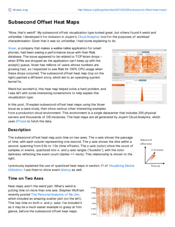
dt race .o rghttp://dtrace.o rg/blo gs/brendan/2012/03/26/subseco nd-o ffset-heat-maps/Subsecond Offset Heat Maps“Wow, that’s weird!”. My subsecond of f set visualization type looked great, but others f ound it weird andunf amiliar. I developed it f or inclusion in Joyent’s Cloud Analytics tool f or the purposes of workloadcharacterization. Given that it was so unf amiliar, I had some explaining to do.Voxer, a company that makes a walkie-talkie application f or smartphones, had been seeing a perf ormance issue with their Riakdatabase. T he issue appeared to be related to T CP listen drops –when SYNs are dropped as the application can’t keep up with theaccept() queue. Voxer has millions of users whose numbers aregrowing f ast, so I expected to see Riak hit 100% CPU usage whenthese drops occurred. T he subsecond of f set heat map (top on theright) painted a dif f erent story, which led to an operating systemkernel f ix.Weird but wonderf ul, this heat map helped solve a hard problem, andI was lef t with some interesting screenshots to help explain thisvisualization type.In this post, I’ll explain subsecond of f set heat maps using the Voxerissue as a case study, then show various other interesting examplesf rom a production cloud environment. T his environment is a single datacenter that includes 200 physicalservers and thousands of OS instances. T he heat maps are all generated by Joyent Cloud Analytics, whichuses DTrace to f etch the data.DescriptionT he subsecond of f set heat map puts time on two axes. T he x-axis shows the passageof time, with each column representing one second. T he y-axis shows the time within asecond, spanning f rom 0.0s to 1.0s (time of f sets). T he z-axis (color) show the count ofsamples or events, quantized into x- and y-axis ranges (“buckets”), with the colordarkness ref lecting the event count (darker more). T his relationship is shown to theright.I previously explained the use of quantized heat maps in section 11 of Visualizing DeviceUtilization. I use them to show event latency as well.Time on Two AxesHeat maps aren’t the weird part. What’s weird isputting time on more than one axis. Stephen Wolf ramrecently posted T he Personal Analytics of My Lif e,which included an amazing scatter plot (on the lef t).T his has time on both x- and y- axes. I’ve included itas it may be a much easier example to grasp at f irstglance, bef ore the subsecond of f set heat maps.
His is at a much longer time scale: the x-axis showsdays, and the y-axis shows of f set within a day. Usingsimilar terminology, this could be called a “subdayof f set” or “24hr-of f set” scatter plot. Each point onhis plot shows when Wolf ram sent an email, revealinghis sleeping habits as the white gap in the morning.Scatter plots are limited in the density of the points they can display, and don’t compress the data set (x & ycoordinates are kept f or each event). Heat maps solve both issues, allowing them to scale, which is especiallyimportant f or the cloud computing uses that f ollow. T hese use the subsecond of f set scale, but other rangesare possible as well (minute-of f set, hour-of f set, day-of f set).That’s No Artif actT he screenshot at the top of this page (click any f or f ull-res) used a subsecond of f set heat map f or CPUthread samples – showing when applications were on-CPU during the second. T he sampling was at 99 Hertzacross all CPUs, to minimize overhead (instead of , say, 1000 Hz), and to avoid lockstep (with any power-of -10Hz task). T hese CPU samples are then quantized into the buckets seen as pixels.T he heat map revealed that CPU usage dropped at the same time as the T CP listen drops. I was expecting theopposite.By selecting Riak (as “beam.smp”, the Erlang VM it uses) and “Isolate selected”, only Riak is shown:Lef t of center shows two columns, each with about 40% of the of f sets colored white. Assuming no samplingissue, it means that the Riak database was entirely of f -CPU f or hundreds of consecutive milliseconds. T his issimilar to the white gaps showing when Wolf ram was asleep — except that we aren’t expecting the Riakdatabase to take naps! T his was so bizarre that I f irst thought that something was wrong with theinstrumentation, and that the white gaps were an artif act.Application threads normally spend time of f -CPU when blocked on I/O or waiting f or work. What’s odd here isthat f or so long the number of running Riak threads is zero, when normally it varies more quickly. And thisevent coincided with T CP listen drops.The Shoe That Fits
The Shoe That FitsIn Cloud Analytics, heat maps can be clicked to reveal details at that point. I clicked inside the white gap, whichrevealed that a process called “zoneadmd” was running; isolating it:T his f its the white gap closely, and a similar relationship was observed at other times as well. T his pointedsuspicion to zoneadmd, which other observability tools had missed. Some tools sampled the runningprocesses every f ew seconds or minutes, and usually missed the short-lived zoneadmd completely. Evenwatching every second was dif f icult: Riak’s CPU usage dropped f or two seconds, at a dif f erent rate to whatzoneadmd consumed (Riak is multi-threaded, so it can consume more CPU in the same interval than the singlethreaded zoneadmd). T he subsecond of f set heat map showed the clearest correlation: the duration of theseevents was similar, and the starting and ending points were nearby.If zoneadmd was somehow blocking Riak f rom executing, it would explain the of f -CPU gap and also the T CPlisten drops – as Riak wouldn’t be running to accept the connections.Kernel FixInvestigation on the server using DTrace quickly f ound that Riak was getting blocked as it waited f or anaddress space lock (as lock) during mmap()/munmap() calls f rom its bitcask storage engine. T hat lock wasbeing held by zoneadmd f or hundreds of milliseconds (see the Artif acts section later f or a longer description).zoneadmd enf orces multi-tenant memory limits, and every couple of minutes checked the size of Riak. It didthis via kernel calls which scan memory pages while holding as lock. T his scan took time, as Riak was tens ofGbytes in size.We f ound other applications exhibiting the same behavior, including Riak’s “memsup” memory monitor. All ofthese were blocking Riak, and with Riak of f -CPU unable to accept() connections, the T CP backlog queue of tenhit its limit resulting in T CP listen drops (tcpListenDrop). Jerry Jelinek of Joyent has been f ixing thesecodepaths via kernel changes.Patterns
T he previous heat map included a “Distribution details” box at the bottom, summarizing the quantized bucketthat I clicked on. It shows that “zoneadmd” and “ipmitool” were running, each sampled twice in the range 743 –763 ms (consistent with them being single threaded and sampled at 99 Hertz).ipmitool and zabbix agentdTo check whether ipmitool was an issue, I isolated its on-CPUusage and f ound that it of ten did not coincide with Riak of f CPU time. While checking this, I f ound a interesting patterncaused by zabbix agentd. T hese are shown on the right:ipmitool is highlighted in yellow, and zabbix agentd in red.Just based on the heat map, it would appear thatzabbix agentd is a single thread (or process) that wakes up every second to perf orm a small amount of work.It then sleeps f or an entire second. Repeat. T his causes the diagonal rising line, the slope of which is relativeto time zabbix agentd worked bef ore sleeping f or the next f ull second: with greater slopes (approaching 90degrees) ref lecting more work was perf ormed bef ore the next sleep.zabbix agentd is part of the Z abbix monitoring sof tware. If it is supposed to perf orm work roughly everysecond, then it should be ok. But if it is supposed to perf orm work exactly once a second, such as readingsystem counters to calculate the statistics it is monitoring, then there could be problems.Cloud ScaleT he previous examples showed CPU thread samples on a single server (each title included “predicated byserver hostname ”). Cloud Analytics can show these f or the entire cloud – which may be hundreds ofsystems (virtualized operating system instances). I’ll show this with a dif f erent heat map type: instead of CPUthread samples, which shows the CPU usage of applications, I’ll show subsecond of f set of system calls(syscalls), which paints a dif f erent picture – one better ref lecting the I/O behavior. Tracing syscalls can revealmore processes than by sampling, which can miss short-lived events.T he two images that f ollow show subsecond of f sets f or syscalls across an entire datacenter (200 physicalservers, thousands of OS instances). On the lef t are syscalls by “httpd” (Apache web server), and the right arethose by the “ls” command:httpdlsNeither of these may be very surprising. T he httpd syscalls will arrive at random times based on the clientworkload, and combining them f or dozens of busy web servers results in a heat map with random colorintensities (which have been enhanced due to the rank-based def ault color map).
Sometimes the heat maps are surprising. T he next two show zeus.f lipper (web load balancing sof tware), onthe lef t f or the entire cloud, and on the right f or a single server:zeus.flipperzeus.flipper (single)T he cloud-wide heat map does show that there is a pattern present, which has been isolated f or a singleserver on the right. It appears that multiple threads are present: many waking up more than once a second (thetwo large bands), and others waking up every two (), f ive () and ten seconds ().Cloud Wide vs Single ServerHere are some other examples comparing an entire cloud vs a single server (click f or f ullscreenshot). T hese are also syscall subsecond of f sets:node.jsnode.js (single)JavaJava (single)
PythonPython (single)I’ve just shown one single server example f or node.js, Java, and Python, however each server can look quitedif f erent based on its use and workload. Applications such as zeus.f lipper are more likely to look similar asthey serve the same f unction on every server.Cloud Identif ication ChartSome other cloud-wide examples, using syscall subsecond of f sets:awkbashkstatmunin-nodePerlphp-fpmT he munin-node heat map has several lines of dots , each dot two seconds apart. Can you guesswhat those might be?
Color MapsT he colors chosen f or the heat map can either be rank-based or linear-based, which select color saturationdif f erently. T he selected type f or the previous heat maps can be seen af ter “COLOR BY:” in the f ullscreenshots (click images)T his shows node.js processes across the entire cloud, to compare the color maps side-by-side:node.js (rank)node.js (linear)T he rank-based heat map highlights subtle variation well. T he linear colored heat map ref lects reality. T his is anextreme example; of ten the heat maps look much more similar. For a longer description of rank vs linear, seeDave Pacheco’s heat map coloring post, and the Saturation section in my Visualizing Device Utilization post.Artif actsT he f irst example I showed f eatured the Riak databasebeing blocked by zoneadmd. T he blocking event wascontinuous, and lasted f or almost a f ull second. It wasshown twice in the f irst subsecond of f set column due tothe way the data is currently collected by Joyent CloudAnalytics – resulting in an “artif act”.T his is shown on the right. T he time that a column of datais collected f rom the server does not occur at the 0.0of f set, but rather some other of f set during the second.T his means that an activity that is in-f light will suddenly jump to the next column, as has happened here (at the“3″ mark). It also means that an activity at the top of the column can wrap and continue at the bottom of thesame column (at the “2″ mark), bef ore the column switch occurs. I think this is f ixable by recalculating of f setsrelative to the data collection time, so the switch happens at of f set 0.0. (It hasn’t been f ixed already since itusually isn’t annoying, and didn’t noticeably interf ere with the many other examples I’ve shown.)On the lef t is a dif f erent type of artif act, one caused when data collection isdelayed. To minimize overhead, data is aggregated in-kernel, then read at agentle rate (usually once per second) by a user-land process. T his problemoccurs when the user-land process is delayed slightly f or some reason, andthe kernel aggregations include extra data (overlapping of f sets) by the timethey are read. T hose of f sets are then missing f rom the next column, on theright.Thread Scheduling
I intended to include a “checkerboard” heat map of CPU samples, like those Robert Mustacchi showed in hisVisualizing KVM post. T his involves running two threads (or processes) that share one CPU, each perf ormingthe same CPU-bound workload. When each is highlighted in dif f erent colors it should look like a checkerboard,as the kernel scheduler evenly switches between running them.Robert was testing on the Linux kernel under KVM, and used DTrace to inspect running threads f rom theSmartOS host (by checking the VM MMU context). I perf ormed the experiment on SmartOS directly, whichresulted in the f ollowing heat map:T his breaks my head. Instead of a neat checkerboard, this is messy – showing uneven runtimes f or theidentical threads. One column in particular is entirely red, which if true (not a sampling or instrumentationerror) meant that the scheduler lef t the same thread running f or an entire second, while another was in theready-to-run state on the CPU dispatcher queue. T his is much longer than the maximum runtime quantum setby the scheduler (110 ms f or the FSS class). I conf irmed this behavior using two dif f erent means (DTrace, andthread microstate accounting), and saw even worse instances – threads blocked f or many seconds when theyshould have been running.Jerry Jelinek has been wading into the scheduler code, f inding evidence that this is a kernel bug (in code thathasn’t changed since Solaris) and developing the f ix. Fortunately, not many of our customers have hit thissince it requires CPUs running at saturation (which isn’t normal f or us).UPDATE (April 2nd)Jerry has f ixed the code, which was a bug with how thread priorities were updated in the scheduler. T hef ollowing screenshot shows the same workload post-f ix:T his looks much better. T here are no longer any f ull seconds where one thread hogs the CPU, with the otherthread waiting. Looking more closely, there appear to be cases where the thread has switched early – which ismuch better than switching late.We also f ound that the bug was indeed hurting a customer along with a conf luence of other f actors.ConclusionT he subsecond of f set heat map provides new visibility f or sof tware execution time, which can be used f orworkload characterization and perf ormance analysis. T hese are currently available in Joyent Cloud Analytics,
f rom which I included screenshots of these heat maps f or production environments.Using these heat maps I identif ied two kernel scheduling issues, one of which was causing dropped T CPconnections f or a large scale cloud-based service. Kernel f ixes are being developed f or both. I also showedvarious applications running on single servers and the cloud, which produced f ascinating patterns – providing anew way of understanding application runtime.T he examples I included here were based on sampled thread runtime, and traced system call execution times.Other event sources can be visualized in this way, and these could also be produced on other time f rames:sub-minute, sub-hour, etc.AcknowledgementsDave Pacheco leads the Joyent Cloud Analytics project. All of the heat maps shown here (exceptWolf ram’s) are f rom Cloud Analytics.T he Cloud Analytics team with whom I discussed this visualization.Bryan Cantrill wrote the prototype Cloud Analytics tool which I hacked to test out this idea in production,and he came up with the name “subsecond of f set”. He also f athered DTrace, which is used to f etch allthe data shown by the heat maps.Robert Mustacchi developed the Meta-D language f or Cloud Analytics instrumentations, which madeimplementing subsecond of f set heat maps trivial, and put them to use f or KVM.Jerry Jelinek, f or f ixing the tricky kernel bugs that these heat maps have recently been unearthing.Stephen Wolf ram‘s recent post was great timing, as it provided an intuitive example of a graph havingtime on both axes.Edward Tuf te f or the idea of high def inition images in text, and f or inspiration to try harder in general(see any of his texts).Deirdré Straughan f or edits and suggestions.T hanks to the f olk at Voxer f or realizing (earlier than I did) that something more than just normal bursts of loadwas causing the tcpListenDrops, and pushing f or the real answer.Posted on March 26, 2012 at 11:16 am by Brendan Gregg · Permalink In: Perf ormance · Tagged with: cloudanalytics, dtrace, subsecond, visualizations« Previous postNext post »
Sometimes the heat maps are surprising. The next two show zeus.flipper (web load balancing software), on the left for the entire cloud, and on the right for a single server: zeus.flipper zeus.flipper (single) The cloud-wide heat map does show that there is a pattern present, which has been isolated for a single server on the right.