Transcription
Web Design 101Susan BaleJennifer FoltzA word on metaphorsThe Web is a communication tool Research background company informationUnderstand how the organization worksKnow the web audienceAlways think of the userGetting Started Develop a hierarchyfor your site Decide who isresponsible forcontent and updating1
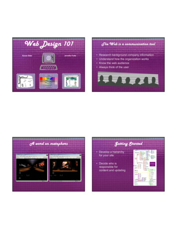
Creating a web can be fun and challenging. It can also befrustrating if you do not know all the tricks of the trade. Thefollowing is an overview of all the basics that need to bemade when creating a web site.The first and most important aspect of web design is to know your client andtheir web user.Research what the business or department does, who they interact with, andpay attention to the image or look that they currently portray. Even if you thinkthat the current image isn’t attractive or fun, get an idea of WHY they havechosen this look before you suggest or make changes.The web can be a powerful and easily accessible medium but above all it is acommunication tool between the business or department and their web user.Your client understands this otherwise they wouldn’t want a website.Organize your site in a way that is easy for the user. Avoid mimicking patternsof your internal office scheme if it can be helped. Eliminating internal jargon willbe easier to read through and navigate for the user. This can be done simply bylabeling hyperlinks with broad terms. Use common names not technical orscientific ones. Technology, plug-in, and flashy scripting available to “enhanceyour website” are one of the most tempting things to add to your page. Thisdefinitely can hinder communication. Always ask yourself when you aretempted by the bells and whistles of technology: will this enhance my site or doI want to add this because it is fun for me to create? If it enhances or helps yoursite by all means use the technology, but keep in mind you might leave someusers behind. Do not turn your page into a technology junkyard.Using a metaphor as a basis for navigating and designing aweb site was a popular idea at one time. For example,basing your site on a visual concept like a train station andthen using this visual idea as a navigational feature. Theuser might go to the ticket window to seek information orboard the train to go to different page. Studies have shownthat is a bad way to navigate a website. It found that peopledo not always get the metaphor. Make things as clearlystated as possible unless your site is being used purely asentertainment.Make a small diagram to show how you want your web to be laid out.Start with the main page at the top or side then draw arrows or linesconnecting pages showing the hyperlink or navigation patterns of yourweb. This chart is the hardest part of the web design process but it isthe greatest tool to help you see what all is involved in putting togethera web site. The chart serves as a great reference to you and helps tocommunicate to others involved with the project the architecture of thesite. It also serves as a reminder to keep the purpose of the web incheck.If you are stuck with reorganizing an existing web make chart of theexisting layout (hierarchy) to see what the navigation patterns are andwhat content you have. Then assess what changes need to be made.Keep in mind that users do not always come into your site from thehomepage. With search engines they might find a page deep into yoursite. Have a navigation system on every page that allows the users toget back to the major pages in your web site.Once you have made your chart will discover what kinds graphics andimages might be needed, how many buttons you might use, and who isresponsible for generating the content for the different sections of theweb.1
Constraints of the delivery medium Browser Window HTML table BandwidthGrid of the html table Sketch a thumbnail ofthe webpage Remember table cellsneed to break up intoeven increments Break up (slice)images to fit the gridWorking with tables If you do not havePhotoshop, Fireworksor a way to sliceimages, design withthe gridInside vs. outside pages The opening page is morefor Introduction and linksWorking around the grid with theappearance of curvy shapes Avoid SPLASH pages,have site navigation on theopening page Inter pages are more forspecific content These pages should besimilar but differentWith the grid2
The browser is part of your web environment. You cannot view awebpage without one. So first of all you have to realize the size andlayout have to fit within those constraints. Decide what screenresolution you are designing for and then design your layout with theproportionate dimensions of the screen resolution. Some tips toconsider when deciding on a screen resolution: always avoid makingthe user scroll sideways (from right to left and left to right), and thehomepage should fit within the opening browser window and should notinvolve scrolling. Scrolling up and down on the inside pages isacceptable within reason. For example do not have your user scrollmore than two or three screen lengths otherwise there is too muchcontent for one page.The second consideration of web design is how to layout your pagewithin the grid system of a table, most widely used for layout.Sometimes a fantastic design on paper is very cumbersome to makehappen on the web.The last consideration is bandwidth. When choosing components ofthe web page be lean and friendly with objects such as pictures,multimedia, and sound. The more pictures, video, and sound equalsmore download time and an unhappy web user.Examples of how to accomplish designs within HTMLtables.Sketch out a rough drawing of what you want your page to look like. Add yourhyperlinks, and all other necessary info in the sketch to see how your page willbe filled.When coming up with an idea keep in mind the following points. First, tablecells in HTML always have to break up in even segments. This can give youproblems with placement of graphics and text. Knowing the HTML languagewill help you to know what is possible and what is not. You might even have toreevaluate your ideas according to your skill level.Second, you have to decide if you want to follow the boxy shape of the tableand browser or contrast the box with curves and organic shapes. Going withthe curvy shapes is a nice break from the angled web but also takes more skillto design. Fitting irregular shapes into a grid system can be done by slicing theshapes. This breaks up graphics and decreases download time because thebrowser only has to render small graphics instead of one large one. AdobeImage Ready (comes with Photoshop) or Macromedia Fireworks are greatsoftware programs for slicing up graphics.Finally, try and see if you can fit your design into a grid.I usually have a design for the opening page and a complementary design forthe inside pages that allows more space for content. The opening page is forIntroduction and links. Inter pages are for specific content. For example, if youwere introducing yourself to someone you would not tell them your whole lifestory all up front. You would give them an overview then as they got to knowyou would give them more information based on questions. Similar to a webpage. The opening page is an overview with doors (hyperlinks) to moreinformation.Keep you layout and navigation in the same place from page to page to insurethat the user understands how to navigate your site. Consistency is a key pointto web design. You also want the user to understand when they come into yoursite and when they leave. You do not want every page within you site adifferent color and theme.Think of a software program you use very day. The application alwayscontains menu bar on across the top of the screen. You know that in the filemenu you can choose functions such as print and save, etc. Web navigationchanges on every site you visit. It does not have the built in consistency of asoftware program. Make navigation friendly and obvious to your user. Avoidusing hyperlinks in the body text of the page for navigation. The user will notintuitively find those links. An appropriate use of links in the content of a pagewould be for contextual use such as glossary definitions, references, etc.2
Five tricks of the trade1.2.3.4.5.Building a visual navigation StructureProvide visual navigation and accessibility aidsDesign for easy scanningBe conciseBe consistentConvey credibility Who are you? Anchor your logoBuilding a visual navigation Structure Section your site with a navigation barBuilding a visual navigation Structure Left navigation is secondary to top navigation3
Building a visual navigation Structure Add tertiary navigation menus as necessaryBuilding a visual navigation Structure Add a focal point: graphic, pull-quote, or headlineBuilding a visual navigation Structure A good slogan answers “Why am I here?”Building a visual navigation Structure Works on even the toughest sites4
Design for Easy ScanningHow do we read on the Web? Reading rates 25-40% slowerMonitor’s flicker causes eyestrainAlmost 80% of readers scan textReaders scan a page for 10 seconds then move on Reserve blue andunderline for links Use sans serif fontsat smaller sizes Use color or icons tohelp conveymessage, but don’trely on them Beware “MysteryMeat” navigationDesign for Easy Scanning Use headlines and lists liberally Write “Lite”. Use 50% fewer words than print (samegreat taste, less filling) Use embedded links sparingly Group links of similar “weight”How much has the Web changed the face of enterpriseapplication development? Let us count the ways. Start withHTML, pervasive clients, fat servers, distributed architectures,and application servers.Move to object messaging, server-side components,decoupled frameworks, and enterprise information portals. Andlet's not forget the year's big buzzes: eXtensible MarkupLanguage (XML), enterprise application integration (EAI),electronic data interchange (EDI), and global supply chainoptimization.Five tricks of the trade1.2.3.4.5.Provide visual navigation and accessibility aidsDesign for easy scanningBe conciseBe consistentConvey credibility5
Color Limit your color palette to three or four choices Use mostly desaturated colors HTML color palette (216 colors) renders the same fromcomputer to computer Use white space for breathing roomDesaturated vs. Saturated Desaturated colorsare more appealing,soothing andprofessional. Using many fullysaturated colors is hardon the eyes. Using limited amounts ofsaturated color worksnicely.Graphics Optimize! Keep graphics small Use the correct fileformat Slice images whenappropriate Try using some solidareas of hexadecimalcolor (ex. CCFFCC) Use alt tagsCascading Style Sheets Style sheets (CSS)separate content frompresentation Help users withdisabilities Helps you to makeglobal changes6
Color is a very subjective consideration, but it can definitely make or break your website. The bestadvice that I can give is to limit your color palette to 3 or 4 colors, use mostly desaturated colors, andlet there be white space.Using desaturated colors or limiting your use of saturatedones gives your pages a cleaner look.A color palette (color choices) of about 3 or 4 help the viewer to focus and not to suffer frominformation overload (isn’t that what the web is all about?) and also gives you some parameters todesign within. Believe it or not total freedom is an artist’s worst nightmare. There is nothing worse thana blank sheet of white paper that you are supposed to create something out of with no constraints. Itis best to set some boundaries to start with.As for color choices ones that are desaturated are more pleasing and not so harsh to the eye ingeneral. Desaturated colors are ones that are softer and seem to have a fog or a gray film over the topof them. Your pages will look cleaner and more professional if you use this type of color palette.Sometimes choosing desaturated colors from HTML color palette of 216 colors this is hard to do. Asyou can see from the visibone web palette that web colors are pretty harsh. There are few colors thatare soft. Just remember if the web palette is used your graphics will be consistent in color across allplatforms. If you choose not to go this route, test your colors for contrast and value on severalsystems.Let there be white space! I strongly recommend leaving some room for the web user to breathe. Whitespace is the space on a page that is not used up by content or graphics, it does not have to be white!!!White space is margins in a document, room between columns in a newspaper or magazine, or solidareas or color or pattern. If words in a book went from one side of the page to the other without amargin the document would be really hard to read! To decide what to place of your web page think ofyour page as real estate. You have pay for every item you insert. The larger the item the higher thecost just like ads in a magazine. If you actually had to pay for each part of the grid you would only putthe most important information up. Although you do not want your web page user to not be able to findinformation you want to limit their choices as guide them through your site with ease. As we say in theart world less is more!Optimize! Optimize! Optimize! Learn and understand resolution on the web. Screen resolution is verysmall 72 dots per inch (dpi or ppi, pixels per inch). You do not want to save your graphics at highresolution and put them on your website this causes you page to load slowly. Similarly, create yourgraphics at the size you will be using them. Using a 72 dpi image that is 10 inches by 8 inches thatonly needs to be 2 inches by 1.5 inches is creating a larger download time as well. Research showsthat a user will only wait for a page to load for about 10 seconds then they get frustrated and leave (pg.61 Web Design by Thomas Powell). This is not much time!Get to know your photo or graphics editor and learn to make your graphics and photos as small aspossible without distorting the image. You will also need to understand the different file types for theweb jpg and gif. Jpg was created for saving photographs and gif was created for saving graphics withflat color. Gif format also allows for transparency but jpg does not. Choosing the correct format willhelp with download time and also help the display of your images. This is essential knowledge for webdesign.Slice or break up larger graphic and put them back together (like a puzzle) in your web page whenappropriate. The browser downloads many small graphics faster than one large graphic. Repeatingyour graphics also helps with download time. If you use the same logo on every page of your site theweb browser only has to download it once. Then the browser remembers or caches the graphic tomemory. I strongly recommend graphics on websites, plain text on a page is extremely boring, butwhen choosing graphics be selective.Besides graphics just using some solid areas of HTML hexadecimal color is a nice way to enhanceyour site without adding to the download time. Another trick to enhance your site is to tile thebackground of your pages with a small textural graphic. Just make sure that the texture is light or darkenough so the viewer can read the content of your site.Cascading Styles Sheets (CSS) are a great way toseparate content from presentation in your web site. CSS isalso American Disability Act (ADA) web compliant. CSScan control the fonts, colors, and other presentation itemson your site without using tags such as the font tags thathinder the use of your site for people with disabilities usingbrowsing tools like as screen readers. CSS is fairly easy tolearn and once implemented it allows you to make globalchanges to your website in one place without going toevery page in your site to change colors and fonts. Myfavorite CSS tutorial is on the w3schools site(http://www.w3schools.com).Another tip to great graphics is using alt tags. This is a text representation of the graphic image thatsolves 80% of users with disabilities problems with using the World Wide Web.6
Just when you thought you were done Make sure your navigation is consistent(and not broken) from page to page Test your site in different browsers andversions Maintain your siteResources for web design: Art and Graphic Design Resource- Web Designhttp://www.deezin.com/indexf.html Tutorials on HTML, CSS, Javascript you name itW3Schools- http://www.w3schools.com Web ndex. Web Design for Designershttp://www.wpdfd.com/ Unforgettable Web Designhttp://www.newark1.com/index.htm Web Design Tipshttp://www.colin.mackenzie.org/webdesign/7
Make sure your navigation is consistent and works onevery page. Broken hyperlinks is a very easy mistake tomake when working on a web page, but if the user cannotnavigate your page say goodbye.Test your page in all major browsers and several differentversions. It should display pretty consistently.Update your pages on a regular basis. There is nothingworse that going to a website that was last updated threeyears ago.7
Web Design 101 Susan Bale Jennifer Foltz The Web is a communication tool Research background company information Understand how the organization works Know the web audience Always think of the user A word on metaphors Getting Started Develop a hierarchy for your site Decide who is responsible for content and updating
