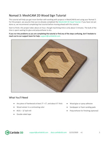
Transcription
Tutorial: ggplot2Ramon SaccilottoUniversitätsspital BaselHebelstrasse 10T 061 265 34 07 F 061 265 31 09 saccilottor@uhbs.chwww.ceb-institute.org
Basel Institute for Clinical Epidemiology and BiostatisticsAbout the ggplot2 PackageIntroduction"ggplot2 is an R package for producing statistical, or data, graphics, but it is unlike most other graphics packages because ithas a deep underlying grammar. This grammar, based on the Grammar of Graphics (Wilkinson, 2005), is composed of a setof independent components that can be composed in many different ways. [.] Plots can be built up iteratively and editedlater. A carefuly chosen set of defaults means that most of the time you can produce a publication-quality graphic inseconds, but if you do have speical formatting requirements, a comprehensive theming system makes it easy to do whatyou want. [.]ggplot2 is designed to work in a layered fashion, starting with a layer showing the raw data then adding layers of annotationand statistical summaries. [.]"H.Wickham, ggplot2, Use R, DOI 10.1007/978-0-387-98141 1, Springer Science Business Media, LLC 2009"ggplot2 is a plotting system for R, based on the grammar of graphics, which tries to take the good parts of base and latticegraphics and none of the bad parts. It takes care of many of the fiddly details that make plotting a hassle (like drawinglegends) as well as providing a powerful model of graphics that makes it easy to produce complex multi-layered graphics."http://had.co.nz/ggplot2, Dec 2010Authorggplot2 was developed by Hadley Wickham, assistantprofessor of statistics at Rice University, Houston. In July2010 the latest stable release (Version 0.8.8) was published.2008 Ph.D. (Statistics), Iowa State University, Ames, IA. “Practical tools for exploring data andmodels.”2004 M.Sc. (Statistics), First Class Honours, The University of Auckland, Auckland, New Zealand.2002 B.Sc. (Statistics, Computer Science), First Class Honours, The University of Auckland, Auckland, New Zealand.1999 Bachelor of Human Biology, First Class Honours, The University of Auckland, Auckland, New Zealand.ggplot2 tutorial - R. Saccilotto2
Basel Institute for Clinical Epidemiology and BiostatisticsTutorial#### Sample code for the illustration of ggplot2#### Ramon Saccilotto, 2010-12-08### install & load ggplot )### show info about the datahead(diamonds)head(mtcars)1200010000### comparison qplot vs ggplotcutFair8000count# qplot histogramqplot(clarity, data diamonds, fill cut, geom "bar")Good6000Very GoodPremium4000Ideal2000# ggplot histogram - same output0ggplot(diamonds, aes(clarity, fill cut)) geom bar()I1SI2SI1VS2clarityVS1 VVS2 VVS1IF### how to use qplot# scatterplotqplot(wt, mpg, data mtcars)qplot accepts transformed input data# transform input data with functionsvalueaesthetic1"green"# add aesthetic mapping (hint: how does mapping work)1"red"qplot(wt, mpg, data mtcars, color qsec)2"blue"qplot(log(wt), mpg - 10, data mtcars)# change size of points (hint: color/colour, hint: set aesthetic/mapping)qplot(wt, mpg, data mtcars, color qsec, size 3)qplot(wt, mpg, data mtcars, colour qsec, size I(3))aesthetics can be setto a constant valueinstead of mapping# use alpha blendingqplot(wt, mpg, data mtcars, alpha qsec)values between 0 (transparent)and 1 (opaque)ggplot2 tutorial - R. Saccilotto3
Basel Institute for Clinical Epidemiology and Biostatistics# continuous scale vs. discrete scalehead(mtcars)30qplot(wt, mpg, data mtcars, colour cyl)qplot(wt, mpg, data mtcars, colour factor(cyl))252545mpgmpglevels(mtcars cyl)30cyl620factor(cyl)4620715# use different aesthetic mappings881523wt45234wt5qplot(wt, mpg, data mtcars, shape factor(cyl))qplot(wt, mpg, data mtcars, size qsec)factor(cyl)304# combine mappings (hint: hollow points, geom-concept, legend combination)625mpgqplot(wt, mpg, data mtcars, size qsec, color factor(carb))8qsec201618qplot(wt, mpg, data mtcars, size qsec, color factor(carb), shape I(1))201522qplot(wt, mpg, data mtcars, size qsec, shape factor(cyl), geom "point")2qplot(wt, mpg, data mtcars, size factor(cyl), geom "point")34wt5legends are combined if possible# bar-plotflips the plot after calculation ofqplot(factor(cyl), data mtcars, geom "bar")any summary statistics# flip plot by 90 qplot(factor(cyl), data mtcars, geom "bar") coord flip()# difference between fill/color bars1414121210qplot(factor(cyl), data mtcars, geom "bar", colour factor(cyl))10factor(cyl)866466884422004# fill by variablefactor(cyl)84countcountqplot(factor(cyl), data mtcars, geom "bar", fill r(cyl), data mtcars, geom "bar", fill factor(gear))# use different display of bars (stacked, dodged, identity)1.0head(diamonds)0.8qplot(clarity, data diamonds, geom "bar", fill cut, position "stack")qplot(clarity, data diamonds, geom "bar", fill cut, position "fill")qplot(clarity, data diamonds, geom "bar", fill cut, position "identity")countqplot(clarity, data diamonds, geom "bar", fill cut, position "dodge")cutFair0.6GoodVery Good0.4PremiumIdeal0.20.0I1qplot(clarity, data diamonds, geom "freqpoly", group cut, colour cut, position "identity")5000qplot(clarity, data diamonds, geom "freqpoly", group cut, colour cut, position "stack")4000SI2 SI1 VS2 VS1VVS2VVS1 IFclaritycutFaircount3000GoodVery Good2000PremiumIdeal1000I1ggplot2 tutorial - R. SaccilottoSI2 SI1 VS2 VS1VVS2VVS1 IFclarity4
Basel Institute for Clinical Epidemiology and Biostatistics# using pre-calculated tables or weights (hint: usage of ddply in package plyr)table(diamonds cut)t.table - ddply(diamonds, c("clarity", "cut"), "nrow")14000head(t.table)1200010000caratqplot(cut, nrow, data t.table, geom "bar")qplot(cut, nrow, data t.table, geom "bar", stat "identity")800060004000qplot(cut, nrow, data t.table, geom "bar", stat "identity", fill clarity)20000Fairqplot(cut, data diamonds, geom "bar", weight carat)GoodVery GoodcutPremiumIdealqplot(cut, data diamonds, geom "bar", weight carat, ylab "carat")### excursion ddply (split data.frame in subframes and apply functions)ddply(diamonds, "cut", "nrow")ddply(diamonds, c("cut", "clarity"), "nrow")ddply(diamonds, "cut", mean)ddply(diamonds, "cut", summarise, meanDepth mean(depth))ddply(diamonds, "cut", summarise, lower quantile(depth, 0.25, na.rm TRUE), median median(depth, na.rm TRUE),upper quantile(depth, 0.75, na.rm TRUE))t.function - function(x,y){z sum(x) / sum(x y)return(z)}ddply(diamonds, "cut", summarise, custom t.function(depth, price))ddply(diamonds, "cut", summarise, custom sum(depth) / sum(depth price))### back to ggplot10000# change binwidth25008000200060001500countqplot(carat, data diamonds, geom "histogram")count# histogram4000100020005000qplot(carat, data diamonds, geom "histogram", binwidth 0.1)01qplot(carat, data diamonds, geom "histogram", binwidth 0.01)2carat34512carat345different binwidth changes the picture# use geom to combine plots (hint: order of layers)qplot(wt, mpg, data mtcars, geom c("point", "smooth"))30qplot(wt, mpg, data mtcars, geom c("smooth", "point"))mpg25qplot(wt, mpg, data mtcars, color factor(cyl), geom c("point", "smooth"))20152ggplot2 tutorial - R. Saccilotto3wt455
Basel Institute for Clinical Epidemiology and Biostatistics# tweeking the smooth plot ("loess"-method: polynomial surface using local fitting)qplot(wt, mpg, data mtcars, geom c("point", "smooth"))# removing standard error3530qplot(wt, mpg, data mtcars, geom c("point", "smooth"), se FALSE)3025# making line more or less wiggly (span: 0-1)mpgmpg25202015qplot(wt, mpg, data mtcars, geom c("point", "smooth"), span 0.6)1510qplot(wt, mpg, data mtcars, geom c("point", "smooth"), span 1)10234wt5234wt5# using linear modellingqplot(wt, mpg, data mtcars, geom c("point", "smooth"), method "lm")# using a custom formula for fittinglibrary(splines)qplot(wt, mpg, data mtcars, geom c("point", "smooth"), method "lm", formula y ns(x,5))# illustrate flip versus changing of variable allocationqplot(mpg, wt, data mtcars, facets cyl ., geom c("point", "smooth"))flips the plot after calculation ofqplot(mpg, wt, data mtcars, facets cyl ., geom c("point", "smooth")) coord flip()any summary statisticsqplot(wt, mpg, data mtcars, facets cyl ., geom c("point", "smooth"))30254# save plot in variable (hint: data is saved in plot, changes in data do not change plot-data)2015p.tmp - qplot(factor(cyl), wt, data mtcars, geom "boxplot")3025mpg6p.tmp201553025844# save mtcars in tmp-var320152t.mtcars - mtcars234wt554wt6mtcars - transform(mtcars, wt wt 2)3032524# change mtcars2015105304825mpg2# draw plot without/with update of plot data6320151520mpg25301030p.tmp2582015p.tmp % % mtcars# reset mtcars1023wt45mtcars - t.mtcars ,am,rm(t.mtcars)gear,carb[32x11]# get information about plotsummary(p.tmp)# save plot (with data included)ggplot2 tutorial - R. Saccilottomapping:x factor(cyl),y wtfaceting:facet grid(. .,FALSE)- ‐- ‐- ‐- ‐- ‐- ‐- ‐- ‐- ‐- ‐- ‐- ‐- ‐- ‐- ‐- ‐- ‐- ‐- ‐- ‐- ‐- ‐- ‐- ‐- ‐- ‐- ‐- ‐- ‐- ‐- ‐- ‐- ‐- ‐- ‐geom boxplot:stat boxplot:position dodge:(width NULL,height NULL)6
Basel Institute for Clinical Epidemiology and Biostatisticssave(p.tmp, file "temp.rData")# save image of plot on disk (hint: svg device must be installed)ggsave(file "test.pdf")ggsave(file "test.jpeg", dpi 72)ggsave(file "test.svg", plot p.tmp, width 10, height 5)5### going further with ggplot# create basic plot (hint: can not be displayed, no layers yet)4p.tmp - ggplot(mtcars, aes(mpg, wt, colour factor(cyl)))factor(cyl)wt4p.tmp683# using additional layers (hint: ggplot draws in layers)2p.tmp layer(geom "point")p.tmp layer(geom "point") layer(geom "line")1520mpg2530# using shortcuts - geom XXX(mapping, data, ., geom, position)p.tmp geom point()400300# using ggplot-syntax with qplot (hint: qplot creates layers automatically)factor(cyl)wt4qplot(mpg, wt, data mtcars, color factor(cyl), geom "point") geom line()68200qplot(mpg, wt, data mtcars, color factor(cyl), geom c("point","line"))100# add an additional layer with different mappingp.tmp geom point()1520mpg2530p.tmp geom point() geom point(aes(y disp))# setting aesthetics instead of mappingyp.tmp geom point(aes(color "darkblue"))33221100yp.tmp geom point(color "darkblue")# dealing with overplotting (hollow points, pixel points, alpha[0-1] )-1-1t.df - data.frame(x rnorm(2000), y rnorm(2000))-2-2p.norm - ggplot(t.df, aes(x,y))-3-3-3-2-1p.norm geom point()p.norm geom point(shape ".")p.norm geom point(colour alpha("blue", 1/10))yp.norm geom point(colour alpha("black", 1/2))12333221100yp.norm geom point(shape 1)x0-1-1-2-2-3-2-1-3-2-1x01230123-3-3ggplot2 tutorial - R. Saccilotto-3-2-1x0123x7
Basel Institute for Clinical Epidemiology and Biostatistics468543# using facets (hint: bug in margins - doesn't work)32qplot(mpg, wt, data mtcars, facets . cyl, geom "point")544wtqplot(mpg, wt, data mtcars, facets gear cyl, geom "point")324, 3# facet wrap / facet grid54, 545534qplot(mpg, wt, data mtcars, facets cyl, geom "point")23152p.tmp - ggplot(mtcars, aes(mpg, wt)) geom point()6, 36, 48, 38, 5202530152025mpg30152025306, 554wtp.tmp facet wrap( cyl)4, 43p.tmp facet wrap( cyl, ncol 3)2p.tmp facet grid(gear cyl)5p.tmp facet wrap( cyl gear)342152025301520253015202530mpg# controlling scales in facets (default: scales "fixed")46p.tmp facet wrap( cyl, scales "free")43.43.084.53.22.54.03.03.52.03.02.8p.tmp facet wrap( cyl, scales "fixed")3p.tmp facet wrap( cyl, scales "free x")65.0wt2426288303218.0 18.5 19.0 19.5 20.0 20.5 21.0wt2.5223.0# contstraint on facet grid (all rows,columns same scale)3.53.04.02.53.5p.tmp facet grid(gear cyl, scales "free", space "free")5p.tmp facet grid(gear cyl, scales "free x")2.04.542.55.02.012141618mpg# using scales (color palettes, manual colors, matching of colors to values)p.tmp - qplot(cut, data diamonds, geom "bar", fill cut)p.tmpp.tmp scale fill brewer()p.tmp scale fill brewer(palette "Paired")RColorBrewer::display.brewer.all()p.tmp scale fill manual(values "))p.tmp scale fill manual("Color-Matching", c("Fair" "#78ac07", "Good" "#5b99d4","Ideal" "#ff9900", "Very Good" "#5d6778", "Premium" "#da0027", "Not used" dYlGnRdYlBuRdGyRdBuPuOrPRGnPiYGBrBG# changing text (directly in qplot / additional shortcut)qplot(mpg, wt, data mtcars, colour factor(cyl), geom "point", xlab "Descr. of x-axis", ylab "Descr. of y-axis", main "OurSample Plot")qplot(mpg, wt, data mtcars, colour factor(cyl), geom "point") xlab("x-axis")# changing name of legend (bug: in labs you must use "colour", "color" doesn't work)qplot(mpg, wt, data mtcars, colour factor(cyl), geom "point") labs(colour "Legend-Name")# removing legendqplot(mpg, wt, data mtcars, colour factor(cyl), geom "point") scale color discrete(legend FALSE)qplot(mpg, wt, data mtcars, colour factor(cyl), geom "point") opts(legend.position "none")ggplot2 tutorial - R. Saccilotto81618
Basel Institute for Clinical Epidemiology and Biostatistics# moving legend to another placeqplot(mpg, wt, data mtcars, colour factor(cyl), geom "point") opts(legend.position "left")# changing labels on legendqplot(mpg, wt, data mtcars, colour factor(cyl), geom "point") scale colour discrete(name "Legend for cyl", breaks c("4","6","8"), labels c("four", "six", "eight"))# reordering breaks (values of legend)qplot(mpg, wt, data mtcars, colour factor(cyl), geom "point") scale colour discrete(name "Legend for cyl", breaks c("8","4","6"))# dropping factorsmtcars2 - transform(mtcars, cyl factor(cyl))levels(mtcars2 cyl)qplot(mpg, wt, data mtcars2, colour cyl, geom "point") scale colour discrete(limits c("4", "8"))# limits vs zooming in vs breaks4wtp.tmp - qplot(wt, mpg, data mtcars, geom c("point","smooth"), method "lm")53p.tmp2p.tmp scale x continuous(limits c(15,30))115p.tmp coord cartesian(xlim c(15,30))20p.tmp3055p.tmp scale x continuous(breaks c(15, 18, 27))4wt4wtp.tmp scale x continuous(breaks c(15, 18, 27),labels c("low", "middle", "high"))25mpg33221# using mpg, wt, data mtcars, colour factor(cyl), geom "point")554433wtqplot(mpg, wt, data mtcars, colour factor(cyl), geom "point") scale y continuous(trans "log2") scale x log10()wtqplot(mpg, wt, data mtcars, colour factor(cyl), geom "point") scale y continuous(trans "log2")221115### themes18mpg27low middlempghigh# use theme for plot onlyqplot(mpg, wt, data mtcars, geom "point")qplot(mpg, wt, data mtcars, geom "point") theme bw()# change font-size for all labels (change base size)qplot(mpg, wt, data mtcars, geom "point") theme bw(18)# change theme for all future plotstheme set(theme bw())ggplot2 tutorial - R. Saccilotto9
Basel Institute for Clinical Epidemiology and Biostatistics# get current themetheme get()# change specific options (hint: "color" does not work in theme text() - use colour)qplot(mpg, wt, data mtcars, geom "point", main "THIS IS A TEST-PLOT")qplot(mpg, wt, data mtcars, geom "point", main "THIS IS A TEST-PLOT") opts(axis.line theme segment(),plot.title theme text(size 20, face "bold", colour "steelblue"), panel.grid.minor theme blank(),panel.background theme blank(), panel.grid.major theme line(linetype "dotted", colour "lightgrey", size 0.5),panel.grid.major theme blank())### create barplot like lattice# use combination of geoms and specific stat for bin calculation5qplot(x factor(gear), ymax .count., ymin 0, ymax .count., label .count.,data mtcars, geom c("pointrange", "text"), stat "bin", vjust -0.5,color I("blue")) coord flip() theme bw()factor(gear)512415302468101214count### create a pie-chart, radar-chart (hint: not recommended)# map a barchart to a polar coordinate systemp.tmp - ggplot(mtcars, aes(x factor(1), fill factor(cyl))) geom bar(width 1)p.tmpp.tmp coord polar(theta "y")p.tmp coord polar()ggplot(mtcars, aes(factor(cyl), fill factor(cyl))) geom bar(width 1) coord 15factor(1)ggplot2 tutorial - R. Saccilotto6factor(1)factor(cyl)10
Basel Institute for Clinical Epidemiology and Biostatistics### create survival/cumulative incidence plotlibrary(survival)head(lung)# create a kaplan-meier plot with survival packaget.Surv - Surv(lung time, lung status)t.survfit - survfit(t.Surv 1, data lung)plot(t.survfit, mark.time TRUE)# define custom function to create a survival data.framecreateSurvivalFrame - function(f.survfit){# initialise frame variablef.frame - NULL# check if more then one strataif(length(names(f.survfit strata)) 0){# create data.frame with data from survfitf.frame - data.frame(time f.survfit time, n.risk f.survfit n.risk, n.event f.survfit n.event, n.censor f.survfit n.censor, surv f.survfit surv, upper f.survfit upper, lower f.survfit lower)# create first two rows (start at 1)f.start - data.frame(time c(0, f.frame time[1]), n.risk c(f.survfit n, f.survfit n), n.event c(0,0),n.censor c(0,0), surv c(1,1), upper c(1,1), lower c(1,1))# add first row to datasetf.frame - rbind(f.start, f.frame)# remove temporary datarm(f.start)}else {# create vector for strata identificationf.strata - NULLfor(f.i in 1:length(f.survfit strata)){# add vector for one strata according to number of rows of strataf.strata - c(f.strata, rep(names(f.survfit strata)[f.i], f.survfit strata[f.i]))}# create data.frame with data from survfit (create column for strata)f.frame - data.frame(time f.survfit time, n.risk f.survfit n.risk, n.event f.survfit n.event, n.censor f.survfit n.censor, surv f.survfit surv, upper f.survfit upper, lower f.survfit lower, strata factor(f.strata))# remove temporary datarm(f.strata)# create first two rows (start at 1) for each stratafor(f.i in 1:length(f.survfit strata)){# take only subset for this strata from dataf.subset - subset(f.frame, strata names(f.survfit strata)[f.i])# create first two rows (time: 0, time of first event)ggplot2 tutorial - R. Saccilotto11
Basel Institute for Clinical Epidemiology and Biostatisticsf.start - data.frame(time c(0, f.subset time[1]), n.risk rep(f.survfit[f.i] n, 2), n.event c(0,0),n.censor c(0,0), surv c(1,1), upper c(1,1), lower c(1,1), strata rep(names(f.survfit strata)[f.i],2))# add first two rows to datasetf.frame - rbind(f.start, f.frame)# remove temporary datarm(f.start, f.subset)}# reorder dataf.frame - f.frame[order(f.frame strata, f.frame time), ]# rename row.namesrownames(f.frame) - NULL}# return framereturn(f.frame)}# define custom function to draw kaplan-meier curve with ggplotqplot survival - function(f.frame, f.CI "default", f.shape 3){# use different plotting commands dependig whether or not strata's are givenif("strata" %in% names(f.frame) FALSE){# confidence intervals are drawn if not specified otherwiseif(f.CI "default" f.CI TRUE ){# create plot with 4 layers (first 3 layers only events, last layer only censored)# hint: censoring data for multiple censoring events at timepoint are overplotted# (unlike in plot.survfit in survival package)ggplot(data f.frame) geom step(aes(x time, y surv), direction "hv") geom step(aes(x time,y upper), directions "hv", linetype 2) geom step(aes(x time,y lower), direction "hv", linetype 2) geom point(data subset(f.frame, n.censor 1), aes(x time, y surv), shape f.shape)}else {# create plot without confidence intervallsggplot(data f.frame) geom step(aes(x time, y surv), direction "hv") geom point(data subset(f.frame, n.censor 1), aes(x time, y surv), shape f.shape)}}else {if(f.CI "default" f.CI FALSE){# without CIggplot(data f.frame, aes(group strata, colour strata)) geom step(aes(x time, y surv),direction "hv") geom point(data subset(f.frame, n.censor 1), aes(x time, y surv), shape f.shape)}else {# with CI (hint: use alpha for CI)ggplot2 tutorial - R. Saccilotto12
Basel Institute for Clinical Epidemiology and Biostatisticsggplot(data f.frame, aes(colour strata, group strata)) geom step(aes(x time, y surv),direction "hv") geom step(aes(x time, y upper), directions "hv", linetype 2, alpha 0.5) geom step(aes(x time,y lower), direction "hv", linetype 2, alpha 0.5) geom point(data subset(f.frame, n.censor 1), aes(x time, y surv), shape f.shape)}}}1.00.8# create frame from survival class (survfit)t.survfit - survfit(t.Surv 1, data lung)survt.survframe - createSurvivalFrame(t.survfit)0.60.40.2# create kaplan-meier-plot with ggplotqplot survival(t.survframe)0200400time6008001000overlay of qplot survival and plot fromsurvival package# drawing survival curves with several stratat.Surv - Surv(lung time, lung status)1.0t.survfit - survfit(t.Surv sex, data lung)1.00.8plot(t.survfit)0.80.6t.survframe - createSurvivalFrame(t.survfit)sex 2sex 10.40.6surv# two stratasurvstrata0.40.2qplot survival(t.survframe)# with CI0.202004006008001000timeqplot survival(t.survframe, TRUE)0# add ggplot options, use different shape2004006008001000timeqplot survival(t.survframe, TRUE, 1) theme bw() scale colour manual(value c("green", "steelblue")) opts(legend.position "none")# multiple strata1.0t.survfit - survfit(t.Surv ph.karno, data lung)t.survframe - createSurvivalFrame(t.survfit)0.8qplot survival(t.survframe)strata# plot without confidence intervals and with different shapeph.karno 90survqplot survival(t.survframe, FALSE, 20)ph.karno 1000.6ph.karno 80ph.karno 700.4ph.karno 60ph.karno 500.20.002004006008001000timeggplot2 tutorial - R. Saccilotto13
Basel Institute for Clinical Epidemiology and Biostatistics### multiple plots in one graphic# define function to create multi-plot setup (nrow, ncol)5vp.setup - function(x,y){# create a new layout with grid4wtgrid.newpage()3# define viewports and assign it to grid layoutpushViewport(viewport(layout grid.layout(x,y)))2}15202530mpg# define function to easily access layout (row, col)10vp.layout - function(x,y){8viewport(layout.pos.row x, layout.pos.col y)4wt6wt}534# define graphics2p.a - qplot(mpg, wt, data mtcars, geom "point") 0theme bw()21520mpg25301520mpg2530p.b - qplot(mpg, wt, data mtcars, geom "bar",stat "identity")p.c - qplot(mpg, wt, data mtcars, geom "step")# setup multi plot with gridvp.setup(2,2)# plot graphics into layoutprint(p.a, vp vp.layout(1, 1:2))print(p.b, vp vp.layout(2,1))print(p.c, vp vp.layout(2,2))ggplot2 tutorial - R. Saccilotto14
Tutorial: ggplot2 Ramon Saccilotto Universitätsspital Basel Hebelstrasse 10 T 061 265 34 07
