Transcription
Orangutan in ColouredPencil & Pitt PensStep by Step Art om1
ContentsReference Photo . 3Introduction . 4Materials List: . 5Line Drawing . 7Transferring your Image .8Right Eye . 10Left Eye . 12Working around the Right Eye . 13Between the Eyes . 17The Nose . 18The Forehead . 21The Fur. 24The Muzzle . 26Final Image . 302
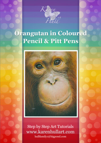
Reference Photo3
IntroductionThe stunning reference photo for this artwork was provided by the very talented andgenerous photographer Thomas Burns who is allowing his fabulous photographs to beused as references by the many artists contributing artworks for the Project Orang-utancause. The full photo can be found on the banner of his Facebook page and is such acaptivating photo, but I decided to crop it down so as to get the full impact of Bunga’ssoulful expression.This artwork was completed using Faber Castell Brush tip Pitt pens in combination withthe coloured pencils and as you will find throughout the tutorial, this can really speed upthe process of doing tricky areas like Bunga’s fur. In the past I have tried using othermarkers to under paint, but after viewing the results of my recent Lightfastness tests, I amsteering away from any other type of marker besides the Pitt pens which performed thebest in this test. This sample was in a sunny window for 15 weeks, and I felt the Pitt Pensheld up reasonably well.4
You can watch a speed drawing of this process on YouTube. For anyone wanting to slowdown this video slightly for learning purposes, you can go tohttp://www.youtubeslow.com/, type in the url of any of my speed drawings and then watchthem at a speed that suits you.I have used a range of different brands of coloured pencils and like always, I stronglyrecommend that you try to work through the tutorial using the pencils you already haveand you may find the Coloured Pencil Conversion Charts helpful in working out whichpencils to substitute from your own range.The Canson Slate Grey Mat board has a very smooth surface. Within Australia, you canbuy this Mat board from most Eckersley’s stores. Within the US, it appears that theCanson Mat Board, such as what is sold at Dick Blick’s is the textured mat board. Youdefinitely don’t need to use the Canson – any mat / mount board that is acid free andconsidered archival and has a smooth surface will give you similar results.Materials List: 8x10 inch Canson Slate Grey Mat / Mount board (You could also use Stonehenge,Fabriano, Illustration Board or whatever your own favourite paper is) Coloured pencilso Faber Castell Polychromos (FC): 101 White, 102 Cream, 103 Ivory, 108Dark Cadmium Yellow, 109 Dark Chrome Yellow, 131 Medium Flesh, 132Light Flesh, 145 Light Phthalo Blue, 154 Aquamarine, 159 Hooker’s Green,169 Caput Mortuum, 170 Apple Green, 172 Earth Green, 179 Bistre, 180Raw Umber, 183 Light Yellow Ochre, 186 Terracotta, 187 Burnt Ochre, 188Sanguine, 189 Cinnamon, 190 Venetian Red, 199 Black, 225 Dark Red, 270Warm Grey I, 272 Warm Grey III, 274 Warm Grey V, 278 Chrome OxideGreen, 280 Burnt Umber, 283 Burnt Siena,o Caran D’Ache Pablos (CD): 001 White, 016 Khaki Green, 025 GreenOchre, 031 Orangish Yellow, 039 Olive Brown, 041 Apricot, 051 Salmon,300 Fast Orange, 371 Bluish Pale,o Prismacolor (PC): 1001 Salmon Pink, 1028 Bronze, 1085 Peach Beige,o Prismacolor Verithins (PV): Black, Dark Brown, Whiteo Derwent Coloursoft (DC): 170 Soft Pink, 560 Peach, Faber Castell Pitt Pens Brush Tip (Optional): 102 Cream, 107 Cadmium Yellow,109 Dark Chrome Yellow, 113 Orange Glaze, 118 Scarlet Red, 120 Ultramarine,132 Light Flesh, 154 Light Cobalt Turquoise, 169 Caput Mortuum, 170 May Green,175 Dark Sepia, 177 Walnut Brown, 180 Raw Umber, 184 Dark Naples Ochre, 186Terracotta, 188 Sanguine, 189 Cinnamon, 192 Indian Red, 199 Black, 247Indanthrene Blue, 264 Dark Phthalo Green. .005 Zig Millenium pen in Pure Brown (or equivalent fine marker) Micron 01 pen in Orange White Transfer paper5
Drafting film or tracing paperKneadable eraserFixative (optional)White gel penHere is a colour chart for the Faber Castell Pitt pens and as you can see the numbers andcolour names correlate with the Faber Castell Polychromo colours.6
Line Drawing7
Transferring your Image8
Use your preferred method for transferring the image from the reference photo, to the matboard. I used drafting film to get a rough outline of the image and then used White transferpaper and a fine knitting needle to transfer the outline to my board.9
Right EyeFirst thing I do is use the (FC) White to mark out all the whites and highlights and I thenwork my way around the eye from lightest to darkest. (FC) Yellow Ochre was used tocolour the golden areas on the right of the eye, the far left and one of the highlights. Thewarm brown area in the middle just below the pupil was coloured using (FC) Terracotta,(FC) Burnt Ochre and (FC) Burnt Siena. The Blue areas were coloured using (FC) LightPhthalo Blue and the green zones using (FC) Hooker’s Green and (FC) Chrome OxideGreen. The darker brown areas were coloured with (FC) Bistre and (FC) Burnt Umber.The lower arc of the eyeball was coloured with (FC) Dark Red and (FC) Caput Mortuum.I then used the (FC) Black to colour in all the black areas. I find you will get darker blacksif you press heavily with your first layer, rather than trying to build your blacks withlighter layers. Finally, I go around and tidy up around all the highlights and edges using(PV) Black (I haven’t yet done this in the image above).Once you have done this, the eye will look more or less finished and if you prefer not touse the Pitt pens, you can move onto the next step, but as you will see in the next image,going over the coloured pencil pigment with the Pitt pens gives a lovely glossy look to theeye and adds a certain richness of colour which is hard to achieve with coloured pencilsalone.In some situations I will use the Pitt pens first and in others I prefer to use them last. If youuse them first, you will find on a surface such as Mat board that the pigment is quickly10
absorbed, and you can’t move it around at all. This method is great where you want to addlarge blocks of solid colour quickly and then add the detail and shading with the colouredpencils later. In the case of the eye, I wanted to be able to move the colour around a bit andalso wanted to add shine to the eye. When the Pitt pens are used over coloured pencil, theydo tend to add a bit of a shine that you don’t get when using the Pitt pens on their own.The Golden beige areas were given a layer of (PP) Raw Umber, the reddish-brown areaswere coloured with (PP) Indian Red. The darker brown areas were shaded using (PP) DarkSepia and (PP) Black was used on the black areas. If you look closely you can see where Iused some coloured pencil and went over the reddish area under the pupil – whilst thislooks glaringly obvious in this enlarged scan, it wasn’t so obvious on the actual drawingand had a softening effect. I did this before the Pitt pens had dried thoroughly. If you waituntil the ink pigment has dried completely, then the transition between pencil and inkwon’t be so obvious.(PP) Dark Phthalo Green was used to enrich the green areas and (PP) Light CobaltTurquoise was used on the Bluish areas. Don’t be too afraid of the Pitt pens – theirpigment is fairly transparent and if you have a tissue or cotton tip handy, you can removeany pigment that you think is too dark if you dab at it quite quickly.11
Once the eye was completed, I used a white gel pen to go back and add a bit of ‘punch’ tothe highlights.Left EyeThis image gives you a good idea of the colours used in my base layers. Once again I startwith the whites and blacks. The lime green you can see in the upper section just to the leftwas coloured using (CD) Khaki Green. The golden area below that was coloured with(FC) Cream, (FC) Dark Cadmium Yellow and (FC) Dark Chrome Yellow. There is also atouch of (CD) Apricot – I used this colour quite extensively around Bunga’s face as it addslovely peachy warmth. I don’t really use my Prismacolors very much, but later you willsee that I use (PC) Salmon Pink for the same reason.Browns just below the pupil and around the eye were coloured using (FC) Bistre and (FC)Burnt Umber. Orange hues were shaded using (FC) Burnt Ochre and (CD) Orange. Thereis also a touch of rust and this was shaded using (FC) Sanguine and (FC) Venetian Red.The touch of blue was added with (FC) Aquamarine.12
The areas that haven’t yet been coloured were mostly coloured using a combination of(FC) Black and (FC) Burnt Umber.In this image the Pitt pens have been used again. The blue at the top of the eye was addedusing (PP) Ultramarine and (PP) Indanthrene Blue. The Greens to the left were colouredusing (PP) May Green and (PP) Dark Phthalo Green. The Golden areas were colouredwith (PP) Dark Naples Ochre, then (PP) Raw Umber was used on the golden beige areas,followed by (PP) Indian Red and (PP) Caput Mortuum on the red brown areas. (PP) Blackwas used for the solid black areas and a mixture of (PP) Black and (PP) Dark Sepia wereused on the more mottled darker areas.Once again the highlights were given a lift with the white gel pen. If you feel thesehighlights are too white, you can soften them with a layer of one of the lighter Pitt pens.Going over the gel pen pigment with coloured pencil can tend to lift up the white ink, butthe Pitt pens will glide over the top leaving just a hint of colour.Working around the Right EyeThe upper eyelid was coloured using (CD) Orangish Yellow, (FC) Dark Cadmium Yellowand (FC) Light Yellow ochre for the golden areas to the right. The Outline was drawn with13
(FC) Black and this outline was shaded and softened with the (FC) Caput Mortuum and(FC) Dark Siena. As we move up and around to the left of the upper eyelid, the coloursused include (FC) Dark Siena, (FC) Dark Chrome Yellow and (CD) Orange. There is alsoa touch of khaki, right above the middle of the eye and this was coloured using (CD)Green Ochre and (CD) Olive Brown. Moving further around and the eyelid is colouredusing (FC) Burnt Umber, Black and even a touch of green with (FC) Chrome OxideGreen.14
The wrinkles under the right eye were drawn in using (FC) Cinnamon for the fleshcoloured outlines and then (FC) Raw Umber and (FC) Bistre for the darker outlines.The lightest areas of each little section (further away from the eye) were shaded usingfrom lightest to darkest, (FC) White, (FC) Ivory, (FC) Cream, followed by more fleshycolours such as (FC) Light Flesh, (FC) Cinnamon and (CD) Apricot.The golden/green colour at the base of some of the patches was coloured using (PC)Bronze. The reddish areas were coloured with (FC) Venetian Red. The brighter red youcan see higher up, just below the outer aspect of the eye was drawn using (FC) Dark Red.Some of the darker peachy tones were shaded using (CD) Salmon.Just below the right eye, where you can see all those rich golden tones, I used acombination of (CD) Fast Orange, (FC) Light Yellow Ochre, (FC) Dark Chrome Yellow(FC) Cinnamon and (FC) Dark Siena.I don’t use any blenders or solvents; I just layer the colours, until a nice solid creamytexture is achieved. I did use (PV) Black to outline all the eyelashes, but as you can see,once I have added the other colours and blended the layers, the eyelashes have lost theirdefinition, however I did add them back in at a later stage.In the next image, you will see that I have used (PP) Dark Naples Yellow and (PP) DarkChrome Yellow to enrich the upper eyelid area, along with the area just below the eye.In the upper part of the image, I shaded using the Pitt pens first, before doing any colouredpencil pigment and this made it a little difficult to soften the outlines when I was blendingcolours around this area. With the other eye, I used more coloured pencil layers first,before using the Pitt pens and this does make it easier to blend surrounding areas as therearen’t those obvious demarcation lines.Looking at the bottom of this image and you can see that I have added (FC) Dark Umberand (FC) Black to the outlines of the wrinkles and you can also see a touch of a light khakicolour which was done using (CD) Green Ochre. The area below that has had initial layersof (FC) Burnt Siena and (FC) Terracotta added.15
16
Between the EyesNow you can see both eyes together and I am starting to work between them. I have used asharp (FC) White and (FC) Ivory and pressed very firmly to leave little indentations forthe lightest areas of the wrinkles on the bridge of the nose. Immediately above each ofthese highlighted areas I have used (FC) Caput Mortuum to add the actual wrinkles.Greens used in this section include (CD) Green Ochre, (CD) Khaki Green, (CD) OliveBrown and (PC) Bronze.The area right at the bottom of the right eye (the bottom left side of the page) has beenfilled in. I used (PP) Raw umber and (PP) Caput Mortuum and roughly drew in a few linesaround the wrinkles and then blended the ink using (CD) Orangish Yellow, (CD) GreenOchre (PC) Bronze and (CD) Fast Orange.To the right of this area, I have used (CD) Olive Brown, (FC) Cinnamon, and (CD)Apricot and the outlines have been done using (FC) Dark Umber.17
Moving up to the top of the Right Eye and I have added some more Pitt pen colours to thecrease of the eye including (PP) Raw Umber and (PP) Caput Mortuum and you can use acotton bud to blend these with the underlying golden colours.Moving over to the right and to the upper bridge of the nose of the lower forehead and Ihave used (PP) Walnut brown and drawn lines fanning out from the upper eye where thecreases go. To the right of this, we go back to the coloured pencils and I have used (FC)Cinnamon, (FC) Dark Umber, and (FC) Burnt Ochre for the initial layers of colour. TheLeft Eye has had the same colours used as the Right eye for the upper eyelid so far.Colours used to blend the area between the two eyes include (FC) Raw Umber, (FC) LightYellow Ochre, (FC) Burnt Siena, (FC) Caput Mortuum, and (FC) Dark Umber. Also usedwere (CD) Olive Brown, (CD) Green Ochre, (CD) Orangish Yellow and (CD) FastOrange.The NoseIn the next step we move down towards the lower nose and nostrils. I have used (FC) DarkUmber to lay down the initial layers of colour for the nostrils then above each nostril used18
(CD) Olive Brown. (FC) White and (FC) Ivory have been used to shade the lightest areas.The pale flesh coloured tones have been added using (FC) Light Flesh and (FC) Cinnamonand to the right you can see some peachy colour, and this was coloured with (CD) Apricot.If you closely compare the previous image and the one below, you should be able to see allthe tiny brown dots I have added on the upper eyelid of the right eye and the area belowthe right eye that connects the nose. If you study the reference photo, these little dots arejust visible. They may be there because I have zoomed in quite a bit on a panoramic photoand so it could be a loss of photo quality that gives rise to these dots, but I still felt theysoftened the overall colour of the Orang-utan’s face giving a more authentic feel to theskin. These little dots were added using a 005 Millemium Zig Permanent Ink pen in PureBrown. These pens can be hard to come by these days and a fine tip Micron Pen in Brownwill do just as well. I have also accentuated the highlights on the upper nose with the whitegel pen.19
Up on the right hand side, on the bridge near the left eye, you can make out where I havegone over the coloured pencil with some lines using (PP) Raw Umber. Even though I didthese lines about 20 minutes before I did the scan, they still appear wet. That wet look willeventually settle down as they do take a while to dry, especially when used over pencil,but if it remains a little too obvious, you can later go back over these lines with thecoloured pencils and they should blend away.Further layers of colour were added to the nose area using all the colours used so far, butwith the addition of (CD) Fast Orange around the septum, and above each nostril. Alsoabove each nostril, I have added some (FC) Apple Green and (FC) Burnt Siena.Again look closely at the area around the nostrils and you can see that I have used my Zigmarker to add a series of tiny dots. I also used an 01 #5 Orange Micron pen to add someorange dots on the septum, but this really isn’t a necessity.More wrinkles have been added between the nose and the left eye and colours used hereinclude (FC) Burnt Umber, (DC) Peach, (CD) Olive Brown, (FC) light Flesh and a touchof (FC) Earth Green. Some areas have a very pale blue green and for these areas, I use20
either the (CD) Olive Brown or the (FC) Earth Green and then lighten them with (CD)Bluish Pale.The ForeheadMoving up to the forehead and the area above the Left Eye, where I have used thefollowing combination of colours: (FC) White, (FC) Ivory, (FC) Light Flesh, (FC)Cinnamon, (CD) Apricot, (CD) Fast Orange and (FC) Medium Flesh and you can see Ihave used a series of short strokes that overlap, following the contours on the face. Eitherside of this area, you can see some greens; to the right, there is just a hint of green and21
these colours include (CD) Khaki Green and (CD) Green Ochre. Towards the middle, Ihave used darker greens including (CD) Olive Brown and (FC) Chrome Oxide Green.Once you have done all the base colouring, I used a (PV) Dark Brown to add some hairs inabove the Left Eye, with long strokes, sweeping up and out.In the above image, the area above the Left Eye has been blended and some darker colourshave been added. I used the (DC) Peach to blend the other colours and have also added(FC) Sanguine, some (FC) Warm Grey III, a touch of (FC) Raw Umber and some (FC)Hooker’s Green and more (CD) Olive Brown.22
The hairs coming out from the middle of the head have had some (FC) Caput Mortuumadded to them. The middle section of the forehead has had more layers of colours addedand these colours are added in short sharp strokes, pushing the colours around and intoeach other – you really don’t need to be precise with your placement of colour – you wanta natural mottled appearance.Colours used here include (FC) Light Yellow Ochre, (FC) Caput Mortuum, (FC) RawUmber, (PC) Bronze, (CD) Burnt Siena, (CD) Green Ochre, (CD) Apricot, (CD) OliveBrown and (CD) Khaki Green.In this step I take a sharp (PV) White and make a series of strokes for the hairs in the coatof Bunga and to show the eyebrows above her Right Eye. Colours used just above theRight Eye are the same as for the Left Eye.If you were to try to do the coat of the Orang-utan with coloured pencil alone, it can betricky trying to reserve your highlights or even trying to add them in later. The beauty ofthe Pitt pens is that they are transparent and do resist the waxiness of the pencils to a23
degree. Once I had laid down a generous number of white pencil lines for the fur I wentback over the fur using the following colours of Pitt Pens in no apparent order, keeping mylines loose and free and overlapping colours: (PP) Orange Glaze, (PP) Dark Naples Ochre,(PP) Terracotta, (PP) Sanguine, (PP) Dark Sepia, (PP) Scarlet Red, (PP) Walnut Brown,(PP) Cinnamon and (PP) Light Flesh.If you find an area looks a bit too dark, you can go over that area with the lighter coloursfrom the Pitt pen range and you will find that this ‘washes’ the colour off the white pencillines and lifts the highlights back out again. Of course, you can also go over the Pitt penpigment with the coloured pencils once it is completely dry.The FurI used (PP) May Green to add some hairs in those areas that meet with the green on theforehead and once the ink has completely dried, I went back over this area with colouredpencils until there was a barely perceptible transition between the forehead and the fur ofthe coat.Because of the lighting in the reference photo, the fur on the right hand side (as we look atit) is much lighter than on the left hand side, so the colours used are a bit lighter andbrighter: (PP) Cadmium Yellow, (PP) Dark Chrome Yellow, (PP) Light Flesh, (PP) RawUmber, (PP) Dark Naples Ochre, (PP) Cinnamon, (PP) Orange Glaze, (PP) Terracotta,(PP) Sanguine and (PP) Scarlet Red.In the above image, you can also see where I have made a start on the muzzle or uppermouth area. Be sure to add the wispy little hairs around the mouth first with a nice sharpwhite.Colours used on the upper mouth area include (FC) White, (FC) Ivory, (FC) Light Flesh,(CD) Apricot, (DC) Peach, (PC) Peach, (PC) Peach Beige, and (CD) Fast Orange. Thelittle dots on the face have been added using (FC) Burnt Ochre and (FC) Terracotta. Hintsof green have been added with (CD) Olive Brown and (CD) Khaki Green.(FC) Burnt Umber has been used for the initial layers of shading down the left-hand side.Moving on to the next image and you can see I have continued to work the fur down bothsides of the face, continuing with the colours already used. I elected to leave out the hint ofa hand and branch that are in the reference photo because I wanted all the focus to be onthe eyes of Bunga but you can certainly add them in if you prefer.On the left had side (as we look at it), I have used (FC) Black and (FC) Dark Umber toblend the area between the face and the fur. You can also use colours such as (FC) CaputMortuum and (FC), Venetian Red and (FC) Bistre, or any other colours you think aresuitable to add random hairs in amongst all the Pitt pen marks.24
The main thing you are trying to do is to make it impossible for the viewer to tell whichmarkings are made by the Pitt pens and which by the pencils Once you have added somepencil markings, you can also go back over these areas, adding richness with the Pitt pensagain.25
I have also used (PP) Light Flesh and (PP) Cinnamon to add some more dots around theupper mouth area. The Light Flesh adds just a hint of colour and gives a lovely subtlety tothe mottled look of the muzzle.The Muzzle26
In the next image, I have used (PP) Black and (PP) Walnut Brown to fill in all the areaunderneath the face with a series of vertical strokes. You won’t be able to see this processon the speed drawing because I turned the picture upside down at this point.In the next image, I have used the following colours and a series of horizontal strokes tofill in the lower mouth area: (on the left) (FC) Burnt Umber, (FC) Caput Mortuum, (CD)27
Olive Brown, (FC) Dark Chrome Yellow, (FC) Sanguine, (FC) Venetian Red and (FC)Dark Red; (on the right) (CD) Fast Orange, (CD) Orangish Yellow and (CD) Green Ochre.The lips have had a bit of colour added, using (FC) White, (FC) Ivory and (FC) LightFlesh.28
Between the above image and the final image, you will see quite a few changes. I haveused (FC) Black and gone back over the area below the face, so that there is a smootherblack appearance, rather than a series of lines. I have also filled in the lower mouth withmany more layers of colour and at this point felt that all my white little hairs had prettymuch disappeared and so I used the white gel pen and a very light touch to draw in a seriesof little hairs all around the lower face. Once the gel pen was thoroughly dry, I then usedthe Pitt pens in colours such as (PP) Dark Naples Ochre, (PP) Terracotta and (PP) RawUmber to add a glaze of colour over these hairs so that they blend back in again.The lips have had more colour added using (DC) Soft Pink, (FC) Warm Grey I, (FC)Warm Grey III, (CD) Apricot, and (FC) Earth Green. Once the lips have been fullycoloured with the coloured pencil, I used the white gel pen to add some highlights.The left side of the upper mouth has been coloured using (FC) Burnt Umber, (FC) CaputMortuum, (CD) Olive Brown, and (CD) Fast Orange. Once all the coloured pencil workhas been finished down the left side of the face, I again used the Zig pen in Pure Brown toadd clusters of tiny dots all along the side.The entire muzzle area has had a decent layer of (PC) Salmon Pink added to it in an effortto try and add more warmth. Once this artwork was completed, and when I compared it tothe reference photo, I still felt it lacked some of the warmth that I could see in the photo,so please feel free to use whatever colours you have on hand to add even more warmth ifyou like.The outline of the lip has been done using (FC) Burnt Umber and (FC) Caput Mortuumand just a touch of black. If you look just below the nose, there are a series of little blackmarkings and these were drawn in using (PV) Black.Use all the pencils we have used so far to blend both sides of the face with the fur on thesides. You really don’t have to be too fussed about which colours to use or the placementof colour – just keep your strokes loose and free and follow the direction of the fur.Once this drawing was finished, I applied three to four light coats of fixative followed bythree to four coats of varnish.I do hope you have enjoyed this tutorial and please don’t hesitate to contact me if you haveany questions.Happy Drawing!Please note, this tutorial is intended for personal use only and is not to be sold or reused in any mannerother than those approved by the author.29
Final Image30
Other TutorialsThe following pages include images and links to tutorials on my website atwww.karenhullart.com.As thanks for purchasing this kit you can use the code 5ed7c490b3 to get 10%discount off your next purchase.31
32
33
34
Once again the highlights were given a lift with the white gel pen. If you feel these highlights are too white, you can soften them with a layer of one of the lighter Pitt pens. Going over the gel pen pigment with coloured pencil can tend to lift up the white ink, but the Pitt pe