Transcription
LIVE FOR N WBRAND GUIDELINESWORK IN PROGRESS3.16.12LIVE FOR N W BRAND GUIDELINES1
SECTION 2:VISUAL ELEMENTSLIVE FOR N W BRAND GUIDELINES9
THE GRIDLIVE FOR N W BRAND GUIDELINES10
LIVE FOR N W BRAND GUIDELINES11
THE GRID IS USED TOEXPRESS THE BRAND ANDTHE EXCITEMENT OF NOW INTHE FOLLOWING MEDIA:OOHTVCPOPDIGITALPRINTLIVE FOR N W BRAND GUIDELINES12
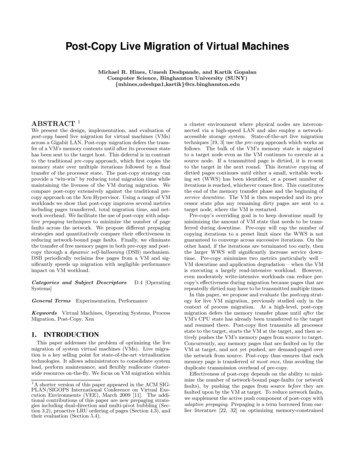
GRID CONTENTSThe 6-box grid will always be composed of these two elements:2 PRODUCT BOXES4 LIFESTYLE IMAGES BOXESTHAT CAPTURE THE EXCITEMENT OF“NOW”LIVE FOR N W BRAND GUIDELINES13
GRID BLUEPRINTThe grid is made up of (1) Pepsi refreshment cues and (2) imagery thatcaptures the excitment and fun of “now”.“Now” ImageProductBox“Now” Image(Can)“Now” ImageProduct Box(Refreshment Cue)“Now” ImageLIVE FOR N W BRAND GUIDELINES14
THE GRID: PRODUCT BOXESLIVE FOR N W BRAND GUIDELINES15
PRODUCT BOXES2 of the 6 grid boxes are dedicated to Pepsi product and refreshment cues.1. Can/Product on Blue Vignette.2. Logo over Condensated Glass or splash.LIVE FOR N W BRAND GUIDELINES16
PRODUCT BOX #1 - CAN ON BLUE VIGNETTELIVE FOR N W BRAND GUIDELINES17
PRODUCT BOX #1 - COLORThe product (can) box should always be on the blue vignetted background. Please request the asset from TBWA\CHIAT\DAY.LIVE FOR N W BRAND GUIDELINES18
PRODUCT BOX #1 - PRODUCT PHOTOGRAPHYRefreshing Taste AppealThe hero grid lockup should always feature the condensated“sweaty” can image with a surface reflection.LIVE FOR N W BRAND GUIDELINES19
PRODUCT BOX #1 - POSITIONING OF CANThe product (can) should always be positioned horizontally and vertically centered within its respective Grid box.Verticallyequal distance.Horizontallyequal distance.LIVE FOR N W BRAND GUIDELINES20
PRODUCT BOX #2 - REFRESHMENT CUELIVE FOR N W BRAND GUIDELINES21
PRODUCT BOX #2 - REFRESHMENT CUEThe second product box is dedicated to a refreshment cue. The approved image is a close-up of a condensated glass with Pepsi being pouredinto it. Please request this asset from TBWA\CHIAT\DAY.LIVE FOR N W BRAND GUIDELINES22
PRODUCT BOX #2 - POSITIONING OF LOGOThe Pepsi logo should always be positioned horizontally and vertically centered within its respective grid box.Verticallyequal distance.Horizontallyequal distance.LIVE FOR N W BRAND GUIDELINES23
THE GRID - PHOTOGRAPHY BOXESLIVE FOR N W BRAND GUIDELINES24
THE GRID - PHOTOGRAPHY BOXESLIVE FOR N W BRAND GUIDELINES25
CAMPAIGN IMAGERY - “NOW” PHOTOGRAPHYLIVE FOR NOW is all about the excitement ofliving in the moment. Each photo that populatesthe grid should feel like a captured moment ofreal people as they’re making the most of now.Each image is an experience people want to bea part of. Our photographs are never staged orgeneric. They OUSUNEXPECTEDMAKING THE MOST OF NOWLIVE FOR N W BRAND GUIDELINES26
TYPOGRAPHYLIVE FOR N W BRAND GUIDELINES33
FUTURA STDFUTURA STD BOLDABCDEFGHIJKLMNOPQRSTUVWXYZ1234567890FUTURA STD stuvwxyz1234567890Font can be purchased at utura std complete pack/LIVE FOR N W BRAND GUIDELINES34
LIVE FOR NOW TAGLINEThe LIVE FOR NOW lockup should always be in Futura Bold Std - ALL CAPS. The Pepsi globe logo should replace the “O” in “Now”.It is the one and only instance to use this look from the “wordplay” art direction.LIVE FOR N WLIVE FOR N W BRAND GUIDELINES35
LIVE FOR NOW TAGLINECORRECT USAGE:The Globe Logo replaces the “O” in “Now” only. Futura STD Bold - All Caps.LIVE FOR N WINCORRECT USAGE:Use the Globe Logo to replace the “O” in “For”.LIVE F R N WINCORRECT USAGE:Do not use a different font weight for the tagline.LIVE FOR N WLIVE FOR N W BRAND GUIDELINES36
HEADLINESALL HEADLINESSHOULD BE WRITTENIN FUTURA STD BOLDALL CAPS.LIVE FOR N W BRAND GUIDELINES39
BODY COPYBody copy shouldalways be written inFutura STD Medium.Always in sentence case.LIVE FOR N W BRAND GUIDELINES40
CAMPAIGN TONELIVE FOR N W BRAND GUIDELINES41
TONE AND MANNERThe language of Live for Now campaign (across all mediums – Film, POS, digital,OOH, Social Media, etc.) should be conversational and fun.Our language isn’t heavy-handed. At every touch point, Pepsi is a spark ofrefreshment (like the drink itself). Encouraging people to have fun, enjoy adelicious Pepsi and make the most of every possible experience happening NOW.WE DO:WE DO NOT:t 4QFBL DPOWFSTBUJPOBMMZt 6TF GFXFS XPSET SBUIFS UIBO NPSFt 4QFBL JO DMJDIÏTt (FU DIFFTZt 5BML BCPVU 1FQTJ JO XBZT OP IVNBO EPFTLIVE FOR N W BRAND GUIDELINES42
TONE AND MANNERPEPSI IS ALSO MORE ABOUTSHOWING THAN TELLING.Our visuals excite consumers to get involved in themoment with images that capture genuine emotionand energize consumers to go out and make themost of now. Language closes the loop, makingPepsi a partner in enjoying each moment.LIVE FOR N W BRAND GUIDELINES43
GRID LAYOUT OPTIONSLIVE FOR N W BRAND GUIDELINES44
GRID LAYOUT OPTIONSThere are three layout options for the LIVE FOR NOW grid. When adapting the grid lockup to specific executions choose the option thatbest fits the media size and space. To get InDesign templates for any of the three grids please request assets from TBWA\CHIAT\DAY.HORIZONTALVERTICALHORIZONTAL - SINGLE LINELIVE FOR N W BRAND GUIDELINES45
THE GRID - HORIZONTAL LAYOUT - HEROThe 3x2 horizontal formatted grid is the hero lockup and should be used whenever possible.LIVE FOR N W BRAND GUIDELINES46
THE GRID - VERTICAL LAYOUTLIVE FOR N W BRAND GUIDELINES47
THE GRID - VERTICAL LAYOUT BLUEPRINTSThe vertical grid compositionallyfollows the same conventions of thehorizontal grid. It is also made upof (1) Pepsi refreshment cues and(2) imagery that captures theexcitment and fun of “now”.“Now” Image“Now” shment Cue)“Now”ImageLIVE FOR N W BRAND GUIDELINES48
THE GRID - SINGLE LINE HORIZONTAL LAYOUTIt is always recommended you try using the horizontal or verical hero grid layouts first. But in some cases you may be required to usethe single line horizontal layout.LIVE FOR N W BRAND GUIDELINES49
THE GRID - SINGLE LINE HORIZONTAL LAYOUT BLUEPRINTSThe single line horizontal grid compositionally follows the same conventions of the horizontal grid.It is also made up of (1) Pepsi refreshment cues and (2) imagery that captures the excitment and fun of “now”.“Now” Image“Now” shmentCue)“Now”ImageLIVE FOR N W BRAND GUIDELINES50
CREATING A GRIDLIVE FOR N W BRAND GUIDELINES51
CREATING A GRIDFirst pick the appropriate grid lockup. InDesign templates can be requested from TBWA\CHIAT\DAY1. HORIZONTAL2. VERTICAL3. HORIZONTAL - SINGLE LINELIVE FOR N W BRAND GUIDELINES52
CREATING A HORIZONTAL GRIDLIVE FOR N W BRAND GUIDELINES53
STROKE WEIGHTFor images at 17” x 11” the grid boxes should be divided by an 8 pt solid white stroke. The strokeweight should scale proportionally to the final size of the grid being used.8 pt strokeLIVE FOR N W BRAND GUIDELINES54
ADDING TYPOGRAPHY - STEP 1The alignment of the “LIVE FOR NOW” tagline is critical to successful executions of the grid. Start by adding “NOW” to thebottom 3 boxes, making sure that each letter (or logo) is horizontally and vertically centered within its respective grid box.Verticallyequal distance.Horizontallyequal distance.Horizontallyequal distance.Horizontallyequal distance.LIVE FOR N W BRAND GUIDELINES55
ADDING TYPOGRAPHY - STEP 2Add the word “LIVE” to the upper left box of the grid, making sure to keep it horizontally and vertically centered within itsrespective box. “LIVE” should be left justified with the “N”, and the tracking and kerning should open the letters to wherethe right edge of the “E” is vertically aligned with the left side of the logo.Horizontallyequal distance.Verticallyequal distance.“L” and “N” are aligned.“E” and logo are aligned.LIVE FOR N W BRAND GUIDELINES56
ADDING TYPOGRAPHY - STEP 3Add the word “FOR” to the upper right box of the grid making sure to keep it horizontally and vertically centered within itsrespective box. “FOR” should be left justified with the left side of the “W” and the tracking and kerning should open theletters to where the right edge of the “R” is vertically aligned with the right side of the “W”.Horizontallyequal distance.Verticallyequal distance.LIVE and FOR should bethe same font size.“F” and “W” are aligned.“R” and “W” are aligned.LIVE FOR N W BRAND GUIDELINES57
ADDING REFRESHMENT CUESMake sure the can and logo are horizontally and vertically centered within their respective grid boxes.Horizontallyequal distance.Verticallyequal distance.Verticallyequal distance.Horizontallyequal distance.LIVE FOR N W BRAND GUIDELINES58
ADDING “NOW” IMAGERYThe grid works like a puzzle, and it is important to select the right images to fill the “Now” boxes of the grid. A mix ofclose-ups and wides works best.LIVE FOR N W BRAND GUIDELINES59
ADDING “NOW” IMAGERYDO NOT USE: more than one image of a person in the same grid. The intention of the grid is to always show several“NOW” moments of people everywhere. Themes are ok to use, for example music or sport, but never the same person inmore than one box.LIVE FOR N W BRAND GUIDELINES60
ADDING “NOW” IMAGERYDO NOT USE: blown out images or images with too much white space. Doing so will reduce legibility of the words.LIVE FOR N W BRAND GUIDELINES61
CREATING A VERTICAL GRIDLIVE FOR N W BRAND GUIDELINES62
STROKE WEIGHTFor images at 17” x 11” the grid boxes should be divided by an 8 pt solid white stroke. The strokeweight should scale proportionally to the final size of the grid being used.8 pt strokeLIVE FOR N W BRAND GUIDELINES63
ADDING TYPOGRAPHY - STEP 1The alignment of the “LIVE FOR NOW”tagline is critical to successful executions of thegrid. Start by adding “NOW” to the bottom 3boxes, making sure that each letter (or logo) ishorizontally and vertically centered within itsrespective grid box.Verticallyequal distance.Horizontallyequal distance.Horizontallyequal distance.LIVE FOR N W BRAND GUIDELINES64
ADDING TYPOGRAPHY - STEP 2 ADD REFRESHMENT CUESHorizontallyequal distance.In the case of the vertical grid, it is importantto add the product boxes and refreshment cuesnext. Maying sure to horizontally and verticallyalign the logo and can within their respectiveboxes.Verticallyequal distance.Verticallyequal distance.Horizontallyequal distance.LIVE FOR N W BRAND GUIDELINES65
ADDING TYPOGRAPHY - STEP 3The left sides of the “F” and “L”should be vertically alignedThe right sides of the “E” and thecan should be vertically alignedHorizontallyequal distance.Add the word “LIVE” to the upperbox of the grid, making sure to keepit horizontally and vertically centeredwithin its respective box. Add the word“FOR” to the left middle box alsomaking sure to keep it horizontallyand verticall centered in its box. “LIVE”should be left justified with the “F”,and the tracking and kerning shouldopen the letters to where the rightedge of the “E” is vertically alignedwith the right side of the can.Verticallyequal distance.LIVE FOR N W BRAND GUIDELINES66
ADDING “NOW” IMAGERYThe grid works like a puzzle, and it isimportant to select the right images to fillthe “Now” boxes of the grid. A mix ofclose-ups and wides works best.LIVE FOR N W BRAND GUIDELINES67
CREATING A SINGLEHORIZONTAL GRIDLIVE FOR N W BRAND GUIDELINES68
STROKE WEIGHTFor images at 17” x 11” the grid boxes should be divided by an 8 pt solid white stroke. The strokeweight should scale proportionally to the final size of the grid being used.8 pt strokeLIVE FOR N W BRAND GUIDELINES69
ADDING TYPOGRAPHY - STEP 1Add the LIVE FOR NOW tagline making sure all type in the single horizontal format is the same font size.All type issame sizeequally sameheight of allletters.LIVE FOR N W BRAND GUIDELINES70
ADDING TYPOGRAPHY - STEP 2The alignment of the “LIVE FOR NOW” tagline is critical to successful executions of the grid. All words and letters should behorizontally and vertically centered within its respective grid box.Verticallyequaldistance.Horizontallyequal distance.Horizontallyequal aldistance.Horizontallyequaldistance.LIVE FOR N W BRAND GUIDELINES71
ADDING REFRESHMENT CUESMake sure the can and logo are horizontally and vertically centered within their respective grid tance.LIVE FOR N W BRAND GUIDELINES72
ADDING “NOW” IMAGERYThe grid works like a puzzle, and it is important to select the right images to fill the “Now” boxes of the grid.A mix of close-ups and wides works best.LIVE FOR N W BRAND GUIDELINES73
SECTION 3:BEYOND THE GRIDGUIDELINES FOR POS AND OTHER EXECUTIONSLIVE FOR N W BRAND GUIDELINES74
ADAPTING THE GRID TO OTHER EXECUTIONSThe grid lockup on all POS and other media should ONLY be used to house the “Live For Now” Tagline .LIVE FOR N W BRAND GUIDELINES75
EXTENDING THE HORIZONTAL GRIDA single extention box can be added to the grid to adapt for POS and other executions. This box should houseall the content and messaging needed for the respective media.Extension box for content“Now” ImageLIVE FOR NOW grid lockup“Now” ImageRefreshmentCue(CanOver)Refreshment Cue(Logo Over)“Now” Image“Now” ImageLIVE FOR N W BRAND GUIDELINES76
EXTENDING THE VERTICAL GRIDA single extention box can be added to the grid to adapt for POS and other executions. This box should houseall the content and messaging needed for the respective media.“Now” ImageExtension box for content“Now” shment Cue)LIVE FORNOWgrid lockup“Now”ImageLIVE FOR N W BRAND GUIDELINES77
EXTENDING THE SINGLE LINE HORIZONTAL GRIDA single extention box can be added to the grid to adap
BRAND GUIDELINES 43. PEPSI IS ALSO MORE ABOUT SHOWING THAN TELLING. Our visuals excite consumers to get involved in the moment with images that capture genuine emotion and energize consumers to go out and make the most of now. Language closes the loop, making Pepsi a partner in enjoying each moment. TONE AND MANNER