Transcription
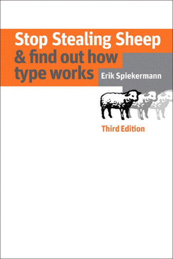
1Stop Stealing Sheep
This page intentionally left blank
3Stop Stealing Sheep& find out how type worksThird EditionErik Spiekermann
Stop Stealing Sheep& find out how type worksThird EditionErik SpiekermannThis Adobe Press book ispublished by Peachpit,a division of Pearson Education.For the latest on Adobe Press books,go to www.adobepress.com.To report errors, please send a note toerrata@peachpit.com.Copyright 2014 by Erik SpiekermannAcquisitions Editor:Production Editor:Proofer:Indexer:Cover Design:Nikki Echler McDonaldDavid Van NessEmily WolmanJames MinkinErik SpiekermannNotice of RightsAll rights reserved. No part of thisbook may be reproduced or transmittedin any form by any means, electronic,mechanical, photocopying, recor ding, or otherwise, without the priorwritten permission of the publisher.For information on getting permissionfor reprints and excerpts, contactpermissions@peachpit.com.Notice of LiabilityThe information in this book is distri buted on an “As Is” basis without warranty. While every precaution hasbeen taken in the preparation of thebook, neither the author nor Peachpitshall have any liability to any personor entity with respect to any loss or damage caused or alleged to be causeddirectly or indirectly by the instructionscontained in this book or by the com puter software and hardware productsdescribed in it.TrademarksAdobe, Photoshop, Illustrator,PostScript, and CoolType are registeredtrademarks of Adobe SystemsIncorporated in the United States and/orother countries. ClearType is a trade mark of Microsoft Corp. All other trademarks are the property of theirrespective owners.Many of the designations used by manufacturers and sellers to dis tinguishtheir products are claimed as trademarks.Where those designations appear inthis book, and Peachpit was aware of atrademark claim, the designations appearas requested by the owner of the trade mark. All other product names and services identified throughout this bookare used in editorial fashion only andfor the benefit of such companies withno intention of infringement of the trademark. No such use, or the use of anytrade name, is intended to conveyendorsement or other affiliation withthis book.ISBN 13: 978-0-321-93428-4ISBN 10: 0-321-93428-8987654321Printed and boundin the United States of America
5Page 8Chapter 1Type is everywhere.Type exists. It is a fundamental part of our lives. These simplefacts are essential to under stan ding how to communicate moreeffectively.262What is type?Between type’s past and its future, our present understandingof type is rooted in who we are and how we communicate.Type is a living enti ty integrated into society’s moods and trends.383Looking at type.Training the eye to recognize type begins with familiar elementson the page. Looking at type from the basic shapes to the finestdetails is the first step toward understanding how type works.604Type with a purpose.Choosing typefaces for a particular purpose need not bemore intimidating than planning your ward robe. Matching anappropriate typeface with the right task is easy.785Type builds character.Understanding the tone, or feeling, of text is essen tial indetermining what typeface to use, and how it might be arrangedon the page.1026Types of type.Once understood, basic characteristics of typefaces can eliminatedifficulty with typeface identification. Simple distinctions amongtypefaces are best understood by analogy to human counterparts.1347How it works.Legible, readable type depends on a few basic principles: spacebetween individual letters and around words. Choosing the righttypeface for the right text also means using the right spacing.1548Putting it to work.Considering where type is going to live and work will determine itseffectiveness. Follow simple rules of placement to create practicalpage layouts.1729Type on screen.Type on screen used to be the poor sister of type for print.While technical restraints remain, there are no more excuses forchoosing an inappropriate typeface for any project that will appearon a screen.18010There is no bad type.Type is a basic element of communication. As the means ofcommunicating changes, type evolves in unique and lively ways.19611Final form.Bibliography, list of typefaces, index.
7stealing sheep? Letterspacing lowercase? Professionals in all trades, whether they be dentists, carpenters, or nuclear scientists, communicate in languages that seem secretiveand incomprehensible to outsiders; type designers and typographers are no exception.Typographic terminology sounds cryptic enoughto put off anyone but the most hard We see so much typenosed typomaniac.The aim of this bookthat we sometimesstop looking. This isis to clarify the language of typographynot necessarily afor people who want to communicatebad thing, as in thecase of this sign,more effectively with type.which tells us thatThese days people need betterwe may not enterthis street betweenwaysto communicate to more diverse eleven and six, norbetween eleven and audiences. We know from experiencesix, and certainlythat what we have to say is muchnot between eleven easier for others to understand if weand six.put it in the right voice; type is that voice,the visible language linking writer and reader.With thousands of typefaces available, choosingthe right one to express even the simplestidea is bewildering to most everyone but prac ticed professionals.Familiar images are used in this book toshow that typography is not an art for the chosenfew, but a powerful tool for anyone who hassomething to say and needs to say it in print oron a screen.You will have ample opportunityto find out why there are so many typefaces, howthey ought to be used, and why more of themare needed every day.See the changesmade to the signin the last twodecades: thesmall picture onthe right isfrom this book’sfirst edition,printed in 1992;the one onits left is fromthe second edition in 2003.This is a sidebar. As you can seeby the small type, the copy hereis not for the faint of heart, nor forthe casual reader. All the infor mation that might be a little headyfor novices is in these narrow columns; it is, however, right athand when one becomes infectedby one’s first attacks of typomania.For those who already know some thing about type and typographyand who simply want to checksome facts, read some gossip, andshake their heads at my opinion ated comments, this is the space towatch.In 1936, Frederic Goudy was inNew York City to receive an awardfor excellence in type design.Upon accepting a certificate,he took one look at it and declaredthat “Anyone who would letter space black letter would stealsheep.” Goudy actually usedanother expression, one unfit forprint. This was an uncomfort able moment for the man sittingin the audience who had hand lettered the award certificate.Mr. Goudy later apologized profusely, claiming that he saidthat about everything.You might have noticed that mybook cover reads “lower case,”while here it reads “black letter”–two very different things. Lowercase letters, as opposed to C APITAL LETTERS, are what youare now reading; black letterisn’t seen very often and lookslike this.I’m not sure how “black letter”in this anecdote got changedto “lower case,” but I’ve alwaysknown it to be the latter; which ever way, it makes infinite sense.By the time you finish this bookI hope you will understandand be amused by Mr. Goudy’spronouncement.
paul watzlawickPaul Watzlawick(1921–2007) is authorof Pragmatics ofHuman Communication,a book about the influence of mediaon peoples’ behavior.“One cannot not communicate” isknown as Watzlawick’sFirst Axiom ofCommunication.EquityOne cannot notcommunicate.
Chapter 4ff Unit Regular ItalicType witha purpose.
63You know what it’s like. It’s late atnight, your plane leaves at 6 am, you’re stillpacking, and you just can’t decide what to putinto that suitcase.Picking typefaces for a design job is a verysimilar experience. There are certain type faces you are familiar with. You know how theywill behave under certain circumstances, andyou know where they are. On the other hand,there are those fashionable types that you’vealways wanted to use, but you’re not quite sure ifthis job is the right one to experiment on. Thisis just like choosing which shoes to take on yourtrip – the comfortable ones are not the heightof fashion, but the fashionable ones hurt. Youmight be able to stand them for a short reception,but not for shopping, let alone for a hike intothe countryside.Before you pack your font suitcase, youneed to look at the task ahead. Strike a balancebetween practicality and aesthetics – that’swhat design is all about.Gulliver is Gerard Unger’s solution for many problems innewspaper design and pro duction. It fits 20% more copyinto the columns without sacri ficing legibility and is sturdyenough to be carelessly printedon recycled paper. Quite afew newspapers around theworld use it to good effect.Coranto is Unger’s latest type face for newspapers. Designedin 2000, it is being used forThe Scotsman as well as news papers in Sweden and Brazil.Tobias Frere-Jones’ work onPoynter was sponsored bythe Poynter Institute to answerthe same question. He askedhimself: how to retain copywithout losing readers?As we read best what we readmost, the designer stuck tofamiliar forms and returned toHendrik van den Keere’s seventeenth-century oldstyleroman. As different methods ofreproduction and printingmay add or reduce weight by afraction, Poynter OldstyleText is offered in four grades.While nobody has ever classifiedtypefaces according to their problem-solving capabilities,many typefaces we use today wereoriginally designed for parti cular purposes. Some of them arementioned on page 33, but thereare many more. Times New Romanwas specially produced in 1931for the London newspaper thatgave its name to the typeface.In the late 1930s, Mergenthaler Linotype in the USA (led byChauncey H. Griffith) developeda group of five typefaces designedto be legible despite the rigorsof newspaper printing. They were,not surprisingly, called the “Legibility Group,” and two of themare still very popular today:Corona and Excelsior. It mightseem odd that legibility has to bea special concern when designinga typeface, but there are plentyof fonts around that are meant tobe seen, not read; these typefacesare very much like clothes thatlook great but barely protect thewearer from the elements.HandglovesT i m es New R o m a nHandglovesCo r o n aHandglovesE xc el si o rHandglovesG u lliverHandglovesCo r a ntohand hand hand handHandglovesPoynter text one Poynter text two Poynter text three Poynter text fourP oynter Ol dst yl e B o l d
65Going on vacation doesn’t necessarily mean travelingto a warm climate, but it always means we can leave behindmany of our conventions, including the way we normallydress — or have to dress, as the case may be.You pick yourclothes according to what is practical: easy to pack, easy toclean, and according to what is fun: casual, colorful,loose, and maybe a little more daring than what you wouldwear in your hometown. The typographic equivalents arethose typefaces that are comfortable to read, but which may bea little more idiosyncratic than your run-of-the-mill stuff.Serifs, too, can be casual, and “loose fit” is actually a type setting term describing letters that have a comfortable amountof space between them. As it happens, quite a few of the veryearly typefaces from the Renaissance and their modern equivalents fit that description. They still show their kinshipwith Italian handwriting, which by necessity had to bemore casual than rigid metal letters. If you were a scribe inthe papal office and had to write hundreds of pages every day,you wouldn’t be able to take the time to fuss over formal capitals. So the scribes developed a fluent, cursive hand writing, which today we call italic, because it was invented inItaly. You will have noticed that this whole page is set ina script font, and it feels quite comfortable. A conventionalrule says that you can’t set whole pages, let alone books, in the italics of a typeface. The only reason it might not work isbecause we’re not used to it. As pointed out on page 41, weread best what we read most. But that’s no reason not totake a vacation from our daily habits and look at somethingdifferent, at least once a year.Some typefaces have a leisurelylook about them while conformingto everyday typographic expecta tions. Others were born withunusual, yet casual, shapes andmake the best of it.Stempel Schneidler combinesfriendly letter shapes withhigh legibility – you can use itevery day without it becomingrestrictive like a necktie.A typeface that looks casual, even“nice,” but is still good for realwork is ITC Flora. It was designedby the Dutch type designer GerardUnger in 1980 and named after hisdaughter. Ellington, released in1990, is a design by Michael Har vey, the English lettering artistand stone carver. Both typefacesare quite unusual and thereforenot often thought of as useful textfaces. But they are.Many typefaces designed to look“friendly” tend to appear patro nizing. They can be so nice thatyou quickly get tired of them.When you’re looking for casualtypefaces, the obvious candidatesare, of course, the scripts. Most,however, are not suited to longspells of reading, just as sandalsare very comfortable, but notwhen walking on rocky roads.HandglovesStem p el S c h n ei dl erTo make a typeface lookas casually elegant asFF Fontesque takesa lot of experience andeffort. Nick Shinndesigned Fontesque in1994. It wasn’t his firstdesign, and it shows. Cafeteria indeed startedon Tobias Frere-Jones’ napkin, and he managedto balance activitywith legibility in this freeform sans serif face.Handglovesitc Flo r aHandglovesEll i ngto nHandglovesff Fo ntesq u eHandglovesfb Ca feter i a
67Most type is used for business communication of onesort or another, so it has to conform to both written andunwritten rules of the corporate world. Just as business people are expected to wear a suit (plus, naturally, a shirtand tie), text set for business has to look fairly serious andgo about its purpose in an inconspicuous, well-organizedway. Typefaces, such as Times New Roman and Helveticafit this bill perfectly, not by their particular suitability butmore by their lack of individualism.However, just as it is now permissible in traditio nal business circles to wear fashionable ties and toeven venture into the realm of Italian suits that arenot black or dark blue, typographic tastes in thosecircles has widened to include other typefaces, fromPalatino to Frutiger.Generally, it is very simple to classify a particular business by the typefaces it prefers: the more technicala profession, the cooler and more rigid its typefaces(Univers for architects); the more traditional a trade,the more classical its typefaces (Bodoni for bankers).The trouble is that there is no law against specu lators employing a true classic, trustworthy typeface intheir brochures, lending these unsavory entities typographic credibility, although nothing else.To show the subtle differencesbetween fonts at this size,we’veset the copy at left in a variety oftypes, one for each paragraph.Handgloves at the bottom of thiscolumn shows them in sequence.Frutiger, originally designedin 1976 by Adrian Frutiger for thesignage at the Charles de Gaulleairport in Paris, has become one ofthe most popular typefaces for corporate use.Palatino, designed by HermannZapf in 1952, owes its popularity –especially in the USA – largelyto its availability as a core fonton PostScript laser printers. It is nevertheless a welcome alter native to other, less suitable, seriffonts.Adrian Frutiger designed Universin 1957. It was the first typefaceto be planned with a coordinatedrange of weights and widths, comprising twenty-one relateddesigns, recently expanded to 59weights (see page 89).ITC Bodoni is one of many rede signs of Giambattista Bodoni’sclassic typefaces from the lateeighteenth century. It shows morecolor and stroke variations thanother Bodoni revivals, and is available in three versions for different sizes.67HandglovesHandglovesF r utig e ritc B o do n i si xHandglovesHandglovesPal atin oitc B o do n i t welveHandglovesHandglovesUn ive r sitc B odo n i sevent yt wo
①FF Unit Medium③6969TH E RE A L WORK H O R SE②If it were just a little heavier,News Gothic by Morris FullerBenton, 1908, would be afavorite workhorse typeface.ITC Franklin Gothic, a1980’s re-design of Benton’soriginal typeface from 1904,has more weights as well asa condensed and a compressedversion plus small caps.Lucas de Groot designed hisThesis family from the out set with 144 weights. The ThesisSans family has become analternative to Frutiger in cor porate circles, as it is both neu tral and versatile. Lucida Sans,by Kris Holmes and CharlesBigelow, 1985, has sturdy, rug ged letter shapes. Its sistertypeface, Lucida, remains oneof the best choices for businesscommunications printed onlaser printers and fax machines.ff Meta has been called the“Helvetica of the 90s”. Whilethat may be dubious praise,Meta is a warm, humanist alter native to the classic sans faces.Lots of detail make it legiblein small sizes and “cool”rather than neutral. You shouldalso look at the condensedweights of Frutiger as useful,but underused alternatives.FF Profil is one of a new gene ration of modern sans faces.Designed by Martin Wenzelin 1999. PTL Skopex Gothic isAndrea Tinnes’ take on the classic Angloamerican genre,it gives News Gothic an inte resting twist. Calling a typeface “a real workhorse”doesn’t mean that others don’t work, itjust means that it is one of those that don’tlook very glamorous and is consequently ④HandglovesHandglovesNews Gothichowever, are used every day by designersHandglovesHandglovesand typesetters because of their reliability.ITC Franklin Gothicnot likely to be known by name; such types, If you set a catalog for machine parts,or instructions for using a fire extinguisher,you’re not worried about subtly curved serifs or classicist contrast. You need letters that are: clearly distinguishable;compact, so enough of them fit into a limited space (is there ever enough space?);HandglovesHandglovesThesis SansHandglovesHandglovesInterstaterigors of printing and copying. Here’s whatHandglovesHandglovesis needed in a hardworking typeface:Gothamand sufficiently sturdy to withstand the① A good regular weight – not so light thatit will disappear on a photocopy (every thing, it seems, gets copied at least oncethese days), and not so heavy that the letter shapes fill in.② At least one bold weight, with enoughcontrast to be noticed, to complement theHandglovesHandglovesFF MetaHandglovesHandglovesFF Meta Condensed③ Very legible numerals – these must beHandglovesHandglovesparticularly robust because confusingFrutiger Condensedregular weight. figures can be, in the worst of cases, down right dangerous.④ Economy – it should be narrow enoughto fit large amounts of copy into the avai lable space, but not actually compressedbeyond recognition. A typeface fittingthis description would also fare very wellwhen faxed.ff Mark BoldHandglovesHandglovesFF ProfileHandglovesHandglovesPTL Skopex GothicHandglovesHandglovesITC Officina
OneThere is no category known as“formal fonts,” but a numberof typefaces come from that back ground. The text at the left is setin Snell Roundhand, a formalscript from the 1700s, redesignedin 1965 by Matthew Carter.of the few sanctuaries for oldaristocratic traditions isSociety. Snell RoundhandApart from formal scripts suchas Snell, Künstler Script, and others like it, there are theaptly named copperplates. Theylook formal and distinguishedand are even available in a rangeof weights and versions, butthey all lack one important feature:lowercase characters.Top hats,cummerbunds, patentleather shoes,and coats with tails are allremnants of the eighteenth century,when countries were run bykings and queens who spoke French toeach other and their entourages. Other typefaces that owe theirappearance to the process of engra ving into steel as opposed to writing with a quill or cuttinginto wood are Walbaum, BauerBodoni, or ITC Fenice. Theycan look formal and aristocraticenough to make a favorableimpression when printed onfine paper.Snell RoundhandnotFF Scala Jewelsmuch of that remains,except for maîtresd’hôtel at posh restaurants who fake Frenchaccents and wear coats with tails.Künstler Script Of CourseWhile FF Scala Jewels is an exten sion of the FF Scala family by Martin Majoor from 1993, which isa contemporary interpretation ofclassic book typefaces, Mrs. Eavesis Zuzana Licko’s idiosyncratictake on Baskerville, as seen fromBerkeley, California in 1996.It is named after Sarah Eaves, thewoman who became John Baskerville’s wife. Licko’s MatrixScript Inline from 1992 gets closerto American vernacular, andRudy VanderLans’ 1993 Suburbanconnects classic scripts with,well, suburban neon signs. And,as VanderLans proudly proclaims,Suburban is the only typefacein existence today that uses anupside down l as a y.Mrs. EavesFrench is still the official languageof the diplomatic corps. Typographically speaking,we have reminders of these somewhatantiquated traditions in the accepted and expected waysof designing invitations and programs.Mrs. Eaves Italic centered type anda preference for fonts that comefrom a good background incopper engraving orupper crust calligraphy.Copperplate And, of course,Matrix Script Inlinethose very familiar four letters, »rsvp«, which mean»please let us know whether you’re going to be there,«but actually stand for »Répondez s’il vous plaΩît.«Suburban Light 71
on the townFutura73Going out on the town allows us to do the thingswe don’t get to do in the office,and to wear all the trendy stuff that we can neverresist buying but don’t really need on a day-to-day basis.What makes typefaces trendy isLyon TexttypetrendsTheinhardtFF Din /There are typefaces that are only suitableFF DIN Condensedfor the more occasional occasion. Theymight be too hip to be used for mainstreamalmost unpredictable – much tothe chagrin of the people who haveto market them. A corporation, amagazine, a TV channel can pick atypeface, expose it to the public,and a new typographic fashioncan be born. But, like with fashionand pop music, it usually takesmore than one designer in theright place at the right time pick ing the right font off a web siteor out of a catalog.Typography is as much a mirrorof what goes in society as thebe too uncomfortable – a bit like wearing styling of cell phones or cars.Cars still take half a dozen yearsvery tight jeans rather than admitting thatfrom concept to p roduction, sothey don’t fit us any longer. Very oftentheir designers have to anticipatetrends. As cars are the icons of ourthese offbeat fonts are both – tight in the crotchmobile society, their design, inand extroverted.turn, does create trends. Whiletechnology allows us to produce afont in weeks – if not hours – fromInterstate Bold Condensedrough sketches or ideas, it stilltakes a few years for a typeface toget to market and to the attentionof the font-buying public. Rightnow, early in the 21st century, weare seeing a return to the timehonored classics and their moderninterpretations. We have alsolearned to live with bitmaps, bothInterstate Lightas a necessity and as a fashionThe entertainment value of this sort of typographical workstatement. Most industrial type is often higher than that of the straightforward corporate stuff, styles have been exploited, frommonospaced typewriter facesso there’s a great deal of satisfaction gained not only fromthrough electronic font generatorsthe words, but also from the fun of being able to work with really to industrial signage. And some ofthe most used typefaces were firstunusual fonts. produced for the signs above orfreeways. Interstate is TobiasGraphikFrere-Jones’ interpretation ofthe white-on-green letters in theNeue Helvetica 75USA, while FF Din expandsthe model used on G ermany’sOne thing leather jackets have on trendy typefaces isthat the jackets get better as they get older, which is more autobahn. Ironically, if a typefacehas been designed for one par than can be said about some of the typefaces we lovedin the 1980s but would be too embarrassed to ask for now. ticular purpose, it seems to lookreally good on anything else.Like all fashions, however, they keep coming back.communication, or they could simplyFUNFONTSFashionable facesDon’t throw away your old fonts – keep them for your kids.
75As long as you print on paper, the choice oftypeface is first and foremost governed by thecontent of the message, then the intended audi ence, and only lastly by technical constraints.When we move from almost limitlessArchitectural typehas to compromiseresolution on paper to images gene between mate rialsrated by cathod rays or liquid crystals,and legibility.A mosaic made upwe enter a world of optical illusions.of millions of piecesThose have to make up for the lack ofwould allow forsmoother letter high fidelity and trick our eyes intoshapes, but would seeing life-like images rather than spotsneither be as durable nor asof colored light (see page 132). On theaffordable asscreen, colors are not mixed fromone with coarserbits.cmyk: cyan, yellow, magenta, and black(the k really stands for key), but are broken downinto rgb: red, green, and blue; letters are com posed of course lines or dots, and black is not anink, but the absence of light. Typefaces have towork very hard under these conditions. There isno room here for leisure fonts, nor for scripts orsome of the trendy faces that hide more than theyreveal. The workhorses for “old” media workwell in the new. Rugged construction, clear coun ter spaces, easily discernible figures and welldefined weights have all been mentioned beforeas being prerequisites for anything which has tobe read under less than ideal circumstances.And whatever progress technology brings in thefuture – staring into light coming from a screenis not what human eyes were made for.Matthew Carter’s Verdana hasbecome a very successfulface on paper as well, whileBigelow & Holmes’ Lucida, initially designed for laser printers in 1983, looksalso great in high-resolutionand is one of the best screenfonts around. FF Typestarby Steffen Sauerteig has thoserugged shapes reminiscentof typewriter faces and suitedfor rough conditions onscreen or paper.HandglovesLook at these faces at very small sizes and you getan idea of how they will perform on screen.HandglovesLook at these faces at very small sizes and you getan idea of how they will perform on screen.HandgloveLook at these faces at very small sizesand you get an idea of how they willperform on screen.All those minute details that makea good typeface pleasant to beholdand easy to read, actually addnoise. The absence of these detailswould make the type look coldand technical, as if generated bymachines and legible only formachines.The designer of typefaces suit able for on-screen readinghas to balance the requirementsof the precise but cold medium(light emitted by all sorts of tubes,crystals, diodes, and plasms)against our need for subtle con trast and soft shapes. And as mostof what we read on screen even tually gets printed as well, thesealphabets have to offer enoughtraditional beauty for us to acceptthem against the competitionwe’ve grown used to over 500years.Slightly extended lettershapeshave more open counters andare thus more legible, but needmore space. Subtle contrastbetween thin horizontals andthicker verticals doesn’t translatewell into single pixels and tiny serifs may look delicate in displaysizes, but on a screen will onlyadd noise at 10pt or less.The screen fonts offered by Microsoft and Apple work wellunder all circumstances, buthave become too ubitiquous tolend an individual note.And if a text is mainly meantfor the screen and for verysmall sizes, pure bitmapfonts work well. If you printthem, the pixels are small enough to all but dis appear.This is 7pt Tenacity Condensed, a bitmap fontfrom Joe Gillespie.
77Brands have to speak their own authenticlanguage. Type is visible language. Using a blandor overused typeface will make the brand andits products or media equally bland and eveninvisible. Having an exclusive typeface designedor adapted used to be expensive, technically challenging, and difficult to implement. Not any more. Whether it’s just one weight for a packagedproduct or a large system for everything, cor porate fonts have become a major source of workfor type designers.Some companies take an existing face andsimply change the name to make it more identi fiable – license models exist for that purpose.While they’re at it, they often add their logo orother glyphs that can then be accessed via thekeyboard. And if the chairman (or his wife)doesn’t like the shape of a certain character, thatcan also be adapted. All with the blessing andpreferably the involvement of the originaltype designer. As a lot of these people are no longer available (think Bodoni, Caslon, or Garamond), the foundry that has the license forthe particular typeface will be happy to help.In 1990, Kurt Weidemanndesigned a trilogy of faces for Mercedes-Benz that was, in fact,a comprehensive system for alltheir brands and subbrands. Corporate A stands for Antiqua,the serif version for the car brand;S is Sans, intended for the trucksdivision; and E is Egyptienne,the slab typeface for the engi neering group. This was the firsttypographic tribe, a family of families. It is no longer exclusiveto Mercedes-Benz, so every backstreet garage can now have atleast a premium name over thedoor.HandglovesCo r p o r ate AHandglovesCo r p o r ate SHandglovesCo r p o r ate ESilicon Valley Bank took the easierroute: they chose FF Unit andFF Unit Slab, changed the name foreasier recognition, and got alicense to distribute it to their suppliers and branches.Ha
book may be reproduced or transmitted in any form by any means, electronic, mechanical, photocopying, recor ding, or otherwise, without the prior written permission of the publisher. For information on getting permission for reprints and excerpts, contact permissions@peachpit.com. Notice of LiabiLity