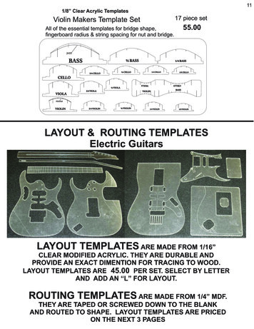
Transcription
P1: OTA/XYZP2: ABCc05JWBT214-ParmenterDecember 23, 200918:2Printer Name: Yet to ComeCHAPTER5Templates for ReportingPerformance MeasuresThe reporting framework must accommodate the requirements of different levels in the organization and the reporting frequency that supports timely decision making. This chapter presents some better-practice formats that will help speedup this vital step.This chapter should be read in conjunction with thewhitepapers and books written by Stephen Few, see www.perpetualedge.com.Reporting Key Result Indicatorsin a Dashboard to the BoardA dashboard should be a one-page display, such as the examples in Exhibits 5.1 and 5.2. The commentary should be includedon this page.A good dashboard with the key result indicators (KRIs) going in the right direction will give the board confidence thatmanagement knows what it is doing and that the ship is beingsteered in the right direction. The board can then concentrateon what it does best: focusing on the horizon for icebergs inthe first-class lounge instead of parking themselves on the ship’s155
P1: OTA/XYZP2: ABCc05JWBT214-ParmenterDecember 23, 200918:2Printer Name: Yet to ComeKey Performance IndicatorsEXHIBIT 5.1 Nine-Graph Dashboard Examplebridge and getting in the way of the captain, who is trying toperform the important day-to-day duties. Ten examples of KRIboard dashboard graphs can be found in Exhibit 5.3.Customer SatisfactionCustomer satisfaction needs to be measured at least every threemonths by using statistical samples and focusing on your top10% to 20% of customers (the ones that are generating mostif not all of your bottom line). This process does not need tobe overly expensive. If you think once a year is adequate forcustomer satisfaction, stick to running a sports club; you are notsafe in the public or private sectors.156
December 23, 200918:2Printer Name: Yet to ComeEXHIBIT 5.2 Six-Graph Dashboard ExampleP1: OTA/XYZP2: ABCc05JWBT214-Parmenter157
P1: OTA/XYZP2: ABCc05JWBT214-ParmenterDecember 23, 200918:2Printer Name: Yet to ComeKey Performance IndicatorsTop 10% of customers satisfaction100%80%60%40%20%Customers group ACustomers group CSep xxJun xxMar xxDec xxSep xx0%Customers group BEXHIBIT 5.3 KRIs for a Board DashboardEmployee SatisfactionThis is no different or less important than customer satisfaction.As one person said, “Happy staff make happy customers, whomake happy owners.” If you believe in this connection, run asurvey now! A staff satisfaction survey need not be expensiveand should never be done covering all staff; instead, it shouldbe replaced by a rolling survey with a vertical and horizontalslice of the management and staff.1Employee satisfaction80%60%40%20%Div 1158Div 2Mar xxDec xxSep xxJun xxMar xx0%Div 3
P1: OTA/XYZP2: ABCc05JWBT214-ParmenterDecember 23, 200918:2Printer Name: Yet to ComeTemplates for Reporting Performance MeasuresValue of New BusinessAll businesses in the private sector need to focus on the growthof their rising-star products. It is important to monitor the pickupof this new business, especially among the top 10% to 20% ofcustomers, who create most of the bottom line.Value of new business m8642New product 1New product 3Sep xxAug xxJul xxJun xxMay xxApr xxMar xxFeb xxJan xxDec xxNov xxOct xxSep xxAug xx0New product 2Net Profit before TaxSince the board will always have a focus on the year-end, it isworthwhile to show the cumulative net profit before tax (NPBT).This graph will include the most recent forecast that should beupdated on a quarterly basis bottom-up. This is the only KRIgraph that starts at the beginning of the year; the rest shouldshow a rolling 15- to 18-month trend.159
P1: OTA/XYZP2: ABCc05JWBT214-ParmenterDecember 23, 200918:2Printer Name: Yet to ComeKey Performance IndicatorsNPBT Year to date40,00030,00020,00010,000YTD ActualYTD ForecastMar xxFeb xxJan xxDec xxNov xxOct xxSep xxAug xxJul xxJun xxMay xxApr xx0BudgetLast yearReturn on Capital EmployedReturn on capital employed (ROCE) is the old stalwart of reporting. The difference now is that ROCE is no longer a keyperformance indicator (KPI) but a key result indicator (KRI).This graph needs to be a 15- to 20-month trend graph.Return on capital employed16%12%8%4%Aug xxSep xxOct xxNov xxDec xxJan xxFeb xxMar xxApr xxMay xxJun xxJul xxAug xxSep xxOct xxNov xxDec xxJan xxFeb xxMar xx0%Actual160Target
P1: OTA/XYZP2: ABCc05JWBT214-ParmenterDecember 23, 200918:2Printer Name: Yet to ComeTemplates for Reporting Performance MeasuresCash FlowThe cash flow graph goes back at least 12 months and shouldbe projected out at least 6 months forward.Cash Flow20Mar xxJan xxFeb xxDec xxOct xxNov xxSep xxJul xxAug xxJun xxApr xxMay xxMar xxJan xxFeb xxDec xxNov xxOct xx–10Sep xx0Aug nses as a Ratio to RevenueThe board should be interested in how effective the organizationhas been in utilizing technology and continuous improvementto ensure that cost of operations is tracking well against revenue.Expense-to-Revenue ratio60%45%30%15%ActualSep xxAug xxJul xxJun xxMay xxApr xxMar xxFeb xxJan xxDec xxNov xxOct xxSep xxAug xx0%Target161
P1: OTA/XYZP2: ABCc05JWBT214-ParmenterDecember 23, 200918:2Printer Name: Yet to ComeKey Performance IndicatorsHealth and SafetyAll boards are interested in health and safety; the well-being ofstaff is a much higher priority these days than it was in the past.Reported accidentsDiv1Div2Aug xxSep xxJul xxApr xxJun xx0May xx0Feb xx50Mar xx5Jan xx100Dec xx10Oct xx150Nov xx15Aug xx200Sep xx20Rolling 12 monthsCapacityMonitoring the capacity of key machines and plant should goforward at least 5 to 12 months. The board needs to be awareof capacity limitations, and such a graph will help focus boardmembers on new capital expenditure requirements.Mainframe162InternetMar xxJan xxNov xxSep xxJul xxMay xxJan xxMar xxCapacity / utilization100%80%60%40%20%0%xxxxx
P1: OTA/XYZP2: ABCc05JWBT214-ParmenterDecember 23, 200918:2Printer Name: Yet to ComeTemplates for Reporting Performance MeasuresOperational EfficiencyOperational efficiency is a composite index based on a varietyof statistics, such as delivered in full on time, portion of idlemachine time (measuring key machines only), and the like.Operational efficiency100%80%60%40%20%ActualSep xxAug xxMar xxFeb xxJan xxDec xxNov xxOct xxSep xxAug xxJul xxJun xxMay xxApr xx0%TargetReporting Performance Measures to ManagementMeasures must be reported to management in a timely fashion.As mentioned throughout this book, key performance indicators(KPIs) need to be reported 24/7, daily, or at the outside weekly;other performance measures can be reported less frequently,such as monthly and quarterly.Daily ReportingThe main KPIs are reported 24/7 or daily. Exhibit 5.4 showshow they should be reported on the intranet—some form oftable giving the contact details, the problem, and some historyso a call can be made and the manager cannot hide poor performance.163
1640:530:450:420:390:360:330:30Time addedPat xxRegion rent time xxxxxxxxxxxxxxxxxxHomeContact details4245252Last 30days334444430-dayave. oflast 3months445435330-dayave. oflast 6monthsNo. of late planes over 1 hour18:2EXHIBIT 5.4 Intranet-Based KPI Exception Report Example2:332:302:272:242:212:182:15Departurelate by7 planes1:401:451:451:451:451:451:45Arrivallate byStatistics of last stopLate planes over 2 hoursDecember 23, htnumberTime:P1: OTA/XYZP2: ABCc05JWBT214-ParmenterPrinter Name: Yet to Come
P1: OTA/XYZP2: ABCc05JWBT214-ParmenterDecember 23, 200918:2Printer Name: Yet to ComeTemplates for Reporting Performance MeasuresAnother benefit of providing senior management withdaily/weekly information on the key performance areas is thatthe month-end becomes less important. In one company wherethere is a 9 o’clock report every morning, management holdsa sweepstakes on the month-end result. Talking about themonthly numbers is a small part of the meeting, which happens in the first week of the following month. In other words,if organizations report their KPIs on a 24/7 or daily basis, management knows intuitively whether the organization is having agood or bad month.Weekly ReportingSome KPIs only need to be reported weekly. Exhibit 5.5 is anexample of how the KPIs could be presented. Note that while allthe KPIs will be graphed over time—at least 15 months—onlythe three KPIs showing a decline in performance would begraphed. The other two KPI graphs would be maintained andused when necessary.Monthly ReportingPerformance measures can be shown endless ways, whether in abalanced scorecard or not. Performance measures can be shownthrough icons, gauges, traffic lights, and so on. Exhibit 5.6 is anexample of a Stephen Few dashboard.Too often too little thought goes into the design of thesemanagement reports. A must visit for all report designers isStephen Few’s Web site www.perceptualedge.com), where youcan access, free of charge, many high-quality white papers ongraphical displays.His book on dashboard design is also highly rated.2165
P1: OTA/XYZP2: ABCc05JWBT214-ParmenterDecember 23, 200918:2Printer Name: Yet to ComeKey Performance IndicatorsTop five KPIsWeekly report xx xxxx 20xxTop 5 weekly KPIsTargetResultXxxxxxx xxxxx xxxxx (see graph below)Xxxxxxx xxxxx xxxxx (see graph below)Xxxxxxx xxxxxxx xxxxxxx.Xxxxxxx xxxxx xxxxx (see graph below)Xxxxxxx xxxxxxx tions to be taken:4%ActualWk-1This 2%8%Actions to be taken:4%ActualThis 6001,200800Actions to be taken:400xxxxxxThis Wk-12Wk-130yyyyyyEXHIBIT 5.5 Top five KPIs Weekly report xx xxxx 20xx166Rating
0255075 100 125 150250EXHIBIT 5.6 Sales Dashboard11.8101,624Middle East20013.8119,394South America100150( 1,000s)22.7195,766100.023.4201,86528.3%Target )Asia50Actual;ActualEurope0(243,585Actual vs TargetNorth AmericaRegion( 1,000s)(10203040Actual;0%502030( 1,000s)5%607020% 25%4050Pipeline 21.224.325.5%75%; Target )15%90%,10%% of Total Market10Actual; Pipeline:Actual and Pipeline vs TargetRevenue QTD00Market ShareCompanyEno BeveragesElysian SpiritsOur CompanyVintner's BestGolden VinesHarvest DelightAll Others(Revenue this Quarter18:2Past 12 Months(100s)60,32352,624Merlot105,934Sauvignan Blanc124,645Chardonnay50 100 150 200 250Target )RevenueActual;Zinfandel0(Revenue vs Target149,003Units vs TargetCabernetProduct19%12345678CustomerThe Big Wine StoreWines 'R UsFruit of the Vine Inc.Spirits of the AgeThe Beverage CompanySips and BitesAmerican Vintner's BestBarrel and KegTop 8 Customers This QuarterHelpDecember 23, 2009Revenue YTDPast 12 MonthsProduct Sales YTD150%4.73 / 5Cust SatisfactionMarket Share94%1,247New Customers 5,766On Time DeliveryAvg Order Size 193,865100%Good )Actual % of TargetActual;(MetricPast 12 Months(Data as of December 19, 2004)Key Metrics YTDSales DashboardP1: OTA/XYZP2: ABCc05JWBT214-ParmenterPrinter Name: Yet to Come167
P1: OTA/XYZP2: ABCc05JWBT214-ParmenterDecember 23, 200918:2Printer Name: Yet to ComeKey Performance IndicatorsStephen Few’s contribution to report design is immense.His workshops, books, whitepapers and articles are a mustattend/read for all those involved in reporting performance tothe Board, senior management, staff and the general public. Allreporting of winning KPIs and other performance measures isvastly improved if one adopts his design techniques in all formsof balanced scorecard reporting.Few has come up with a very useful list of 11 commonpitfalls in dashboard design:1. Exceeding the boundaries of a single screen (where managers have a multiple choice as to what they can see—in other words the designer has not determined what isimportant).2. Supplying inadequate context for the data. (Graphs whichdo not clearly show what is good or bad performance).3. Displaying excessive detail or precision (not roundingenough).4. Expressing measures indirectly (Few prefers, on occasion toto hold one data series as a constant and express the otheras a percentage deviation).5. Choosing inappropriate media of display (choosing thewrong graph, especially a pie chart; using a graph whena table would be better; etc.).6. Introducing meaningless variety (using a myriad of differentgraphs on one page, just because we can do them).7. Using poorly designed display media (lack of thought regarding the real issues).8. Encoding quantitative data inaccurately (by setting the starting scale away from zero).9. Arranging the data poorly (by not linking issues togetherand not positioning graphs on the same point together).168
P1: OTA/XYZP2: ABCc05JWBT214-ParmenterDecember 23, 200918:2Printer Name: Yet to ComeTemplates for Reporting Performance Measures10. Not highlighting what is important (all data competing forattention).11. Cluttering the screen with useless decoration (too manyrocket scientist’s toys).Each one of these pitfalls is explained in detail in his whitepaper on the topic.3Reporting Performance Measures to StaffTeam Balance ScorecardsExhibit 5.7 is an example of a team scorecard using Excel. Excelis a useful tool to design and test a template before a morerobust and integrated solution is sourced.Some providers supply graphs, help you develop them, andthen charge by usage. One such provider is Ergometrics (www.ergometrics.com).Exhibit 5.8 presents another speedometer report. Exhibit 5.9explains how the graphs in Exhibit 5.8 are interpreted.Reporting Organizational Progress to StaffIt is a good idea to have some form of monthly icon report forstaff, a report that would not be damaging to the organizationif it found its way to a competitor. Icon reports are ideal, asthey tell you what is good, what is adequate, and what needs tobe improved without giving away core data. Exhibit 5.10 is anexample of an icon staff report that covers the CSFs and remindsstaff about the strategies.169
P1: OTA/XYZP2: ABCc05JWBT214-ParmenterDecember 23, 200918:2Printer Name: Yet to ComeKey Performance IndicatorsIS Team's ScorecardProjects StatusCustomer focusHelp deskProgramme visits to managersService requests outstanding (faults,works requests)at month endService requests closed in month% Fixed by Help Desk from 1st callInitiatives underway based on satisfaction surveyCurrentTarget462415455555%65%05 by 30/6/xxxxxxxxxxxxxxServices outages Vs SLA'sCurrentAverage Mainframe Response TimeTarget0%25% 0.75 secDoneOutage time per month / # of timesNone 1hr/mthInternal capabilityTargetNo. of training hours provided by key staff28 / month412In-house training courses for IS staff02 per year264 by 30/6/0XPPRs completed on IT projects02 per yearCurrentTargetDeveloping Intellectual CapitalSuccession plans for key positions25 4Staff who have had a coaching session in last month310Staff who have verbal feedback about performance in month40Target60%55%65%45150CurrentTargetProjects in progress7 8Reports/documents still in draft mode15 5Project value kStatus 20 2FinancialIS Function Expenditure600450300 15Annual PlanForecast CumulativeDec xxOct xxNov xxTarget 3 in yearSep xx0Current1 in last 12months10Jul xx150Environment and communityAug xx9701Staff functions planned for in next three monthsJun xxxxxNo. of formal staff recognitions made in the monthApr xx14516targetMay xx495xxx8currentIS team satisfactionMar xxxxxNumber of Finance staff involved in communityactivities2 per year0100%25Presentations given to local professional BodiesTarget1Initiatives underway based on PPRs344%Progress on major IS capex projectsCurrentPost project reviews (PPRs) performedNo. of PPRs participated in100%CurrentCompletionsTargetTargetOur ability to deliverStaff trained to use xxxxxxxCurrentCurrentRolling checks on C drives% of jobs completed on time on budget% of time of developers spent on highpriority / high value workLearning & Growth 1hr/mthThis cycleJan xxMonths since last back-up tested at remote site100% 1hr/mthInternal processBackup every night75%Risk of Non-CompletionNoneProgramme visits to managersPresentations of ISSP to managersDisaster recoveryBehind15 mins / 5Feb xxServers (file and print)Servers (email)Servers (transactional)ISSP50%Percentage completeOn-TrackActual CumulativeLast YearFindings:xxxxxxxxxx xxxx xxxxxxxxxxx xxxxxxxxxx xxxxx xxxxxxxxxxxxx xxxxxxx xxxxxxxxx xxxxxx xxxxx xxxxxxxxxxxxxxx xxxxxxx xxxxxxxxxxxxxxx xxxxxxxxxxxxxxxxxx xxxxxxx xxxxxxxxxx xxxx xxxxxxxxxxx xxxxxxxxxx xxxxx xxxxxxxxxxxxx xxxxxxxxxxxxxxxx xxxxxx xxxxx xxxxxxxxxxxxxxx xxxxxxx xxxxxxxxxxxxxxx xxxxxxxxxxxxxxxxxx xxxxxxxxxxxxxxxxx xxxx xxxxxxxxxxx xxxxxxxxxx xxxxx xxxxxxxxxxxxx xxxxxxx xxxxxxxxx xxxxxx xxxxx xxxxxx xxxxxxxxxxxxx xxxxxxx xxxxxxxxxxxxxxx xxxxxAction to be taken:xxxxxxxxxx xxxx xxxxxxxxxxx xxxxxxxxxx xxxxx xxxxxxxxxxxxx xxxxxxx xxxxxxxxx xxxxxx xxxxx xxxxxx xxxxxxxxxxxxx xxxxxxx xxxxxxxxxxxxxxx xxxxxxxxxxxxxx xxxxxxx xxxxxxxxxxxxxxx xxxxxxxxxxxxxxxxxx xxxxxxxxxxxxxxxxx xxxx xxxxxxxxxxx xxxxxxxxxx xxxxx xxxxxxxxxxxxx xxxxxxx xxxxxxxxx xxxxxx xxxxx xxxxxx xxxxxxxxxxxxx xxxxxxx xxxxxxxxxxxxxxx xxxxxxxxxxxxxx xxxxxxx xxxxxxxxxxxxxxx xxxxxxxxxxxxxxxxxx xxxxxxxxxxxxxxxxx xxxx xxxxxxxxxxx xxxxxxxxxx xxxxx xxxxxxxxxxxxx xxxxxxx xxxxxxxxx xxxxxx xxxxxxxxxxxxxx xxxxxxx xxxxxxxxxxxxxxx xxxxxxxxxxxxxxxxxx xxxxxxxxxxxxxxxxx xxxx xxxxxxxxxxx xxxxxxxxxx xxxxx xxxxxxxxxxxxx xxxxxxx xxxxxxxxx xxxxxx xxxxxEXHIBIT 5.7 Team Scorecard Designed in Excel Example170
P1: OTA/XYZP2: ABCc05JWBT214-ParmenterDecember 23, 200918:2Printer Name: Yet to ComeTemplates for Reporting Performance MeasuresIT Balanced ScorecardCustomerFinanceProcessQuality – impacted customer transactions01010Brand AccountATM501PC Banking6080Delivery vs Support95Charge outBeing Developed01000101Corporate Deskbank Internet Online BankingDo Right Things – Projects with Strategic Intent010050100Project NumbersLME Used0EFTPOS80Charge out - Contractors50010050Dollars SpentLearning800Expenses50500Apps Not Meeting SLs10080Outsourced chargesBenefit Review Intent1Training Days/FTEStability and Benefit EXHIBIT 5.8 Team Speedometer ReportCurrent PerformanceValueCurrentPerformanceRange Color(emphasis)Range of s LowestPerformancePrevious HighestPerformance104Range of GoodPerformanceTrendRange of ExcellentPerformanceRange of PoorPerformanceRaised/Flat Border(can drill)Gauge MeasurementScaleGauge Name0Production Rate150Performance Current Current 1 Current 2EXHIBIT 5.9 How One Company Has Made the Speedometer GiveMore Information171
P1: OTA/XYZP2: ABCc05JWBT214-ParmenterDecember 23, 200918:2Printer Name: Yet to ComeKey Performance IndicatorsOur missionTo provide energy at the right price at the right timeOur vision fornext five yearsTo be the preferred energy provider in the xxxOur strategies1. Acquire profitable customers2. Increase cost efficiencies3. Innovation through our people4. Use best business practicesOur perspectives and progressFINANCIALJKUtilization of assetsOptimization of workingcapital, EBIT, growth,etc.INTERNAL PROCESSJJLProcess delivery infull on timeOptimizing technologyWork JIncreasing customersatisfactionGaining profitablecustomers,etc.LJSupporting localbusinessesLinking with futureemployeesCommunity leadership,etc.EMPLOYEESATISFACTIONLEARNINGAND GROWTHJJKLPositive companycultureRetention of key staffIncreased sing staffadaptabilityCoaching Increasing,etc.EXHIBIT 5.10 Icon Report for Staff ExampleGraph Format ExamplesExhibits 5.11 through 5.22 provide graphs for demonstrationpurposes only. The KPI team will need to be experts in graphicaldisplays, ensuring, in each case, that the graph chosen conveysthe appropriate message.Good Features in Exhibit 5.11 Use of a five-point scale Grid lines to highlight “nearly 40% of all participants weresatisfied with . . .”172
P1: OTA/XYZP2: ABCc05JWBT214-ParmenterDecember 23, 200918:2Printer Name: Yet to ComeTemplates for Reporting Performance Measures100%90%Percentage of staff80%70%60%50%40%30%20%10%0%SelectionAnalysts5 Very Satisfied2 DissatisfiedGeneralGroupadministrators4 Satisfied1 Very DissatisfiedLevel 3Power user3 Neither satisfied nor dissatisfiedEXHIBIT 5.11 Satisfaction Survey ResponseWhen showing this graph in color, you may wish to use redfor very dissatisfied as a warning.Good Features in Exhibit 5.12 A clear summary of a number of activities Graph incorporates an “overall” scoreThis graph would be shown with a yellow background.Good Features in Exhibit 5.13 Particularly useful for survey responsesThe vertical gridlines are lightly shaded.Good Features in Exhibit 5.14 Ease of sector comparison Overall trends clearly displayed Groups easily differentiatedBest suited for multicompany/unit comparison where similar units can be compared.173
P1: OTA/XYZP2: ABCc05JWBT214-ParmenterDecember 23, 200918:2Printer Name: Yet to ComeKey Performance IndicatorsSatisfaction with Delivery ActivitiesApplication supportStandards and ServicespecificationsCreating reportsDocumentation managementon intranet/InternetDrawings support serviceDesktop support (e.g., fixinghardware faults, installingnew equipment)Action center12345Average Rating (1 Very dissatisfied, 3 Neithersatisfied nor dissatisfied, 5 Very satisfied)OverallExpertise of staffQualityTimeliness (to deadline)Proactive/responsiveEXHIBIT 5.12 Satisfaction Graph Example 1Good Features in Exhibit 5.15 Two-line combination graph comparing financial and nonfinancial information Lines shaded to match the scalesNotice that the vertical scales do not match up—there arefour divisions on the left and six on the right-hand sidescale. It is always best to match them up.174
P1: OTA/XYZP2: ABCc05JWBT214-ParmenterDecember 23, 200918:2Printer Name: Yet to ComeOverall Satisfaction for Working StyleOverallTeam’s accessibilityand promptnessTeam’s ability toanticipate issuesTeam’s understanding ofyour business issuesTeam’s service ethic(positive attitude, flexibility)Degree of respectdemonstrated toward youWillingness to takeownership of issuesTeamwork and ability to redirectkey issues to the appropriateperson within the teamDecision making withinthe teamTeam’s follow-through/abilityto close issues0%10% 20% 30% 40% 50% 60% 70% 80% 90% 100%Percentage of respondents1 Very dissatisfied2 Dissatisfied4 Satisfied5 Very satisfied3 Neither satisfied nor dissatisfiedTotal Accounting StaffEXHIBIT 5.13 Satisfaction Graph Example 2 40Organizations with total FTE staff 5003020100050100150200250300350400450500Total Organization FTE StaffCouncilHealthCrown EntitiesManufacturing SectorGovernment SectorService SectorEXHIBIT 5.14 Scatter Diagram Example175
P1: OTA/XYZP2: ABCc05JWBT214-ParmenterDecember 23, 200918:2Printer Name: Yet to ComeKey Performance IndicatorsVisitor NumbersVisitors 000s7560453015Oct xxSep xxAug xxJul xxJun xxMay xxApr xxMar xxFeb xxJan xxDec xxNov xxOct xxSep xxAug xx0Visitor numbers300Operational WagesWages 000s25020015010050Oct xxSep xxAug xxJul xxJun xxMay xxApr xxMar xxFeb xxJan xxDec xxNov xxOct xxSep xxAug xx0Operational WagesEXHIBIT 5.15 Contrasting Two Relevant Data StreamsGood Features in Exhibit 5.16 A sparkline graph looks like a line graph without the axis’s.Even with this truncated diagram you can still see the trend.These sparkline graphs come with a bullet graph that showdifferent detail about current performance. The shades aregood to poor performance and the dark vertical line thetarget. The large bullet points indicates where action needsto be taken.176
P1: OTA/XYZP2: ABCc05JWBT214-ParmenterDecember 23, 200918:2Printer Name: Yet to ComeTemplates for Reporting Performance MeasuresSales Dashboard(Data as of December 19, 2004)Key Metrics YTDPast 12 Months(MetricActual;Target;Poor,Satisfactory,% of Target 913,394 193,865 5,76694%1,2474.73 / 519%RevenueProfitAvg Order SizeOn Time DeliveryNew CustomersCust SatisfactionMarket Share0%Good )Actual50%100%150%EXHIBIT 5.16 Combination of Sparkline and Bullet GraphsSource: Stephen Few at www.perpetualedge.comThis color matching aids identification of results and comprehension. Note that gridlines match up. Both verticalscales have same number of divisions.Good Features in Exhibit 5.17 A stacked bar graph for ease of display of both total andindividual costs and not too many components (Four to fiveitems is about the maximum.)Good Features in Exhibit 5.18 Horizontal multibar graph allowing easy comprehensionand comparisonGood Features in Exhibit 5.19 Multiline graph showing a 15-month range with three clearlyidentifiable revenue streams177
P1: OTA/XYZP2: ABCc05JWBT214-ParmenterDecember 23, 200918:2Printer Name: Yet to ComeKey Performance IndicatorsMajor Costs 000s400300200100Expense 1Expense 2Expense 3Expense 4Oct xxSep xxAug xxJul xxJun xxMay xxApr xxMar xxFeb xxJan xxDec xxNov xxOct xxSep xxAug xx0EXHIBIT 5.17 Stacked Bar xxTransportXxxxxxxxProgramXxxxxxxxxxxxxservicingX provisionXxxxxxxxxxxstrategy024681012Count of purchase agreement activities by risk categoryDoneBehindOn TrackRisk of NoncompletionEXHIBIT 5.18 Horizontal Multibar Graph Example17814
P1: OTA/XYZP2: ABCc05JWBT214-ParmenterDecember 23, 200918:2Printer Name: Yet to ComeTemplates for Reporting Performance MeasuresKey Revenue Streams 000s1200900600300AdmissionsOct xxSep xxAug xxJul xxJun xxMay xxApr xxMar xxFeb xxJan xxDec xxNov xxOct xxSep xxAug xx0RetailMai OraEXHIBIT 5.19 Multiline Graph ExampleGood Features in Exhibit 5.20 Demonstrates acceptable range of performance as well asindicating that improvement is being sought over time(cascading downward target)3.0%High2.0%Business unit 1Business unit 2Aug xxJul xxJun xxMay xxApr xxMar xxJan xxDec xxNov xxOct xxSep xxAug xx0.0%Feb xxLow1.0%Business unit 3EXHIBIT 5.20 Acceptable Ranges Graph Example179
P1: OTA/XYZP2: ABCc05JWBT214-ParmenterDecember 23, 200918:2Printer Name: Yet to ComeKey Performance Indicators 000'sExpenditure is tracking over budget20015010050Actual expenditure (XX)Forecast (XX)Budget (XX)Actual expenditure (YY)Forecast (YY)Budget (YY)Jan 00Jan 00Jan 00Jan 00Jan 00Jan 00Jan 00Jan 00Jan 00Jan 00Jan 00Jan 00Jan 000EXHIBIT 5.21 YTD Cumulative ExampleGood Features in Exhibit 5.21 Ready comparison between actual/forecast and budget fortwo significant items of expenditure covering the year infocusNote that the budget year-to-date trend is not drawn in, asit would be a straight line in most cases, and where thereis a seasonal trend the line would be merely an error-proneguess.Good Features in Exhibit 5.22 Three lines beginning as actual and moving on to forecastIt is a good idea to show a clear distinction between actualand forecast numbers by changing the color of the line (e.g.,from dark blue to light blue).The checklist in Exhibit 5.23 will help ensure that yourgraphs help in the decision-making process.180
P1: OTA/XYZP2: ABCc05JWBT214-ParmenterDecember 23, 200918:2Printer Name: Yet to ComeKey Revenue Streams 000s480ForecastActual40032024016080Xxxx - ActualYyyy - ForecastXxxx - ForecastZzzz - ActualJul xxJun xxMay xxApr xxMar xxFeb xxJan xxDec xxNov xxOct xxSep xxAug xx0Yyyy - ActualZzzz - ForecastEXHIBIT 5.22 Actual and Forecast Comparisons ExampleEXHIBIT 5.23 Better-Practice Graphics Checklist1. Insert graphs into tables in a Word documentto enable formatted text to be placedunderneath or to the side without the need forcomplex tab arrangements. Graphs will alsoauto size to the width of the table whenpasted, saving formatting time.Check asappropriate Yes No2. Where possible, show at least 15-month trendanalysis. Yes No3. Avoid more than three trend lines per graph,as they probably will cross over numeroustimes and cause confusion. Yes No4. In line graphs, thicken the standard line toallow colors to stand out. Yes No5. Use a pale-yellow background to maximizecolor impact. Yes No6. Avoid more than five divisions in a stacked bar. Yes No7. Wherever possible, print in color. Yes No8. Use high-quality glossy paper for the finalcopy. Yes No9. Put the title of the graph in the table ratherthan on the graph to enable an 11th-hourchange without having to go back to thesource graph. Yes No(Continued)181
P1: OTA/XYZP2: ABCc05JWBT214-ParmenterDecember 23, 200918:2Printer Name: Yet to ComeEXHIBIT 5.23 (Continued )10. Make the graph title mean something (e.g.,instead of RoCE, say “RoCE is improving”;instead of EBIT, say “EBIT is declining butexpected to recover.”)Check asappropriate Yes No11. Organize workbooks so that worksheet namesclearly show which graphs are in eachworksheet. Yes No12. Limit graphs to four per worksheet so thatthey can be viewed on one screen. This alsoavoids searching for graphs six months laterwhen you have forgotten which worksheetthey are in. Yes No13. Keep it simple; there are many graphicaloptions that do not convey their messagequickly (e.g., radar, bubble, and 3D surfacegraphs are so difficult to read that twoindividuals can read the same graph and endup with very different conclusions). Yes No14. When paste-linking graphs into the document,select the manual link option as opposed toautomatic. Word attempts to update allautomatic links when opening a document,and this can corrupt graphs or lock thecomputer if the source worksheet was notopened first. Yes No15. Integrate graphs with the text. Do not pla
example of a Stephen Few dashboard. Too often too little thought goes into the design of these management reports. A must visit for all report designers is Stephen Few’s Web site www.perceptualedge.com), where you can access, free of charge, many high-quality white papers on graphical displays. His boo