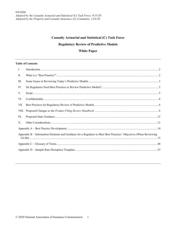
Transcription
Final Report: Statistical Modeling and Analysis Resultsfor the Topsoil Lead Contamination Study(Quemetco Project)Submitted to:Prof. Shoumo MitraDepartment of AgricultureCal Poly PomonaRussell PlumbMasters CandidateCal Poly PomonaReport Prepared By:Scott M. LeschPrincipal Statistician, GEBJ Salinity LaboratoryConsulting Affiliate, Statistical Consulting CollaboratoryUniversity of California: Riverside, CA 92521(951) 369-4861Daniel R. JeskeAssociate Professor, Department of StatisticsDirector, Statistical Consulting CollaboratoryUniversity of California: Riverside, CA 92521(951) 827-3014Javier SaurezPh.D. Student, Department of StatisticsUniversity of California: Riverside, CA 92521January 28, 2006
Table of ContentExecutive summary i,ii,iii1 Introduction .12 Sampling protocol .23 Basic summary statistics .54 Analysis of the Sampling Depth Effect. .185 Exploratory Spatial Data Analysis Plots .216 Quantile Indicator Maps and Tests of Association .307 Contamination by Distance to Factory Plots 398 Linear Spline Models 489 References .56Appendix: SAS code programs .57
Executive SummaryThis report summarizes the statistical modeling and analysis results associatedwith the Ca Poly Pomona Topsoil Lead Contamination study. The purpose of this reportis to document both the implemented sampling design and all corresponding datamodeling and inference techniques used during the subsequent statistical analyses.The development of the sampling protocol, including both the initialrecommended design and final implemented sampling strategy are discussed in Section 2.The initial Stratified Random sampling design was developed using a Neyman allocationscheme. After presenting this design to the client, a refined GIS analysis was performedand more accurate available sampling areas for each school were calculated. Thesecalculations were used to revise the second-stage random sampling scheme.Additionally, two extra properties were added to the sampling design (one nurserylocated within 2 Km of the factory and one previously overlooked park) and 12 additionalsampling locations were selected along the factory perimeter. After these refinements,the final sampling plan contained 361 sampling locations from 69 distinct non-factoryproperties (and the factory perimeter).The basic univariate statistics that summarize the contamination data associatedwith the analyzed metals (for all 360 topsoil samples) are given in Section 3. A total ofseven metal concentration measurements were made on each topsoil sample; the metalsanalyzed in this study include Arsenic (As), Cadmium (Cd), Chromium (Cr), Copper(Cu), Nickel (Ni), Lead (Pb), and Zinc (Zn). The univariate statistics summarize boththe raw and natural log transformed metal data, where the transformed data is defined asY ln(X 1). The histograms and quantile plots of each log transformed metal dataappear to be approximately symmetric (but in some cases also moderately heavy-tailed).Section 4 presents the analysis of the sampling depth effect, based on the 43 siteswere topsoil samples were acquired from two sampling depths. Paired t-tests and sign-i
rank tests are employed to determine what, if any, effect the sampling depth had on theobserved metal concentration levels. Both sets of tests suggest that there was nosampling depth effect at the 0.05 level (i.e., the mean and/or median metal concentrationlevels did not change across sampling depths).Two types of exploratory data analysis (EDA) plots for assessing the degree ofspatial structure (present in the metal concentration data) are discussed in Section 5;quatile maps and robust variogram plots. The quantile maps suggest that a substantialamount of short-range, local variation is present in the metal concentration data.Additionally, both the quantile maps and variogram plots suggest that distinct propertyeffects may also be present; i.e., samples gathers from within one property may be moresimilar (less variable) than samples gathered from different properties.Section 6 introduces the idea of quantile indicator maps and describes thecorresponding Chi-square tests of association that are derived from these maps. Thecorresponding Chi-square test results indicate that at the corrected 0.01 significance level,an excessive number of Pb samples near the factory exceed both the median and q90 cutoffs. Additionally, an excessive number of Cr and Ni samples exceed the q90 cut-off.These results imply that an abnormally high number of “hot” (i.e., contaminated) Cr, Ni,and Pb samples occur within close proximity ( 2 Km) to the factory location.Section 7 presents the contamination by distance to factory (CD2F) plots. Theseplots display the natural log transformed contamination levels for each metal as afunction of the distance (of each sample site) to the factory, along with a smoothed splinefunction fitted to the resulting contamination pattern. The CD2F plots for Cr, Ni, and Pbdisplay fairly clear evidence of an increasing contamination trend towards the factory.Finally, in Section 8 a mixed linear spline model is proposed for modeling thedistance to factory effect, while simultaneously adjusting for secondary covariates thatwere hypothesized to also (possibly) influence the metal contamination levels. The fittedspline models are then used to estimate the Baseline, Factory, and Proximity effects. Theii
Baseline effect estimates the background log contamination level across the surveyregion (i.e., the background level not influenced by the factory), the Factory effectestimates the log contamination level within or immediately around the perimeter of thefactory, and the Proximity effect quantifies the distance to factory contaminationrelationship. These results agree with the earlier test results presented in sections 6 and 7.More specifically, they confirm that (i) the factory perimeter samples appear to be highlycontaminated with respect to the estimated baseline metal contamination levels observedthroughout the sampling region (for all metals), and (ii) at least two (and possibly three)of the seven metals analyzed in this study (Cr, Ni, and Pb) exhibit significantly elevatedcontamination levels near the factory site.iii
1.0IntroductionThis report summarizes all of the primary statistical modeling and analysis resultsassociated with the Ca Poly Pomona Topsoil Lead Contamination study. The purpose ofthis report is to document both the implemented sampling design and all correspondingdata modeling and inference techniques used during the subsequent statistical analyses.Additionally, this report is designed to serve as a template for describing the samplingprotocol and statistical analysis techniques in any future technical manuscripts developedby the client(s).The remainder of this report is organized as follows. Section 2 describes thedevelopment of the sampling protocol, including both the initial recommended designand final implemented sampling strategy. Section 3 presents the basic univariatestatistics that summarize the contamination data associated with the seven analyzedmetals (for all 360 topsoil samples). Section 4 presents the analysis of the samplingdepth effect, based on the 43 sites where topsoil samples were acquired from twosampling depths. Section 5 next describes the two types of exploratory data analysis(EDA) plots used for initially determining the degree of spatial structure present in themetal concentration data; i.e., the quatile maps and robust variogram plots. Section 6then introduces the idea of quantile indicator maps and describes the corresponding Chisquare tests of association that are derived from these maps. Following this, section 7presents the contamination by distance to factory (CD2F) plots, and section 8 presents theresults for the formal mixed linear spline models (motivated by the CD2F plots). Notethat the main confirmatory statistical results concerning the apparent factorycontamination effect(s) are given in sections 6 and 8, respectively.1
2.0Sampling ProtocolIt is well known that topsoil samples are very sensitive to historical near surfaceactivities. For example, in highly industrialized areas it is not at all uncommon to findsignificant disturbances to the topsoil due to various (commercial, residential, orindustrial construction) “cut-and-fill” activities. Thus, in order to collect reliable topsoilsample data for this study, the sampling locations were restricted to two specific types ofwell established, open-space areas: (i) public access parkland, and (ii) public or privateschool playgrounds.Using a preliminary GIS analysis (performed by the client), 67 schools and publicparklands were identified to be within 4.8 Km (3.0 miles) of the factory site. In additionto identifying the centroid location of each property (school or park), the approximatesize of each property was also calculated and subsequently used in the initial sampleallocation process. This initial protocol followed a two-stage sampling design. In thefirst stage the identified properties were divided into 3 strata based on their centroiddistances to the factory; these strata were defined as follows:Strata A:within 0 – 1.6 Km (0-1 miles) of factoryStrata B:within 1.6 – 3.2 Km (1-2 miles) of factoryStrata C:within 3.2 – 4.8 Km (2-3 miles) of factoryFigure 2.1 shows an example of the circular stratum pattern used in the initial protocol.Based on prior research on sampling for trace metal concentrations in soil, we initiallyassumed that the sampling variances (for Pb) would be approximately 9σ2, 3σ2, and σ2 forstrata A, B, and C, respectively (Jackson et al., 1987). Using an initial target sample sizeof 300 sites, we used a Neyman allocation scheme to allocate the samples across thesethree stratum (Lohr, 1999). In the second stage of the sampling plan (i.e., within eachstratum), we then employed a proportional allocation scheme to determine the number ofsamples chosen from each identified property (proportional to the size of each property).Note that during this initial analysis, 50% of the calculated area of each school property2
was assumed to consist of playgrounds or school yards amenable to sampling (in contrast,100% of the public park areas were assumed to be amenable to sampling).After this initial sampling design was presented to the client, a refined GISanalysis was performed (again by the client). During this second stage GIS analysis,more accurate available sampling areas for each school were calculated and a simplerandom sampling scheme was employed to select random sampling positions within eachidentified property. Additionally, during this refined analysis two extra properties wereadded to the sampling design (one nursery located within 2 Km of the factory and onepreviously overlooked park), along with 12 additional sampling locations on the factoryperimeter. Due to these refinements, the final sampling plan contained 361 samplinglocations from 69 distinct non-factory properties (and the factory perimeter). Table 2.1summarized the final number of properties and sample sites acquired within each strata; acomplete listing of the property names and number of samples acquired at each propertyare given in the next section.For the record, one topsoil sample that registered 0 concentration levels for allseven metals has been removed from the subsequent data analyses. This topsoil samplecorresponds to sample site #3 on the Cedarlane Middle School property.Table 2.1StrataABCFinal number of properties and sample sites allocated within the threeStrata defining the sampling region.Number ofProperties6 **2935Number ofSample y44202361(**): includes factory perimeter (12 samples)3
Figure 2.1Example of the circular stratum pattern used in the initial samplingprotocol.4
3.0Basic Summary StatisticsIn this study, 360 topsoil samples were acquired from 70 distinct propertylocations (including the perimeter of the factory site). Table 3.1 lists the number ofsamples associated with each property; note that the factory site is listed as “RSRQuemetco Inc.”. Most properties contained between 3 to 8 sample sites each, but 52distinct sample sites were collected from one very large park (“Industry Hills”).A total of seven metal concentration measurements were initially made on eachtopsoil sample and then these ICP measured concentration levels were converted intoppm units (for the subsequent statistical analyses). Each sample was analyzed for thefollowing metals: Arsenic (As), Cadmium (Cd), Chromium (Cr), Copper (Cu), Nickel(Ni), Lead (Pb), and Zinc (Zn). Table 3.2 lists the basic univariate summary statistics forthe ppm metal data. For the non-factory sites, these statistics include the mean, standarddeviation, variance, skewness, and associated quantile estimates (minimum, 1%, 5%,10%, median, 90%, 95%, 99%, and maximum) for each metal. For the 12 factory sites,the displayed statistics include the mean, standard deviation, variance, minimum, andmaximum observed levels for each metal. Note that a cursory examination of Table 3.2shows that the mean concentration level of each metal at the factory site tends to be 4 to10 times higher than the surrounding area.Table 3.3 lists the exact same set of univariate summary statistics for the naturallog transformed metal data, where the transformation is defined as Y ln(X 1). Thus,all statistics are expressed in ln(ppm) units in Table 3.3.Table 3.4 lists the observed, log transformed metal correlation matrix for the 348non-factory sample sites. This matrix shows the degree of correlation between each (logtransformed) metal across the sampling region. The corresponding p-values are shownbeneath each correlation estimate (these p-values can be used to assess the statisticalsignificance of each correlation estimate, if desired). Interestingly, these correlation5
estimates suggest that the seven metals are only weakly correlated with one another(across the sampling region).Finally, univariate panel graphs for each metal are shown after the tables (Figures3.1 through 3.7). Each panel graph contains two histogram charts and two quantile plotsfor a specific metal; these charts and plots show the distribution shape of the raw andnatural log transformed data, respectively. All seven panel graphs suggest that the logtransformed metal data is approximately symmetric (but in some cases also moderatelyheavy-tailed).Table 3.1Listing of property names and the number of samples acquired fromwithin each property.Property NameAllen J. Martin ParkAmar High SchoolAmar SchoolAvacado Heights ParkB.F. Maxson Elementary SchoolBaldwin SchoolBassett ParkBassett Senior High SchoolBixby SchoolCalifornia Elementary SchoolCalifornia SchoolCedarlane Middle SchoolCharles T. Kranz Intermediate SchoolDel Valle SchoolDibble SchoolDon julian Elementary SchoolGlen A. Wilson High SchoolGlenelder Elementary SchoolHacienda La Puente Adult Education SchooHillgrove SchoolIndustry HillsJ.E. Van Wig Elementary SchoolKeenan SchoolKwiss Elementary School# of 320.8321.3923.0625.2839.7240.0041.1143.336
Table 3.1continued.Property NameLa Puente High SchoolLa Puente ParkLassalette Elementary SchoolLatin American Bible SchoolLos Altos Elementary SchoolLos Altos High SchoolLos Molinos Elementary SchoolLos Robles Elementary SchoolLos Robles ParkManzanita ParkMesa Robles Elementary SchoolMountain View High SchoolMountain View ParkNelson SchoolNewton Middle SchoolNueva Vista Continuation High SchoolOrange Grove Middle SchoolOrangewood Elementary SchoolPalm Elementary SchoolPalm NurseryPuente Hills high SchoolRSR Quemetco Inc.Rio Hondo Junior CollegeSaint Joseph SchoolSaint Louis SchoolSan Angelo ParkShadybend Elementary SchoolSierra Vista Middle SchoolSparks Elementary SchoolStimson ParkSunkist Elementary SchoolSunset Elementary SchoolTemple Elementary SchoolThomas Burton ParkThomas E. Erwin Elementary SchoolTonopah SchoolTorch Middle SchoolTri Cities AcadamyValley Continuation HSValley Vocational CenterWallen L. Andrews North Whittier ElementWalnut Creek Nature ParkWillwood SchoolWorkman Elementary SchoolWorkman High School# of 92.7893.3394.7295.2896.3996.6796.9497.50100.007
Table 3.2Basic univariate summary statistics for As, Cd, Cr, Cu, Ni, Pb, and Zn: allstatistics shown in ppm units.Non-Factory pm][ppm][ppm]NMeanStd m][ppm][ppm][ppm][ppm][ppm][ppm]1st Pctl5th Ptcl10th Pctl50th Pctl90th 71.97244.0095th Pctl99th 0.0868.80277.451737.53Quemetco Factory ][ppm][ppm][ppm][ppm][ppm][ppm]NMeanStd 7.0049.9019.40193.55403.50119.255051.005027.008
Table 3.3Basic univariate summary statistics for the natural log transformed As, Cd,Cr, Cu, Ni, Pb, and Zn data: all statistics shown in ln(ppm 1) units.Non-Factory s 1)ln(Cd 1)ln(Cr 1)ln(Cu 1)ln(Ni 1)ln(Pb 1)ln(Zn 1)VariableLabellnAslnCdlnCrlnCulnNilnPblnZnln(As 1)ln(Cd 1)ln(Cr 1)ln(Cu 1)ln(Ni 1)ln(Pb 1)ln(Zn 1)VariableLabellnAslnCdlnCrlnCulnNilnPblnZnln(As 1)ln(Cd 1)ln(Cr 1)ln(Cu 1)ln(Ni 1)ln(Pb 1)ln(Zn 1)NMeanStd 8330.1820.9161.2092.1971st Pctl5th Ptcl10th Pctl50th Pctl90th .7033.4133.7063.0704.2905.50195th Pctl99th 64.2465.6297.461Quemetco Factory s 1)ln(Cd 1)ln(Cr 1)ln(Cu 1)ln(Ni 1)ln(Pb 1)ln(Zn 1)NMeanStd .7908.5288.5239
Table 3.4Calculated correlation matrix for the seven log transformed metals.Ln[Metal 1] Transformed DataJoint (7-metal) Correlation StructureNon-Factory SitesPearson Correlation Coefficients, N 348Prob r under H0: Rho 0lnAslnCdlnCrlnCulnNilnPblnZnlnAsln(As 1)1.000000.38086 .00010.125400.01930.22097 .00010.33842 .00010.40267 .00010.33431 .0001lnCdln(Cd 1)0.38086 190.205630.00010.193150.0003lnCrln(Cr 1)0.125400.0193-0.001750.97401.000000.40564 .00010.42893 .00010.34987 .00010.30168 10.24774ln(Cu 1) .00010.0554 .0001 .0001 .0001 .0001lnNiln(Ni 1)0.33842 .00010.024270.65190.42893 .00010.28658 .00011.000000.30287 .00010.28281 .0001lnPbln(Pb 1)0.40267 .00010.205630.00010.34987 .00010.22581 .00010.30287 .00011.000000.52194 .0001lnZnln(Zn 1)0.33431 .00010.193150.00030.30168 .00010.24774 .00010.28281 .00010.52194 .00011.0000010
Figure 3.1Panel graph for As: histograms and quantile plots.11
Figure 3.2Panel graphs for Cd; histograms and quantile plots.12
Figure 3.3Panel graphs for Cr; histograms and quantile plots.13
Figure 3.4Panel graphs for Cu; histograms and quantile plots.14
Figure 3.5Panel graphs for Ni; histograms and quantile plots.15
Figure 3.6Panel graphs for Pb; histograms and quantile plots.16
Figure 3.7Panel graphs for Zn; histograms and quantile plots.17
4.0Analysis of the Sampling Depth EffectA side issue of interest in this study was the effect of sampling depth on themeasured metal concentration levels. To address this issue, soil samples from twodistinct sampling depths (A:0-5 cm and B:5-10 cm) were acquired from six propertylocations visited during the first two rounds of sampling (i.e., five properties from strataA and one additional property from strata B). In all, 43 sites were sampled during thisfirst round, yielding 43 locations with metal concentration levels for these two distinctdepths.Paired t-tests and sign-rank tests were employed to determine what, if any, effectthe sampling depth had on the observed metal concentration levels (Hollander & Wolfe,1999). The sign-rank tests were performed on the paired difference data for all sevenmetals; these test results are shown in Table 4.1. Only one of the seven tests produced ap-value 0.05 (Zn). Furthermore, because seven simultaneous tests have beenperformed in this analysis, a Bonferonni corrected significance level of 0.05/7 0.0071should be used to ensure an overall 0.05 type I error rate (Johnson & Wichern, 1988).Note that the observed p-value for the Zn difference (0.0362) is larger than 0.0071,suggesting that none of the sign-rank tests are statistically significant.In addition to the sign-rank tests, paired t-tests were also performed on the sixmetals for which the ln(M 1) transformation induced approximate symmetry (i.e., allmetals except Cd). These test results are shown in Table 4.2. Again, only one of the sixtests produced a p-value below 0.05 (Cu: p 0.0367) and this p-value was larger than theBonferonni corrected significance level of 0.05/6 0.0083. Additionally, a multivariateHotelling’s T test computed on all six metals was also non-significant (F 1.86,p 0.1141), further suggesting that none of the individual t-tests were statisticallydifferent from 0 (Press, 1981; Johnson & Wichern, 1988). These results, which agreewith the sign-rank test results shown in Table 4.1, imply that the mean (and/or median)metal concentration levels were the same within each sampling depth.18
In addition to the mean comparison tests, depth A versus B correlation estimateswere calculated for each on the six ln[M 1] transformed metals. These correlationestimates and associated p-values are shown in Table 4.3. Surprisingly, both Cr and Niexhibit no statistically significant correlation across depths. Additionally, As and Cuexhibit only moderate positive correlation; only two of the six metals (Pb and Zn) appearto be strongly correlated.Table 4.1VariableAs AAs Bd rASCd ACd Bd rCdCr ACr Bd rCrCu ACu Bd rCuNi ANi Bd rNiPb APb Bd rPbZn AZn Bd rZnSign-rank test results for all seven metals (n 43 paired samples,depths A versus B).LabelMeansr-testp-valueAs difference10.399.311.08116.50.1620Cd difference1.482.62-1.13-44.50.3196Cr difference53.2456.66-3.42-4.00.9622Cu difference70.1883.76-13.58-105.00.2086Ni difference40.7148.40-7.70-72.50.3876Pb difference592.87739.38-146.5163.00.4533Zn difference498.28456.4341.86172.00.036219
Table 4.2Univariate t-test results for the six log transformed metals(n 43 paired samples, depths A versus B).VariablelnAs AlnAs Bld rASlnCr AlnCr Bld rCrlnCu AlnCu Bld rCulnNi AlnNi Bld rNilnPb AlnPb Bld rPblnZn AlnZn Bld rZnTable 4.3LabelMeant-testp-valueln(As 1) difference2.0631.8490.2141.5060.1397ln(Cr 1) difference3.6813.6260.0550.2480.8056ln(Cu 1) difference3.6164.041-0.425-2.1580.0367ln(Ni 1) difference3.4453.630-0.186-1.0430.3031ln(Pb 1) difference4.9044.8420.0610.3430.7334ln(Zn 1) difference5.4075.0390.3681.8620.0696Depth correlation estimates and p-values for the six log transformedmetals (n 43 paired samples, depths A versus B).MetalCorrelation(p-value)ln[As 1]0.4988 (p 0.0007)ln[Cr 1]0.0584 (p 0.7097)ln[Cu 1]0.3119 (p 0.0418)ln[Ni 1]0.0673 (p 0.6680)ln[Pb 1]0.8046 (p 0.0001)ln[Zn 1]0.6245 (p 0.0001)20
5.0Exploratory Spatial Data Analysis PlotsThe degree of spatial structure apparent in the metal concentration data wasassessed using two specific graphical techniques; quantile maps and (robust) variogramplots. A quantile map is simply a color-coded sampling map, where the symbols identifythe sampling locations and their corresponding colors indicate the magnitude of theresponse variable. In this study, each metal concentration measurement was classifiedinto one of 4 distinct quantile ranges: q0 – q25, q25 – q50, q50 – q75, and q75 – q100.Note that the 25%, 50%, and 75% percentile cut-off values for each metal are shown inTable 5.1.Variogram plots are used extensively in geostatistical applications (Cressie, 1991;Wackernagel, 1998). Empirical variogram plots are used to show the degree of spatialsimilarity between data observations separated x-units apart. Usually (if the data arespatially correlated), the pattern (i.e., calucated variance) in the variogram plot initiallyincreases as the separation distance increases, but then levels off (once the separationdistance exceeds the maximum range of spatial correlation). Thus, in theory, variogramplots can be used to show the degree and range of spatial structure apparent in the data.In this study, robust variogram plots were constructed using the log transformed metalconcentration data (Cressie, 1991).The panel graphs shown in Figures 5.1 through 5.7 display the quantile andvariogram plots for each individual metal, except for Figure 5.2 (which shows thequantile map only). Note that a meaningful variogram plot could not be constructed fromthe log transformed Cd data, due to the excessive number of zeros (non-detects).While the seven quantile maps suggest that there is a substantial amount of spatialvariation in the metal concentration data over very short ranges, there is some hint thatconcentration levels of samples are correlated with their distance from the plant. Most ofthese maps also suggest that distinct property effects may also be present; i.e., samplesgathers from within one property may be more similar (less variable) than samples21
gathered from different properties. Perhaps not surprisingly, the majority of thevariogram plots appear to be rather noisy and no consistent spatial structure appears to bepresent. Four of the six variogram plots (As, Cu, Pb, and Zn) suggest the presence of twodistinct variance components, since the variograms appear to abruptly increase after the0.5 Km distance. This effect could reflect a compound symmetric variance structure (i.e.,within versus between property effects), or it may just be an artifact of the highlyclustered sampling design. Overall, these variogram plots do not appear to be especiallyinformative, except that they tend to confirm that the metal concentration data is indeedhighly variable over very short distances.Table 5.1Percentile (q25, q50, q75) cut-off values used in the construction of thequantile maps (shown in Figures 5.1 through m][ppm][ppm]25th Pctl(ppm)50th Pctl(ppm)75th .95139.8122
Figure 5.1Exploratory spatial plots (quantile map and variogram) for As.23
Figure 5.2Exploratory spatial plots (quantile map only) for Cd.24
Figure 5.3Exploratory spatial plots (quantile map and variogram) for Cr.25
Figure 5.4Exploratory spatial plots (quantile map and variogram) for Cu.26
Figure 5.5Exploratory spatial plots (quantile map and variogram) for Ni.27
Figure 5.6Exploratory spatial plots (quantile map and variogram) for Pb.28
Figure 5.7Exploratory spatial plots (quantile map and variogram) for Zn.29
6.0Quantile Indicator Maps and Tests of AssociationA quantile indicator (QI) map can be used to detect non-random patterns in themagnitudes of spatially referenced sample data, specifically with respect to ahypothesized location of point-source contamination. The construction of a QI map isfairly simple; a cut-off quantile of interest is selected (such as the median, or 90%percentile, etc.) and all of the sampling locations that exceed this quantile are highlighted. If a point-source contamination location is suspected, one simply inspects the QImap to see if an abnormally high number of high-lighted locations appear to occur withinclose proximity to the point-source.The above idea can be translated into a formal hypothesis test as follows. First,define a region surrounding the point-source (usually a circle of constant radius) andclassify the sampling locations accordingly (i.e., either contained or not contained with
statistics that summarize the contamination data associated with the seven analyzed metals (for all 360 topsoil samples). Section 4 presents the analysis of the sampling depth effect, based on the 43 sites where topsoil samples were acquired from two sampling depths. Section 5 next describes th
