Transcription
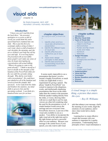
www.publicspeakingproject.orgvisual aidsPublic Speaking: The Virtual Textchapter 13By Sheila Kasperek, MLIS, MSITMansfield University, Mansfield, PAintroduction“I know you can't read this fromthe back there,” the presenterapologizes to a screen so full ofwords you would think the entirespeech had been crammed into oneslide. This is just the first of aseemingly endless string of slides Ican't read, charts so full of numbers Ican't decipher the meaning, and clipart so clichéd I can't help but roll myeyes and sigh. It is not long beforeI'm presented with an incrediblydense graph I can't make any sense ofsince he keeps interrupting myconcentration with actual talking.“When is he going to come to thepoint already?” I think to myself as Istart to doodle in the margins of thehandout of the PowerPoint slides forthe very talk I'm currently sittingthrough. Why did he even botherwith a presentation? He could havejust emailed us all of the handout andsaved us from this painful, dullspectacle. As he reads from his slidesand belabors his statistics, my minddrifts to grocery lists and theupcoming weekend. I can think of ahundred better uses for an hour.chapter objectives:After studying this module, you should be ableto:1.2.3.4.5.Identify when and howvisual aids will enhance apresentationIdentify the different typesof visual aidsIdentify effective andineffective use of visualaidsApply basic designprinciples to slide designIdentify best practices toincorporating visual aids ina presentationIt seems nearly impossible to see apresentation that doesn’t revolvearound a lengthy PowerPoint, so muchso that you might think it was arequirement for giving a speech. Thephrase “death by PowerPoint” wascoined in response to the ubiquitous,wordy, and intellectually deadeningpresentations that focus on the slidesrather than the content or the presenter.With the speaker reading directly fromthe slides, or worse, showing slideswith text so small that it can't be read,viewers are often left wondering whatthe need for the presentation is at all. Asimple handout would convey themessage and save everyone's time.PowerPoint, however, is just one of thevisual aids available to you as aspeaker. Your ability to incorporate theright visual aid at the right time and inthe right format can have a powerfuleffect on your audience. Because yourmessage is the central focus of yourspeech, you only want to add visualchapter outline: Introduction Effective Visual Aids Types of Visual Aidso Personal Appearanceo Objects and Propso Demonstrationo Posters and Flip Chartso Audio and Videoo Handoutso Slideware Design Principleso Slide Layouto Backgrounds and Effectso Colorso Fontso Texto Imageso Graphs and Charts Implementation Visual Aid Tips Conclusion Review Questions and Activities Glossary ReferencesA visual image is a simplething, a picture that entersthe eyes. Roy H. Williamsaids that enhance your message, clarifythe meaning of your words, target theemotions of your audience, and/orshow what words fail to clearlydescribe.Learning how to create effectivevisuals that resonate with youraudience is important for a qualitypresentation. Understanding basicprinciples of how visual information isThis work is licensed under the Creative Commons Attribution-Noncommercial-No Derivative Works 3.0 United States License. To view a copy of this license, visit / or send a letter to Creative Commons, 171 Second Street, Suite 300, San Francisco, California, 94105, USA.PDF documents prepared by Donna Painter Graphics.
Chapter 13 Visual Aidsprocessed alone and in combinationwith audio information can make orbreak your visuals' effectiveness andimpact. Incorporating visuals into yourspeech that complement your wordsrather than stand in place of them ordistract from them, will set you apartfrom other presenters, increase yourcredibility, and make a bigger and morememorable impact on your audience.It has been said that 80% ofwhat people learn is visual. Allen Kleineffective visual aidsBefore you just open up PowerPointand begin creating slides, you shouldstop for a moment and consider whattype of visual aid will best serve yourpurpose and if you even need an aid atall. Select a visual aid that adds to yourpresentation in a meaningful way, notmerely something pretty to look at or asubstitute for thorough preparation.Visuals are not there for you to hidebehind when you are in front of youraudience. Because of the tendency fornovice speakers to use visuals as acrutch in their speeches, it has evenbeen suggested that beginner speakersbe forbidden from using visual aidswhile they are learning to present(Palmer, 2011).Visual aids serve a unique role in apresentation, and you should considerthe specific purpose and desiredoutcome of your speech whendetermining if, when, to what extent,and in what format you use visual aids.www.publicspeakingproject.orgVisuals can spark interest, buildemotional connections, clarify yourwords, explain abstract ideas, helpdraw conclusions, or increaseunderstanding. For instance, a speakermay show a stacks of books torepresent the amount of data storage ina speech about the evolution ofcomputers; or demonstrate the properuse of ear plugs by distributing earplugs, showing how to insert them, andthen blasting an air horn in a speechabout preventing hearing loss in orderto make the value of ear protectionmore memorable and concrete. Donewell—simple, visible, relevant,memorable, and audience-focused—visual aids can have a profound impacton your audience and your overallmessage.Visual aids can be an important partof conveying your message effectivelysince people learn far more by hearingand seeing than through hearing orseeing alone (Vasile, 2004). The brainprocesses verbal and visual informationseparately. By helping the audiencebuild visual and verbal memories, theyare more likely to be able to rememberthe information at a later time(Malamed, 2009). If you can find avisual aid to complement what you aresaying, you will help your audienceunderstand the information you arepresenting and remember yourmessage. For example, a speaker mightshow the proper and improper ways tobow when being introduced in Japanwhile at the same time talking about themovements and also displaying a slidewith the appropriate angles andpostures for bowing. By using multiplemodes in concert with each other, themessage is strengthened by the pairingof words, images, and movement.Not just any visual will do, however.Each visual should be relevant to yourmessage, convey an important point, beclearly understandable, and be visibleby your entire audience. Visualsshould be used to make concepts easierto understand and to reinforce yourmessage. They should illustrateimportant points that are otherwise hardto understand (Detz, 2000; Palmer,2011; Young & Travis, 2008).Use visuals for speeches aboutprocesses, products, or demonstrationsof how to do something, such as adiagram of how email is delivered in aspeech about computer security. Usevisuals when you need to explain thingsyou cannot see because they are hiddenor abstract, like a model of yourinternal organs in a speech aboutgastric bypass surgery. Use them whenyou need to grab your audience’sattention or stir their emotions. Aspeaker could use a photo of a starvingchild and a bag of rice that representsthe daily calorie intake of a poor childin a speech about food insecurity tocreate a visceral reaction in theaudience. As they say, a picture isworth a thousand words, so use imagesto tell a story or create a visualmetaphor. Visual metaphors are usefulwhen trying to evoke an emotion, suchas showing an image of someonerunning or diving into a pool when youwant to evoke action on the part of youraudience. The images convey themessage to “get going” or “dive in.”When talking about numbers orstatistics, use visuals to providecontext, comparison, and to help youraudience understand the meaning ofdata. Done well, graphs can conveyyour point where numbers only provide13-2
Chapter 13 Visual Aidswww.publicspeakingproject.orgdata (Malamed, 2009; Palmer, 2011;Tufte 1997; Vasile, 2004). Whilethere are many possible reasons to usevisuals in your presentation, yourguiding principle should be: does thismake the message clearer or morememorable? If you cannot answer witha resounding “YES!” then re-think theplan for your visuals and begin again.safety or an actual sample of theproduct you are trying to sell, cangreatly enhance your presentation.Seeing the actual item will often makeit easier for your audience tounderstand your meaning and will helpyou connect with your audience on anemotional level. Props can be used aspart of demonstrations (discussedbelow) or as a stand-alone item thatyou refer to in your speech.types of visual aidsIn the past, transparencies displayedwith overhead projectors, posters, andflip charts were common visual aids,but these have mostly been replacedwith computer technology. For manypeople, the term “visual aids” forpresentations or speeches issynonymous with PowerPoint (oftenlong, dry, painful PowerPoint at that),but this is just one type of visual aid.You should consider all the availableoptions to determine what will be mosteffective and appropriate for yourpresentation.If you wear clothes that don'tsuit you, you're a fashionvictim. You have to wearclothes that make you lookbetter. Vivienne Westwoodpersonal appearanceSome people chose to dress up aspart of their presentation, and this canhelp set the tone of the speech orreinforce a specific point. A speakermay choose to wear a handmadesweater in a talk about knitting in orderto inspire others to begin the hobby.Another speaker may opt for afirefighter's uniform in a speech aboutjoining the local volunteer firedepartment in an effort to appeal to therespect most people have for people inuniform.If you aren't dressing in relation toyour topic, you should dressappropriately for your audience andvenue. A presentation to a professionalaudience or at a professionalconference would lend itself toappropriate business attire. If you aregiving a presentation to your local GirlScout troop, more casual clothing maybe the best choice. Any time you aredoing a demonstration, make sure youare dressed appropriately to give thedemonstration. It is difficult for aspeaker to show how to correctly puton a rock climbing harness if she iswearing a skirt the day of thepresentation.Beyond dressing appropriately foryour audience and topic, the audiencewill make judgments about you evenbefore your presentation begins.Your dress, mannerisms, the way yougreet the audience when they arearriving, how you are introduced, andthe first words out of your mouth allimpact your credibility and ability toconnect with your audience. Makesure you are calm and welcoming toyour audience when they arrive andgreet them in a professional manner.Your credibility and professionalismsuffer when the audience arrives andyou are busy scrambling aroundattempting to finish your preparations(Duarte, 2010).There are several importantconsiderations for using props in yourpresentation. If you have a largeaudience, showing the prop at the frontof the venue may mean that audiencemembers can't see the item. Thealternative to this is to pass the itemaround, though Young and Travis(2008) advise caution in passingobjects around during your speech, asmost people will be seeing the objectafter you have moved on with yourtalk. Having your prop out of syncwith your presentation, either as it ispassed around disrupting youraudience's attention or by having yourprop visible when you aren't talkingabout it, is distracting to your audienceand message. To make the mosteffective use of props in yourpresentation, carefully consider howthe object will be visible to your entireaudience when you are speaking aboutit, and make sure it is out of sight whenyou are not.objects and propsObjects and props, such as abicycle helmet for a speech on bike13-3
Chapter 13 Visual Aidswww.publicspeakingproject.orgthe difference between reading theinstructions on how to perform CPR,watching someone perform CPR, andtrying CPR on the training dummy. Asevidenced by the huge number ofonline videos illustrating how to dosomething, there is great value inwatching while you learn a new task.If your presentation includes a processwhere seeing will improveunderstanding, consider including ademonstration.demonstrationA demonstration can serve twodifferent purposes in a speech. First, itcan be used to “wow” the audience.Showing off the features of your newproduct, illustrating the catastrophicfailure of a poorly tied climbing knot,or launching a cork across the roomduring a chemistry experiment are allways of capturing the audience'sattention. Demonstration should not begimmicky, but should add value to yourpresentation. When done well, it canbe the memorable moment from yourspeech, so make sure it reinforces thecentral message of your talk.Demonstration can also be used toshow how something is done. Peoplehave different learning styles, and aprocess demonstration can help visuallearners better understand the conceptbeing taught. Consider for a momentBecause you have a limited time topresent, make sure your demonstrationsare succinct, well rehearsed, and visibleto the entire audience. Be prepared forthe demonstration to fail and have aback-up plan in place. It is better tomove forward with your presentationthan to fret with trying to get yourdemonstration perfect or fixed.However, if you are providing ademonstration of your new product,make sure it is as error free as possible.If you can't be positive the product willperform as expected, it is better to skipthe demonstration.posters and flip chartsIf you are presenting to a smallaudience, around a dozen people, youmay choose to use a poster rather thanPowerPoint. The focus of your postershould be to support your core messageand can be left behind to remind thosein attendance of your presentation afteryou have left. Posters should lookprofessional (e.g., not handwritten), bevisible to everyone in the room, andfollow design rules covered later in thischapter. Before your presentation, youshould ask whether posters must behung or be free standing. For postersthat will be hung from a wall, sturdyposter or matte boards will suffice. Ifyour poster is going to be free standingor if you are going to use the sameposter for multiple presentations, youshould consider using a tri-fold displayboard.Other text-based visual aids includewhite boards and flip charts. Both canbe used to write or draw on during thepresentation and should be used withseveral caveats. Writing during yourpresentation actually takes away fromyour speaking time, so make sure tofactor this into your speaking time.Speaking and writing at the same timecan be tricky because the audience willhave a difficult time processing whatthey are hearing when they are alsotrying to read what you write.Additionally, if you are writing, youneed to be careful not to turn your backon your audience, which is makes itharder for them to hear you and for youto connect with your audience. Legiblehandwriting that can be seen at adistance is of prime importance, sousing these kinds of visual aids shouldbe limited to small audiences. Whilesome speakers write and draw tohighlight important points, this takes anenormous amount of skill and practice.For those with less developed skills,flip charts are best limited to situationswhere audience input is necessary forthe direction or continuation of thepresentation (Duarte, 2008).The soul never thinks withouta picture. Aristotleaudio and videoA large amount of digitized audioand video is now available to beincluded and embedded in yourpresentation. Select short clips; Youngand Travis (2008) recommend only 1020 seconds, but this will depend in parton the length of the presentation, thepurpose of the presentation, and clipcontent and relevance. You should nothave a presentation primarily composedof audio/video clips. Select only clipsthat reinforce the message or serve asan appropriate segue into your nexttopic.When including audio or video inyour speech, there are several technicalconsiderations. It is important that theclip be properly cued to start at exactlywhere you want it to begin playing. Itdistracts from both your audience'sattention and your credibility when youare fumbling with technology during aspeech. It is also important that yourfile format can be played on thecomputer you are using. Since not all13-4
Chapter 13 Visual Aidscomputers will play all file formats, besure to test playability and audiovolume before your presentation.Again, going back to providing aprofessional appearance from your firstinteraction with your audience, youshould iron out the technical detailsbefore they enter the room. As with ademonstration, if your clip isn’t playingproperly, move on rather than attemptto correct the issue. Fumbling withtechnology is a waste of youraudience’s valuable time.handoutsThere are many schools of thoughton the use of handouts during apresentation. The most commoncurrent practice is that the presentersprovide a copy of their PowerPointslides to the participants before or afterthe presentation. This is so commonthat some academic and professionalconferences require presenters tosubmit their slides prior to the event, socopies of the slides can be made foreach attendee. Despite this prevailingtrend, you should avoid using yourslides as handouts because they servedifferent purposes. Using yourpresentation slides as the handout bothshortchanges your slides and fails as ahandout.Handouts are best used tosupplement the content of your talk. Ifyou are providing statistical data, yourslide may only show the relevantstatistic focusing on the conclusion youwant your audience to draw. Yourhandout, on the other hand, can containthe full table of data. If you need toshow a complex diagram or chart, ahandout will be more legible thanwww.publicspeakingproject.orgtrying to cram all that information on aslide. Since you need to simplify thedata to make it understandable on aslide, the handout can contain theevidence for your message in a waythat is legible, detailed, complex, andshows respect for the audience's timeand intelligence (Tufte, 2003).You don’t need to include everythingin your talk, and you don’t need to packall your information into your slides.Write a handout document with asmuch detail as you want and keep theslides simple. Presenters often feel theneed to display all the data andinformation they have so they willappear knowledgeable, informed, andthoroughly prepared. You can helpease this feeling by creating a handoutwith all of the detailed data you wish,which leaves your slides open to focuson your key message (Reynolds, 2008).There are many truestatements about complextopics that are too long to fiton a PowerPoint slide. Edward TufteCrafting an appropriate handout willtake additional time for the presenter,but doing so will result in a take-awaydocument that will stand on its own anda slide show that focuses on effectivevisual content. Duarte (2008) andTufte (2003) recommend handouts onlyfor dense, detailed information.Reynolds (2008) expands on this idea,noting that your handout needs to becomplete enough to stand in your placesince you won't be there to present theinformation or answer questions.When to distribute handouts is alsoheavily debated. So common is thepractice of providing handouts at thebeginning of a presentation that it mayseem wrong to break the convention. Itis important to understand, however,that if people have paper in front ofthem while you are speaking, theirattention will be split between thehandout, your other visual aids, andyour words. To counter this, you mightconsider distributing handouts as theyare needed during the presentation andallowing time for people to reviewthem before continuing on (Vasile,2004). This may not be a viable optionfor shorter presentations, and theinterruption in the flow of thepresentation may be hard to recoverfrom. Unless having the documents infront of your audience is absolutelycritical to the success of thepresentation, handouts should bedistributed at the end of thepresentation.slidewareSlideware is a generic term for thesoftware used create and display slideshows such as Microsoft PowerPoint,Apple iWorks Keynote, Google DrivePresentation, Zoho Show and others.Composed of individual slides,collectively known as the slide deck,slideware is a de facto standard forpresentation visual aids despitecriticisms and complaints about theformat. In truth, the problem is notwith the software but in the use of theprogram. The focus of much of theremainder of this chapter will besuggestions and best practices forcreating effective slide decks that willbe high impact and avoid many of thecomplaints of slideware detractors.Before this discussion, there are twodistinct slideware presentation stylesthat should be mentioned.13-5
Chapter 13 Visual Aidswww.publicspeakingproject.orgbut also lends itself to over-populatingthe blank canvas with images (Yee &Hargis, 2010).A picture is a poem withoutwords. HoracePecha KuchaPecha Kucha is a method ofpresenting using a slide deck of 20slides that display for 20 seconds perslide, advance automatically, andgenerally contain no text (Duarte,2008). This method began in 2003 as away to contain the length ofpresentations of architects andcontinues to grow in popularity, but isstill reserved mostly for people increative industries (Lehtonen, 2011).Because of the restrictive format, PechaKucha-style presentations help thespeaker practice editing, pacing,connecting with the audience, focusingon the message, and using images inplace of words (Beyer, 2011).PreziWhile not quite slideware, Prezi isdigital presentation software that breaksaway from the standard slide deckpresentation. It requires users to plotout their themes before addingprimarily image-focused content(Panag, 2010). Instead of flippingthrough the slide deck, the presenterzooms in and out of the presentation tovisually demonstrate connections notavailable in other slideware. Thedesign of the software lends itselftoward more rapidly changing visuals.This helps to keep the viewer engagedPrezi’s fast moving images and, attimes, unusual movement can makeusers dizzy or disoriented. Carefulwork is needed during planning andpractice so that the point of the talkisn’t the wow factor of the Prezisoftware, but that your visuals enhanceyour presentation. The best way tolearn more about this emerging tool isto visit the Prezi website to viewexamples (http://prezi.com/explore/).If opting to use Prezi in a corporateenvironment, you should stronglyconsider one of the paid options for thesole purpose of removing the Prezi logofrom the presentation.medium, and your audience. Each slideshould reinforce or enhance yourmessage, so make conscious decisionsabout each element and concept youinclude (Reynolds, 2008) and editmercilessly. Taken a step further,graphic designer Robin Williams(2004) suggests each element be placedon the slide deliberately in relation toevery other element on the slide.Figure 13.1Too Little Informationdesign principlesSlide and slide show design have amajor impact on your ability to getyour message across to your audience.Numerous books address variousdesign fundamentals and slide design,but there isn't always consensus onwhat is “best.” What research hasshown, though, is that people havetrouble grasping information when itcomes at them simultaneously. “Theywill either listen to you or read yourslides; they cannot do both” (Duarte,2010, p. 178). This leaves you, thepresenter, with a lot of power to director scatter your audience's attention.This section will serve as an overviewof basic design considerations that evennovices can use to improve their slides.First and foremost, design with youraudience in mind. Your slide show isnot your outline. The show is also notyour handout. As discussed earlier, youcan make a significantly moremeaningful, content-rich handout thatcomplements your presentation if youdo not try to save time by making aslide show that serves as both. Keepyour slides short, create a separatehandout if needed, and write as manynotes for yourself as you need.All decisions, from the images youuse to their placement, should be donewith a focus on your message, yourToo Much InformationProviding the right amount ofinformation, neither too much nor toolittle, is one of the key aspects ineffective communication (Kosslyn,2007). See Figure 13.1 as an exampleof slides with too little or too muchinformation. The foundation of thisidea is that if the viewers have too littleinformation, they must struggle to putthe pieces of the presentation together.Most people, however, include toomuch information (e.g., slides full oftext, meaningless images, overlycomplicated charts), which taxes theaudience's ability to process themessage. “There is simply a limit to aperson’s ability to process newinformation efficiently and effectively”13-6
Chapter 13 Visual Aids(Reynolds, 2008, p. 122). As apresenter, reducing the amount ofinformation directed at your audience(words, images, sounds, etc.) will helpthem to better remember your message(Mayer, 2011). In this case, less isactually more.The first strategy to keeping itsimple is to include only one concept oridea per slide. If you need more thanone slide, use it, but don't cram morethan one idea on a slide. While manyhave tried to proscribe the number ofslides you need based on the length ofyour talk, there is no formula thatworks for every presentation. Use onlythe number of slides necessary tocommunicate your message, and makesure the number of slides correspondsto the amount of time allotted for yourspeech. Practice with more and fewerslides and more and less content oneach slide to find the balance betweentoo much information and too little.With simplicity in mind, the goal isto have a slide that can be understoodin 3 seconds. Think of it like abillboard you are passing on thehighway (Duarte, 2010). You canachieve this by reducing the amount ofirrelevant information, also known asnoise, in your slide as much aspossible. This might includeeliminating background images, usingclear icons and images, or creatingsimplified graphs. Your approachshould be to remove as much from yourslide as possible until it no longermakes any sense if you remove more(Reynolds, 2008).Figure 13.2Cluttered Imagewww.publicspeakingproject.orgFigure 13.3Low Contrast ImageHigh Contrast Imageand layout throughout yourpresentation will help tie all of yourslides together. This is especiallyimportant if a group is putting visualstogether collaboratively. If you havehandouts, they should also match thisformatting in order to convey a moreprofessional look and tie all your piecestogether (Reynolds, 2008).Another general principle is to usecontrast to highlight your message.Contrast should not be subtle. Maketype sizes significantly different. Makecontrasting image placements, such ashorizontal and vertical, glaringlyobvious. A general principle to follow:if things are not the same, then makethem very, very different (Williams,2004), as in Figure 13.3.Figure 13.4Centered Slideslide layoutIt is easy to simply open up yourslideware and start typing in the bulletpoints that outline your talk. If you dothis, you will likely fall into the trapsfor which PowerPoint is infamous.Presentation design experts Reynolds(2008) and Duarte (2010) bothrecommend starting with paper andpen. This will help you break awayfrom the text-based, bullet-filled slideshows we all dread. Instead, considerhow you can turn your words andconcepts into images. Don't let thesoftware lead you into making amediocre slide show.Regarding slide design, focus onsimplicity. Don't over-crowd yourslide with text and images. Clutteredslides are hard to understand (seeFigure 13.2). Leaving empty space,also known as white space, givesbreathing room to your design. Thewhite space actually draws attention toyour focus point and makes your slideappear more elegant and professional.Using repetition of color, font, images,Rule of ThirdsA common layout design is calledthe rule of thirds. If you divide thescreen using two imaginary lineshorizontally and two vertically, you endup with nine sections. The mostvisually interesting and pleasingportions of the screen will be at thepoints where the lines intersect.13-7
Chapter 13 Visual Aidswith color and color perception that arebeyond the scope of this chapter.Because color can have such a hugeimpact on the ability to see andunderstand your visuals, this sectionwill explore basic rules andrecommendations for working withcolor.www.publicspeakingproject.orglight background (Kadavy, 2011). Ifyou want something to stand out, thesecolor combination rules can act as aguide.Figure 13.8Complementary ColorsColor does not add apleasant quality to design - itreinforces it. Pierre BonnardMuch of what we perceive in termsof a color is based on what color is nextto it. Be sure to use colors that contrastso they can be easily distinguishedfrom each other (think yellow and darkblue for high contrast, not dark blueand purple). High contrast improvesvisibility, particularly at a distance. Toensure you have sufficient contrast, youcan view your presentation ingreyscale either in the software ifavailable or by printing out your slideson a black and white printer (Bajaj,2007).Analogous ColorsWith all these rules in place,selecting a color palette, the group ofcolors to use throughout yourpresentation, can be daunting. Somecolor pairs, like complementary colorsor analogous colors as in Figure 13.8,are naturally pleasing to the eye andcan be easy options for the colornovice. There are also online tools forselecting pleasing color palettes usingstandard color pairings including Kuler(https://kuler.adobe.com/) and ColorScheme Designer
Public Speaking: The Virtual Text A visual image is a simple thing, a picture that enters the eyes. Roy H. Williams . introduction “I know you can't read this from the back there,” the presenter apologizes to a screen so full of words you would think the entire speech had

