Transcription
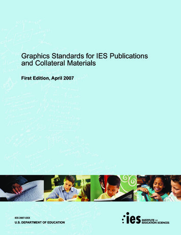
Graphics Standards for IES Publicationsand Collateral MaterialsFirst Edition, April 2007IES 2007-XXXU.S. DEPARTMENT OF EDUCATION
Graphics Standards for IES Publicationsand Collateral MaterialsFirst Edition, April 2007IES 2007-XXXU.S. DEPARTMENT OF EDUCATION
CONTENTSOverview. . . . . . . . . . . . . . . . . . . . . . . . . . . . . . 2Purpose . . . . . . . . . . . . . . . . . . . . . . . . . . . . . . 2IES Logo . . . . . . . . . . . . . . . . . . . . . . . . . . . . . . 3Center Logos . . . . . . . . . . . . . . . . . . . . . . . . . . 5Secondary Logos . . . . . . . . . . . . . . . . . . . . . . 5Color Palette . . . . . . . . . . . . . . . . . . . . . . . . . . 6Typography . . . . . . . . . . . . . . . . . . . . . . . . . . . 7Photography . . . . . . . . . . . . . . . . . . . . . . . . . . 8Reports and Publications . . . . . . . . . . . . . . . . 9COVERS . . . . . . . . . . . . . . . . . . . . . . . . . . . . . . . . . . . . . . 9TITLE PAGE . . . . . . . . . . . . . . . . . . . . . . . . . . . . . . . . . . 20BACK OF THE TITLE PAGE . . . . . . . . . . . . . . . . . . . . . 22INSIDE COVERS (FRONT AND BACK) . . . . . . . . . . . . . 24BACK COVER . . . . . . . . . . . . . . . . . . . . . . . . . . . . . . . . . 24SPINE AND BINDING . . . . . . . . . . . . . . . . . . . . . . . . . . . 27Other Types of Collateral Materials . . . . . . . 28PowerPoint Presentations . . . . . . . . . . . . . . 38First Edition1
OverviewMarket researchshows that consistentdesign elements,including colors,layout, font andimagery, can helpaudiences recognizematerials as acoordinated series ofinformation pieces.2IES Graphic StandardsDozens of government agencies and hundreds of organizations work in theeducation field. They each develop and distribute a range of materials, includingresearch reports and informational brochures. It can be difficult for audiences todistinguish between the materials because of the sheer volume produced.Market research shows that consistent design elements, including colors, layout,font and imagery, can help audiences recognize materials as a coordinated seriesof information pieces. Complementary design elements also contribute toperceptions about the professionalism and quality of information resources.The following guidance is intended to help the Institute of Education Sciences(IES) develop publications and other products that have complementarydesign and style elements. It provides a framework to build brand recognitionfor IES products.PurposeTo ensure that all IES collateral materials reinforce a consistent IES identity sothat they are easily recognized as IES products.
IES LogoThe logo represents the personality of a brand. It is a unique identifier thatconnects audiences to the organization. It reinforces that IES is committed to“Building Evidence-based Education.”The IES logo makes a similar promise. The logo emphasizes the acronym“IES” in order to build recognition for the name among education stakeholders,such as researchers, practitioners and policymakers. The four circles representthe four Centers within the Institute of Education Sciences. That they areascending symbolizes innovation, progress and improvement.In order to communicate a consistent message, the brand identity, asexemplified by the logo, should follow basic rules of presentation.The logo representsthe personality of abrand. It is a uniqueidentifier that connectsaudiences to theorganization.213ELEMENTS OF THE IES LOGO123IES Acronym – The IES acronym is the core element of the logo. It isdisplayed in lower case letters (ies) in the center of the logo, between theascending circles and the full Institute name. The acronym is displayed inblack for both the full-color and single color version of the logo, in whitefor the reversed logo.Ascending Circles – The ascending circles are displayed to the left of theacronym. The highest circle serves as the dot for the “i” in the acronym. Thecircles are displayed in gradations of IES green for the full color logo, as tonesof grey in the one color version and in all white when the logo is reversed.Institute Name – The complete Institute name, “Institute of EducationSciences,” is displayed in all capital letters to the right of the IES acronym.The text is displayed on two lines. The first line consists of the words“Institute of ” with “Institute” in green for the full color logo, in black forthe one color logo and in white for the reversed logo. “Education Sciences”is displayed in all capital letters on the second line. The phrase is displayed inblack for the full color and single color logos; it is white in the reversed logo.First Edition3
LOGO VERSIONSFIGURE 1There are four versions of the logo that can be used: full color, one color,reversed and icon. (Figure 1) Full Color – The standard version of the logo consists of Pantone 355 andblack. This version can also be converted to process colors if printing usingCMYK technology. It consists of ascending circles in green, the lower caseacronym in black and the full Institute name with “Institute” in green and“of ” in black on one line of text and “Education Sciences” in black on thesecond line of text. One Color – The one color logo is to be used for black and white printing. Reversed – The reversed logo is used when the logo is placed on a darkbackground color or image. The reversed logo is only used in all white. Icon – The IES icon, consisting of the acronym and ascending circles, canbe used separately from the Institute name if the complete Institute nameis displayed elsewhere on the same page. The icon can be used in full color,one color or reversed.(FULL COLOR)(ONE COLOR)A designer should select the version of the logo based on how well the logowill complement the design. For example, the reversed logo would be usedwhen a publication cover uses a dark background color or image.(REVERSED)Guidance (ICON)Center logo. FIGURE 2.4259”1.76”4Usage – All materials produced for and by IES must carry the IES orIES Graphic StandardsPlacement and Size – The logo must be prominently displayed on thefront of all publications and other visual materials produced by and forIES. Additionally, elements of the logo, such as the ascending circles, maybe used as a graphical element. However, this does not eliminate the needfor the placement of the logo on the cover. A minimum size of .4259” talland 1.76” wide should be used. (Figure 2) File Types – EPS, TIF, JPG and GIF versions for each logo areavailable on the IES members site at https://members.nces.ed.gov. Forprofessionally printed documents, use a minimum resolution of 300 dots perinch (dpi). For presentations and the Web, use a screen resolution of 72dpi. EPS – Native, vector-based version of the logo. This is the preferredfile format for professional offset and digital printing as well as forsending to graphic designers. TIF – High-resolution CMYK color mode version alternately usedwhen printing professionally. JPG – High-resolution, RBG color mode for internal use. Ideal forplacing into Word document and PowerPoint presentations. GIF – Low-resolution RBG version for use on the Web.
Center LogosFIGURE 3The logos for the Centers have been developed to complement the IES logoand one another. Center logos follow the same general guidelines as the IESlogo, except they are arranged in a slightly different manner. Specifically, thewords “Institute of Education Sciences” are beneath the icon and the name ofthe Center is placed to the right of the IES acronym.LOGO VERSIONSFull Color – The standard version of the Center logos is comprised ofPantone 355 (green) and black. This version can also be converted toprocess colors if printing using CMYK technology. It consists of ascendingcircles in green, the lower case acronym in black, the full Center namewith “National Center” in green and the rest of the Center’s name in black.(Figure 3) One Color – The one color logo is to be used for black and white printing. Reversed – The reversed logo is used when the logo is placed on a darkbackground color or image. The reversed logo is only used in all white. Icon – The IES icon, consisting of the acronym and ascending circles, canbe used separately from the Center’s name if the complete Center name isdisplayed elsewhere on the same page. The icon can be used in full coloror reversed. Secondary LogosSecondary logos, such as survey logos, can be used on the title page only. Do notplace them on covers. (See Figure 4 for examples of IES secondary logos, and seepage 20 for guidance on the Title Page.)FIGURE 430pt Avant Garde, Arial NarrowTitle16pt Avant Garde, Arial Narrow Subtitle16 PT MONTH YEAR12pt Author Name12pt Organization (American Institutes for Research, Education Statistics Services Institute,RTI International, MPR Associates, Inc, Etc)12pt Project Officer Name12pt Organization (IES, NCER, NCES, Etc)8PT NCES 2007-XXX10PT U.S. DEPARTMENT OF EDUCATIONFirst Edition5
Color PaletteOnly the approvedcolor palette shouldbe used for all printedmaterial within IESand its Centers.Color is an essential element of any publication design. Defining a colorpalette helps to create the sense that publications are part of the same family ofmaterials. The primary and secondary color palettes are approved for all IES andU.S. Department of Education publications.Approved Color PalettePANTONE355PANTONE4645C 92M5Y 96K1C 95M 74Y5PANTONEReflex Blue K 1C 22M 45Y 75K8C 27M7Y4K1PANTONE277PANTONE116PANTONE411C2M 15Y 93K0C 50M 52Y 64K 45PANTONE193PANTONE202C 12M 93Y 71K2C 30M 93Y 75K 20Guidance 6IES Graphic StandardsThe palettes should be used for all color blocks, accent colors and text.Colors outside of the primary and secondary palette should not be used.Tints of colors on the palette are allowable.Publications may be printed in black and white.When materials are being professionally printed, the specific Pantonenumbers should be provided to the printer for accurate color matching.Process color equivalents are provided as well (to the right of each colorswatch) if using CMYK technology. Only the above color palette shouldbe used for all printed material within IES and its Centers.
TypographyTypography plays an important role in shaping an organization’s unique identityand helps it create a consistent look and feel.GuidanceProfessionally Printed Publications – All professionally printed IESpublications will use the Avant Garde, Arial or Arial Narrow type familiesfor titles, headings and pull-out quotes. These fonts may also be used forthe body text in smaller publications and brochures. Garamond should beused for the body text in longer publications and can also be used as analternative in smaller publications. (Figure 5) Font Sizes – The publication’s title should be displayed in 30pt type forall standard size (8 1/2 x 11) publications. A smaller font size than 24ptwould be used for titles and subtitles on brochures and other printedmaterial. (See page 28) FIGURE 5Avant GardeAvant Garde TitleAvant Garde SubtitleArial tuvwxyz1234567890 (& . , ; : ! ? ” pqrstuvwxyz1234567890 (& . , ; : ! ? ” ”)Arial SubtitleArial NarrowArial Narrow tuvwxyz1234567890 (& . , ; : ! ? ” ”)Arial Narrow ijklmnopqrstuvwxyz1234567890 (& . , ; : ! ? ” ”)First Edition7
PhotographyPhotos provide engaging images that grab the attention of audiences and helpthem relate to the subject matter.FIGURE 6Guidance 30pt Approved Title Font16pt Approved Subtitle Font NCER 2007-XXXU.S. DEPARTMENT OF EDUCATION 8IES Graphic StandardsStyle – A single image is more powerful than photos displayed in a collage;however, a row of images can be used when needing to convey multiplesubjects. (Figure 6) As a general rule, photos of people are typically moreappealing than images of inanimate objects. Wherever possible, photosshould represent the diversity of the U.S. population, including differencesin gender, race, ethnicity, age and abilities.Text Overlapping Images – Careful attention should be paid to thereadability of any text that is placed over an image. It is significantly moredifficult for the reader to discern text that is placed over the background ofa photograph, as opposed to a solid color. Any text displayed over an imageshould be limited and legible.Photo Credits – For professionally shot or rights-managed photography,not including royalty-free images, a credit should be placed on the insidefront cover or at the end of the table of contents. Credits should not beplaced under photographs.Photo Captions – Photographs are not required to be captioned.However, if a photo is captioned, the caption should consist of a short,descriptive phrase in sentence form, beginning with a capital letter andending with a period.Release Forms – Proper photo release forms must be signed and on-filefor all photos commissioned for use in a publication. This is particularlyimportant for photos of minors (under age 18) for which parental consentmust be secured before photographs can be used.Royalty-free and Rights-managed Photos – Rights-managed picturesare purchased for a specific, one-time use, while royalty-free images canbe used more than once. Royalty-free images are preferred. Be sure tounderstand the rights of the photos that have been purchased for use sothat you are not violating license restrictions.Endorsements – Photos should not prominently display corporate logosor other identifiers that might imply endorsement of a particular productor company.
Reports and PublicationsCOVERSThe cover design is the first opportunity to engage audiences and encouragethem to explore what is inside a publication or product. The design should besubject appropriate and complement other IES publications in style and color.All artwork should be of high quality and reflect gender, race, ethnicity, age andabilities diversity whenever possible. Given that all IES publications are relatedto education, images of students provide an engaging visual.FIGURE 730pt Approved Title Font16pt Approved Subtitle Font16pt Approved Subtitle FontLine Spacing of 24Publication titles should be as succinct and descriptive as possible; they shouldnot extend beyond two lines of text. For annual reports that include a year inthe title, the year should be listed last (e.g., The Condition of Education 2005).First LookSpecific examples illustrating the guidance below appear on pages 10-19.Guidance Publication Title – The publication title should be displayed in AvantGarde, Arial, or Arial Narrow font family in 30pt type with line spacing of30 for all reports and publications. (Figure 7)Subtitle – If there is a publication subtitle, it should be placed immediatelybelow the title and set in the same font as the title in 16pt type with a linespacing of 24.Product Number – The product number (e.g., IES 2007-XXX) shouldappear on the front of all publications or products in one of the approvedsans-serif fonts in 8pt type (or smaller, depending on the size/type of product).U.S. Department of Education – “U.S. DEPARTMENT OFEDUCATION” should be displayed in one of the approved sans-serif fontsin ALL CAPS, 10pt type.Logos – The cover should prominently display the IES or Center logo.Suggested placements for the logo are included in the cover template on thefollowing pages in Figures 10A-E.Institute of Education Sciences – If using the icon version of the logoboth “Institute of Education Sciences” and the appropriate Center name(if applicable) need to be displayed on the cover in one of the approvedsans-serif fonts at a minimum size of 8pt. Title case or ALL CAPS may beused. The “of ” in Institute of Education Sciences should be lowercase ifusing title case.Cover Templates – Design templates are available for creating cover artfor reports. (Figures 8A-E) To access the IES Template Library, pleasevisit the IES members site at https://members.nces.ed.gov.NCEE 2007-XXXU.S. DEPARTMENT OF EDUCATIONFirst Edition9
FIGURE 8A[2.5”][1”]30pt Approved Title Font16pt Approved Subtitle Font[2.125”][1.25”][1.5”][1/2”]IES 2007-XXXU.S. DEPARTMENT OF EDUCATION[.85”]10IES Graphic Standards[2.25”]
30pt Approved Title Font30pt Approved Title Font16pt Approved Subtitle Font16pt Approved Subtitle Font16pt Approved Subtitle FontNCER 2007-XXXNCEE 2007-XXXU.S. DEPARTMENT OF EDUCATIONU.S. DEPARTMENT OF EDUCATION30pt Approved Title Font16pt Approved Subtitle Font30pt Approved Title Font30pt Approved Title Font16pt Approved Subtitle FontNCSER 2007-XXXNCSER 2007-XXXU . S . D E PA R T M E N T O F E D U C AT I O NU.S. DEPARTMENT OF EDUCATIONFirst Edition11
FIGURE 35”]30pt Approved Title Font16pt Approved Subtitle Font[.5”]NCEE 2007-XXXU.S. DEPARTMENT OF EDUCATION[.60”]12IES Graphic Standards[.80”][.45”][2.25”]
30pt Approved Title Font30pt Approved Title Font16pt Approved Subtitle Font16pt Approved Subtitle FontIES 2007-XXXNCER 2007-XXXU.S. DEPARTMENT OF EDUCATIONU.S. DEPARTMENT OF EDUCATION30pt Approved Title Font30pt Approved Title Font16pt Approved Subtitle FontNCES 2007-XXXU.S. DEPARTMENT OF EDUCATION30pt Approved Title Font16pt Approved Subtitle Font16pt Approved Subtitle FontNCSE2007-XXXNCSER 2007-XXXU.S. DEPARTMENT OF EDUCATIONFirst Edition13
FIGURE 8C[.35”][.35”]30pt Approved Title Font[1”]16pt Approved Subtitle Font[.25”][8.5x7.25”][.25”]NCER 2007-XXX[.25”]14IES Graphic StandardsU . S . D E PA R T M E N T O F E D U C AT I O N
30pt Approved Title Font30pt Approved Title Font16pt Approved Subtitle Font16pt Approved Subtitle FontIES 2007-XXXU . S . D E PA R T M E N T O F E D U C AT I O NNCEE 2007-XXXU . S . D E PA R T M E N T O F E D U C AT I O N30pt Approved Title Font30pt Approved Title Font16pt Approved Subtitle Font16pt Approved Subtitle FontNCES 2007-XXXU . S . D E PA R T M E N T O F E D U C AT I O NNCSER 2007-XXXU . S . D E PA R T M E N T O F E D U C AT I O NFirst Edition15
[2.6”][3.25”][1.25”]FIGURE 8D[5.175”][1.75X1.25”][1”]30pt Approved Title Font16pt Approved Subtitle Font[1/2”]NCES 2007-XXXU.S. DEPARTMENT OF EDUCATION[.70”]16IES Graphic Standards[.45”][2.25”]
30pt Approved Title Font16pt Approved Subtitle Font30pt Approved Title Font30pt Approved Title Font16pt Approved Subtitle FontIES 2007-XXXNCER 2007-XXXU.S. DEPARTMENT OF EDUCATIONU.S. DEPARTMENT OF EDUCATION30pt Approved Title Font30pt Approved Title Font16pt Approved Subtitle Font16pt Approved Subtitle Font16pt Approved Subtitle FontNCEE 2007-XXXNCSER 2007-XXXU.S. DEPARTMENT OF EDUCATIONU.S. DEPARTMENT OF EDUCATIONFirst Edition17
FIGURE 8E[1/2”][.35”]NCSER 2007-XXXU . S . D E PA R T M E N T O F E D U C AT I O N[2.5”][2”][3”][1”]30pt Approved Title Font16pt Approved Subtitle Font[.85”][1/2”][1.3”]18IES Graphic Standards
IES 2007-XXXU . S . D E PA R T M E N T O F E D U C AT I O NNCER 2007-XXXU . S . D E PA R T M E N T O F E D U C AT I O N30pt Approved Title Font30pt Approved Title Font16pt Approved Subtitle Font16pt Approved Subtitle FontNCES 2007-XXXU . S . D E PA R T M E N T O F E D U C AT I O N30pt Approved Title Font16pt Approved Subtitle Font16pt Approved Subtitle FontNCEE 2007-XXXU . S . D E PA R T M E N T O F E D U C AT I O N30pt Approved Title Font30pt Approved Title Font16pt Approved Subtitle FontFirst Edition19
TITLE PAGEThe title page should match the cover in style, including placement of the titleand supporting text. Graphic design elements may also be carried over from thecover. The title page for reports should include the title, subtitle, month andyear of publication, authors and/or project officers and logos. (Figure 9)Guidance 20IES Graphic StandardsPublication Title – The publication title should be displayed in Avant Garde,Arial, or Arial Narrow font family in 30pt type with line spacing of 30.Subtitle – If there is a publication subtitle, it should be placed immediatelybelow the title and set in the same font as the title in 16pt type with a linespacing of 24.Date – The month and year of the publication is displayed beneath thesubtitle in Bold, ALL CAPS and 16pt type.Authors/Project Officers – The author(s) and project officer(s) shouldbe listed in 12pt, Bold with a line spacing of 16. Affiliations are listedimmediately below each author or officer in the same 12pt font, except notbolded. A recommended line spacing of 16 should be used with a paragraphbreak between each listing. If multiple people have the same affiliation, theorganization is displayed beneath the list of grouped names.Product Number – The product number should appear on all reports andpublications in one of the approved sans-serif fonts in 8pt type.U.S. Department of Education – “U.S. Department of Education”should be displayed in one of the approved sans-serif fonts in ALL CAPS,10pt type.Logos – The IES or Center logo should be used in the single color (blackor grayscale) version unless the inside of the publication is being printedin color. If there is a secondary logo it should be of comparable size anddisplayed in a color scheme that matches the IES or Center logo displayedwith it.Page Number – A page number should not appear on the title page.
FIGURE 930pt Avant Garde, Arial NarrowTitle16pt Avant Garde, Arial Narrow Subtitle16 PT MONTH YEAR12pt Author Name12pt Organization (American Institutes for Research, Education Statistics Services Institute,RTI International, MPR Associates, Inc, Etc)12pt Project Officer Name12pt Organization (IES, NCER, NCES, Etc)8PT NCES 2007-XXX10PT U.S. DEPARTMENT OF EDUCATIONFirst Edition21
BACK OF THE TITLE PAGEThe back of the title page is an opportunity to provide more detailedinformation about IES and/or the Center producing the publication, as well ascontact and ordering information. (Figure 10)Guidance 22IES Graphic StandardsDepartment of Education – The “U.S. Department of Education” shouldbe listed at the top of the page, with the name of the Secretary of Education.IES – The “Institute of Education Sciences” should be listed below theDepartment along with the Director’s name and title.Center – The relevant Center’s name should be listed below IES, with theCommissioner’s name and title.Center Description – Optional.Date – The month and year of publication or reprint are listed beneath theDepartment, IES and Center information.Center Web Address(es) – Listing of web addresses relevant to thepublication and Center.Suggested Citation – The Suggested Citation should comply with thestandard style outlined in the IES Style Guide, References section.Ordering Information (if appropriate) – The mailing address, phonenumber and website address for ordering the publication are listed beneaththe citation.Content Contact – The name, phone number and e-mail address of theProject Officer are listed for contact about publication content.
FIGURE 10The National Longitudinal Transition Study-2 (NLTS2) has been funded by the U.S. Department of Education, Institute of Education Sciences, under contract number ED-01-CO-0003. This report was produced under that contract.The content of this publication does not necessarily reflect the views or policies of the U.S. Department of Educationnor does mention of trade names, commercial products, or organizations imply endorsement by the U.S. government.U.S. Department of EducationMargaret SpellingsSecretaryInstitute of Education SciencesGrover J. WhitehurstDirectorNational Center for Special Education ResearchEdward Kame’enuiCommissionerThe National Center for Special Education Research (NCSER) supports a comprehensive research program to promote the highest quality and rigor in research on special education and related services, and to address the full rangeof issues facing children with disabilities, parents of children with disabilities, school personnel, and others.We strive to make our products available in a variety of formats and in language that is appropriate to a variety of audiences. You, as our customer, are the best judge of our success in communicating information effectively. If you haveany comments or suggestions about this or any other NCSER product or report, we would like to hear from you.Please direct your comments to:National Center for Special Education ResearchInstitute of Education SciencesU.S. Department of Education555 New Jersey Avenue NWWashington, DC 20208October 2006The NCSER World Wide Web Home Page address is http://ncser.ed.govThe NCSER World Wide Web Electronic Catalog is http://ncser.ed.gov/pubsThe National Longitudinal Transition Study-2 website is http://www.nlts2.orgThis publication is only available online. To download, view, and print the report as a PDF file, go to the NCSERWorld Wide Web Electronic Catalog address shown above.Suggested CitationWagner, M., Newman, L., Cameto, R., and Levine, P. (2006). The Academic Achievement and Functional Performanceof Youth With Disabilities. A Report From the National Longitudinal Transition Study-2. (NCSER 2006-3000).Washington, DC: U.S. Government Printing Office.Content ContactPatricia Gonzalez(202) 219-1011patricia.gonzalez@ed.govFirst Edition23
INSIDE COVERS (FRONT AND BACK)The inside back cover is typically left blank except in shorter publicationsor brochures. The inside covers, however, may also be used to incorporateadditional information related to the publication, such as the names of taskforceand board members.BACK COVERThe back cover of a report typically contains minimal contact or resourceinformation, while the back cover of a brochure can be used to communicateadditional information about IES or a Center. (Figures 11A-B)GuidanceThe outside back cover should complement the design used on the frontcover of the publication whenever possible. The back cover should contain the Department of Education seal, centeredat the bottom of the page and contain both the ED and IES web addresses.The seal must be in either its full regulation colors, as well as font style, orin black and white or all blue or reversed out. The Department of Education web address (www.ed.gov) should bedisplayed to the left of the seal and the IES web address (ies.ed.gov) shouldbe displayed to the right. (Figure 11A) Alternately, the web addresses mayalso be placed below the seal, reversed on a solid bar. (Figure 11B) 24IES Graphic Standards
NCER 2007-XXXU . S . D E PA R T M E N T O F E D U C AT I O NFIGURE 11A30pt Approved Title Font16pt Approved Subtitle FontFirst Edition25
IES 2007-XXXU . S . D E PA R T M E N T O F E D U C AT I O NFIGURE 11B30pt Approved Title Font16pt Approved Subtitle Font26IES Graphic Standards
SPINE AND BINDINGFIGURE 7FIGURE 12The determination of binding options should be made with the advice andcounsel of IES’s printing officer. As a general rule, all publications over 72pages in length should be perfect bound, while publications under 72 pagesshould be saddle-stitched.NOTE: Perfect binding creates a spine that can be used to display informationabout the publication. Saddle-stitched publications do not have a spine. black or color bar or full color turned horizontally with the title text.(Figure 12)Color – The color of the spine should complement the design of the frontand back covers. The text color also should match the text color used onthe cover.Type Style – Text should be set in the same font used on the cover. Thefont size will need to be adjusted in order to fit. A minimum font size of10pt should be used. The title may be shortened if needed.Alignment – There should be a 1/4” margin on the top and bottom. Thetext and logo should be centered from left to right.Date – The publication year should be displayed at the baseline of the spine.Publication Title Logo – The spine should display the IES logo, either reversed on a solidTitle HerePublication TitleGuidanceYEARYEARYEARFirst Edition27
Other Types of Collateral MaterialsThe following pages contain visuals of how the graphic standards have beenapplied to various IES products. (Figures 13-17)Guidance 28IES Graphic StandardsTitle – The title should be displayed in Avant Garde, Arial, or Arial Narrowfont family in bold, 12-14pt type.Subtitle – If there is a subtitle, it should be placed immediately below thetitle and set in the same font as the title in 10-12pt type.Product Number – The product number (e.g., IES 2007-XXX) shouldappear on the front of all products in one of the approved sans-serif fonts in8pt type (or smaller, depending on the size/type of product).U.S. Department of Education – “U.S. DEPARTMENT OFEDUCATION” should be displayed in one of the approved sans-serif fontsin ALL CAPS, 10pt type.Logos – The cover should prominently display the IES or Center logo.Institute of Education Sciences – If using the icon version of the logo,both “Institute of Education Sciences” and the appropriate Center name(if applicable) need to be displayed on the cover in one of the approvedsans-serif fonts at a minimum size of 8pt. Title case or ALL CAPS may beused. The “of ” in Institute of Education Sciences should be lowercase ifusing title case.Design Templates – Design templates are available for creating varioustypes of collateral materials. To access the IES Template Library, please visitthe IES members site at https://members.nces.ed.gov.
FIGURE 13A14pt Approved Title Font10pt Approved Subtitle FontIES 2007-XXXU.S. DEPARTMENT OF EDUCATION14pt Approved Title Font10pt Approved Subtitle Font10PT MONTH YEARIES 2007-XXXU.S. DEPARTMENT OF EDUCATIONFirst Edition29
14pt Approved Title Font10pt Approved Subtitle FontITSTINUTEOFNCES 2007-XXXEDOFUCNTEATIONRTMSCIENEPAU.S. DCES14pt Approved Title Font10pt Approved Subtitle Font10PT MONTH YEARIES 2007-XXXU.S. DEPARTMENT OF EDUCATION30IES Graphic StandardsCATIONFIGURE 13BEDU
FIGURE 13CFirst Edition31
FIGURE 14A[4”][1.25”][2.2”][.5”]Institute of Education SciencesInstitute of Education SciencesBuilding Evidence-based Educatio
4 IES Graphic Standards FIGURE 1 LOGO VERSIONS There are four versions of the logo that can be used: full color, one color, reversed and icon. (Figure 1) Full Color – The standard version of the logo consists of Pantone 355 and black. This version can also be conve
