Transcription
CHAPTER 1The Facts of Economic GrowthC.I. JonesStanford GSB, Stanford, CA, United StatesNBER, Cambridge, MA, United StatesContents1. Growth at the Frontier1.1 Modern Economic Growth1.2 Growth Over the Very Long Run2. Sources of Frontier Growth2.1 Growth Accounting2.2 Physical Capital2.3 Factor Shares2.4 Human Capital2.5 Ideas2.6 Misallocation2.7 Explaining the Facts of Frontier Growth3. Frontier Growth: Beyond GDP3.1 Structural Change3.2 The Rise of Health3.3 Hours Worked and Leisure3.4 Fertility3.5 Top Inequality3.6 The Price of Natural Resources4. The Spread of Economic Growth4.1 The Long Run4.2 The Spread of Growth in Recent Decades4.3 The Distribution of Income by Person, Not by Country4.4 Beyond GDP4.5 Development Accounting4.6 Understanding TFP Differences4.7 Misallocation: A Theory of TFP4.8 Institutions and the Role of Government4.9 Taxes and Economic Growth4.10 TFPQ vs TFPR4.11 The Hsieh–Klenow Facts4.12 The Diffusion of Ideas4.13 Urbanization5. ConclusionAcknowledgmentsReferencesHandbook of Macroeconomics, Volume 2AISSN 1574-0048, 566060616262 2016 Elsevier B.V.All rights reserved.3
4Handbook of MacroeconomicsAbstractWhy are people in the richest countries of the world so much richer today than 100 years ago? And whyare some countries so much richer than others? Questions such as these define the field of economicgrowth. This paper documents the facts that underlie these questions. How much richer are we todaythan 100 years ago, and how large are the income gaps between countries? The purpose of the paper isto provide an encyclopedia of the fundamental facts of economic growth upon which our theories arebuilt, gathering them together in one place and updating them with the latest available data.KeywordsEconomic growth, Development, Long-run growth, ProductivityJEL Classification CodesE01, O10, 04“[T]he errors which arise from the absence of facts are far more numerous and more durable thanthose which result from unsound reasoning respecting true data.”—Charles Babbage, quoted in(Rosenberg, 1994, p. 27).“[I]t is quite wrong to try founding a theory on observable magnitudes alone It is the theorywhich decides what we can observe.”—Albert Einstein, quoted in (Heisenberg, 1971, p. 63).Why are people in the United States, Germany, and Japan so much richer today than 100or 1000 years ago? Why are people in France and the Netherlands today so much richerthan people in Haiti and Kenya? Questions like these are at the heart of the study ofeconomic growth.Economics seeks to answer these questions by building quantitative models—modelsthat can be compared with empirical data. That is, we’d like our models to tell us notonly that one country will be richer than another, but by how much. Or to explainnot only that we should be richer today than a century ago, but that the growth rateshould be 2% per year rather than 10%. Growth economics has only partially achievedthese goals, but a critical input into our analysis is knowing where the goalposts lie—thatis, knowing the facts of economic growth.The purpose of this paper is to lay out as many of these facts as possible. Kaldor (1961)was content with documenting a few key stylized facts that basic growth theory shouldhope to explain. Jones and Romer (2010) updated his list to reflect what we’ve learnedover the last 50 years. The approach here is different. Rather than highlighting a handfulof stylized facts, we draw on the last 30 years of the renaissance of growth economics tolay out what is known empirically about the subject. These facts are updated with thelatest data and gathered together in a single place—potentially useful to newcomersto the field as well as to experts. The result, I hope, is a fascinating tour of the growthliterature from the perspective of the basic data.
The Facts of Economic GrowthLog scale, chained 2009 dollars64,00032,00016,0002.0% per g. 1 GDP per person in the United States. Source: Data for 1929–2014 are from the U.S. Bureauof Economic Analysis, NIPA table 7.1. Data before 1929 are spliced from Maddison, A. 2008. Statisticson world population, GDP and per capita GDP, 1-2006 AD. Downloaded on December 4, 2008 fromhttp://www.ggdc.net/maddison/.The paper is divided broadly into two parts. First, I present the facts related to thegrowth of the “frontier” over time: what are the growth patterns exhibited by the richestcountries in the world? Second, I focus on the spread of economic growth throughoutthe world. To what extent are countries behind the frontier catching up, falling behind,or staying in place? And what characteristics do countries in these various groups share?1. GROWTH AT THE FRONTIERWe begin by discussing economic growth at the “frontier.” By this I mean growthamong the richest set of countries in any given time period. For much of the last century,the United States has served as a stand in for the frontier, and we will follow this tradition.1.1 Modern Economic GrowthFig. 1 shows one of the key stylized facts of frontier growth: For nearly 150 years, GDPper person in the US economy has grown at a remarkably steady average rate of around2% per year. Starting at around 3,000 in 1870, per capita GDP rose to more than 50,000 by 2014, a nearly 17-fold increase.Beyond the large, sustained growth in living standards, several other features of thisgraph stand out. One is the significant decline in income associated with the Great5
6Handbook of MacroeconomicsTable 1 The stability of US GrowthPeriodGrowth RatePeriodGrowth 2001–20072.551.72Note: Annualized growth rates for the data shown in Fig. 1.Depression. However, to me this decline stands out most for how anomalous it is. Manyof the other recessions barely make an impression on the eye: over long periods of time,economic growth swamps economic fluctuations. Moreover, despite the singular severity of the Great Depression—GDP per person fell by nearly 20% in just 4 years—it isequally remarkable that the Great Depression was temporary. By 1939, the economy isalready passing its previous peak and the macroeconomic story a decade later is once againone of sustained, almost relentless, economic growth.The stability of US growth also merits some discussion. With the aid of the trend linein Fig. 1, one can see that growth was slightly slower pre-1929 than post. Table 1 makesthis point more precisely. Between 1870 and 1929, growth averaged 1.76%, vs 2.23%between 1929 and 2007 (using “peak to peak” dates to avoid business cycle problems).Alternatively, between 1900 and 1950, growth averaged 2.06% vs 2.16% since 1950.Before one is too quick to conclude that growth rates are increasing; however, noticethat the period since 1950 shows a more mixed pattern, with rapid growth between1950 and 1973, slower growth between 1973 and 1995, and then rapid growth duringthe late 1990s that gives way to slower growth more recently.The interesting “trees” that one sees in Table 1 serves to support the main point onegets from looking at the “forest” in Fig. 1: steady, sustained exponential growth for thelast 150 years is a key characteristic of the frontier. All modern theories of economicgrowth—for example, Solow (1956), Lucas (1988), Romer (1990), and Aghion andHowitt (1992)—are designed with this fact in mind.The sustained growth in Fig. 1 also naturally raises the question of whether suchgrowth can and will continue for the next century. On the one hand, this fact more thanany other helps justify the focus of many growth models on the balanced growth path,a situation in which all economic variables grow at constant exponential rates forever.And the logic of the balanced growth path suggests that the growth can continue indefinitely. On the other hand, as we will see, there are reasons from other facts and theoriesto question this logic.
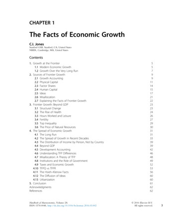
The Facts of Economic GrowthIndex (1.0 in initial year)4540Per capita GDP353025201510Population502004006008001000 1200 1400 1600 1800 2000YearFig. 2 Economic growth over the very long run. Source: Data are from Maddison, A. 2008. Statistics onworld population, GDP and per capita GDP, 1-2006 AD. Downloaded on December 4, 2008 from http://www.ggdc.net/maddison/ for the “West,” ie, Western Europe plus the United States. A similar patternholds using the “world” numbers from Maddison.1.2 Growth Over the Very Long RunWhile the future of frontier growth is surely hard to know, the stability of frontier growthsuggested by Fig. 1 is most certainly misleading as a guide to growth further back in history. Fig. 2 shows that sustained exponential growth in living standards is an incrediblyrecent phenomenon. For thousands and thousands of years, life was, in the evocativelanguage of Thomas Hobbes, “nasty, brutish, and short.” Only in the last two centurieshas this changed, but in this relatively brief time, the change has been dramatic.aBetween the year 1 C.E. and the year 1820, living standards in the “West” (measuredwith data from Western Europe and the United States) essentially doubled, from around 600 per person to around 1200 per person, as shown in Table 2. Over the next200 years; however, GDP per person rose by more than a factor of twenty, reaching 26,000.The era of modern economic growth is in fact even more special than this. Evidencesuggests that living standards were comparatively stagnant for thousands and thousands ofyears before. For example, for much of prehistory, humans lived as simple hunters andgatherers, not far above subsistence. From this perspective—say for the last 200,000 yearsaPapers that played a key role in documenting and elaborating upon this fact include Maddison (1979),Kremer (1993), Maddison (1995), Diamond (1997), Pritchett (1997), and Clark (2001). This list neglectsa long, important literature in economic history; see Clark (2014) for a more complete list of references.7
8Handbook of MacroeconomicsTable 2 The Acceleration of world growthGDP 001820190020065904207801240335026,200– 010.170.281.010.76Note: Growth rates are average annual growth rates in percent, and GDPper person is measured in real 1990 dollars.Source: Data are from Maddison, A. 2008. Statistics on world population,GDP and per capita GDP, 1-2006 AD. Downloaded on December 4,2008 from http://www.ggdc.net/maddison/ for the “West,” ie, WesternEurope plus the United Statesor more—the era of modern growth is spectacularly brief. It is the economic equivalentof Carl Sagan’s famous “pale blue dot” image of the earth viewed from the outer edge ofthe solar system.Table 2 reveals several other interesting facts. First and foremost, over the very longrun, economic growth at the frontier has accelerated—that is, the rates of economicgrowth are themselves increasing over time. Romer (1986) emphasized this fact for livingstandards as part of his early motivation for endogenous growth models. Kremer (1993)highlighted the acceleration in population growth rates, dating as far back as a millionyears ago, and his evidence serves as a very useful reminder. Between 1 millionB.C.E. and 10,000 B.C.E., the average population growth rate in Kremer’s data was0.00035% per year. Yet despite this tiny growth rate, world population increased by afactor of 32, from around 125,000 people to 4 million. As an interesting comparison,that’s similar to the proportionate increase in the population in Western Europe andthe United States during the past 2000 years, shown in Table 2.Various growth models have been developed to explain the transition from stagnantliving standards for thousands of years to the modern era of economic growth. A keyingredient in nearly all of these models is Malthusian diminishing returns. In particular,there is assumed to be a fixed supply of land which is a necessary input in production.bAdding more people to the land reduces the marginal product of labor (holdingtechnology constant) and therefore reduces living standards. Combined with some subsistence level of consumption below which people cannot survive, this ties the size of thepopulation to the level of technology in the economy: a better technology can support alarger population.bI have used this assumption in my models as well, but I have to admit that an alternative reading of historyjustifies the exact opposite assumption: up until very recently, land was completely elastic—whenever weneeded more, we spread out and found greener pastures.
The Facts of Economic GrowthVarious models then combine the Malthusian channel with different mechanisms forgenerating growth. Lee (1988), Kremer (1993), and Jones (2001) emphasize the positivefeedback loop between “people produce ideas” as in the Romer model of growth withthe Malthusian “ideas produce people” channel. Provided the increasing returns associatedwith ideas is sufficiently strong to counter the Malthusian diminishing returns, this mechanism can give rise to dynamics like those shown in Fig. 2. Lucas (2002) emphasizes the roleof human capital accumulation, while Hansen and Prescott (2002) focus on a neoclassicalmodel that features a structural transformation from agriculture to manufacturing. OdedGalor, with his coauthors, has been one of the most significant contributors, labeling thisliterature “unified growth theory.” See Galor and Weil (2000) and Galor (2005).2. SOURCES OF FRONTIER GROWTHThe next collection of facts related to economic growth are best presented in the contextof the famous growth accounting decomposition developed by Solow (1957) and others.This exercise studies the sources of growth in the economy through the lens of a singleaggregate production function. It is well known that the conditions for an aggregate production function to exist in an environment with a rich underlying microstructure arevery stringent. The point is not that anyone believes those conditions hold. Instead,one often wishes to look at the data “through the lens of” some growth model that ismuch simpler than the world that generates the observed data. A long list of famouspapers supports the claim that this is a productive approach to gaining knowledge,Solow (1957) itself being an obvious example.While not necessary, it is convenient to explain this accounting using a Cobb–Douglas specification. More specifically, suppose final output Yt is produced using stocksof physical capital Kt and human capital Ht:Yt ¼ At Mt Ktα Ht1 α fflffl{zfflffl}(1)TFPwhere α is between zero and one, At denotes the economy’s stock of knowledge, and Mtis anything else that influences total factor productivity (the letter “M” is reminiscent ofthe “measure of our ignorance” label applied to the residual by Abramovitz (1956) andalso is suggestive of “misallocation,” as will be discussed in more detail later). The nextsubsection provides a general overview of growth accounting for the United States basedon this equation, and then the remainder of this section looks more closely at eachindividual term in Eq. (1).2.1 Growth AccountingIt is traditional to perform the growth accounting exercise with a production function like (1). However, that approach creates some confusion in that some of the9
10Handbook of Macroeconomicsaccumulation of physical capital is caused by growth in total factor productivity (eg, as ina standard Solow model). If one wishes to credit such growth to total factor productivity,it is helpful to do the accounting in a slightly different way.c In particular, divide bothsides of the production function by Ytα and solve for Yt to get αKt 1 α(2)Yt ¼Ht Z tYt1where Zt ðAt Mt Þ1 α is total factor productivity measured in labor-augmenting units.Finally, dividing both sides by the aggregate amount of time worked, Lt, gives αYtKt 1 α Ht(3)¼ ZtLtYtLtIn this form, growth in output per hour Yt/Lt comes from growth in the capital-outputratio Kt/Yt, growth in human capital per hour Ht/Lt, and growth in labor-augmentingTFP, Zt. This can be seen explicitly by taking logs and differencing Eq. (3). Also, noticethat in a neoclassical growth model, the capital-output ratio is proportional to the investment rate in the long-run and does not depend on total factor productivity. Hence thecontributions from productivity and capital deepening are separated in this version, in away that they were not in Eq. (1).The only term we have yet to comment on is Ht/Lt, the aggregate amount of humancapital divided by total hours worked. In a simple model with one type of labor, one canthink of Ht ¼ htLt, where ht is human capital per worker which increases because ofeducation. In a richer setting with different types of labor that are perfect substituteswhen measured in efficiency units, Ht/Lt also captures composition effects. The Bureauof Labor Statistics, from which I’ve obtained the accounting numbers discussed next,therefore refers to this term as “labor composition.”Table 3 contains the growth accounting decomposition for the United States since1948, corresponding to Eq. (3). Several well-known facts emerge from this accounting.First, growth in output per hour at 2.5% is slightly faster than the growth in GDP perperson that we saw earlier. One reason is that the BLS data measure growth for the privatebusiness sector, excluding the government sector (in which there is zero productivitygrowth more or less by assumption). Second, the capital-output ratio is relatively stableover this period, contributing almost nothing to growth. Third, labor composition (a risein educational attainment, a shift from manufacturing to services, and the increased laborforce participation of women) contributes 0.3 percentage points per year to growth.Finally, as documented by Abramovitz, Solow, and others, the “residual” of total factorcKlenow and Rodriguez-Clare (1997), for example, takes this approach.
The Facts of Economic GrowthTable 3 Growth accounting for the United StatesContributions fromPeriodOutput per hourK/YLabor compositionLabor-Aug. 70.1 72.32.21.1Note: Average annual growth rates (in percent) for output per hour and its components for the private business sector, following Eq. (3).Source: Authors calculations using Bureau of Labor Statistics, Multifactor Productivity Trends, August 21, 2014.productivity accounts for the bulk of growth, coming in at 2.0 percentage points, or 80%of growth since 1948.The remainder of Table 3 shows the evolution of growth and its decomposition overvarious periods since 1948. We see the rapid growth and rapid TFP growth of the1948–1973 period, followed by the well-known “productivity slowdown” from 1973to 1995. The causes of this slowdown are much debated but not convincingly pinneddown, as suggested by the fact that the entirety of the slowdown comes from theTFP residual rather than from physical or human capital; Griliches (1988) contains adiscussion of the slowdown.Remarkably, the period 1995–2007 sees a substantial recovery of growth, not quite tothe rates seen in the 1950s and 1960s, but impressive nonetheless, coinciding with thedot-com boom and the rise in the importance of information technology. Byrne et al.(2013) provide a recent analysis of the importance of information technology to growthover this period and going forward. Lackluster growth in output per hour since 2007 issurely in large part attributable to the Great Recession, but the slowdown in TFP growth(which some such as Fernald, 2014 date back to 2003) is troubling.d2.2 Physical CapitalThe fact that the contribution of the capital-output ratio was modest in the growthaccounting decomposition suggests that the capital-output ratio is relatively constant overdThere are a number of important applications of growth accounting in recent decades. Young (1992) andYoung (1995) document the surprisingly slow total factor productivity growth in the East Asian miraclecountries. Krugman (1994) puts Young’s accounting in context and relates it to the surprising finding ofearly growth accounting exercises that the Soviet Union exhibited slow TFP growth as well. Klenow andRodriguez-Clare (1997) conduct a growth accounting exercise using large multicountry data sets and showthe general importance of TFP growth in that setting.11
12Handbook of MacroeconomicsRatio of real k / real gdp7654Total3Nonresidential21Private 0YearFig. 3 The ratio of physical capital to GDP. Source: Burea of Economic Analysis Fixed Assets tables 1.1 and1.2. The numerator in each case is a different measure of the real stock of physical capital, while thedenominator is real GDP.time. This suggestion is confirmed in Fig. 3. The broadest concept of physical capital(Total), including both public and private capital as well as both residential and nonresidential capital, has a ratio of 3 to real GDP. Focusing on nonresidential capitalbrings this ratio down to 2, and further restricting to private nonresidential capital leadsa ratio of just over 1.The capital stock is itself the cumulation of investment, adjusted for depreciation.Fig. 4 shows nominal spending on investment as a share of GDP back to 1929. The shareis relatively stable for much of the period, with a notable decline during the last twodecades.In addition to cumulating investment, however, another step in going from the(nominal) investment rate series to the (real) capital-output ratio involves adjusting forrelative prices. Fig. 5 shows the price of various categories of investment, relative tothe GDP deflator. Two facts stand out: the relative price of equipment has fallen sharplysince 1960 by more than a factor of 3 and the relative price of structures has risen since1929 by a factor of 2 (for residential) or 3 (for nonresidential).A fascinating observation comes from comparing the trends in the relative pricesshown in Fig. 5 to the investment shares in Fig. 4: the nominal investment shares arerelatively stable when compared to the huge trends in relative prices. For example, eventhough the relative price of equipment has fallen by more than a factor of 3 since 1960,the nominal share of GDP spent on equipment has remained steady.The fall of equipment prices has featured prominently in parts of the growth literature; for example, see Greenwood et al. (1997) and Whelan (2003). These papers makethe point that one way to reconcile the facts is with a two-sector model in which
The Facts of Economic GrowthShare of 196019701980199020002010YearFig. 4 Investment in physical capital (private and public), United States. Source: National Incomeand Product Accounts, U.S. Bureau of Economic Analysis, table 5.2.5. Intellectual property products andinventories are excluded. Government and private investment are combined. Structures includes bothresidential and nonresidential investment. Ratios of nominal investment to GDP are shown.Index (2009 value 100, log ntial arFig. 5 Relative price of investment, United States. Note: The chained price index for various categoriesof private investment is divided by the chained price index for GDP. Source: National Income andProduct Accounts, U.S. Bureau of Economic Analysis table 1.1.4.technological progress in the equipment sector is substantially faster that technologicalprogress in the rest of the economy—an assumption that rings true in light of Moore’sLaw and the tremendous decline in the price of a semiconductors. Combining thisassumption with Cobb–Douglas production functions leads to a two-sector model that13
14Handbook of MacroeconomicsPercent80Labor share706050Capital share4030201950196019701980199020002010YearFig. 6 Capital and labor shares of factor payments, United States. Source: The series starting in 1975 arefrom Karabarbounis, L., Neiman, B. 2014. The global decline of the labor share. Q. J. Econ. 129 (1), 2014i1p61-103.html and measure the factor shares for thecorporate sector, which the authors argue is helpful in eliminating issues related to self-employment.The series starting in 1948 is from the Bureau of Labor Statistics Multifactor Productivity Trends,August 21, 2014, for the private business sector. The factor shares add to 100%.is broadly consistent with the facts we’ve laid out. A key assumption in this approachis that better computers are equivalent to having more of the old computers, so thattechnological change is, at least partially, capital (equipment) augmenting. The Cobb–Douglas assumption ensures that this nonlabor augmenting technological change cancoexist with a balanced growth path and delivers a stable nominal investment rate.e2.3 Factor SharesOne of the original Kaldor (1961) stylized facts of growth was the stability of the sharesof GDP paid to capital and labor. Fig. 6 shows these shares using two different data sets,but the patterns are quite similar. First, between 1948 and 2000, the factor shares wereindeed quite stable. Second, since 2000 or so, there has been a marked decline in thelabor share and a corresponding rise in the capital share. According to the data fromthe Bureau of Labor Statistics, the capital share rose from an average value of 34.2%between 1948 and 2000 to a value of 38.7% by 2012. Or in terms of the complement,the labor share declined from an average value of 65.8% to 61.3%.eThis discussion is related to the famous Uzawa theorem about the restrictions on technical change requiredto obtain balanced growth; see Schlicht (2006) and Jones and Scrimgeour (2008).
The Facts of Economic GrowthYears of schooling1514By birth cohort131211Adult labor force109871880190019201940196019802000YearFig. 7 Educational attainment, United States. Source: The blue (dark gray in the print version) line showseducational attainment by birth cohort from Goldin, C., Katz, L.F. 2007. Long-run changes in the wagestructure: narrowing, widening, polarizing. Brook. Pap. Econ. Act. 2, 135–165. The green (gray in theprint version) line shows average educational attainment for the labor force aged 25 and over fromthe Current Population Survey.It is hard to know what to make of the recent movements in factor shares. Is this atemporary phenomenon, perhaps amplified by the Great Recession? Or are some moredeeper structural factors at work? Karabarbounis and Neiman (2014) document that thefact extends to many countries around the world and perhaps on average starts evenbefore 2000. Other papers seek to explain the recent trend by studying depreciation,housing, and/or intellectual property and include Elsby et al. (2013), Bridgman(2014), Koh et al. (2015), and Rognlie (2015).A closely-related fact is the pattern of factor shares exhibited across industries withinan economy and across countries. Jones (2003) noted the presence of large trends, bothpositive and negative, in the 35 industry (2-digit) breakdown of data in the United Statesfrom Dale Jorgenson. Gollin (2002) suggests that factor shares are uncorrelated with GDPper person across a large number of countries.2.4 Human CapitalThe other major neoclassical input in production is human capital. Fig. 7 shows a timeseries for one of the key forms of human capital in the economy, education. Morespecifically, the graph shows educational attainment by birth cohort, starting withthe cohort born in 1875.15
16Handbook of MacroeconomicsPercent6040Percent100Fraction of hours workedby college-educated workers(left scale)80College wage premium(right scale)2060040196019701980199020002010Fig. 8 The supply of college graduates and the college wage premium, 1963–2012. Note: The supply ofUS college graduates, measured by their share of total hours worked, has risen from below 20% tomore than 50% by 2012. The US college wage premium is calculated as the average excessamount earned by college graduates relative to nongraduates, controlling for experience andgender composition within each educational group. Source: Autor, D.H. 2014. Skills, education, andthe rise of earnings inequality among the “other 99 percent”. Science 344 (6186), 843–851, fig. 3.Two facts emerge. First, for 75 years, educational attainment rose steadily, at a rateof slightly less than 1 year per decade. For example, the cohort born in 1880 got justover 7 years of education, while the cohort born in 1950 received 13 years of educationon average. As shown in the second (green) line in the figure, this translated into steadilyrising educational attainment in the adult labor force. Between 1940 and 1980, forexample, educational attainment rose from 9 years to 12 years, or about 3/4 of a yearper decade. With a Mincerian return to education of 7%, this corresponds to a contribution of about 0.5 percentage points per year to growth in output per worker.The other fact that stands out prominently, however, is the leveling-off of educationalattainment. For cohorts born after 1950, educational attainment rose more slowly thanbefore, and for the latest cohorts, educational attainment has essentially flattened out.Over time, one expects this to translate into a slowdown in the increase of educationalattainment for the labor force as a whole, and some of this can perhaps be seen in the lastdecade of the graph.Fig. 8 shows another collection of stylized facts related to human capital made famousby Katz and Murphy (1992). The blue line in the graph shows the fraction of hoursworked in the US economy accounted for by college-educated workers. This fractionrose from less than 20%
suggested by Fig. 1 is most certainly misleading as a guide to growth further back in his-tory. Fig. 2 shows that sustained exponential growth in living standards is an incredibly recent phenomenon. For thousands and thousands of years, life was, in the evocative language of Thomas Hobb