Transcription
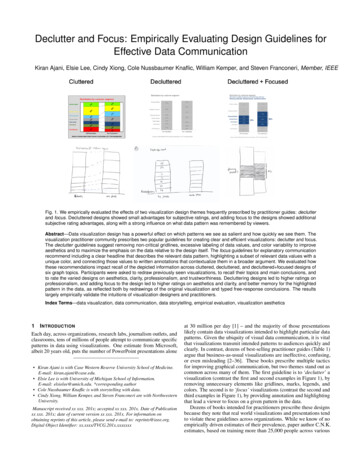
Declutter and Focus: Empirically Evaluating Design Guidelines forEffective Data CommunicationKiran Ajani, Elsie Lee, Cindy Xiong, Cole Nussbaumer Knaflic, William Kemper, and Steven Franconeri, Member, IEEEFig. 1. We empirically evaluated the effects of two visualization design themes frequently prescribed by practitioner guides: declutterand focus. Decluttered designs showed small advantages for subjective ratings, and adding focus to the designs showed additionalsubjective rating advantages, along with a strong influence on what data pattern was remembered by viewers.Abstract—Data visualization design has a powerful effect on which patterns we see as salient and how quickly we see them. Thevisualization practitioner community prescribes two popular guidelines for creating clear and efficient visualizations: declutter and focus.The declutter guidelines suggest removing non-critical gridlines, excessive labeling of data values, and color variability to improveaesthetics and to maximize the emphasis on the data relative to the design itself. The focus guidelines for explanatory communicationrecommend including a clear headline that describes the relevant data pattern, highlighting a subset of relevant data values with aunique color, and connecting those values to written annotations that contextualize them in a broader argument. We evaluated howthese recommendations impact recall of the depicted information across cluttered, decluttered, and decluttered focused designs ofsix graph topics. Participants were asked to redraw previously seen visualizations, to recall their topics and main conclusions, andto rate the varied designs on aesthetics, clarity, professionalism, and trustworthiness. Decluttering designs led to higher ratings onprofessionalism, and adding focus to the design led to higher ratings on aesthetics and clarity, and better memory for the highlightedpattern in the data, as reflected both by redrawings of the original visualization and typed free-response conclusions. The resultslargely empirically validate the intuitions of visualization designers and practitioners.Index Terms—data visualization, data communication, data storytelling, empirical evaluation, visualization aesthetics1I NTRODUCTIONEach day, across organizations, research labs, journalism outlets, andclassrooms, tens of millions of people attempt to communicate specificpatterns in data using visualizations. One estimate from Microsoft,albeit 20 years old, puts the number of PowerPoint presentations alone Kiran Ajani is with Case Western Reserve University School of Medicine.E-mail: kiran.ajani@case.edu. Elsie Lee is with University of Michigan School of Information.E-mail: elsielee@umich.edu. *corresponding author Cole Nussbaumer Knaflic is with storytelling with data. Cindy Xiong, William Kemper, and Steven Franconeri are with NorthwesternUniversity.Manuscript received xx xxx. 201x; accepted xx xxx. 201x. Date of Publicationxx xxx. 201x; date of current version xx xxx. 201x. For information onobtaining reprints of this article, please send e-mail to: reprints@ieee.org.Digital Object Identifier: xx.xxxx/TVCG.201x.xxxxxxxat 30 million per day [1] – and the majority of those presentationslikely contain data visualizations intended to highlight particular datapatterns. Given the ubiquity of visual data communication, it is vitalthat visualizations transmit intended patterns to audiences quickly andclearly. In contrast, dozens of best-selling practitioner guides (Table 1)argue that business-as-usual visualizations are ineffective, confusing,or even misleading [2–36]. These books prescribe multiple tacticsfor improving graphical communication, but two themes stand out ascommon across many of them. The first guideline is to ‘declutter’ avisualization (contrast the first and second examples in Figure 1), byremoving unnecessary elements like gridlines, marks, legends, andcolors. The second is to ‘focus’ visualizations (contrast the second andthird examples in Figure 1), by providing annotation and highlightingthat lead a viewer to focus on a given pattern in the data.Dozens of books intended for practitioners prescribe these designsbecause they note that real world visualizations and presentations tendto violate these guidelines across organizations. While we know of noempirically driven estimates of their prevalence, paper author C.N.K.estimates, based on training more than 25,000 people across various
Table 1. Data Visualization Practitioner GuidesBook TitleInfo We TrustGood ChartsThe Functional ArtThe Truthful ArtData At WorkTrees, Maps, andTheoremsDataStoryslide:ologyEffective Data StorytellingEffective DataVisualizationPresenting DataEffectivelyNow You See ItInformation DashboardDesignAvoiding Data PitfallsCommunicating DataWith TableauData VisualisationStorytelling With DataStorytelling With Data:Let’s Practice#MakeoverMondayThe Book of TreesDesign for InformationVisualization Analysis& DesignTableau Your Data!Better PresentationsElevate the DebateVisual ExplanationsVisual Display ofQuantitative InformationEnvisioning InformationThe Power of DataStorytellingInformation Visualization:Perception for DesignVisual Thinking for DesignBig Book of DashboardsWSJ Guide to InformationGraphicsData Declutter Focus DuarteDuarteDykesEvergreen Evergreen FewFew JonesJones KirkKnaflicKnaflic Kriebel et al.LimaMeirellesMunzner MurraySchwabishSchwabishTufteTufte TufteVora Ware WareWexler et al.Wong Yau organizations and industries, that the overwhelming majority of visualizations intended for explanatory purposes include graphical clutterand do not focus attention. Note that this sample is likely to be anoverestimate, because these organizations had self-selected for visualization design training. But it is consistent with the fact that dozensof best-selling books have taken the time to make these prescriptions –that would be unlikely if those practices were already common in thereal world.While these two guidelines are argued to improve the comprehension and clarity of data communication, given their prevalence asprescriptions and their potential for impact in daily life, these recommendations have not been sufficiently empirically evaluated. Thedeclutter guideline has some less controversial elements, such as replacing legends with direct labels, which are highly likely to improveperformance [3–7, 9–20, 24–30, 32–36]. However, other aspects of thisprocess present potential tradeoffs. In the example in Figure 1, theoverall aesthetic of the visualization might improve by removing dottedlines connecting the segments (contrast the first and second graphs),but that could also decrease the precision of comparing values betweenthe two stacks. Removing the variety of colors for the nominal cate-gories (as shown between the first and second graphs) might lead tohigher aesthetic appeal, but it may also render the different categoriesharder to match. Are these ‘clutter’ elements really such an impedimentfor a powerful visual system that takes up almost half of the humanbrain [37], or might they perhaps lead to a level of minimalism thatthe viewer finds boring? Likewise, the focus guideline points viewerstoward a particular pattern in the data, with one intention of having aviewer better remember the shape of the data. But again, given such apowerful visual system, is this step really needed? Might the viewerinstead feel that a single story is being ‘pushed’ on them?We empirically tested the impacts of these design guidelines, acrossparticipant ratings (aesthetics, clarity, professionalism, and trustworthiness) and memory recall (via drawings and typed responses) forcluttered, decluttered, and decluttered focused versions of visualizeddatasets. In collaboration with a practitioner guide author (paper authorC.N.K.), we generated six example visualization topics in each of thethree design styles shown in Figure 1. We find that decluttered visualizations are generally rated more positively on professionalism, butlarger benefits appeared for decluttered focused visualizations. Thesewere rated more positively on aesthetics and clarity, and led to improvedmemory for focus-relevant data patterns, as measured by drawings andtyped conclusions from memory. However, the focus manipulation didnot have an additional effect beyond the declutter manipulation on ratings of professionalism, and neither decluttering alone nor the additionof focusing showed strong evidence for improving trustworthiness of agraph.1.11.1.1Related WorkDecluttering a VisualizationOne form of argument for minimalist design in a visualization is Tufte’s‘data-to-ink ratio’ [28]. While the definitions of ‘data’ vs. ‘ink’ can bevague and subject to context [38], the general prescription is to removeany unnecessary elements in a visualization. In many cases, this ruleis invoked as a reason to omit ‘chartjunk,’ pictorial ornamentation andmetaphors such as arranging increasingly large bars in a graph as amonster’s teeth, or putting a memorable dinosaur in the backgroundof a graph. Some past work shows that these pictorial embellishmentscan lead to either better or worse performance on immediate reportsdepending on the details of task and context [39, 40], and found nosignificant effect of the presence of chartjunk on decision-making[41]. Chartjunk can lead to higher engagement and aesthetics ratings[40], as well as better short- and long-term memory for whether thevisualization was previously seen [42] and what the data content ormessage was [43–45].Our present work focuses not on such pictorial ‘chartjunk,’ but with‘clutter,’ “.conventional graphical paraphernalia routines added toevery display that passes by: over-busy grid lines and excess ticks, .the debris of computer plotting.” [28]. A critique of the default settingsof Microsoft Excel 2007 shows that the software created visualizationsthat nudge users toward redundant gridlines, excessive labels, excessivecolor, and 3D effects [31, 32, 46–48]. Authors of data visualizationbooks also suggest reducing the number of colors present in a displayto as few as possible, eliminating separate colors to indicate nominalcategories in the data (e.g., using different colors for marks in a lineor bar graph), or other areas of a visualization such as the background[3, 19, 46, 49].Some existing studies have sought to determine whether declutteringwould lead to objectively better performance on graphical perceptionand memory tasks. One study found that within a simulated monitoring dashboard for nine metrics, removing unnecessary elements (tickmarks, verbose scale number labeling, redundant readouts, coloredbackgrounds highlighting relevant thresholds, etc.) did not improveresponse times or situation awareness accuracy [50]. A more extrememanipulation stripped away the graphical display entirely so that values were only displayed as text digits, and this did improve responsetimes [50]. But this more drastic change might improve performancenot because it omits clutter, but because it contained larger versions oftext digits and a more precise data representation that was likely moresuitable for the participant’s high-precision monitoring task. Another
study asked participants to compute simple means, differences, andcomparisons on bar graphs with only two bars, while manipulating thepresence of individual bits of ‘clutter,’ finding that including axis tickmarks slightly increase response times, but completely removing the xand y-axes can slightly slow responses, with both effects occurring forbar but not line graphs [39]. Finally, another study showed that graphswith ‘data redundancy’ – symbolic numbers placed on or near visualmarks that already show those numbers visually – actually showedhigher quality memory reports for their content [44].Other studies evaluate the impact of decluttering on preference ratings. When they are important for a precise estimation task, viewersprefer lower-contrast gridlines compared to heavier lines that can obscure the underlying data, and the authors even provide quantitativealpha values for the preferred range [51], and show how this rangevaries by the color of the gridlines [52]. Another study evaluated ratings of beauty, clarity, effectiveness, and simplicity of visualizationswith high vs. low ‘data-ink’ ratios [53]. Surprisingly, visualizationswith lower data-ink ratios (more ‘clutter’) were rated more positively,potentially because the more minimalistic style was unfamiliar, giventhat the cluttered designs are encountered more frequently in tools likeMicrosoft Excel. Another study found similar results, especially forextremely minimalistic designs [54], and again argued that the lowerlevel of familiarity might drive a distaste for overly decluttered designs.1.1.2Focusing a VisualizationWhile broad statistics about the data values, such as distributions andoutliers, are available quickly [55], picking out one of the many – evendozens or hundreds – of potential patterns, trends, and relations ofinterest within it is an inefficient perceptual process [56], requiringseconds or minutes of processing to unpack the ‘paragraphs-worth’ ofinformation implicit in a single visualization [57]. One study showedthat once a pattern is seen within a visualization, a ‘curse of expertise’biases people to tend to think that others will focus on that patternas well, even when they don’t. Viewers saw background informationthat focused on a particular data pattern (i.e., relationships betweentwo lines from a four-line graph) in a visualization. They then askedparticipants to forget that story, and predict which of multiple possiblepatterns would be most salient to a viewer who had not heard thatstory. Despite reminders that other viewers had not heard the story,participants still incorrectly predicted that others would see what theysaw in the visualization [58].This problem motivates a frequent practitioner guideline to focus avisualization: if there is a single pattern that a viewer should extractand remember, then the designer should state the pattern clearly withdirect annotation, and highlight the key data values that create thatpattern [2–36]. One study found that visualizations with a title showedhigher quality memory reports for their content, especially when thetitle included ‘message redundancy,’ an additional section of text thatfocused the viewer on a key pattern in the visualization [44]. That studyalso found that titles were robustly fixated (especially when placed atthe top as opposed to the bottom of the visualization), and that laterdescriptions from memory tended to reflect a rewording of the contentexpressed in the title. Other work focuses not just on focusing a singleview on a single visualization, but instead on the broader practice of‘storytelling’: creating a sequence of views that follows an argumentor other narrative as a rhetorical tool to guide a viewer through a morecomplex set of data patterns over time, with some considering the addedcomplexities of user interactivity, path choice, and drilldown [59–62].Some of these studies pick out real-world examples of highlightingrelevant data values in a visualization [60].1.2Contributions of the present workRelatively more existing work has tested the declutter guideline thanthe focus guideline, but this work has not converged on a clear answer.Some of this work shows an advantage to decluttering [51], some showsno difference [50], some shows a disadvantage [44], and some showsa mix [39]. For preference ratings, at least two recent studies actuallyshow a preference for more cluttered designs, perhaps because theyare more familiar [53, 54], though these studies use graphs that arealready highly minimalistic and abstract (e.g. an Excel bar graph of‘Sales’ across four regions ‘North,’ ‘South,’ etc.). Other work thatfinds little impediment of clutter on objective performance uses verysimple displays, such as 2-value graphs [39], or relies on a specificdashboard monitoring task [50]. While well-controlled, these highlyabstract graphs and specific tasks may not reflect the preference andperformance effects generated by the types of clutter seen frequently byparticipants. To test this idea, we use realistic examples of both graphtopics and clutter types drawn from a guidebook derived from manyyears of experience in organizational presentation settings [19].Little work has tested the effects of the focus guideline. In the closestwork, titles (particularly those that focused on a single message) led tobetter objective memory of the content in the visualization [44]. Whilehighly suggestive, these data are correlational because presence of atitle was not randomly assigned, so it is possible that a third variablecontributed to that advantage. For example, a particularly salient datapattern could drive both the original visualization author and experimental participant to notice that more memorable pattern. We thereforetest the same visualizations across three designs, in a between-subjectcounterbalanced manipulation. Furthermore, that study was concernedwith measuring ‘objective’ memory for correct vs. incorrect information in the visualization, while our focus is on measuring how stronglya focus manipulation could subjectively emphasize one possible patternin the data over others. This previous work also measured relativelylong-term memory for visualizations after seeing 100 total visualizations for 10 seconds each, simulating a longer-term exposure to manyvisualizations. In contrast, our goal was to test an immediate understanding after a 10-second viewing period, in order to simulate theexperience of being shown data on a handout or presentation slide in ameeting, conference, or discussion. In addition to memory reports viatyped text, we add a novel method of collecting drawings from memory,to see if the focus manipulation would affect not only what they say, butwhat they remember seeing. Finally, we know of no existing work thatmeasures preference ratings (aesthetics, etc.) across the increasinglyprevalent practice of implementing the focus guideline in visualizationdesigns.2E XPERIMENT OVERVIEWFigure 1 depicts an example of three design variations – cluttered,decluttered, and decluttered focused – for one of the visualizationtopics used in our experiments. We take representative examples froma popular practitioner guide [19], 100,000 copies sold according tostorytellingwithdata.com [63], and the alternate designs were createdin collaboration with that book’s author.We measured several metrics of communication effectiveness acrossthese three design variations, including whether viewers would bemore likely to recall the intended message of each visualization, asmeasured by qualitative coding of visualizations drawn from memoryand from typed free-responses. We additionally measured whether theywould rate the design variations differently across quantitative scalesof aesthetics, clarity, professionalism, and trustworthiness, as well asqualitative explanations of those ratings.2.1ParticipantsAn omnibus power analysis from the quantitative data collected froma pilot experiment (see Supplementary Materials) suggested a targetsample of 24 participants would give us more than 95% power todetect an overall effect of graph version (cluttered, decluttered, decluttered focused) on quantitative ratings of aesthetics, clarity, professionalism, and trustworthiness. All 24 participants whose data wereused in the final analysis are either students or community members atNorthwestern University (18 female, age range 18 to 26, average age19.5, all normal or corrected-to-normal vision). We replaced a subset ofour initial 24 participants to resolve a condition counterbalancing errorand this replacement was performed blind to participant results, onlygoverned by which conditions they were shown. They participated inreturn for 10/hour or for course credit.
DeclutteredFocusedHolidayCarClutteredpresent in the cluttered version, and added white space.The focused graphs added a single highlight color (e.g. red) to thegrayscale graph, intended to focus the viewer on a given pattern. In theHoliday graph topic, intensity of color was manipulated to focus theviewer particularly to a pair of data values. A one-sentence annotationdescribed a conclusion that could be drawn from that data pattern, withkey words in the same font color as the highlighted data pattern. Forexample, in the News graph, the focused version adds contrast betweenthe blue ‘Internet’ line and the other news source lines to draw attentionto the pattern of increasing usage.3.2TiresPrisonPlantsNews3.2.1Fig. 2. We created three versions (cluttered, decluttered, and focused) ofsix different graph topics following popular data visualization guidelines.33.1M ATERIALSANDP ROCEDUREStimuliThe stimuli for this experiment (Figure 2) consisted of cluttered, decluttered, and decluttered focused (which will be shortened to ‘focused’from here forward) versions each of six different example graphs: concerns about an automotive design split by concern category (‘Car’),holiday shopping frequencies over time split by gender (‘Holiday’),news sources over time split by medium (‘News’), the distribution ofcustomer-preferred flower seeds split by customer category (‘Plants’),US prisoner offenses split by category (‘Prison’), and retail prices oftires over time split by manufacturer (‘Tires’). The graphs consistedof vertical bar charts, horizontal bar charts, stacked vertical bar charts,and line graphs. We created the three different visualization designs ofthe same graph, using examples adapted from Nussbaumer Knaflic [19]The cluttered graphs contained a larger palette of color, used lowlegibility fonts, and included gridlines, heavy borders, backgroundshading, axis tick marks, data markers, redundant numeric labeling,diagonally rotated text, overuse of bolded text, and 3D shading cues.The decluttered graphs removed color, chart borders, gridlines, tickmarks, and even axis lines in some cases, but kept the graph’s title, datavalues, and axes and their labels. Text was oriented horizontally insteadof diagonally, and text was spatially aligned to other elements in thegraph; for example, instead of being centered, titles were left-alignedwith the y-axis. White space was added between major elements (e.g.between the title and graph, or graph and footnote). Legends wereconverted into direct labels. For example, for the News graph, thedecluttered version removed the excessive data points and gridlinesProcedurePart 1We presented each of the six graph topics to 24 participants in a Latinsquare counterbalanced design that balanced presentation order acrossexamples. Participants were placed into one of six counterbalancinggroups, each of which had a predetermined balance of cluttered, decluttered, and focused versions such that each participant viewed twoexamples of each of the three visualization designs for a total of sixgraphs. The combination of which visualization design was seen withwhich graph topic was balanced across the counterbalancing groups,resulting in an equal presentation of each visualization design and graphtopic across all participants.Redraw Task. Participants saw the following prompt: “You areabout to be shown a graph for 10 seconds. After the graph is displayed,you will be asked to redraw as much as you can remember about thegraph. Please do not draw anything on the paper in front of you untilafter the graph has disappeared from the screen.” Participants wereadditionally presented with a scenario that provided context for thegraph they were about to see. For example, before seeing any versionof the Plants graph, they read the following scenario: “A local botanicalgarden sells seven different brands of flower seeds to the community.These different seed companies also sell all over the United States. Ourlocal botanical garden wants to know how these brands are selling inour own store, compared to how they sell around the United States ingeneral.” All of the scenarios are available in Supplementary Materials.After the 10-second exposure, participants saw the prompt: “Please take1-2 minutes to redraw whatever you can remember from the graph thatyou just saw on the piece of paper in front of you. Advance to the nextpage once you have redrawn the graph.” Participants then redrew asmuch of the graph as possible from memory. All drawings are availablein the Supplementary Materials.Free Response Conclusions. Participants wrote about the subjectmatter and conclusions that could be drawn from the graph. On the nextpage after redrawing the graph, they typed out the subject matter (“Whatwas the subject matter of the graph?”) and their perceived conclusion ofthe data (“What conclusions can be drawn from the graph?”) in a freeresponse text box. The subject matter responses were collected but arenot reported because they were largely redundant with more detailedresponses provided for the conclusion. For example, in response to thePlants graph, the subject matter written by Subject 1 was: “how seedbrands are selling in a local botanical store compared to the US,” whilethe conclusion response was: “which seeds are most popular locally,which seeds are most popular nationally, what seeds have poor saleslocally and/or nationally.” The subject matter and conclusion data isavailable in the Supplementary Materials.3.2.2Part 2Quantitative Evaluation. We next presented all three visualizationdesigns of each graph topic simultaneously to each participant, andasked them to rate the three designs according to four Likert scales (1-5range). This process was repeated for each of the six topics for a totalof 18 graphs (3 designs x 6 topics) in a counterbalanced order suchthat each topic appeared an equal number of times in each spot in theordering. The four scales were: Aesthetics: “Overall, is this a visually appealing image?”, ratedfrom one (“very hideous”) to five (“very beautiful”).
Clarity: “Is it clear what information is being presented andwhy?”, rated from one (“I am utterly confused”) to five (“makesperfect sense”). Professionalism: “Does this graph look like something youwould see in a professional environment?”, rated from one (“veryunprofessional”) to five (“very professional”). Trustworthiness: “Based on the presentation, how trustworthyis the person who made this graph?”, rated from one (“very untrustworthy”) to five (“very trustworthy”).Qualitative Evaluation. Finally, we asked an open-ended question: “Please explain your reasoning for choosing these ratings. (1-2sentences)” for each of the four scales for all 18 graphs.4 P ILOT E XPERIMENTWe first piloted this experiment (17 participants, all received coursecredit at Northwestern University) in order to measure statistical powerfor our quantitative measures and to refine our stimuli. The stimuli andprocedure were similar to those described above, with the followingexceptions. For stimuli, we realized that some graph topics in thepilot condition appeared to have insufficient contrast in the focus oftheir conclusions between the decluttered and focused designs (e.g.the Prison topic), and made edits to the stimuli to address this forthe experiment. Focused designs initially omitted source information,which trustworthiness rating explanations revealed to be importantto participants, so these were added for all graph topics and designsafter the pilot. The Holiday example had confusingly inconsistenttemporal bins sizes on the x-axis (e.g., some bars represented 2-weekranges, some months), so for the experiment we changed these labelsto consistently present one month intervals. Finally, the pilot originallyused abstract data labels on the Plant and Tires topics, which weresubsequently changed from “Segment 1, Segment 2, Segment 3, etc.”to “Fresh Blooms, Terra Nova, Plant Select, etc.” and from “Product 1,Product 2, Product 3, etc.” to “BF Goodrich, Bridgestone, Continental,etc.,” respectively.For the procedure of the pilot, when participants rated graphs alongthe four scales, they saw each of the 18 total graphs (3 designs x6 topics) individually, which we later decided would make it moredifficult for participants to weigh the different designs for each topicsimultaneously. Therefore, the experiment showed all three designsfor each topic at the same time. We did not perform a formal analysison the qualitative pilot data, as they were only intended to provideinspiration for refining the stimuli.4.1 Pilot ResultsAn initial MANOVA examined the effect of graph version (cluttered, decluttered, and focused) on aesthetics, clarity, professionalism, and trustworthiness ratings of the visualizations. This test revealed a significantmultivariate effect (Pillai’s value 0.34) of design, after accounting forwithin-subject error. We conducted 999 simulations using Bonferroniadjustment methods using the R pairwise.perm.manova function [64]to obtain post-hoc pairwise comparisons between the three levels ofdesign with corrections for multiple testing. The test revealed that overall, across all four dimensions, focused designs were rated significantlyhigher across all metrics than decluttered designs (p 0.003), whichwere rated significantly higher than cluttered designs (p 0.003).We entered the Pillai’s value into G*Power [65] and conducted apower analysis. In this experimental design with 3 groups of visualization design (cluttered, decluttered, and focused) and 4 responsevariables (aesthetics, clarity, professionalism, and trustworthiness), thepilot experiment achieved 90.4% power at the alpha level of 0.05. Withan increased sample size of 20 participants (with 3 measures for eachresponse variable), we would be able to obtain 95.29% power at analpha level of 0.05. We only analyzed the rating data from the pilot inorder to conduc
Visual Explanations Tufte Visual Display of Tufte Quantitative Information Envisioning Information Tufte The Power of Data Vora Storytelling Information Visualization: Ware Perception for Design Visual Thinking for Design Ware Big Book of Dashb