Transcription
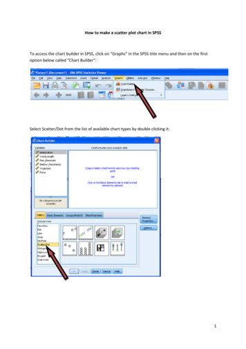
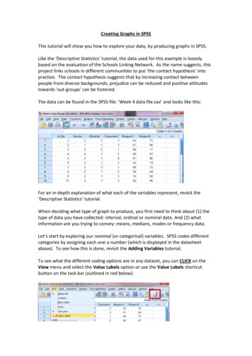
Creating Graphs in SPSSThis tutorial will show you how to explore your data, by producing graphs in SPSS.Like the ‘Descriptive Statistics’ tutorial, the data used for this example is looselybased on the evaluation of the Schools Linking Network. As the name suggests, thisproject links schools in different communities to put ‘the contact hypothesis’ intopractice. The contact hypothesis suggests that by increasing contact betweenpeople from diverse backgrounds, prejudice can be reduced and positive attitudestowards 'out-groups' can be fostered.The data can be found in the SPSS file: ‘Week 4 data file.sav’ and looks like this:For an in-depth explanation of what each of the variables represent, revisit the‘Descriptive Statistics’ tutorial.When deciding what type of graph to produce, you first need to think about (1) thetype of data you have collected: interval, ordinal or nominal data. And (2) whatinformation are you trying to convey: means, medians, modes or frequency data.Let’s start by exploring our nominal (or categorical) variables. SPSS codes differentcategories by assigning each one a number (which is displayed in the datasheetabove). To see how this is done, revisit the Adding Variables tutorial.To see what the different coding options are in any dataset, you can CLICK on theView menu and select the Value Labels option or use the Value Labels shortcutbutton on the task bar (outlined in red below).
Doing this will display thevariable labels for each ofyour conditions or groups.So how might you bestsummarise this kind ofdata? What informationmight you want to show?Let’s explore this using one of the variables above: Ethnicity. One thing you mightwant to consider when exploring the effectiveness of the Schools Linking Network ishow diverse the students who took part were. In other words, you would want away to represent the proportion of participants who fell into each of the differentethnic groups defined here. A good way to represent proportions is using a piechart.Pie ChartsJust to confuse you, SPSS has multiple ways of producingcharts and graphs but this tutorial is going to focus onthe method you are likely to use the more: using thechart builder.To produce a pie chart you first need to CLICK on the Graphs menu and select theChart Builder option.The first thing you will see is a pop-up box asking you to define your level ofmeasurement for each variable (i.e. tell SPSS whether it is interval, ordinal ornominal). This has already been done for this example (to see how, revisit theAdding Variables tutorial).To stop this pop-up from displaying again, tick the ‘Don’t show this dialog again’ box.CLICK on OK to continue.This will open up the chart builder for you.
The chart builder is an interactive drag-and-drop dialog box where you can defineexactly what type of graph you would like.The Variableslist displays thedifferentvariables youhave in yourdataset.The ChartPreview box isthe canvas,where you candrag and dropinformation tobuild andpreview yourgraph or chart.The Gallerydisplays eachtype of graphyou can createand its variants.To create a pie chart, CLICK on Pie/Polar from the Gallery options, and SELECT theimage of the pie chart and drag and drop it to the Chart Preview window.12You may have noticed two things happen when you do this:1. The first is that the Chart preview window now displaysa preview of a standard pie chart, which provides dragand-drop boxes for you to define which informationyou want it to display.2. The second is the opening of the Element Propertiesdialogue box, which allows you to define whatnumerical aspects of your data will be displayed.
So, you now need to define the information you want the pie chart to display.In this case, you want the Slicesof the pie to represent theethnicity of your participants.So, SELECT the Ethnicity variablefrom the Variables List and dragand drop it to box marked ‘Sliceby?’ in the Chart Previewwindow.You may have noticed that indoing this, your AngleVariable box hasautomatically filled itself to‘Count’. This means theangles of the slices will bedetermined by how manyparticipants are in each group.If we wanted to change this,we could do so using theElement Properties box.However, as this is what wewant to display, simply clickon the OK button in the ChartBuilder to produce your chart.In the SPSS Output viewer, youshould now find you haveproduced the following pie chart:From this we can easily see thatthe vast majority of pupils takingpart in the Linking SchoolsNetwork were white, making upalmost three-quarters of thesample.
HistogramsNow you know how to produce a simple pie chart, let’s try to produce a differenttype of graph. This time, let’s investigate how much the participants in the LinkingSchools Project enjoyed meeting people through the program.The variable Enjoyment recorded how much pupils enjoyed this on a scale of 1-5(where 1 did not enjoy at all and 5 really enjoyed). As this is a single scale with 5ordered categories to choose from, it’s an ordinal variable. In this case, you might beinterested in the frequency with which participants chose each of these fiveresponse options. A good way to investigate a frequency distribution like this wouldbe with a histogram.Again, open up the Chart Builder by selecting thisoption through the Graphs menu.The Chart Builder will remember your settings from the last graph you produced(unless you have closed SPSS in between). Don’t worry about that – you just need toreplace the options.First, tell SPSS what graph you want by selecting Histogram from the Gallerywindow.This time, there are a number of graph optionsthat you can choose from. You are only ever likelyto need two of these options:Simple Histogram: when you want to look at thefrequency distribution for a single variable (as wedo now).Stacked Histogram: where you want to comparethe frequency distribution for a single variableacross different groups.As we only have one variable that we are interested in here, CLICK on Histogramfrom the Gallery options, and SELECT the image of the simple histogramanddrag and drop it to the Chart Preview window.
The Chart Preview window now displaysa histogram, but it still contains theEthnicity variable. To replace this,simply click on the box containing thevariable and drag it back to theVariables list.This gives you a blank histogramtemplate. You now need to define whatinformation will be displayed on theX-axis and the Y-axis of the graph.In this case, you want each bar of thehistogram to represent a score on theEnjoyment scale.So, SELECT the Enjoyment variable from the Variables List and drag and drop it tobox marked X-Axis’ in the Chart Preview window.As with the pie chart, doing thisautomatically fills the other box (Y-Axis,)with ‘Count’. This means the height ofeach of the bars will be determined byhow many participants are in eachgroup. While this is absolutely fine for ahistogram, for this example let’s changethe display to something else.We can change what the Y-Axis represents using theElement Properties dialog box.In this case, we want to change the display from Countto Percentage (which will display the percentage ofparticipants who selected each of the responseoptions).To do this, CLICK on the drop-down Statistic menu inthe Statistics box, and SELECT ‘Percentage ()’.Once this is selected and displays in the Statistic box,CLICK on Apply to change the histogram display.
When the changes have been applied in theChart Preview display, CLICK on OK in the ChartBuilder window to produce your histogram.Your histogram should now appear in the SPSSOutput window:From the histogram you can seethat the majority of pupilsenjoyed meeting new peoplethrough the Linking SchoolsNetwork.
Bar ChartsSo far we have looked at producing charts that display the frequency distributions ofnominal or ordinal variables. But what about situations where we want to comparemean scores on one variable across different conditions or groups. For example: You might want to compare the mean Respect scores that boys and girls hadbefore taking part in the Linking Schools Network. In this case, the groupsbeing compared are independent from one another, as participants can onlyfall into one of the two grouping categories (they are either male or female). Alternatively, you might want to investigate the effectiveness of the LinkingSchools Network by comparing the mean Respect scores participants hadboth before and after taking part in the program. In this case, the groupsbeing compared are related, as the same participants would give data at bothof the two time points.When comparing group means, the best type of graph to use is a bar chart.But whether the comparison you want to make is Independent (betweenparticipants) or Related (within-participants) affects the way you would produce thebar chart.Regardless of the example you choose, you would start off in the same way. First,let’s imagine we want to compare mean Respect1 scores across gender.In this case you would open up the Chart Builder(as above) and select Bar from the Gallerywindow.Again, several options are displayed, but you areonly ever likely to use two:Simple Bar: when you are investigating mean scores on one variable (e.g. respectscores) across the different groups or conditions of another single variable (e.g.across gender, or across time points).Clustered Bar: when you are investigating differences in mean scores on onevariable across the different groups or conditions of multiple other variables (e.g.across gender and ethnicity simultaneously).In both of our examples here, we would use a Simple Bar. As such, SELECT the imageof the simple barand drag and drop it to the Chart Preview window.Now, empty the chart preview of any existing variables (as before).
Bar Charts Comparing Independent Group MeansLet’s take our first example, displaying mean respect scores for boys and girls in theprogram. In this example, we would want two bars; one to each represent gender.Their height would represent their Respect scores.As such, SELECT the first Respectvariable from the Variables List anddrag and drop it to the box markedY-Axis in the Chart Preview window.Next, SELECT the Gender variable anddrag and drop it to the box markedX-Axis.You may have noticed that in doing this the Statisticsbox has detected the variable on the Y-Axis and hasautomatically recommended displaying the Meanvalue here. As this is what we want to displaythere is no need to change this.But when producing a bar chart it is always good toinclude error bars, as this gives an idea of thedispersion in your data and the representativeness ofyour sample.To do this, SELECT the Display error bars box andchoose an option from the ‘Error Bars Represent’box. In this case, choose the ‘Standard error’option with a Multiple of 2. This measure isimportant, as you will learn when it comes toinferential statistics later on.CLICK on Apply to save the changes.When the changes have been applied inthe Chart Preview display, CLICK on OK inthe Chart Builder window to produce thefollowing bar chart in the Outputwindow:As you can see from the graph, Respectscore appear very similar for the twogenders (something you can tell from theoverlap of the error bars).
Bar Charts Comparing Related Group MeansAs our final example, let’s go back to our suggested example investigating theeffectiveness of the Linking Schools Network. In this case, participants’ meanRespect scores need to be compared both before and after taking part in theprogram. The means are related, because the same participants give data at eachtime point.Following the steps you have gone through before, open up the Chart Builder andempty the Chart Preview window of any existing variables.In this example, we want the bars to represent each time point (before and aftertaking part in the program) and their height to show their Respect scores.To do this, you need to holddown the Ctrl key on yourkeyboard and SELECT bothRespect variablessimultaneously.Once they are bothhighlighted, drag and dropthem to the box markedY-Axis in the Preview window.This brings up the following dialog box:Essentially this box tells us that it iscreating two new variables:Summary: which is the variable we aremeasuring directly (i.e. Respect scores)Index: which represents the groupingcategories (i.e. Before and After takingpart in the program)Just CLICK on OK to accept this.As SPSS remembers all of ourprevious settings (i.e. displayingMeans and /- 2SE error bars) theChart Preview window should becorrect.CLICK on OK in the Chart Builderwindow to produce the bar chart.
The SPSS Output window should now display the following bar chart:In this case it appears that Respectscores after the intervention werehigher than beforehand.You have now produced several different types of graphs. Why don’t you take thetime to explore the other different types of charts you can produce by downloadingthe data file used in this tutorial and playing with the different graph options.For example, see if you can produce: a pie chart for the different gendersa box plot for one of the variablesa bar chart looking at respect scores before and after the intervention,clustered by genderThe more you play with SPSS, the more familiar with the program you will become.
chart. Pie Charts Just to confuse you, SPSS has multiple ways of producing charts and graphs but this tutorial is going to focus on the method you are likely to use the more: using the chart builder. To produce a pie chart you first need to CLIC