Transcription
PEARC17, July, New Orleans, LAA. Chourasia et al.Visual Exploration and Analysis of Time Series Earthquake DataA. ChourasiaK. B. Richards-Dinger9500 Gilman Dr., MC 0505La Jolla, CA - 92093amit@sdsc.edu900 University Ave.Riverside, CA - 92521keith.richards-dinger@ucr.eduY. CuiJ. H. Dieterich9500 Gilman Dr., MC 0505La Jolla, CA - 92093cui@sdsc.edu900 University Ave.Riverside, CA - 92521dieterichj@ucr.eduABSTRACTEarthquake hazard estimation requires systematic investigation ofpast records as well as fundamental processes that cause thequake. However, detailed long-term records of earthquakes at allscales (magnitude, space and time) are not available. Hence asynthetic method based on first principals could be employed togenerate such records to bridge this critical gap of missing data.RSQSim is such a simulator that generates seismic event catalogsfor several thousand years at various scales. This synthetic catalogcontains rich detail about the earthquake events and associatedproperties.Exploring this data is of vital importance to validate the simulatoras well as to identify features of interest such as quake timehistories, conduct analyses such as calculating mean recurrenceinterval of events on each fault section. This work1 describes anddemonstrates a prototype web based visual tool that enablesdomain scientists and students explore this rich dataset, as well asdiscusses refinement and streamlining of data management andanalysis that is less error prone and scalable.CCS CONCEPTS Human-centered computing Visualization Visualization application domains Geographic visualization Information systems Information systems applications Spatial-temporal systems Geographic information systemsKEYWORDSVisualization, data management, earthquake simulators1INTRODUCTIONEarthquake simulators are computer codes that can resolve thediscrete fault-slip events across the scale (magnitude, space andtime) needed to track the state evolution for the brittle regions ofthe solid Earth. We will develop and apply the most capableearthquake simulators to investigate brittle deformation, faultinteraction, and earthquake predictability. The need to generate105 -107 earthquakes in simulations spanning 104 yearsprecludes full representation of inertial dynamics in thesimulations, so the more advanced simulators incorporate quasidynamic approximations such as radiation damping.RSQSim incorporates rate-state constitutive properties. It hasunique capabilities to deterministically model short-termclustering together with long-term statistical properties ofearthquakes [1, 2]; and to represent the different modes of slipobserved in nature. Through the use of analytic approximations,and a computational approach based on sliding state transitions,RSQSim is very efficient numerically [3]. This efficiency enablesrepeated simulations of long earthquake catalogs (105 to 107events) with outer scales of the dimensions of regional plateboundaries, and sufficiently resolved inner scales to permitdetailed simulations of the evolution of system state throughoccurrence of frequent small earthquakes. This study focuses onvisualization, analysis and data management aspect for the dataproduced on high performance computing resources by theRSQSim simulator.Table 1: Data properties for a sample catalogSizeFilesCatalog time durationNumber of eventsEvent variablesNumber of fault patchesFault patch variablesNumber of event actionsEvent action variables2.4 GB2 ascii, 9 binary filesFrom 50k to 90k years5,970,62112260,0511119,127,4618
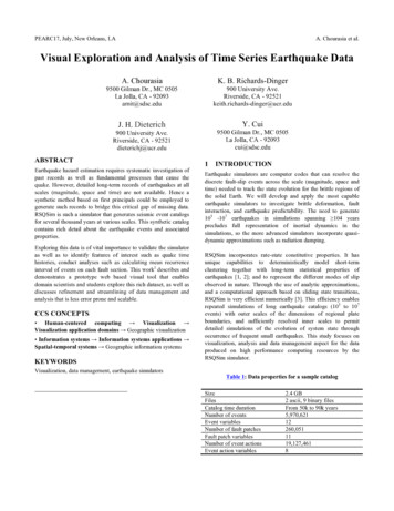
PEARC17, July, New Orleans, LA22.1A. Chourasia et al.DATA WRANGLINGSource DataThe data is in form of a time series catalog containing millions ofearthquake events with varying magnitudes and occurrenceintervals within the entire catalog that spans tens of thousands ofyears. Metadata for a sample catalog is listed in Table 1. Anearthquake catalog is generated for each simulation scenario for agiven time period. Each catalog consists of events (earthquakes),patches (a geometrically well defined portion of a fault) andaction (relationship between event and patches and theirproperties). A brief overview of event, patch and actioninformation is as followa) Event information: This columnar text data includes implicitevent ID, time, event magnitude; event origin coordinates inUTM projection [4], event duration, name of fault sectionand few other properties.b) Patch information: This columnar text data includes implicitfault patch ID, fault patch geometry either as triangles orrectangles, its coordinates in UTM projection, fault sectionID and the name to which this patch belongs.c) Action information: This data is a set of binary files thatrecord the action for every given earthquake event and itseffect on affected patches and associated properties such aschange in slip, stress, etc.2.2Data TransformationWorking with source data required parsing, restructuring and inmemory indexing, this requires processing time beforevisualization or analysis to be conducted. Iterative refinements tothe implementations of raw data handling improved from 20minutes to 2 minutes on a MacPro workstation with 2x 2.26 GhzFigure1:FrequencydistributionofquakesforQuad Core Intel Xeon processor and 16 GB memory. Howeverthis duration was not ideal as it was still too slow whenapplication would restart. Furthermore, this implementation wassingle user oriented and could not be easily deployed on the web.The source data can be mapped to a relational database in astraightforward manner by representing the data with three tables;one for events, second for patches, and third for actions thatincludes relationship between former two. SQLite [5] databasewas chosen based on following considerationsa) The database will be written once, rarely modified, but readrepeatedly for visualization and analysisb) SQLite simplifies data management, but keeps notion of afile, this is desirable as the domain scientists are used to filehandlingc) SQLite does not requires database server setup, this lowerssetup hurdles for domain scientistsd) SQLite database is portable on multiple platforms, thus canbe easily generated on diverse computing resources andshared easily with otherse) SQLite drivers are available in many languages, thus can beeasily used from variety of languages such as R [6] andPython [7]The data transformation was conducted using Python andvalidated to match source data. During the data transformationgeographic data was translated from UTM projection toEPSG:4326 projection [8] and stored in GeoJSON format [9] forquick retrieval later. The data translation process takesapproximately 20 minutes on a workstation mentioned previously;the resulting database is almost twice the size, mainly due toaddition of ID columns that were implicit in source data and extracomputed columns as well as translated geo-referenced erangeisindicatedbycolor.
PEARC17, July, New Orleans, LA3 VISUALIZATION3.1TasksThe domain scientists had developed a method to view the data in3D using R scripting. As most quake events affect very few faultpatches the 3D aspect was deemed to be of less interest, insteadwe focused on developing a projected 2D visualization that wouldallow the domain scientists to accomplish the followinga) Browse events and view them in geographic contextb) View the fault patches affected by a given quakec) View chronology in space and time of events that precedeand follow a selected eventd) Filter events based on magnitude and number of affectedfault patchese) Provide a web interface to easily investigate and disseminatethis dataA. Chourasia et al.3.2Visual encodingTo accomplish the set tasks, we employed map visual idiom(see Fig. 2) that implicitly represents geographic spatial data andline plot idiom (see Fig. 3) that allow us to represent time seriesdata in abstract form. The map shows geographic context withroads, cities and other landmarks, the data encoded using circlemarkers and displayed at its geo-referenced locations. Events onmap are shown by polygons with shape corresponding to theirmagnitude in whole number. Events with magnitude less than 4are shown as triangles, event with magnitude between 4 and 5 areshown with a square, events between 5 and 6 are shown aspentagon and so on. The selected event is shown with red colorpolygon, clicking on this polygon presents a popup windowcontaining contextual information associated with this event asshown in Table 2.Figure 2: Map showing selected event with a red circle and corresponding affected fault patches in blue. Previous events aredisplayed with grey circles connected by a grey line that indicates their chronology with respect to the selected event. Similarly nextevents are displayed with purple circles connected by a purple line. Visibility control toggles for various layers are on top right.Figure 3: Line plot shows magnitude, duration and area of 100 previous and 100 next events that are adjacent the selected oneshown in the center. Clicking on any event on the time series loads the chosen event in the map above, enabling swift exploration.
PEARC17, July, New Orleans, LAA. Chourasia et al.Similarly previous and next events adjacent to the selected eventare displayed as grey and purple polygons respectively, thesepolygons are connected via a trail line to indicate eventchronology. Affected fault patches are projected in 2D and aredisplayed as explicit geometry in blue color. All these elementsincluding the base maps are separated into layers such that theycan be either displayed or hidden on demand.Lastly, a timeline chart below the map displays event chronologyof 100 events adjacent to the selected event. The timeline chartincludes few properties such as magnitude, area and duration ofevents. The timeline and the map interface are linked such thatwhen an event is selected in the timeline the map is updated.Table 2: Pop up information for a selected event IDEvent propertiesEvent IDM-MagnitudeM0-Moment (Nm)T0-Time (s)DT-Duration (s)Patch IDX-Coord (m)Y-Coord (m)Z-Coord (m)Area (m 2)Patches affected3.3Value1086327.6508013.76879000084e 201.60341098492e 42.4242423.668567208065194User interfaceThe catalog consists of millions of events, thus a careful userinterface design was needed to accomplish event selection. Weimplemented the graphical users interface (GUI) which could besubdivided into a composite of three sections (see Fig. 4).The top section allows event selection via event ID (Fig. 5) ortime. In case the of event selection via time which is nativelystored in seconds, on interaction we show the time in humanreadable format as year:day:hour:second (see Fig. 6). Both ID andtime based selections offer sliders for quick pick and text input forprecise input. Additionally increment and decrement buttons atvarious scales are provided for swiftly changing the selection.The middle section of the GUI allows filtering of selected eventby magnitude and number of patches affected. The correspondingsliders for these filers offer the user an ability to set upper andlower range as desired. The Map trail and Time slider allow theuser to customize the number of events to be shown on map andtime series chart respectively.The bottom section of the GUI provides checkboxes for applyingfilters on time series, auto fitting of all displayed events on themap and an ability to set auto submission rather than submittingchanges manually after desired changes.Figure 4: Snapshot of full graphical user interface, showingselection by event ID. The event can be further filtered viamagnitude and patch sliders. Trail and time series slidersallow customization of ancillary items for display.Figure 5: Selection by event ID snapshot. The interface allowsusers to provide input via a slider (for easy scrubbing), textinput box (for precise numeric input) as well as increment anddecrement buttons at preselected scales for swift exploration.A drop down selection list enables choice for additional scales.Figure 6: Selection of event by time. The interface allows usersto provide input via a slider (for easy scrubbing), text inputbox (for precise numeric input) as well as increment anddecrement buttons at preselected scales for swift exploration.A drop down selection list enables choice for additional y:hour:second format is shown in the orange box.
PEARC17, July, New Orleans, LA3.3ImplementationCustom visualization is implemented using Python, JavaScriptand HTML as a server-client application. The server side handlesprocessing and responds with renderable data to the client. Theclient (web browser) fetches the served data and displays theresult along with the user interface. The application relies onLeafletJS mapping library [10] that provide geographicenvironment. Flask framework [11] in Python is utilized for webserving and query response interaction. The selection and filtersare mapped to appropriate database queries on server side. FoliumPython module [12] is used to generate custom map with customcode that fuses data for selected event and fault patchesondemand. The timeline chart is generated using the C3JSJavaScript library [13] and linked with map visualization. Thegraphical user interface is created using noUISliderJS JavaScriptlibrary [14], which provides mobile friendly and range sliders thatare not natively available with HTML5. The web application isdeployed using Gunicorn [15] web server.4RESULTS AND DISCUSSIONWe have developed and demonstrated a web based visualizationapplication [16] that displays an interactive map with set of layersthat includes base map, selected event, trail events (previous andnext events adjacent to the selected event), trail event line (lineconnecting previous, selected and next events) and affected faultpatches. These layers can be toggled on/off to reduce clutter andthe map could be zoomed in/out or panned.A graphical user interface allows the users to interactively select,browse, search and filter events of interest, refer to section 3.3 forinteraction details. Users can spatially view location of chosenevent (see red polygon in Fig. 2) and its chronology on a map (seeblack and purple polygons connected by a grey and purple lines inFig. 2) as well as inspect other calculated properties such as area,duration by clicking on these markers. The users can also view thepatches affected by the event spatially (see series of projected bluetriangles Fig. 2). Finally the event chronology is shown as lineplot, which allows easy comparison and trend assessment ofmagnitude, duration and area (see Fig. 3) adjacent to the selectedevent. Each event in this timeline in linked to map visualization,such that when the user clicks on any event, the clicked event isupdated on the map. This linking enables swift navigation andexploration.In addition to the interactive visualization, the newly implementeddata management scheme can be used for scientific analysis. Onesuch analysis is implemented and the results were validated withthe domain scientists. The analysis is computation of meanrecurrence interval of quake on each fault sub section from a totalof 2,606.A. Chourasia et al.The following steps illustrates the computation processi.Find all unique fault sections in fault geometry tableii.For each section find event record in event tableiii.Arrange records from ii in chronological orderiv.Calculate time duration between successive records bycomputing pairwise difference of all records in iiiv.Compute mean of all items in ivvi.Repeat ii–v for each sectionThis analysis using the original workflow with R scripts consumesmore time compared to the new one that uses database. Theoriginal analysis required loading, parsing and structuring of rawdata, which is not need by new analysis, as it relies well structureddatabase. More importantly the new analysis does not need to loadentire data into memory as the database is kept on disk. Thisdemonstrates that the analysis-using database will offer betterscalability and convenience for domain scientists.The domain scientists are currently using this web basedvisualization interface for data exploration and also considering itsuse for pedagogy purpose in classroom.5CONCLUSIONSTo conclude, we have developed and demonstrated an interactiveweb based application for visualizing of large time seriesearthquake data. The application not only allows easy browsingand filtering, but also is also easily accessible by multipleconcurrent users. Furthermore, we have transformed the originaldata handling to a modern environment that lends itself to errorreduction as less code is required for custom parsing and filtering,easier data management, easy dissemination and most importantlyscalable data analysis and visualization.6 FUTURE WORKWe would like to refine and extend this work for the entirescientific pipeline; this includes writing output directly to thedatabase from simulation, rather than translating it as a postprocessing step. Refine the visualization to include graphicalspatial region selection. Provide an ability to download filtereddata and perform custom queries on the web application. Finally,refactor all existing analysis routines to use database queries.ACKNOWLEDGMENTSThis work used the Extreme Science and Engineering DiscoveryEnvironment (XSEDE), which is supported by National ScienceFoundation grant number ACI-1053575. The National ScienceFoundation grant number EAR-1135455 and Keck Foundationgrant number 005590-00001 also supported this work.
PEARC17, July, New Orleans, .Dieterich, J. H., Applications of rate- and state-dependent friction to models offault slip and earthquake occurrence, In: Treatise On Geophysics, Vol. 4.Elsevier, Oxford, Vol. 2 Earthquake Seismology, Elsevier, 107-129, 2007.Dieterich, J., and K. Richards-Dinger, Earthquake recurrence in simulated faultsystems, Pure Appl. Geophys., 167, 1087-1104, 2010.Pekurovsky, D., A. Chourasia, K. B. Richards-Dinger, B. E. Shaw, J. H.Dieterich, and Y. Cui (2016). Performance enhancements and visualization forRSQSim earthquake simulator. Presented at the 2016 SCEC AnnualMeeting. Palm Spring, CA, Sep 11-14, 2016.Dutch, S. The Universal Transverse Mercator System. Retrieved Jun 8, 2017from .htmSQLite – SQLite Home Page. Retrieved Jun 8, 2017 fromhttps://sqlite.org/index.htmlR: The R Project for Statistical Computing. Retrieved Jun 8, 2017 fromhttps://www.r-project.orgPython. Retrieved Jun 8, 2017 from https://www.python.orgWGS84: EPSG Projection – Spatial Reference. Retrieved Jun 8, 2017 ON, 2016. Retrieved Jun 8, 2017 from http://geojson.orgLeaflet – a JavaScript library for interactive maps. Retrieved Jun 8, 2017 fromhttp://leafletjs.comFlask (A Python microframework). Retrieved Jun 8, 2017 fromhttp://flask.pocoo.orgFolium: python data leaflet.js. Retrieved Jun 8, 2017 C3.js D3-based reusable chart library. Retrieved Jun 8, 2017 fromhttp://c3js.orgnoUISlider – JavaScript Range Slider Refreshless.com. Retrieved Jun 8, 2017from https://refreshless.com/nouisliderGunicorn – Python WSGI HTTP Server for UNIX. Retrieved Jun 8, 2017 fromhttp://gunicorn.orgChourasia. A.Visualization for RSQSim. 2017. Retrieved Jun 8, 2017 fromhttp://vis.sdsc.edu:5555A. Chourasia et al.
The domain scientists had developed a method to view the data in 3D using R scripting. As most quake events affect very few fault patches the 3D aspect was deemed to be of less roads, cities and other landmarks, the data encoded using circle interest, instead we focused on developing a projected 2D visualization that would