Transcription
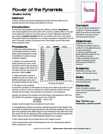
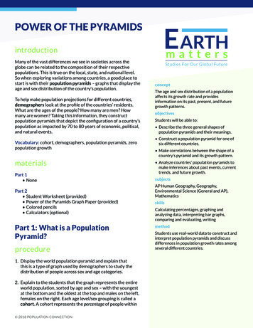
POWER OF THE PYRAMIDSintroductionMany of the vast differences we see in societies across theglobe can be related to the composition of their respectivepopulations. This is true on the local, state, and national level.So when exploring variations among countries, a good place tostart is with their population pyramids – graphs that display theage and sex distribution of the country’s population.To help make population projections for different countries,demographers look at the profile of the countries’ residents.What are the ages of the people? How many are men? Howmany are women? Taking this information, they constructpopulation pyramids that depict the configuration of a country’spopulation as impacted by 70 to 80 years of economic, political,and natural events.Vocabulary: cohort, demographers, population pyramids, zeropopulation growthmaterialsPart 1 NonePart 2 Student Worksheet (provided) Power of the Pyramids Graph Paper (provided) Colored pencils Calculators (optional)Part 1: What is a PopulationPyramid?procedure1. Display the world population pyramid and explain thatthis is a type of graph used by demographers to study thedistribution of people across sex and age categories.2. Explain to the students that the graph represents the entireworld population, sorted by age and sex – with the youngestat the bottom and the oldest at the top and males on the left,females on the right. Each age level/sex grouping is called acohort. A cohort represents the percentage of people within 2018 POPULATION CONNECTIONStudies For Our Global FutureconceptThe age and sex distribution of a populationaffects its growth rate and providesinformation on its past, present, and futuregrowth patterns.objectivesStudents will be able to: Describe the three general shapes ofpopulation pyramids and their meanings. Construct a population pyramid for one ofsix different countries. Make correlations between the shape of acountry’s pyramid and its growth pattern. Analyze countries’ population pyramids tomake inferences about past events, currenttrends, and future growth.subjectsAP Human Geography, Geography,Environmental Science (General and AP),MathematicsskillsCalculating percentages, graphing andanalyzing data, interpreting bar graphs,comparing and evaluating, writingmethodStudents use real-world data to construct andinterpret population pyramids and discussdifferences in population growth rates amongseveral different countries.
that sex and age range within the population. Soon the world population pyramid, we can see that4.5 percent of the global population is made up ofmales aged 0-4.Age3. Ask the students the following comprehensionquestions and allow them time to ask their ownquestions.World (2017)Malea. What is the largest age cohort and how canyou tell?Answer: 0-4 year old males; that bar extendsfurthest from the center axis.b. What cohort makes up 4% of the globalpopulation?Answer: 25-29 year old females.c. Where are you represented on the pyramid?What percentage does your cohort represent?Answers will vary.Female75 20-2415-1910-145-90-4108642024Percentage of Population6810Source: United States Census Bureau, International Databased. Are there currently more old people or young people living on the planet? How can you tell?Answer: More young people. The cohorts for young ages extend out further than the cohort bars for elderly people.e. In general, the bars get smaller as we move up the graph until the top cohorts – they break the pattern andextend further out. Why? Hint: Look at the y-axis and the ages represented in each cohort.Answer: All of the previous cohorts span a five year age increment. The cohorts at the top of the graph – 75 malesand 75 females – represent everyone aged 75 years or older. Those cohorts cover a much larger span of ages thanthe other cohorts.World (2017)4. Discuss the shape of the world populationpyramid and ask students if they think the graphrepresents a population that is growing orshrinking and their reasoning.Explain that the percentage of a population thatfalls within each reproductive category providesclues to the population’s future growth. As such,the shape of a population pyramid reveals a lotabout how a population is growing.Age5. Now display the world population pyramidshowing the age intervals grouped intoreproductive categories.MaleFemale75 Pre-Reproductive108642024Percentage of Population6810Source: United States Census Bureau, International Database 2018 POPULATION CONNECTIONpopulation dynamics unit POWER OF THE PYRAMIDS 2
6. Display the three sample population pyramids below. Graph 1: Expanding – Ethiopia. The triangular shape reflects a growing population. A significant percentageof people are in the pre-reproductive age groups. As those children age and enter their reproductive yearsand start having children of their own, the population will almost surely grow. Graph 2: Stable – New Zealand. The rectangular shape shows a stable population. There is a fairly evendistribution of people across each age group. Generations are replacing each other so the population willnot grow or shrink. Graph 3: Diminishing – Japan. The cup shape shows a shrinking population. The largest percentage ofpeople are in their post-reproductive years and no longer having children. As fewer and fewer people reachreproductive age, the size of the population will decrease.Graph 1Graph 2Ethiopia (2017)Female75 leReproductivePre-Reproductive108642024Percentage of Population6810New Zealand (2017)Female75 Pre-Reproductive108642024Percentage of Population6810Graph 3Japan (2017)AgeMaleFemale75 Pre-Reproductive108642024Percentage of Population6810Source: United States Census Bureau, International Database 2018 POPULATION CONNECTIONpopulation dynamics unit POWER OF THE PYRAMIDS 3
Part 2: Exploring Pyramids from Across the Globeprocedure1. Distribute the Student Worksheet and the Pyramid Graph Paper to each student and assign them one of thesix countries. If you’d prefer, students can work in pairs.2. The figures on the Worksheet are the population of each age group within each sex for each particular country.In order to construct the country’s pyramid, students must first calculate the percentage of the population ofeach sex in each age group.Example: According to the Worksheet, the total population of the United States in 2017 was 326,625,791. Thepopulation of U.S. males aged 0-4 was 10,310,369.10,310,369326,625,791 .032 or 3.2%Students should complete these calculations for each cohort.3. Model how to construct a population pyramid. You may want to project a blank sheet of Pyramid Graph Paperwith a data sheet on the board using a document camera or Smartboard.4. Students construct a population pyramid for their assigned country by graphing the percentage data onto thePyramid Graph Paper.5. Choose one completed pyramid from each country to display for the class.Answers to Student WorksheetSee Answer Key for the Population Pyramids and Student Worksheetdiscussion questions1. Can you tell from the data if there are more male or female babies in each country?Yes, there are more male babies. There is a slightly greater probability of giving birth to male children. For every 100girls born, there are about 105 boys born. For most countries, this 5 percent difference is reflected in the numbers onthe data sheet. There are two countries in this set (India and China) where the sex difference is more pronounced. InIndia, there are nearly 13 percent more boys than girls ages 0-4 and in China there are 15.6 percent more boys thangirls in that age group. This is due to sex selection based on a preference for sons.2. Can you tell from the graphs which country has the most people?No. The graphs represent 100 percent of the population of each country broken down by age groups. 2018 POPULATION CONNECTIONpopulation dynamics unit POWER OF THE PYRAMIDS 4
Demographers typically use the percentage data instead of the raw data so that each pyramid fits on the same size gridand can be compared to other population pyramids.3. Are there more elderly women or men? Why might that be the case?There are more elderly women. Throughout the world, life expectancy for women is higher than for men. This is due toa number of genetic and social factors. In general, men are more predisposed to certain health risks than women. Also,men make up the majority of the military and are more likely to die during wars.4. If you had a business and wanted to capitalize on your information about the population age distribution forthe United States, what would you sell and why? What about a business in Nigeria? A business in Germany?United States – Answers should include any products for people between 20-29 or 50-59 because they make up thelargest percentages of people. Nigeria – Answers should include any products for children and infants. Germany –Answers should include any products for older people.5. Which of the six countries is growing the fastest? How do you know? Can you think of any other informationwe can infer from the pyramid shape?Nigeria is growing the fastest. It has the widest base, and the largest percentage of the population in pre-reproductiveand reproductive years. Population growth occurs when the segment of the population currently in its childbearingyears (ages 15-44; bars 4-9 on the graphs) has produced a generation larger than itself (bars 1-3). The triangularpyramid shape also indicates that a relatively small proportion of the population is elderly – the bars at the top of thegraph are very small – and could mean that life expectancy is low.6. Looking at the pyramids, which countries appear to have the slowest rates of population growth? How can youtell?Germany has the slowest population growth with over half of the country’s population in their post-reproductive years.The pyramid is inverted with a wide top and thin base showing that 53 percent of the population is over the age of 45(bars 10-16 on the graphs). The United States is also growing slowly. The graph is closer to a rectangle than a pyramid,showing more uniform population size across the age groups and therefore a more stable population.7. Which country would you suspect is closest to zero population growth?Zero population growth (ZPG) occurs when a country’s birth rate and death rate are roughly equal. If there is significantmigration in or out of the country, that must be taken into account as well. Though the graphs do not display birth anddeath rates, we can reason by their shapes, that Germany and the U.S. are closest to reaching ZPG.8. What factors would change the shape of the pyramids in the future?A decrease in the birth rate. The people in their childbearing years would be having fewer children, and therefore,be producing a generation more similar in size to itself. This would change the shape of the graph over time from apyramid to more of a rectangle, indicating a more stable population. Additionally, as life expectancy increases and theproportion of older people increases, the top bars will expand.9. There are two noticeable “bumps” on the U.S. population pyramid. What do these larger cohorts correspond to? 2018 POPULATION CONNECTIONpopulation dynamics unit POWER OF THE PYRAMIDS 5
The “bump” closer to the top of the pyramid reflects the baby boom generation – children born following World WarII. (The baby boom generation includes those born between 1946 and 1964. ) The “bump” lower down the pyramid isan echo boom – the children of baby boomers.10. China’s population pyramid is the most varied of the six. Can you think of any historic events from the past 75years that helped shape the Chinese pyramid?In the early 1950s, Chinese women were having an average of six children. Then the Great Leap Forward (19581962), a national campaign that moved many agricultural workers into industries, created widespread famine andan estimated 20-40 million people died of starvation. The years 1958-1962 are represented by the cohorts for ages55-59 on the pyramid, which are smaller than the surrounding cohorts.The Chinese population continued to grow in the 1960s and 1970s and in 1980, the one-child policy was put inplace. The birth rate dropped as many people were allowed only one child, and this is reflected in the cohorts for ages35-39. The one-child policy remained until 2016. The larger percentages for the 20-24 year old cohorts are an “echoboom,” the children of those in the 45-49 year old bars.11. Which of the three general pyramid shapes would you use to describe India’s population pyramid? What doesthis mean for India’s future growth?The top portion of India’s pyramid is triangular while the bottom portion is rectangular. This shows that in years past,India was growing significantly with each younger cohort larger than its predecessor. In more recent years, India’sgrowth has slowed and we see that the bottom four cohorts are more evenly balanced.It is important to note that India’s population is still increasing and will do so until the birth rate (currently 21) anddeath rate (currently 7) are equal.12. Compare and contrast the population pyramids of Nigeria and Guatemala. How are they similar/differentand what does this mean for each countries’ future growth?The pyramids for both Nigeria and Guatemala are generally a triangle shape – the base of each is much wider than itstop, and every younger cohort is larger than its predecessor. So we know that both countries are growing.However, we can see in the pyramid fo
POWER OF THE PYRAMIDS concept The age and sex distribution of a population affects its growth rate and provides information on its past, present, and future growth patterns. objectives Students will be able to: Describe the three general shapes of population pyramids and their meanings. Construct a population pyramid for one of six different countries. Make correlations between the .