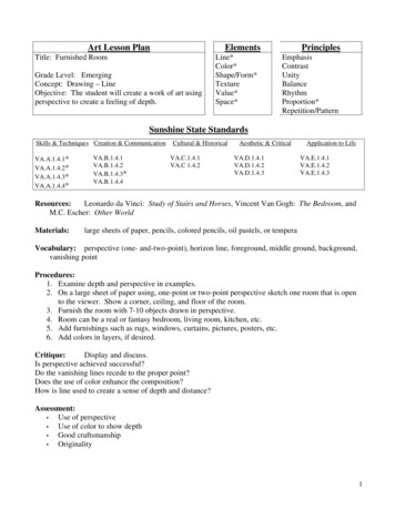
Transcription
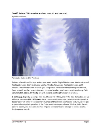
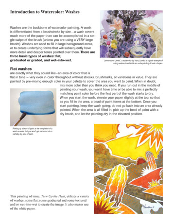
Introduction to Watercolor: WashesWashes are the backbone of watercolor painting. A washis differentiated from a brushstroke by size a wash coversmuch more of the paper than can be accomplished in a single swipe of the brush (unless you are using a VERY largebrush!). Washes are used to fill in large background areas,or to create underlying forms that will subsequently havemore detail and deeper tones painted over them. There arethree basic types of washes: flat,graduated or graded, and wet-into-wet.Flat washes“Lemons and Limes”, a watercolor by Mary Lizotte, is a good example ofusing washes to establish an underpainting of basic shapes.are exactly what they sound like—an area of color that isflat in tone — very even in color throughout without streaks, brushmarks, or variations in value. They arepainted by pre-mixing enough color in your palette to cover the area you want to paint. When in doubt,mix more color than you think you need. If you run out in the middle ofpainting your wash, you won’t have time or be able to mix a perfectlymatching paint color before the first part of the wash starts to dry.When you start the wash, elevate your paper slightly at the top, so thatas you fill in the area, a bead of paint forms at the bottom. Once youstart painting, keep the wash going; do not go back into an area alreadypainted. When the area is all filled in, pick up the bead of paint with adry brush, and let the painting dry in the elevated position.Picking up a bead of paint at the completion of awash ensures that you won’t get backruns into apartially dry area of paint.This painting of mine, Turn Up the Heat, utilizes a varietyof washes, some flat, some graduated and some texturedand/or wet-into-wet to create the image. It also makes useof the white paper.
Exercise: Flat washesWork from observation of your subject, and REDUCE it to simple outline shapes (thinkcoloring book). Lightly pencil in your drawing on your watercolor paper, then paint, usingonly flat washes (no modeling of form). Leave some parts of your image unpainted, whitepaper. In order to avoid backruns or bleeding colors, once you lay down a wash, let it drycompletely before painting next to it, OR, leave a tiny white space of unpainted paperbetween each flat wash.Caution: if you touch one wet wash intoanother wet/damp wash, the two colorswill bleed together, (right) and you willno longer have a flat wash. The imagesillustrate some ways to simplify shapesand use flat areas of color. Paint eacharea just once. Try to anticipate howmuch the color will lighten as it dries andadjust the amount of pigment in your wash accordingly. If you areunsure, mix your wash, paint a small sample on scrap paper andlet it dry before applying to your painting.Pigments to use for this exercise: Permanent Alizarin Crimson (or equivalent purple-biased red) Winsor Lemon (or equivalent green-biased yellow) French Ultramarine (or equivalent purple-biased blue)Vary the values of each color by adjusting the pigment/water ratio. More water lighter values. You may use any two or three ofthe above colors to mix additional hues, but to get an even-tonedflat wash, mix in your palette, not on your paper.Above: Milton Avery used flat areas of color to create thispainting, “Pensive Woman”, oil, 1946, 34 by 26 inchesThis exercise is about controlling the evenness of your washes.A “perfect” flat washwill have an even tonality throughout.no streaks, brush marks orlighter/darker areas.Evaluation: Did you achieve an even tone throughout each wash? Did your colors dry to the color saturation that you expected?Right: Southwest by Far East, watercolor, image 22” x 15”, EllenFountain, private collectionI used mostly flat washes in this piece from my Southwest Series. Ialso cut stencils, laid them over dry flat washes in several places,and spattered additional paint over the stencils to create patterns.Some areas were painted wet into wet, and the cactus got agraduated wash in places. The smaller inset diagrams the initialflat washes of color.
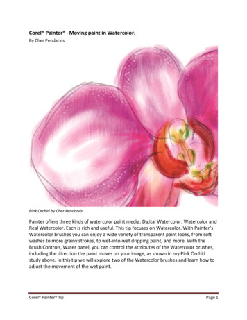
Wet-into Wet WashesThese washes are really fun to do and never totally predictable.It involves pre-wetting your paper with clean water or a wash ofcolor, and then charging other colors into the wet area. You canthen tip or rock your board to blend the colors a little, but don’t gooverboard or you will blend them too completely and end up witha single, neutralized hue.In the sample at the right, I began with a clear yellow wash, thencharged (dropped) into it, scarlet lake, winsor green and burntsienna. The paints will spread more the wetter the surface is, andless as the paper begins to dry. The pigment characteristics alsodetermine how much the paint will spread.Still Life With Colima DuckTransparent Watercolor, 2006, image 14½ x 10¼ inches Ellen Fountain, private collectionI took advantage of wet-into-wet washes for both thebackground and the terry-textured pink-purple fabric. I alsoused it on a much smaller area in the glazed pottery bowl.
Exercise: Wet-into-Wet BackgroundChoose a subject, and simplify its contour. You can use a singleflower or plant, a building shape, an animal, insect, fish shape,etc. Lightly pencil in your simplified shape’s contour (outline) ona half sheet of scrap paper. Cut out this shape. Now place it onyour watercolor paper and lightly trace around it, then move it toa new position that slightly overlaps the first outline and retrace.Repeat once more - let some of your design go off the edges ofyour watercolor paper. Plan to leave some area(s) of your paintingunpainted white paper (you can mark the white areas with a smallX to remind you where they are if you wish).Pigments to use: Permanent Alizarin Crimson (or equivalent purple-biased red) Transparent Yellow (or equivalent orange-biased yellow) Winsor Blue (green shade) (or equivalent green-biased blue)In your palette, mix up three puddles of each color, using a goodrich pigment/water saturation (not too thin, as you will be working on very wet paper which will dilute the mixtures). These arepowerful and staining colors.you won’t need much to make a richmixture. Then, pre-wet only the background area (the area aroundyour subject) with clean water, and working very quickly beforeAbove: “Mission at Zuni” by Fran Larsen.In this watercolor, the background is the most active area, done this pre-wet area dries, add your pre-mixed colors one at a timewet in wet, with clean water and air “blows” introduced as theby touching your paint-loaded brush to the wet paper in severalwash began to dry.places. Rinse and blot your brush between colors. Let one colordominate. Slightly mix the colors by tilting the paper – don’t usea brush. If you want white in the background, don’t drop paint intothat area, or lift by blotting with a paper towel. Don’t overmix, or everything will turn a gray/brown. As the paperdries, you can add drops of clean water to make lighter areas if you wish and give the background a “mottled” effect, or load the tip of your brush with more concentrated paint and touch it to the paper for more “intense” spotsof color. Let this background dry thoroughly before going on to Exercise 2.This exercise will give you practice in: Creating wet-in-wet washes Controlling the blending of colors on wetpaper Estimating how saturated to make yourwashes so they will dry the value you want Timing the addition of colors to a wet washto control “spread” or “creep”Left: I did the background forthis night blooming cereuswet-in-wet. Below: I used a wetin-wet under-painting and thenglazed over it in this watercolor,which also uses lost (soft) edgesto anchor the pots to the ground.Evaluation:The Night Queen Meets Her Nemesis Did your colors dry to the saturation E llen Fountainthat you expected? Do the colors in your wet-in-wet areasstill maintain some of their individuality, or did you overmix (and getgray/brown)? Does one color (red, yellow or blue) dominate?Three Pebbles, Three Pots E llen Fountain
Graduated or Graded Washesare washes that change gradually and evenly from eitherdark to light or from one hue to another. The process for asingle-color graduated wash is simple: Paper at a slightlyelevated position at the top where you will start the wash.Fully load your brush with the most saturated color you wantto use, and quickly paint a stroke horizontally across thearea you want to cover. A bead of excess paint should formacross the bottom of this stroke.Paint another stroke horizontallyfrom the opposite direction of thefirst, just catching the bead of paint."Taking a Look Back" - watercolor on paper, 22x30, Ellen FountainExtend this value/saturation for asThe sky is an example of a graduated wash.far as you want it to go before youA graduated wash in progressbegin to lighted the hue by addingwater. You will not go back for additional paint once you begin to add water to yourbrush, nor will you rinse your brush. You will simply continue to dip the brush inclean water between strokes to gradually thin and dilute it, all the time working thewash down the sheet until the color is as thin as you want it. Then, dry your brushand pick up the excess bead of paint from your last stroke. Let the paper dry in theslightly elevated position.A graduated wash, dryThese washes are used to give three dimensional form to objects, and are great forcreating skies.The 2-hue graduated wash is a gradual blending of one color into another. This requires thatyou begin by mixing two “puddles” of the twocolors you want to blend. Begin painting withthe lightest of the two, but with your board flat.Extend this first color as far as you wish, then,QUICKLY, turn your board, and either rinse yourbrush or have another clean one ready with thesecond color, and begin painting with it. Slightlyoverlap the two colors in the center to let themblend together to make a new third hue. Youmust work very quickly here if the first colordries before you begin to overlap it with thesecond, you will have either streaks, or hardlines instead of a smooth blend."To EB" - watercolor on paper, image 30 x 22 inches, Ellen FountainGraduated washes create a sense of movement in the background stripes of thispainting. It is a tribute to Ed Baynard, whose still life reproduction I cut into stripsand “rearranged”, then repainted the new arrangement, substituting desert wildflowers for his cultivated ones, and creating different vases and objects (the blackrock) to make my new composition work.
Exercise: Graduated Washes and Soft/Hard EdgesTwo-colorgraduatedwashHard to softedges formountains“Up and Away,” from my Southwest Series, is paintedentirely with washes.some applied with a toothbrush spattertechnique over handcut stencils, and some given a salt texture.Use your painting from Exercise 1 (Wet-in-Wet Washes). Be sure thewet-in-wet background is completely dry. In this exercise, you’re goingto concentrate on the unpainted subject you drew in assignment 1 andleft unpainted.Decide on at least one or two parts of your subject that can be paintedusing a graduated wash. Rotate your paper/board so that the part thatwill receive the beginning stroke of the graduated wash is placed atthe top (away from you) and elevated about ¾ inch. Use a large roundbrush or your aquarelle/flat brush used on the wide side for this wash.Mix a fairly saturated patch of color (enough to saturate your brush).Lay in the first stroke of very wet color, working from one directionhorizontally across the shape in a single stroke. The color should befluid enough to form a bead of paint along the bottom of the stroke.Dip the bottom third of your brush in clean water, wipe it on the edgeof your water container, and make another stroke, catching the beadof paint from the first stroke. Repeat the previous step. Each strokeshould slightly lighten the value of the color until it disappears intowhite paper. Work as quickly as you can. Timing is critical, as is theamount of water in your brush. If you make the mixture in your brushwetter than what is on your paper, you run the risk of back runs (this isminimized by keeping your paper elevated on one edge).For the remainder of your subject, do some hard to soft edge painting.This means that you are going to begin with a stroke on dry paper and then soften its opposite edge. There are twoways to accomplish this. One is to prewet with clean water an area 1/8 to 1/4 inch away from where you will havethe hard edge of your stroke. As you pull your paint-loaded brushBelow top: Detail from a snow scene watercolor by Zoltan Szabo.across the paper, the part of the brush on dry paper will make aBelow bottom: Detail from “Summer Still Life” by Elizabeth Osbornehard edge, while the part of the brush that contacts the prewetarea will soften and spread. The second method is to make a strokeon dry paper, then IMMEDIATELY take a brush dampened withclean water and touch the stroke on one side, pulling the colorout to soften it. Knowing how wet to have your brush will requirepractice. Keep a pad of folded paper towel or a damp sponge nextto your palette so you can remove excess water from your brusheasily and quickly.Soft edgesHard edgesEvaluation: Did your graduated wash changegradually and smoothly from saturated tounsaturated color, or did you have streaksor large jumps in value? Did you sucessfully create some hard tosoft edged shapes?Soft edges and hard edgescreate the petal forms inthese flowersGraduated washes createa suggestion of threedimensions in the vases
Washes, Edges and PaperPapersPapers for watercolor affect how the paint behaves as it is applied, and how it looks when it is dry.Watercolors are designed to be thinned out with varying amounts of water and to be applied to thepaper in a manner that allows light to reflect back up through the color, once dry. This reflectivity fromthe paper surface is what gives watercolors their unique luminosity.Paper surfaces influence this reflectivity. There are three basic surfaces for watercolor paper: rough, coldpress and hot press. Some watercolor paper manufacturers have added a third surface, not press, whichis somewhere between cold press and hot press. Visualize your paper on a scale from bumpy to smooth:Rough paper is particularly suited to direct painting, where color is put down once and not reworked, orfor using the heavier pigments (cadmiums, cobalts, etc.) as it accentuates their sedimentary qualities.Hot press is a very smooth surfaced paper, which allows the paint to “slide around” on the paper more,and will tend to record each brush mark you make.leaving unpredictable accumulations of paint. It canbe a very expressive surface in the hands of an experienced direct painter. For beginners, it can presentreal challenges for painting smooth, non-streaky areas. It is a good paper surface for dry-brush or hightlydetailed approaches to watercolor.Cold press paper is a good, all around paper surface, as it has enough “bumpiness” to take advantageof sedimentary pigments when you use them, but is smooth enough for detail work.Exercise 1:Use an 1/8 sheet of each of your papers — hot press, cold press and rough — and do these test samples,painting the sample patches up toward the top of the sheet placed vertically: Use a sedimentary color (like ultramarine blue) and paint a 2”x2” patch of color on each of your papers. Use a non-sedimentary color (like permanent alizarin crimson) and do the same test patch on eachpiece of paper. Compare the results.The other thing that affects reflectivity is sizing. All good watercolor paper is sized, during the pulp stageof the paper making, after the sheet is formed, or both times. The amount and type of sizing determinehow absorbant the paper will be, how easy it will be to lift off (remove) dry paint, and ultimately, howluminous the color will appear. The less absorbent the paper is, the more the paint sits on the surfaceand the brighter it will appear. The downside to paint sitting on the surface comes when you want toglaze or layer over it.as watercolor is always resoluable, paint that sits completely on the surface is veryeasily disturbed and blended into subsequent washes, sometimes making a muddy mess!Find the paper surface, through experimentation, that suits your painting style.
"Lemons and Limes", a watercolor by Mary Lizotte, is a good example of using washes to establish an underpainting of basic shapes. Introduction to Watercolor: Washes This painting of mine, Turn Up the Heat, utilizes a variety of washes, some flat, some graduated and some textured and/or wet-into-wet to create the image. It also makes use