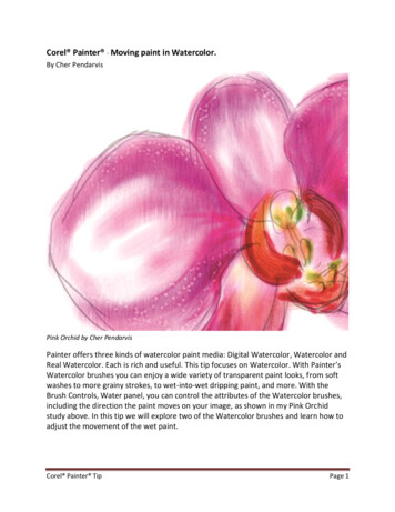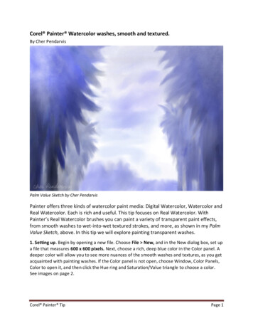
Transcription
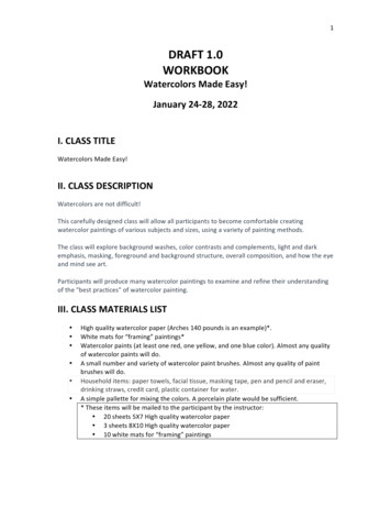
Introduction to Watercolor - Paint CharacteristicsThere are several characteristics of watercolors that the painter needs to be familiar with in order to make aninformed decision about which palette or group of colors to use for a particular painting. These properties are:transparency/opacity, tinting strength, staining quality, granulation/sedimentary quality, and color temperature(warm/cool bias).You can use inexpensive, lightweight (90 lb) watercolor paper or “scrap” watercolor paper for all color tests/exercises, but it is suggested you do these test on the paper that you intend to paint on most of the time, aspaper influences the results due to differences in sizing,surface and other factors.Exercise 1:Make a 1/2” wide line on cold press or rough watercolorpaper with a permanent, waterproof (Sanford “Sharpie” or ElMarko) felt-tip pen (or with waterproof India Ink). Make surethe line is completely dry.Paint a saturated* color swatch of paint over your blackline and let it dry. Label each swatch with the color nameand manufacturer as you paint them. Do this for each coloron your palette. Let each swatch dry. Then look at where the color goesover the black line. If you see no “color” where it goes over the black, labelthat swatch “Transparent”. If there is just a little color showing on the black,label it “Semi-Transparent”. If the color nearly covers the black line, label theswatch “Opaque”. You may add a “semi-opaque” category if you wish. I usethe abbreviations T, ST, SO and O to label my paints. Why is this important?If you want to glaze or layer watercolor, you want to use only transparentor semi-transparent colors. The opaques and semi-opaques do not glazesuccessfully, nor do pigments that contain a large amount of granulatingparticles.Exercise 2:This test gives you information on how staining a particular color is. Why is this important? If you want to liftout white or light areas from parts of your painting after the paint is dry, then you want to use the least stainingpigments you can. Staining pigments do not lift easily or completely. They will also stain all other hues belowthem when used as a glaze, particularly if the glazed layer isat all saturated with pigment.Again paint a saturated swatch of each of your colors onwatercolor paper. Label each swatch as you go with the colorname and manufacturer and let the swatches dry completely.Then using a synthetic bristle brush or toothbrush moistenedwith clean water, scrub back and forth over each swatch.Blot each swatch with paper towel or kleenex and rinse yourbrush between color swatches. Use the same number ofscrubbed back and forth strokes for every swatch, so the testwill be consistent (I count out 20 strokes). Note that if yousoak and stretch your watercolor paper prior to painting, any surface sizing will be diluted or removed, and yourpaints will not lift as easily when dry.* Saturation has to do with the pigment to water ratio. ANY pigment will appear transparent if there is a lot of water relative to the pigment, somake your swatches with enough pigment so that the mix is more like espresso, not weak tea.
Introduction to Watercolor: COLOR PROPERTIESThe properties of color include HUE, VALUE and INTENSITY.HUE is the name of a color, like red or blueVALUE is the relative lightness or darkness of a color (tints are light values; shades are dark values)INTENSITY—sometimes called chroma—is the relative brightness or dullness of a color.The uses of color in painting include: Creation of deep or shallow spacial illusions Creation of a particular “mood” or “feeling” Creation of symbolism or cultural associations Possibilities for personal expression and visual impact Identification of objects through use of local, descriptive color Pictorial organization through manipulations of color value, intensity, hue, dominance, etc.How we use color in painting:We work with color in the following ways, all of which have to do with CONTRASTS: We use a change in hue to contrast one color with another (red & blue for example) We use a change in value to contrast a light color with a dark one We use a change in color temperature to contrast a warm color with a cool one We contrast intensity (bright/saturated vs. dull/unsaturated) We contrast a color with its complementary (opposite) color We contrast the relative appearance between colors We contrast the quantity of one color with anotherThe first 5 of these contrasts are fairly straightforward, easily discernable and fairly easily manipulated. Thelast 2 are mainly of concern to painters whose primary interest in their work is the relationship betweencolors, although they can also be used to fine tune a painting that doesn’t quite achieve harmony or unity.Color HarmonyColor harmony or unity is achieved when the colors in your painting work well together, when the greatestcontrasts help highlight your focal point, and when your color choices relate to the subject matter.There are limitless possibilities for choosing and mixing colors, so it is up to you to limit your choices to thecolors that will work best for the idea that you have in mind, and that reflect your own preferences in termsof how the painting looks, and the feeling the color generates. Some people prefer strong, saturated colorswith strongly contrasting color schemes. Others lean toward “color neutral” schemes, using lots of earthcolors in almost a monochromatic way. And some watercolorists prefer “close value” paintings, with alltheir values in a similar range whether light, medium or dark.Color Keying and Pigment CompatibilityBeginners should probably limit themselves to 3-5 colors per painting. Doing so will guarantee a moreharmonious color result, and force the artist to use a more complete range of values and intensities foreach of the three or four colors chosen.
Introduction to Watercolor: NEUTRALIZING COLORSTo orchestrate your paintings, you will usually have one area that contains the purest, most intense colors,surrounded by other colors that have been subdued in intensity, or neutralized. You neutralize a colorby adding some of its complementary color (the one opposite it on the color wheel). The more of thecomplement you add, the more neutral the color becomes until it is either a grayish or brownish hue.Generally, these are the basic color complements:Red & GreenBlue & OrangeRed Orange & Blue GreenBlue Violet & Yellow OrangeYellow & VioletYellow Green & Red VioletWhy is this important?Most beginners don’t have any difficulty making muddy colors, so you are probably wondering why it’simportant to learn to make these low intensity, neutralized hues. And the answer is: Neutral doesn’tmean muddy, chalky or necessarily opaque. Neutrals can be wonderful, subtle colors, and can serve as afoil to the brighter, clear, intense ones in your paintings. Learning to make “good” neutrals will help youorchestrate your colors, and as a result, create stronger paintings.PURE COLORHansa Yellow Lt.or Winsor LemonNew Gamboge orTransparentYellowQuinacridone Redor Perm.AlizarinCrimsonOrganic Vermillionor Scarlet LakeOrganic Vermillionor Scarlet LakeNEUTRALPURE COLORPerm.Aliz.Crimson Ultramarine BluePerm.Aliz.Crimson Ultramarine BlueThalo Blue GS Hansa Yellow Lt. orWinsor LemonCeruleanBlueThalo Blue GSNote that the strongest darks are made from colors that are already darker in value right out of the tube.The difference is apparent when you compare the neutral made from cerulean and organic vermillion withthe one made from the same red, but using thalo blue.
Exercise 3:Make a chart similar to the one on the previous page, using your six primary colors. Where Cerulean Blueis used in the example, you are to use French Ultramarine Blue, and your mixtures will look different thanthe ones shown. The goal of this exercise is to begin to get comfortable with estimating the proportion ofeach color to use in the mix.ALWAYS start any mixture with the lightest of the two colors, and add the darker one to it a little at a time.For example, the first row starts with Winsor Lemon or Hansa Yellow Light in your palette - a small puddleof fairly saturated color. In a SEPARATE puddle, mix a clear purple by starting with Quinacridone Red orPermanent Alizarin Crimson and adding the Ultramarine Blue to the red until you have a clean purple. Thenyou will start adding the purple to the yellow, a little at a time. For this exercise, you only have to makethree mixtures - many more steps between yellow and purple are possible. Try to get your middle swatchhalfway in between the yellow and purple, both color wise and value wise.Repeat the exercise with the other color combinations.What did you notice?Too much water dilutes both value (light/dark) and intensity (bright/dull). Make sure you have enough pigment in your mixtures.Some colors are stronger than others in mixtures (we call this tinting strength). You need far less of them inany mixture to affect a noticeable change in hue/value/intensity.Value and intensity matter just as much as hue does when working with watercolor (see the examplesbelow and their equivalent B/W versions) Your intent, as the artist, helps you decide which will dominate –hue, value or intensity.
Exercise 4:Every color has a corresponding value. Learning to see that value, regardless of color, will help you orchestrate your paintings to take full advantage of both the white paper, and all the values between lightand dark. Use or paint a 5-7 step white to black value scale, and then, for each of your 6 primary colors,create a corresponding value scale. Paint your swatches on scrap paper so you can choose the onesthat best match up to the gray scale. Hint: You can use black to darken many, but not all colors. If you addblack to any pigment with yellow in it, the results will be “greenish”. Try a darker color in the same family orthe color’s complement. Use clean water to lighten the pure colors for the steps toward white paper.Note that thepure huesaren’t in thesame placeon the valuescale.purepurepureWe use the strongest light/dark contrasts of value to help focus attention where we want it to be (centerof interest), to define or lose/blur edges of objects, and to make many small shapes/areas “read” as asingle large shape.
Exercise 5:Use this drawing, or lightly draw one of your own with the same simplicity of form (just outlines). Usingonly three primary hues (a red, a yellow and a blue), paint the image, mixing any secondary or tertiary colors you need from your primaries. Leave some part of your painting unpainted white paper (for the lightestlight). Vary the pigment to water ratio with the rest of your mixtures so that some areas are very dark, somemid-value and some light-value.
Introduction to Watercolor: COLOR PROPERTIES The properties of color include HUE, VALUE and INTENSITY. HUE is the name of a color, like red or blue VALUE is the relative lightness or darkness of a color (tints are light values; shades are dark values) INTENSITY—sometimes called chroma—is the relative brightness or dullness of a color. The uses of color in painting include: