Transcription
Unit 2: StemplotsprerequisitesStemplots require familiarity with place value in the number system. There are no statisticalprerequisites.additional topic coverageAdditional coverage of stemplots can be found in The Basic Practice of Statistics, Chapter 1,Picturing Distributions with Graphs.activity descriptionStudents are often more invested if they have an opportunity to analyze data that they havecollected. Use the questions suggested in the Unit 2 Activity survey (these questions are listedbelow for your reference) or create alternative questions of your own.MaterialsSurvey questionnaire, one copy per student.Prior to handing out the survey, ask students to wait a moment while you get things ready.Take your time – so that students have to wait a few moments. (This wait time is related toquestion 1.) Then hand out the survey.Once students have answered the survey, they will need to turn in their responses. Combinestudent responses to each question into a single table (See Table T2.1 in the activity solutionsfor an example.) Make sure that the same units are used by all students – for example, heightin inches. These data will be revisited in Unit 5’s activity (boxplots), so save these data. (If youdecide not to collect data from your class, use the sample data from Table T2.1 instead.)As students make stemplots of the data on each variable, encourage them to experiment withusing different stems. Sometimes it is helpful to expand the stems and other times it is helpfulto truncate the data values and collapse the stems. The idea is to get a stemplot that revealsUnit 2: Stemplots Faculty Guide Page 1
information about the data. Below is a copy of the suggested survey questionnaire. Feel free toadapt or revise the questions.Survey Questionnaire1. How long (in seconds) did you wait while your instructor was getting ready for this activity?2. How much money in coins are you carrying with you right now?3. To the nearest inch, how tall are you?4. How long (in minutes) do you study, on average, for an exam?5. On a typical day, how many minutes do you exercise?6. Circle your gender:MaleFemaleReturn your answers to your instructor.Unit 2: Stemplots Faculty Guide Page 2
The Video Solutions1. Sample answer: head circumference, upper arm circumference, foot length,foot width, height.2. The foot length data was fairly symmetric with a single peak. The center was around26.8 inches.3. City miles per gallon (mpg).4. There were outliers at the upper end of fuel efficiency. A few cars got great gas mileage.5. The data for the 2012 models exhibited more spread. There were vehicles that were morefuel efficient (for example, the Prius) in 2012 compared to 1984, but there were vehicles thatwere less fuel efficient (for example, SUVs) in 2012 compared to 1984.Unit 2: Stemplots Faculty Guide Page 3
Unit Activity SolutionsSample solutions are based on the data in Table T2.1.Question 1Wait 0305045Question 2Coins 85355914513714262Question 3Height 706969Question 4Study 30302030TableTT2.1.2.1TableSample data from unit activity survey.Unit 2: Stemplots Faculty Guide Page 4Question 5Exercise 560Question emaleFemaleFemaleFemaleMaleMaleMale
1. Sample answers based on sample data in Table T2.1.Time (sec)334455667705500000000555555555000055The stemplot for Time is single-peaked and fairly symmetric. The middle is somewhere in the40s. There is one outlier at 75.Money (cents) Leaf unit 100 000 23330 45550 66770 8911 2231 44451 71 822 2For the stemplot above of the money (cents), we truncated the pennies place. These data arenot symmetric. There are two clumps of data and one single high value in the 220s.Unit 2: Stemplots Faculty Guide Page 5
Height (in)6666677702234445667889999011122235The height data are somewhat mound-shaped and roughly symmetric. The middle is around67. There are no outliers.Study Time e data do not appear symmetric. The study times are mostly under 45 minutes. There isat least one outlier, the largest of which is 120 minutes.Unit 2: Stemplots Faculty Guide Page 6
Exercise (min)012345678900000000000055555000550000There are some gaps in the data. There are some people who don’t exercise and the samenumber who exercise, on average, 90 minutes per day. The middle appears around 45.2. The time estimates from male students were more spread out than for female students. Amiddle value for the female students looks to be at around 40 seconds and for male studentsat around 45 seconds. One male student was an outlier, at 75 seconds.TimeFemaleMale3 05 3 500000 4 0005555 4 5555500 5 005 56677 5Unit 2: Stemplots Faculty Guide Page 7
3. The change in male students’ pockets split into two groups. One group was at the low endof the change carried by female students. However, the other group tended to have morechange than the female students. One female was an outlier. She carried 2.25 in change,more than anyone else in the class.MoneyFemale03255476984000001111122 2Male03356722344578Unit 2: Stemplots Faculty Guide Page 8
Exercise Solutions1. Sample answer: time to run one mile; time to complete an obstacle course; number ofpull-ups completed without stopping, number of sit-ups completed without stopping; restingpulse rate (a low rate means more fit).2. a.23456254511666794490b. It is roughly symmetric with the center at stem 4. It is unimodal.c. The center is around 46. (There are 15 observations – the 7th, 8th, and 9th value of theordered data are all 46.)d. No. Although 60 is the largest data value it is not outside the pattern that includes two 54sand a 59. There is no gap between 60 and the other data values.3. 4557033992685348012560345602369Unit 2: Stemplots Faculty Guide Page 9
b. Sample answer: The distribution appears to have three peaks, one around the 490’s,another around the 510’s and a third around the 580’s (or around the 570’s – 590’s). The distribution doesn’t look very symmetric. At the lower end, there are few scores in the 460’s and470’s and then the number of scores increases for the 480’s and 490’s. On the higher end, thepattern is reverse. There are a larger number of scores in the 590’s, 580’s and 570’s and thenthe number of scores decreases in the 560’s and 550’s. The middle number is 523, which canserve as the center of the distribution. (Or students might suggest the middle is in the 520’sbecause 24 scores are below this stem and 24 scores are above this 64319733219755345464748495051525354555657581 31113246827d. Sample answer: The average Math SATs are more spread out than the average WritingSATs. The lowest Math SAT was 457 and the highest was 617, for a spread of 160 points. Thelowest Writing SAT was 453 and the highest was 591, for a spread of 138 points. The centerof the Writing SATs is in the 510’s and the center of the Math SATs is in the 520’s. (The actualmiddle number of the ordered data is 511 for the Writing SATs and 527 for the Math SATs.)There are gaps in the Math SAT data in the 470’s and 580’s; the average scores of 457 and469 might be considered outliers. There is a gap in the 580’s for the Writing SATs and 591is a potential outlier. The Writing SATs appear multimodal, with a peak around the 470’s andanother around the 560’s. Neither of the distributions appears to be roughly symmetric.Unit 2: Stemplots Faculty Guide Page 10
4. The distribution is not symmetric. The data is concentrated toward the lower numbers andthen trails off as the numbers get larger. In other words, this show attracts a mostly youngaudience. The center is around 19 (the 22nd observation in the ordered data of 44 values).There is an outlier at 120, which is considerably larger than the second largest data value ofonly 65. Most likely this is a typo – maybe the person was 12 or 20 but certainly not 120. Theother possibility is that someone was being funny and responded that he/she was 70135280025050Unit 2: Stemplots Faculty Guide Page 11
Review Questions Solutions1. 6784477880134478907993b. The states divide into two clusters, with students from one group of states participating inSATs at a very low rate and students in the second group participating at a much higher rate.The lower cluster varies from 3% to 28% and the upper cluster from 47% to 93%. The lowercluster is concentrated around the single digits and then trails in the teens and twenties. Theupper cluster is unimodal and roughly symmetric with its center at around 70%. (In somestates, most college-bound students take the SATs. In other states, the rival American CollegeTesting, or ACT, exams dominate and only students applying to selective colleges take theSATs. This explains, in part, the two clusters.)c. Similar to the 2010/2011 data, the 1990 data breaks into two clusters. The lower cluster ofthe 1990 percentages has a similar spread to the 2010/2011 percentages and has roughly thesame number of data values in the lower cluster. The gap between lower and upper clustersbegins at the same stem for both years, but is slightly wider for the 2010/2011 data than forUnit 2: Stemplots Faculty Guide Page 12
the 1990 data. The upper cluster is reasonably symmetric in both years. However, the spreadof the upper cluster is wider for the 2010/2011 data (47% to 93% for a difference of 46%) thanfor the 1990 data (42% to 74% for a difference of 32%). The center of the upper cluster for the2010/2011 data is around 70%; the center for the 1990 upper cluster is only around 7880279016872367844778801344789079932. Sample answer: The Army should stock boots that fit foot widths from 90 millimeters to 113millimeters. There was one outlier, a soldier with a foot width of 119 millimeters – 6 millimeterslarger than the second largest foot width. The boot for that soldier should be specially ordered(See stemplot on next page.).Unit 2: Stemplots Faculty Guide Page 13
4457788000011393. a.Leaf unit 4151617181920 62122 82324 52 259 26Unit 2: Stemplots Faculty Guide Page 14
b. Sample answer: The overall pattern for boys’ BMI is a flat mount shape that is roughlysymmetric. There is a gap in the 18s and 19s and then three possible outliers: 20.6, 22.8, and24.5.c. Sample answer: The overall pattern for girls’ BMI is mound-shaped and roughly symmetric.However, there appear to be two outliers: 25.2 and 26.9.d. Sample answer: Ignoring the outliers identified in (b) and (c), the girls’ data is less spreadout than the boys’ data. Just by eyeballing the data, the girls’ data is centered around 15.1 andthe boys’ data is centered a little higher at about 15.5. The outliers in the girls’ data are moreextreme than the potential outliers in the boys’ data.Unit 2: Stemplots Faculty Guide Page 15
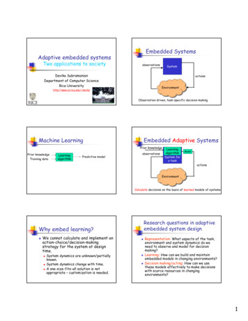
Unit 3: HistogramsPrerequisitesHistograms require the ability to group numbers by size into categories. Students will need tobe able to compute proportions (relative frequencies) and percentages. This unit continues thediscussion of describing distributions that began in Unit 2, Stemplots.Additional Topic CoverageAdditional information on histograms and other graphic displays can be found in The BasicPractice of Statistics, Chapter 1, Picturing Distributions with Graphs.Activity DescriptionThe Unit 3 activity focuses on quality control in the production of polished wafers used in themanufacture of microchips. The Wafer Thickness tool found in the Interactive Tools menu isrequired for this activity. Using this interactive, students can set three controls at three differentlevels. These controls affect the thickness distribution of polished wafers. The final task asksstudents to make a recommendation for the control settings so that the product is consistentlyclose to the target thickness of 0.5 mm.MaterialsStudents will need access to the Wafer Thickness interactive from the onlineInteractive Tools menu.The activity introduces students to histograms and the concept of variability. Students learnhow histograms are constructed by watching a histogram being made in real time as the dataare generated by the Wafer Thickness interactive. In addition, students should discover (at aninformal level) that there are different sources of variability – this understanding will be usefulpreparation for future units. Here are some sources of variability that students should observe:Unit 3: Histograms Faculty Guide Page 1
Under the same control settings, thickness varies from wafer to wafer. Under the same control settings, the histograms from two samples of wafers will differ(variability due to sampling). Changing the control settings changes the distribution of wafer thickness (variability due tocontrol settings).Questions 4 and 5 are ideal for group work. In question 4a students must design a strategyfor determining the effect that changes in the control settings have on the sample data. Thereare three control settings, each having three levels. Hence, there are 3 x 3 x 3 27 distinct setsof possible control levels. A carefully designed plan may reduce the number of settings used inthe investigation. The variability due to sampling makes 4b somewhat difficult to answer.Students may have to view more than one sample from a given set of control settings. Ifstudents get frustrated, have them start with Control 3. Control 3’s effect on the spread of thedata is probably the easiest to spot. Control 1’s shift in location is also not difficult to observe,particularly if Control 3 is set at level 3. Control 2’s effect on shape as well as location is themost difficult to ascertain and students may not be able to figure out how Control 2 affects thedistribution of wafer thickness. (That’s OK – this happens in the real world.)In question 5, students need to make a recommendation on the best choice of settings forthe three controls and to support that recommendation based on the histograms they haveconstructed. There is not a single correct answer to this question. Some settings clearly givebetter results than others – but a “best” choice of control settings is a point open to argument.Students should make a decision and defend it against other possibilities.It should be noted that data from a single sample can be saved in a CSV file. Data from CSVfiles can be imported into statistics packages or worked with in Excel.Students may be interested in seeing how real data on microchip thickness are gathered. Thevideo clip at the following site shows a technician taking measurements from wafers on whichmicrochips have been embedded:http://www.youtube.com/watch?v jG84UjCZbooUnit 3: Histograms Faculty Guide Page 2
The Video Solutions1. Time of first lightning flash.2. Horizontal scale: Time of day in hours.Vertical Scale: Percent of days with first lightning flash within that hour.3. Roughly symmetric.4. These were values that were separated from the overall pattern by a gap in the data.5. The classes need to have equal width.6. Using too many classes can make it difficult to summarize patterns connected with specificvalues on the horizontal axis. (In other words, you can’t see the forest for the trees.) Too fewclasses can mask important patterns.Unit 3: Histograms Faculty Guide Page 3
Unit Activity Solutions1. a. Sample answer based on the following sample data (in mm): 0.591, 0.483, 0.489, 0.452,0.639, 0.523, 0.601, 0.511, 0.498, 0.467.After the first wafer was measured, a rectangle was drawn above the interval 0.550 to 0.600since the thickness 0.591 fell between these values. The second, third, and fourth rectangleswere stacked on top of each other over the interval 0.450 to 0.500, since 0.483, 0.489, and0.452 all fell in that interval. The process continued until a rectangle was drawn for each of the10 measurements.b. Sample answer: The histogram for the sample data from 1a appears below.Histogram of First Sample5Frequency432100.30.40.50.60.7Wafer Thickness (mm)0.80.9The histogram does not appear to be symmetric.The interval 0.450 mm to 0.500 mm has the tallest bar and hence more wafers hadthicknesses that fell in this interval than any other interval.There are no gaps between the bars. However, none of the wafers had thicknesses that fell inthe intervals 0.300 to 0.450 and 0.650 to 0.900.The smallest data value fell in the interval from 0.450 to 0.500 and the largest data value fell inthe interval from 0.600 to 0.650.Unit 3: Histograms Faculty Guide Page 4
The thickness 0.5 mm does not appear to be a good choice for summarizing the location ofthese data. One bar falls to the left of 0.500 mm (the tallest bar) and three bars fall to the rightof this value; perhaps 0.525 mm would be a better choice. The controls do not appear to beproperly set to produce wafers of consistent 0.5 mm thickness.2. a. Sample answer data for second sample: 0.389, 0.541, 0.525, 0.621, 0.543, 0.500, 0.638,0.392, 0.382, 0.602.b. Sample answer:Histogram of Second Sample4Frequency32100.30.40.50.60.7Wafer Thickness (mm)0.80.9The histogram does not appear to be symmetric. (It would be symmetric if the second bar hadbeen closer to the first bar.)The interval 0.500 mm to 0.550 mm has the tallest bar and hence, more wafers hadthicknesses that fell in this interval than any other interval.There are gaps between each of the bars. None of the wafers had thicknesses that fell in theintervals 0.300 mm to 0.350 mm, 0.400 mm to 0.500 mm, 0.550 mm to 0.600 mm and 0.650mm to 0.900 mm.The smallest data value fell in the interval from 0.350 to 0.400 and the largest data value fell inthe interval from 0.600 to 0.650.The thickness 0.5 mm might be a good choice for summarizing the location of these data. It’sthe lower endpoint of the interval corresponding to the tallest bar. The outside bars are thesame height. Given there is a larger gap between the first and the second bar than there isUnit 3: Histograms Faculty Guide Page 5
between the second and the third bar, using the lower value of the middle bar’s interval seemsreasonable. So, it is somewhat reasonable to assume that the controls are properly set toproduce wafers that are fairly consistently close to 0.5 mm in thickness.3. Sample answer from sample data shown in histogram that follows descriptions of commonfeatures and differences.Common features: Neither histogram is symmetric. In both samples, the data values arespread from 0.35 to 0.65. The highest bar occurs over the interval 0.400 to 0.450 in bothhistograms.Differences: The two histograms appear different in shape. In the left histogram, the heightsof the bars are irregular – down, up, down, up, down. However, in the right histogram, from thesecond bar to the last bar, the heights of the bars decrease.Histogram of Sample 1, Sample 20.3Sample 10.40.50.60.7Sample 27Frequency65432100.30.40.50.60.74. a. Sample: Change one control setting at a time and compare histograms to see whathas changed. For example, start with the following settings: Control 1 1, Control 2 1 andControl 3 1. Change Control 3 from 1 to 2 to 3 and describe the change. Then choosedifferent settings for Controls 1 and 2 and repeat the process described above. See if theobserved pattern remains the same. If so, describe how the settings of Control 3 affect waferthickness in sample data.Adapt the strategy described above to determine how Controls 1 and 2 affect the thicknessof wafers.Unit 3: Histograms Faculty Guide Page 6
b. Sample answer: Samples were collected with Control 1 1 and Control 2 1 and thenchanging Control 3 from 1 to 2 to 3. The notation (1, 1, 1), (1, 1, 2), and (1, 1, 3) is used to identifythe three control settings. In the histograms below, the most apparent change appears to be toin the spread of the data. The data are least spread out (thicknesses are most consistent) whenControl 3 3. (It is almost as if the right tail shrinks as the level of Control 3 is increased.)181614Frequency1210864200.30.40.5Sample (1,1,1)0.60.70.30.40.5Sample (1,1,2)0.60.70.30.40.5Sample 1050Unit 3: Histograms Faculty Guide Page 7
Next, we kept Control 1 1, set Control 2 2, and then changed Control 3 from 1 to 2 to 3.The histograms appear below. The same pattern of reduced spread occurred. The data aremore consistent (less spread out) when Control 3 3.1412Frequency10864200.30.40.5Sample (1,2,1)0.60.70.30.40.5Sample (1, 2, 2)0.60.70.30.40.5Sample (1, 2, 050Unit 3: Histograms Faculty Guide Page 8
Next, we focus on the effect of Control 2. The histograms below compare settings (1,1,1),(1,2,1) and (1,3,1). When Control 2 1, the data appear more concentrated to the left. WhenControl 2 2, the data appear more symmetrical, and when Control 2 3, the data appearmore concentrated to the right. So, we conclude that Control 2 affects the shape of the data.Histogram of Sample (1,1,1), Sample (1,2,1), Sample (1,3,1)0.30.4Sample (1,1,1)0.50.60.7Sample (1,2,1)1612Frequency840Sample (1,3,1)16128400.30.40.50.60.7Last, we change the settings for Control 1, leaving settings for Control 2 and Control 3 fixed.Below are histograms for samples from settings (1, 1, 1), (2, 1, 1) and (3, 1, 1). Changing thesettings on Control 1 from 1 to 2 to 3 appeared to shift the bars in the histogram to the right –hence, increasing the thicknesses.Histogram of Sample (1,1,1), Sample (2,1,1), Sample (3,1,1)0.3Sample (1,1,1)0.40.50.6Sample (2,1,1)0.70.81612Frequency840Sample (3,1,1)16128400.30.40.50.60.70.8Unit 3: Histograms Faculty Guide Page 9
5. Sample answer (student answers will vary): We recommend settings (3,2,3). We choseControl 3 3 to reduce variability. We chose Control 2 2 so that we had balance betweenhigh and low values. Finally, we chose Control 1 3 to increase the thickness. We comparethis choice of settings with (2,2,3) and (2,3,3) in the histograms below.Histogram of Sample (3,2,3), Sample (2,2,3), Sample (2,3,3)0.40Sample (3,2,3)0.440.480.520.56Sample (2,2,3)1612Frequency840Sample (2,3,3)16128400.400.440.480.520.56Unit 3: Histograms Faculty Guide Page 10
Exercise Solutions1. a.25Frequency201510500100020003000Number (thousands) 65 and Older in Each State4000b. Sample answer (assuming the student’s home state is Massachusetts): For Massachusetts,there were 903 thousand people 65 or older in 2010. Massachusetts’ population of 65 andover appears to be fairly typical.25Frequency201510500100020003000Number (thousands) 65 and Older in Each StateUnit 3: Histograms Faculty Guide Page 114000
c. Sample answer: The distribution is skewed to the right. There are two gaps – one between2,000 thousand and 2,500 thousand and the other between 3,500 thousand and 4,000thousand. California with 4,247 thousand people 65 or over could be an outlier. Florida with3,260 thousand, New York with 2,618 thousand, and Texas with 2,602 thousand might also beoutliers (or they could simply be the tail of the overall pattern in the distribution).d. In the histogram below, the gaps in the data are hidden. However, you still can observe anoverall pattern that is skewed to the right.40Frequency302010001000200030004000Number (thousands) 65 and Older in Each State50002. a. Sample answer (this time assuming the student’s home state is Florida): For Florida,17.3% of the people were 65 or older. Florida has a higher percentage of people 65 or olderthan all other states and the District of 0%Percent of 65 and Over in Each State16.0%Unit 3: Histograms Faculty Guide Page 1218.0%
b. Sample answer: The overall pattern is roughly symmetric. There is a small gap – thereare no percentages between 8% and 9%. South Carolina (7.8%) and Alaska (7.7%) might beoutliers. However, they really don’t appear to be unusual values – the gap is small and thesevalues are at the upper end of the class interval from 7% to 8%.3. a. Sample answer (students could have made other choices for the class sizes):25Frequency20151050080001600024000Total 20103200040000b. Sample answer: The overall pattern of the distribution of states’ population sizes is skewedto the right. There are two gaps in the data, one between 20,000 thousand and 24,000thousand and the other between 28,000 thousand and 36,000 thousand. California (37,254thousand) is definitely an outlier. In addition, Texas (25,146 thousand) is a potential outlier.4. a. Yes.Sample explanation: If you look at the breaking strengths recorded in the first column, all theentries are different. In fact, all but four of the breaking strengths are distinct. So, breakingstrength varied from stake to stake even though the stakes were nearly identical.Unit 3: Histograms Faculty Guide Page 13
b.76Frequency543210110120130140150Breaking Strength (hundreds of pounds)160170c. The interval from 160 to 165 contained the most data.d. The histogram below looks exactly the same as the histogram in (b) – it has the sameshape, the same gaps, and the same potential outliers. The only thing that changed was thescaling on the vertical axis.40Percent3020100110120130140150Breaking Strength (hundreds of pounds)160170e. Sample answer. The overall pattern in the data is skewed to the left. The three data valuesbetween 115 and 125 represent a departure from the overall pattern and are sufficiently farfrom the rest of the data that they may be considered outliers. There are three class intervalscontaining no data that separate these potential outliers and the rest of the data.Unit 3: Histograms Faculty Guide Page 14
Review Questions Solutions1. Sample answer: The overall pattern in the first histogram is skewed to the right. There is agap between 600 and 700 and one outlier between 700 and 800. The outlier is Babe Ruth’srecord 714 career home runs. Although the pattern in the second histogram could still bedescribed as skewed to the right (because the tail of the data on the right is stretched out),the pattern is more jagged compared to the first histogram. There are a few secondary peaksand valleys apparent in the second histogram, which are not visible in the first histogram. Alsointeresting is the fact that the data values in the second class interval (100 to 200) of the firsthistogram are not evenly distributed when that class interval is divided in half, 100 to 150 and150 to 200. There are 24 data values in the class interval 100 to 150 but only one-quarteras many from 150 to 200. A similar pattern holds when the class interval from 200 to 300 isdivided into two class intervals.50Frequency4030201000200400Career Home Runs60080025Frequency201510500150300450Career Home Runs600Unit 3: Histograms Faculty Guide Page 15750
2. a.254020FrequencyFrequency30201001510591419Career Years2429Histogram 1091317Career Years2125Histogram 2b. Sample answer: Yes, for example Rod Carew had 19 career years. In the first histogram, hisdata value was classified in the class 19 – 24 and in the second histogram it was classified inthe class 19 – 21.c. Histogram 1: The shape appears unimodal and skewed right. Histogram 2: The shapeappears bimodal and roughly symmetric. Changing the class intervals had a big effect on theoverall shape.3. a.Duration(minutes)0–66 – 1212 – 1818 – 2424 – 3030 – 3636 – 4242 – 4848 – .55Reviewb. 55%Questions3ac. Solutions10%d. (See histogram on next page.)Unit 3: Histograms Faculty Guide Page 16
3530Percent25201510500122436Duration (minutes)48e. Sample answer: The distribution is skewed to the right. There is a gap between 30 and 36minutes. There are two distinct groups of phone calls, those lasting under 30 minutes and afew lasting 36 or more minutes.Unit 3: Histograms Faculty Guide Page 17
Unit 4: Measures of CenterPrerequisitesStudents should be able to identify whether distributions are roughly symmetric or skewedgiven a histogram (Unit 3). The only mathematics prerequisite is knowledge of basic arithmeticoperations (ordering, addition, division) needed to calculate the mean and median. Brieflyintroduce summation notation, x , if that notation is new to students.Additional Topic CoverageAdditional coverage of measures of center can be found in The Basic Practice of Statistics,Chapter 2, Describing Distributions with Numbers.Activity DescriptionThe purpose of this activity is to help students learn how to assess the relationship betweenthe mean and median based on the shape of the distribution. Students work with theStemplots interactive from the Interactive Tools menu. The Stemplots interactive generatesdata and then organizes it into stemplots. Students use information from the graphic display toguess which is larger, the mean or the median. Then they calculate the mean and median. Theinteractive allows them to check their answers.MaterialsStudents will need access to the Stemplots tool from the Interactive Tool’s menu online.Unit 4: Measures of Center Faculty Guide Page 1
The Video Solutions1. The variable is the weekly wages for Americans, separated by gender.2. The men’s distribution is skewed to the right.3. The medians of the two dis
Sample answer: The average Math SATs are more spread out than the average Writing SATs. The lowest Math SAT was 457 and the highest was 617, for a spread of 160 points. The lowest Writing SAT was 453 and the highest was 591, for a spread of 138 points. The center of the Writing SATs is in the 510's and the center of the Math SATs is in the .