Transcription
Cover SheetTitle: CAREER: Effective Interaction Design in Data VisualizationPI: Arvind Satyanarayan, NBX Career Development Assistant Professor, MITE-Mail: arvindsatya@mit.edu
CAREER: Effective Interaction Design for Data VisualizationSociety’s broad adoption of data visualization has been driven, in part, by decades of research developingtheories of effective visual encoding, and instantiating them in software systems to lower the thresholdfor authoring visualizations. However, there has been little analogous theory-building for interactivity — afeature widely thought to be critical for effective visualization as it enables a tighter feedback loop betweengenerating and answering hypotheses. Comparative empirical studies of interactivity are rare, and havebeen conducted in an ad hoc fashion; and, interaction taxonomies do not provide design guidelines such ashow to pick between different techniques for a given task. For instance, does the data distribution affectwhether zooming should occur via buttons, continuous scrolling, or brush-to-zoom? Similarly, how shouldinteractive filters be depicted (e.g., highlighting selected points, dimming unselected points, or removingthem from the chart altogether) to more easily perceive trends in the data? And, critically, how do theseinteraction design choices affect dataset coverage, the rate of insights, and people’s confidence?This lack of theory has also impeded support for interaction design in visualization systems. While recentwork has explored higher-level abstractions for authoring interactivity, users must still manually invoke andwire the necessary components together, with little of the guidance and support that accompanies the visualencoding process. Moreover, with no established conventions for interaction design, authors and consumersmust contend with inconsistent and unreliable experiences — for instance, by default, dragging may pan thechart, highlight brushed points, or zoom into the selected region depending on the tool used.The proposed work will begin to develop a theory of effective interaction design for data visualization, andwill leverage it to enable new methods of specifying interactive behaviors. We propose to systematicallystudy the interaction design space using the PI’s Vega-Lite visualization grammar to enumerate candidatepoints. By conducting a mix of large-scale crowdsourced experiments and in-lab studies, we will evaluate the lower-level features of interaction design (e.g., usability) in context (e.g., data science notebooks,interactive articles, etc.) and tie interaction design choices to higher-level cognition such as hypothesis generation. Study results will be codified in computational models (i.e., an interaction recommender system) toenable exploration of new automated and mixed-initiative interfaces for authoring interactivity.Intellectual Merit: The proposed work will contribute the first systematic, empirically-validated effectiveness rankings for interaction techniques in data visualization. Critically, these rankings will be conditionedon dataset characteristics, analytic task, and context, and will account for both low-level properties (e.g.,accuracy and time-taken) and higher-level features such as query formulation and learnability (e.g., as determined by interaction traces). We will codify these rankings in a recommender system to suggest effectiveinteraction techniques for a given dataset and task, as well as unexplored interactive states. Finally, we willexplore how the recommender system allows us to operationalize our effective rankings by developing newmethods for authoring interactivity, and designing novel perceived affordancces for interactive visualization.Broader Impacts: If successful, the proposed work will establish best practices for interaction design indata visualization, and significantly lower the barrier to entry for authoring interactive data visualizations.To support real-world adoption of our results, we will open source our software contributions, integrate themwith popular data science environments (e.g., Jupyter and Observable), and host workshops and tutorials forpractitioners at appropriate venues (e.g., OpenVis Conf and ODSC). We will incorporate our research resultsinto classes the PI teaches at MIT, developing new material to teach interaction design through faded workedexamples and rapid prototyping exercises. Moreover, we will prioritize providing research opportunities forwomen, underrepresented populations, and undergraduate students.Keywords: visualization; interaction; empirical studies; design; data science; computational notebooks1
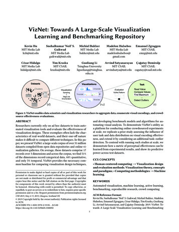
Project Description1 IntroductionData visualization has gone mainstream — from business intelligence to data-driven journalism, society hasembraced visualization as a medium for recording, analyzing, and communicating data. Although visualization has been practiced for centuries1 , the success of modern visualization rests, in part, on decades ofresearch developing theories of effective visual encoding. The need for this theory was prominently articulated by statisticians in the 1970s, including William Kruskal who noted that “in choosing, constructing,and comparing graphical methods we have little to go on but intuition, rule of thumb, and a kind of masterto-apprentice passing along of information” [53]. In response, in a seminal 1984 paper, statisticians WilliamCleveland and Robert McGill began to define a theory of visual encoding by identifying a set of elementaryperceptual tasks people perform when reading charts, and thenconductingexperimentsorder theRankstasksChannels:ExpressivenessTypes and toEffectivenessbased on how accurately participants performed them [22].Magnitude Channels: Ordered AttributesCleveland & McGill’s theory-building has had a transformative effect on the field. As they note, “a theory istestable” and the subsequent body of graphical perception studies has refined and expanded their initial rankings [32,33,49,87], as well as questioned expert wisdom onavoiding pie charts [52] and “chart junk” [9, 17]. And, instantiating this theory in software systems has lowered thebarrier to entry for visualization design — people no longerneed to be experts in, nor have an intuition for, visualization design but can rather rely on recommender systems toguide them towards effective design choices [58, 61, 93].Position on common scaleSpatial regionPosition on unaligned scaleColor hueLength (1D size)MotionTilt/angleShapeArea (2D size)Depth (3D position)Color luminanceColor saturationAlthough the research community has long articulatedthe value of interactivity in supporting a “dialogue beCurvaturetween the analyst and the data” [89], current visualization theory has focused almost exclusively on visual enVolume (3D size)codings [27, 28, 45, 90, 96]. Comparative empirical studiesof interaction techniques are rare [48, 83]; those that exFigure 1: An excerpt of rankings of visual encodist have been largely conducted in a piecemeal and ad hoc ing effectiveness [62], first empirically validatedfashion, making it difficult to gain a broad overview of in- by Cleveland & McGill [22].teraction effectiveness. Taxonomies of analysis tasks, interaction techniques, and cognitive costs have been proposed [4, 19, 34, 54, 77, 96] but have never beenempirically validated to produce effectiveness rankings. For instance, are the different means of depictinginteractive filters (e.g., highlighting selected points, dimming unselected points, or removing the latter fromthe visualization altogether) equally usable, and do they have any impact on higher-level goals such as identifying trends or formulating hypotheses? Without analogous theory on effectiveness, current interactiondesign practice suffers from many of the concerns of early visual encoding: there is a high barrier to entryfor authoring interactivity, and it is driven by largely unscientific and unstructured intuition.This project proposes to begin developing a theory of effective interaction design for data visualization,and exploring how it can be operationalized to enable new forms of authoring interactivity that lower thebarrier to entry. In particular, we expect the project to unfold across three phases:1The first bar charts and line charts are credited to William Playfair, appearing in his 1786 work Commercial and Political Atlas.1Identity Channels: C
(1) Empirically Derive Effectiveness Criteria. We will design and conduct controlled studies to develop measures for comparing alternative interactive designs conditioned on data, task, and context. Akin tographical perception studies, we will use large-scale crowdsourced experiments to study the “lower-level”features of an interaction technique including usability, task completion time, and accuracy. Critically, wewill complement these experiments with in-lab studies to evaluate interactivity in context (including withindata science notebooks and interactive articles) and understand how it impacts “higher-level” cognition suchas hypothesis generation and downstream consumption of data. For instance, how does an interactive visualization change subsequent analysis in a notebook, or does data comprehension increase for readers whohave interacted with a visualization embedded in an article?(2) Codifying Effectiveness Criteria. To study the implications of effectiveness rules for interaction design, we will first codify the results from the previous phase of research into a new interaction recommendersystem. This system should not only recommend effective interaction techniques for a given dataset, analysis task, and visual encodings, but should also suggest unexplored interactive states. To do so, we will designa novel task-based representation of interaction design, express our effectiveness criteria through a systemof logical facts and formal constraints, and incorporate machine learning methods to mine interaction traces.(3) Operationalizing Effectiveness Criteria. We will explore how our effectiveness criteria, throughour recommender system, enable novel visualization interfaces and techniques. For instance, we will exposerecommended interactive states through new minimap displays, and adapt information scent techniques todesign new perceived affordances for interactive visualization. And, with recommended interaction techniques, we will develop new approaches for authoring interaction through demonstration and automaticallyaugmenting static visualizations with interactivity by inferring analysis tasks in data science notebooks.1.1Intellectual MeritThis project will contribute the first testable theory of interaction design in data visualization. This theorywill comprise measures to rank alternative interaction techniques conditioned on dataset characteristics, analytic task, and overall context, and account for both lower-level usability concerns as well as higher-levelimplications on user goals and workflows. By building an interaction recommender system, this project willalso demonstrate how to operationalize this theory. In particular, we will design new perceived affordancesfor interactivity in data visualization, as well as new approaches for authoring interactive behaviors including through mixed-initiative interfaces and methods that automatically augment static visualizations withinteractivity by inferring task context and user goals. If successful, this project will serve as the foundationfor future work that systematically studies the interaction design space, mirroring the success of graphicalperception studies in the visual encoding space.1.2Broader ImpactsThrough this work, we aim to shift interaction design practice away from being guided purely by intuition and towards being grounded in empirically-validated principles. And, in doing so, we seek to makeauthoring interactive visualizations more broadly accessible, particularly for non-technical and non-expertaudiences. To support these goals, we will (1) open source our software contributions; (2) engage in collaborations (letters attached) to integrate them with popular data science environments including Jupyter andObservable; (3) host workshops and tutorials at practitioner-oriented venues (e.g., OpenVis Conf, ODSC,and Information ); (4) integrate both theory and systems results into data visualization and human-computerinteraction classes the PI teaches at MIT (detailed plans are in § 4.1); and (5) as described in § 4.2, we willprioritize providing research opportunities for women, underrepresented populations, and undergraduates.2
1.3PI Qualifications and Career ObjectivesThe PI is poised to conduct this research based on his award-winning prior work developing toolkits [37,80–82] and design systems [78, 79] for visualization with a focus on abstractions for interaction design.This work will be central to achieving both the intellectual merits and broader impacts of this project: theVega-Lite grammar [80] provides the first representation of interactive visualization that can systematicallyenumerate the interaction design space — a critical property for phase one of the project; the Lyra visualization design environment [79] offers a platform for developing mixed-initiative approaches for interactiondesign (phase three); and the thriving community around these tools (including wide adoption in the Jupyterdata science community, on Wikipedia, and at companies such as Apple and Google) provides not only alarge potential participant pool for phase one, but also an avenue for more immediate uptake of our results.Moreover, the PI has an established track record of outreach to underrepresented and non-academic populations. In his first year at MIT, a majority of his 13-member group are women and/or people of color.The PI has served on the diversity committees for several conferences, and is a diversity co-chair for IEEEVIS 2019, responsible for the diversity scholarship. He has a track record of speaking at practitioner venues(including repeated appearances at OpenVis Conf and OSDC East) and has also served in these communities(on the OpenVis Conf 2017 program committee, and as conference co-chair in 2018).An Early Career Award will enable the PI to expand his research agenda to cover new categories of visualization contributions2 : while his doctoral work focused exclusively on visualization systems, this projectmakes contributions in empirical studies, theories & models, and techniques & algorithms. This project, andthe collaborations it spurs, also lays a foundation for the PI to generalize insights on formally modeling andempirically evaluating interactivity from visualization to the broader human-computer interaction space.2Background and Related Work2.1Graphical Perception StudiesIn his seminal 1967 work Semiologie Graphique, French cartographer Jacques Bertin laid the foundation fora theory of data visualization by proposing that visualization is a process of mapping data variables to thevisual variables (or channels) of graphical primitives called marks, and that these channels had an effectiveness ordering [15]. By conducting human-subjects experiments, statisticians Cleveland & McGill were thefirst to empirically validate these rankings (their elementary perceptual tasks roughly map to Bertin’s visualvariables), and Heer & Bostock later replicated and extended this work with crowdsourced participants [33].In this work, effectiveness is defined as how accurately participants perceive encoded proportions by datatype (nominal, ordinal, or quantitative). More recent work has expanded this definition to include ensembleencodings [88] (i.e., encodings of more than one visual object where participants perceive averages [2, 30]or correlation [32, 44]). Thus, effectiveness rankings are now conditioned on task and dataset characteristics [50, 77]. However, this body of work has only considered static visualizations, and a similar systematicand rigorous approach has not yet been applied to determine the effectiveness of interactive behaviors.2.2Studies of Interaction DesignIn the data visualization literature, interaction techniques have typically been evaluated at the point of theirdevelopment. Researchers have primarily focused on validating internal design decisions [24, 60, 86] andif comparative studies are conducted, they focus on at most a handful of related techniques [48, 51]. Asa result, it is difficult to gain a broad and systematic overview of interactivity in data visualization. pation/infovis-paper-types3
human-computer interaction (HCI) literature provides exemplars of comparative evaluations of interactivebehaviors, with a rich body of work comparing techniques for pointing [3, 5, 8, 31, 64], scrolling [36, 70, 98,99], and selecting [14, 23]. However, this work has primarily focused on low-level properties of interactiondesign — namely, the speed of performing an interaction and often through the lens of Fitt’s Law [57] — andhas rarely studied the implications of interaction on higher-level cognition. For instance, does the scrollingmechanism affect how likely a participant is to complete reading a document? Similarly, do particularpointing techniques spur collaboration in multi-user settings? It has been difficult to make progress onthis dimension in HCI as the design space is insufficiently structured or constrained — techniques suchas pointing, scrolling, and selecting can be instantiated in myriad, diverse interfaces. By contrast, datavisualization provides a more structured design space to evaluate both lower-level properties and higherlevel implications of interactivity as researchers have developed taxonomies of analysis tasks and interactiontechniques at varying levels of abstraction [4, 19, 34, 77, 96] as well as their associated costs [54].2.3Models of Interaction DesignHCI pioneer Michel Beaudouin-Lafon has proposed [11, 12] that interaction models should provide threeproperties: (1) descriptive power, “to describe a significant range of existing interfaces”; (2) evaluativepower, “to help assess multiple design alternatives”; and (3) generative power, “to help designers createnew designs”. This lens is useful for understanding why it has been difficult to build a theory of effective interaction design: generative power is critical for isolating specific properties and systematically enumeratingalternative designs to test. With visual encodings, Bertin’s visual variables and Cleveland & McGill’s elementary perceptual tasks provided this power: experimental conditions could be systematically generated byvarying one channel and holding the others constant. Thus far, we have lacked an equivalent generative representation of interaction design, which has typically occurred through low-level imperative event handlingprogramming [63]. As a result, interaction techniques have been implemented in isolation and researchershave had to reverse engineer [70] and reimplement them [83] in order to conduct ad hoc comparative evaluations. The PI’s past work with the Vega-Lite visualization grammar [80] provides the first generativerepresentation of interaction design. For a constant set of visual encodings, Vega-Lite allows us to notonly systematically enumerate interaction techniques (e.g., filtering, panning, zooming) but also vary theirconstituent properties (e.g., what events trigger the interaction, or how is it depicted on the visualization).3Research Plan and Intellectual MeritTo begin developing a theory of effective interaction design in data visualization, this project proposes threephases of research. First, we will conduct empirical comparative studies to evaluate the low-level usabilityof different alternative designs for common interaction techniques (e.g., panning, zooming, and filtering)and to study the implications of interactivity on higher-level cognition such as query formulation and insightgeneration. To study their implications, we will codify these results in an interaction recommender systemthat is able to suggest effective techniques for a given dataset and task, and is also able to recommendunexplored interactive states. Finally, we will explore how our theory, via the recommender system, enablesnew visualization techniques and interfaces that help lower the threshold for interaction design.3.1Phase One: Empirical Studies of Interaction DesignThe goal of phase one is to begin to do for interaction design what Cleveland & McGill’s early studies,and the subsequent rich body of graphical perception studies, have done for visual encoding: develop effectiveness rankings. We define the effectiveness of an interaction technique by drawing on cognitive sciencetheory: Hutchins, Hollan, & Norman identify that an interactive behavior is most successful when it bridgesthe gulf of execution, or how easily can a user operate a given technique, and the gulf of evaluation, or4
how well does the technique accomplish the user’s goals [41]. Heidi Lam proposes that an additional gulfof formulation is necessary to capture the cost of reacting to output and formulating subsequent new goalsduring interactive data analysis and discovery [54]. In this phase, we will empirically evaluate these threegulfs through a series of controlled studies.To evaluate the gulfs of execution and evaluation, we will isolate individual interaction techniques (e.g.,zooming or filtering) and vary their constituent properties (e.g., what input events trigger them, how arethey displayed on the visualization, etc.) for a constant set of visual encodings. We will measure theaccuracy, time taken, and number of interactions (i.e., input events) needed to complete tasks from Amaret al.’s taxonomy [4] of primitive analysis tasks (e.g., retrieve value or characterize distribution). As weare assessing the lower-level mechanics of interactivity, we will conduct these studies by crowdsourcingparticipants, akin to graphical perception studies [33].By contrast, to evaluate the gulf of formulation and impact on subsequent analysis goals, we must studyinteractivity in context and under a more open-ended process. Thus, we will conduct in-lab experimentswith participants covering a broad range of data analysis expertise, and will ask them to engage with instrumented visualizations embedded in data science notebooks (e.g., Jupyter and Observable) and interactivearticles. Participants will be asked to conduct tasks, such as explore the dataset, drawn from higher-leveltaxonomies [34,96]. In addition to capturing quantitative measures (e.g., usability metrics, dataset coverage,etc.), we will ask participants to think aloud, and bookmark and caption interesting interactive states thatgenerate insights or spur further questions — a protocol used to evaluate visual analytics systems [94, 95].Through a qualitative coding procedure, we will characterize these insights using existing taxonomies toidentify their complexity, depth, and relevance [67,97]. Finally, we will record interaction traces [25,35,42]to determine patterns between interactive operations, higher-level cognition, and participant personality [20].Recent work by Kim et al. has shown that visual encoding effectiveness is conditioned on dataset characteristics [50], and we expect the same to hold true for interaction effectiveness. Thus, following their setup, weexpect to use a mixed-design: a within-subjects treatment for interaction techniques, and between-subjectstreatments for task and data distributions balanced across subjects. To ensure ecological validity, we buildon the PI’s preliminary work with VizNet: a large-scale corpus of over 31 million real-world datasets,with which the Kim et al. results were replicated [40]. All study conditions will be constructed using thePI’s Vega-Lite visualization grammar [80], which provides the first generative model of interaction designin data visualization: for constant visual encodings, we can enumerate interaction techniques and vary theirconstituent design elements systematically (see Figs. 2&3). Moreover, Vega-Lite provides us with a thriving user community which we can tap into for recruiting participants; doing so further promotes ecologicalvalidity by ensuring our studies account for real-world data analysis and visualization design expertise.3.1.1Example Empirical StudiesHere, we describe some specific studies we plan to conduct. We note that this is not an exhaustive list, butrather serves to provide concrete examples of the broader guiding principles discussed above.(A) Pan & Zoom. Recent work by Schwab et al. [83] provides one of the rare examples of empiricalevaluation of interaction techniques in data visualization: a comparative study of pan & zoom techniques inone-dimensional timelines. To do so, however, the authors had to re-implement the techniques they soughtto compare in a custom toolkit. As Figure 2 depicts, a number of the design variations they consider, aswell as several they did not, naturally fall out of the Vega-Lite interaction grammar. Thus, a first study weintend to run will replicate this prior study and extend it to evaluate additional designs (e.g., two-dimensionalpanning & zooming, multi-view techniques such as overview detail, etc.) and the effect of varying datasetdistributions. As in the original study, participants will be asked to locate a particular point (a task the authors5
B"sel1": {"type": "interval","bind": "scales", "zoom": "dblclick".alternateinput events}{"data": {"url": "gapminder.json"},"mark": "point","selection": {"sel1": {."type": "interval","bind": "scales"(e.g., multi-view zooming)"bind": {"scales": "mouseup"}}"sel1": {"type": "interval","bind": "scales", "encodings": ["x"]}}},"encoding": {"x": {"field": "fertility","type": "Q"},"y": {"field": "life expect", "type": "Q"}}"sel1": {"type": "interval",.A"sel1": {C"type": "interval","bind": "scales", "encodings": ["y"]}}Figure 2: A systematic enumeration of alternate designs for interactive zooming using Vega-Lite [80] including (a)uni-dimensional zooming; (b) via alternate input events as described by the event stream selector syntax [82]; (c)brush-to-zoom functionality; and (not depicted) multi-view mechanisms such as overview detail.drew from Brehemer & Munzner’s taxonomy [19], which roughly maps to retrieve value from Amar et al.)and we will measure usability metrics to assess the gulf of execution these techniques present.With additional rounds of studies, we can also study the implications on the gulf of formation. In particular,by instantiating these techniques in context, and posing a broader more open-ended task for participants(e.g., explore the dataset), we can ask questions including how does the panning & zooming style affectdataset coverage and the rate participants make observations about the data? Or, might particular techniquesbe preferred within data science notebooks versus interactive articles? With this latter question, for instance,we might expect data scientists to prefer the precision of brush-to-zoom to explore a small cluster, but articlereaders may favor continuous zooming via the scroll wheel for the low activation energy it presents [91].(B) Interactive Filtering. Dynamic query widgets (e.g., dropdown menus, range sliders, etc.) are frequently used to interactively filter a dataset [1], and Figure 3 illustrates a number of design variations thatVega-Lite yields for depicting their effect: driving conditional visual encoding for selected or unselectedpoints, removing unselected points from the visualization, or showing selected points in a secondary view.Users perform the same action (manipulating input widgets) across all variants, but what they are attending to likely varies. As a result, how filters are depicted on the visualization may affect the difficulty ofperforming particular analysis tasks (i.e., the design variants may present different gulfs of evaluation). Toevaluate this question, we will employ a mixed design with a within-subjects treatment for the design alternatives, and between-subjects assignments for different data distributions and across 5 tasks from Amar etal.: retrieve value, find extremum, determine range, characterize distribution, and correlate.{"data": {"url": "gapminder.json"},"mark": "point","data": {"url": "gapminder.json"},C"data": {"url": "gapminder.json"},"transform": [{"filter": {"selection": "sel1"}}]D"selection": {"sel1": {"type": "single", "fields": ["country", "year"]"bind": {"hconcat": [{"data": {"url": "gapminder.json"},"transform": [{"filter": {"selection": "sel1"}}]"country": {"input": "select", .},"year": {"input": "range", .},}},"encoding": {"x": {"field": "fertility","type": "Q"},"y": {"field": "life expect", "type": "Q"},"vconcat": [{"transform": [{"filter": {"selection": "sel1"}}]A"encoding": {.,"color": {"condition": {"color": {"value": "steelblue"}"selection": "sel1", "value": "red"}"selection": {"not": "sel1"}, "value": "gray"},}B"encoding": {.,"color": {"condition": {},"value": "steelblue"}"value": "steelblue"}.condition other encoding channels.Figure 3: A systematic enumeration of alternate designs for depicting interactive filters using Vega-Lite [80] including(a) highlighting selected points; (b) dimming unselected points; varying (a) or (b) using other encoding channels (e.g.,opacity, shape, size, etc.); (c) displaying only selected points; or, (d) displaying selected points in a secondary view.6
(C) Multiplexing Space vs. Time. Comparing different subsets of data is a common analysis task [96],and a natural question to ask is whether comparisons should occur visually or temporally. Thus far, researchers have focused on a narrow portion of this problem space: comparing visual juxtaposition (or smallmultiples) with animation for graph data [6] or temporal trends [72]. The role of interactivity has beenunderexplored and applying our experimen
Data visualization has gone mainstream—from business intelligence to data-driven journalism, society has embraced visualization as a medium for recording, analyzing, and communicating data. Although visual-ization has been practiced for centuries1, the succ