Transcription
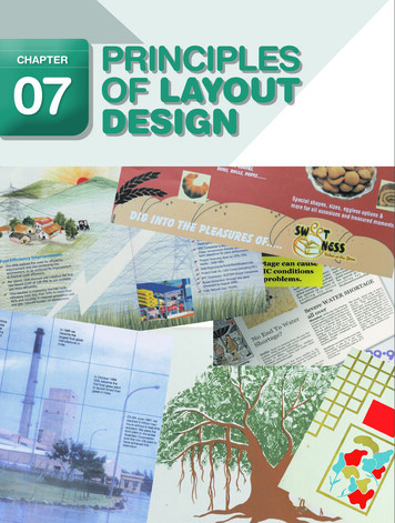
80ChapterTowards a New Age Graphic Design07PRINCIPLESof layoutdesign
hile making a design, certain things need to be takencare off, so that the design fulfils the need for effectivecommunication besides being attractive and beautiful.While embarking on the making of the layout, one needs tounderstand the message and for whom it is intended. So thefollowing aspects become the points of study to facilitate thejob of making a layout.For an advertisement design is more important to besuccessful than just beautiful. The design must have balance,rhythm, emphasis, unity, simplicity, preparation, harmony,line, shape and movement.Good layouts never just happen, they have to be deliberatelyand carefully planned and worked out. Some of the thingsthat help or direct the design of the layout must be kept inmind and considered serious: The nature of the message. Kind of picture or image that will be used. The process and paper on which it will be reproduced. The amount of text and its size. Whether the layout will stand alone like a poster orcompete with others in surrounding environment like ina newspaper.ThemeandContentThe subject, theme or content dominate the idea of a layout— which then gives an idea about the target audience andhow they need to be approached to get a favourable result.Something that is meant to shock, alarm or awaken themasses like an epidemic or terrorism need to have a bold andhard hitting approach, where as a film with a love story canhave a softer and sensitive approach. The requirement of thesubject leads to the “style” of the layout.Our communication should be made only afterunderstanding how the receiver will look at it, not just howit was perceived by the creator, the receiver may just fail81Principles of Layout DesignW
to see it from our point of view. This should be the guidingforce while working out a concept. Recall the series ofadvertisements for a leading television brand which used adevil to show envy. When the revolutionary campaign wasreleased long ago, the up-market target audience may haveenjoyed the concept, but majority of the countrymen whosaw it did not understand it.Creative strategy needs a bit of practice — a backgroundhas to be made for the main message so that it is receivedfavourably in the right manner as desired.Example, it is like how you ask your dad for a laptop. Hemust be in the right mood, you will look for the correct timeand grab the opportunity when it comes, besides havingpracticed couple of times for what words to choose and whattone to use.Towards a New Age Graphic Design82TypesofLayoutA layout is the play in placement of given text and suitableimages on a given surface area.Layouts can be classified in three categories: Text Dominant Image Dominant Image and TextText Dominant: If there is too much or large text then it willhave to be text dominated. But from the layout point of viewthe headline could be used in large display fonts occupyingmore area if that creates the desired effect.Image Dominant: These layouts are seen regularly in ournewspapers and magazines, where a picture of a celebritytakes centre stage or the product is shown in all its glory likein most automobile advertisements.Image and Text: In these types of layouts, image and textare used in equal measure, and given a balanced exposure.These two layouts areexamples of image dominantand text dominant
The paper or surface we use for artworks usually is rectangularin shape. How you place it when you start working on it, tallerside i.e.-vertical or wider side i.e. horizontal is what is calledorientation of layout. Those of you who are familiar with workingon a computer may know that if you open ‘page layout’ in themenu you get two options – the horizontal format which is calledlandscape and vertical known as portrait.When one starts to work on a design, its important todecide which option we want to use or better, which onewill be more suitable to the job we are about to execute. Forexample if it’s a letter, it is always in a vertical format asthe line length in a horizontal orientation will become toolong to read and comprehend. (You have learnt in the chapteron typography about the ideal number of characters easilyreadable in a line.) Besides business letters, certificates andother such official documents are normally stored in files, sothe vertical or portrait style is preferred.The choice of format has to be made only on some occasionsas certain things already have a fixed format like:Vertical: Newspapers, Magazines, Most Books, JournalsHorizontal: Hoardings, Banners and Sign Boards, Vehiclegraphics.However when we have to decide about particularadvertisements in newspapers or designing posters, thedesigner can exercise his discretion. Even though most booksare vertical, some coffee table books are made in horizontaland even in square format, if that is what is suitable or addsto the aesthetic of the subject.But who decides what is suitable? It is the designer. Thereforeit is important for a designer to work towards understandingwhat is suitable. Practice, no doubt makes one perfect, so keepworking. In the beginning, it may be easier to first make yourdesign, after putting together all the necessary elements andthen arranging them in both formats. Experience will howeverteach you that if the predominant element is of a verticalorientation (like a picture of Eiffel Tower or Mount Everest,or tall pine trees) a portrait format will most likely be moresuitable, and if it’s a picturesque and panoramic seascapeor mountainscape, a horizontal orientation will definitely bemore suitable, this however is not the only rule, other elementsalso have to be considered.Layout CompositionThe visual aspects of the message to be conveyed have to beconsidered to make the layout aesthetic and communicateeffectively. Then it also depends on what the layout is beingmade for since the requirements for different media differ.If you look at newspapers, magazines, books, stationary,posters, hoardings, book covers etc., you will notice that thelayout is different. These layouts are based on a fixed formatcalled Grid. There can be layout compositions which are not83Principles of Layout DesignOrientation of the Layout
Towards a New Age Graphic Design84formatted or conform to any specification, they are calledfree or informal compositions, and they may be illustrative.Balance in Compositions is usually classified as: Symmetrical Asymmetrical Mechanical VisualThe layout composition is easy to make if it is based ona grid. A grid helps divided and use the given space in anorganised manner. A grid is made after centre of interestis decided depending on the requirement, for text if it isprimary in the case of books, in a book cover text could besecondary and in case of a magazine cover, apart from thetitle, the rest of the text could be tertiary in importance. Agrid helps define the text box, the image box and the gutter(space between text and image boxes.) Let us take a closerlook at how a grid is made and how it works.The Grid SystemThe grid method encourages the designer to view the entirepage surface as a total unit, breaking the area into sub-zonesin which the elements are placed – rather than letting thelayout develop from copy in a free flowing haphazard manner.Each element of the total presentation like copy, picture, logoetc. is placed into one or more of these sections. It is thenvery easy to move each of these units around until the mostsuitable and pleasing arrangement is determined. Text andvisuals can be distributed leaving white spaces as requiredand suitable. Let us go step by step. The Grid system first divides the page into vertical andhorizontal sections of equal size. Now margins are added around each unit. The marginsindicate breaks between columns of copy and or breakswhich would keep blocks of elements from coming tooclose to each other. The divisions can now be used as required to place textand visuals.Copy, headline, logo, visual and other such elements likethese determine the grid format, the grid in turn, determinesthe precise size and space. Another example is of an IrregularGrid. This when used gives a more refined look. This is called
dropping units. In this case the material to be used can definethe design of the grid. There is no rule which says you have tofill all the available space. The graphic rule is that you must useall the space and achieve a visual balance. Remember there is abig difference between using the space and simply filling it.Adjusting to Mechanical limitations: The grid shouldbe planned within whatever limitations imposed by a printingmethod, for example while designing for a book, one has to keepallowance for binding of the volume. Or a centre-spread—one candisregard normal inside margins and create a two page grid.inPrinciples of Layout DesignColour85LayoutColour is a very important factor in an advertising layoutbecause it attracts attention. If an advertisement iscolourful its obviously more attractive, provided it is useddiscriminatively. Since the image reproduced is as good asreal, and the nature of properly and perfectly conveyed colourcan be very advantageous. Colour increases the degrees ofattention and invites more audience. It increases memoryvalue and layout efficiency, also creates a pleasing, rhythmicmovement of the eye. Colour has emotional qualities.All colours convey a certain feeling or emotion. The way inwhich a colour is used goes a long way in the effectiveness ofthe message. Perceptions, connotations, cultural conventions,HateLoveinterpretations, all these affect the way different peopleassimilate the meanings of colours used in a design. So beforemaking a colour advertisement it is essential to work out somefacts about the meanings of different colours and how peoplereact to them. In one of the previous chapter we have alreadygone through the concepts related to symbolism of colour.In advertising layouts, colour increases or decreases thelegibility of the letter forms.CopyandTypeReading the content of the text, and understanding themessage always helps make a good layout. It is good, to thinkseriously about the written text, which is called copy in alayout. Since you have to work with it so learn to examineSee howclearlythis canbe readNowcan youreadthis?
the words themselves in order to find some key that will be aguide. Reading or studying the copy will help plan the layout.Choosing the column width and typeface may be influencedby the kind of text you have to deal with, so you can workbackwards.Know all the elements to be included: headlines, subhead,text, illustrations, logotypes, testimonials, order forms andthe rest. Have the illustrative matter beforehand and knowthe actual working of headlines. Do not compromise on effort;care taken at this stage will ward off problems at the laterstage. Type arrangement has to be worked at–to get the exactlook and feel of balance and harmony.It is not always the size of the font that facilitates readability,it’s more often the space between words and lines that makesfor more effective and easier reading. See these two examples.Towards a New AgeGraphicGraphicDesignDesign86DesignThese are examplesof talking typographywhere visual languageovertakes the text butmeans the sameforPublicationWhen we begin to design it is important to know how andwhere it is going to be printed. These days the design couldbe applicable to various media, not just one, so one must tryto know the expected usages. While designing for the printmedia the size and other things have to be kept in mind.After all a good design has to look good after it is printed ina magazine, newspaper, poster or book, wherever it is meantBooks are printedin different sizes andthicknessesActivity 1Collect text dominant,image dominant, and layoutswith equal emphasis onboth, from newspapers andmagazines and observe theirpeculiarities and nuances.for. Two things that largely contribute to the final result are,the type or method of printing which could be offset, digitalor screen and the type of paper used.A large variety of papers are available in the marketincluding handmade, coloured and textured papers with variedthicknesses. The thickness of a paper is measured in ratio toits weight and is called ‘GSM’ that is grams per meter. Just togive you an idea, greeting cards are printed on thick paper andcould measure up to 270 or 300 GSM, whereas, papers in yournotebook would be around 100 GSM only. Besides the weight
the smoothness of the paper also plays a role in the printedresults. Apart from its thickness and smoothness, all papersare not suitable for all types of printing. Since the intenseand personalised use of computers and the advent of DeskTop Publishing (DTP), paper sizes have been standardisedinternationally to fit printers in every office and home to theA1, A2, A3, A4 and letter series you may already be familiarwith and these are the paper sizes used for digital printing.However, papers for printing large quantities and massproduction come in different sizes and types. For instanceyou may have noticed the daily newspapers are printed ona paper which is different from other paper quality size, it iscalled newsprint. Some other types of paper are ivory card,maplitho, executive bond, alabaster, cartridge etc. Thesenames either come from their usage or place of origin.What matters to us at this juncture is that all thesepapers come in different size and have some technical orother limitations, so at the time of making a layout a graphicdesigner needs to be aware of, and learn to adjust to thetechnical or mechanical limitationsPrinciples of Layout Design87Layout of a NewspaperNewspapers as you may have observed have a typical layoutand the pages are divided vertically into what is known ascolumns. The column size in different newspapers also vary,newspapers are generally around eight columns of 4cmswidth each. The divisions are made by line spaces left blankbetween two sets of texts, these are called gutters. Thesehelp to separate the news items as well as aid readability. Ifyou closely notice the advertisements you will notice that,they also confirm to the columns. The width is measured bycolumns, while the height is measured in centimeters. Theseare important as they not only form the basis of the layout,but also, help in calculating the cost-in terms of column/centimeters. In some newspapers there are less number ofcolumns whereas, the width of each column may be more.Try and collect samples of different types for your scrapbook.Activity 2Take any two half pageadvertisements from thelocal newspaper or a centrespread from any magazineand suggest differentlayouts for them whichaccording to you do morejustice to the product thanthe original one.
Layout for a MagazineTowards a New Age Graphic Design88Like newspapers, magazines also have their specifications.The page sizes are defined and the print area is also fixedand artwork or layout must adhere to that. Notice that in allnewspapers and most magazines, a kind of border or marginis left outside of the area of artwork, the matter or textarea is known as the print area. Printing of text is seldomdone till the edge of the paper. On the covers of magazinesand on some pages inside you may observe the picture orbackground colour printed up to the edge of the paper, thisis called the bleed. If your design, calls for a bleed, then thesize of actual artwork will have to be larger than the pagesize of the magazine. Usually reading matter of articles andstories in magazines is set in columns but advertisementsdo not confine themselves to these divisions. Advertisementsin popular magazines mostly come in full page, half pageor double page. A recent trend even includes series andsometimes pages cut in half or cutouts to attract attention.Magazines mostly havea 3-column format, buthave lot of freedomwithin the print area.Exercises1. Explain with some examples how selection of fonts affectsthe layout?2. Observe and collect samples of different types of magazines,note sizes. Also collect samples of different papers choose 1or 2 layouts that you like and give reasons why you like them.3. Explain what would happen if newspapers are not dividedinto columns.4. What are the considerations while designing an advertisementlayout for a magazine?
Graphic design is not limited to paper and print media. Graphicdesign has applications on television, animation, film/cinema, andin outdoors advertising and campaign design. Digital media ornew media is the latest addition to the list. Today almost anythingthat influences public at large is considered as media. This unitconsisting of chapters from eight to twelve explain the role of agraphic designer in the context of these media application.With the arrival of Information Technology (IT), there hasbeen a great revolution in media. The traditional ‘passive user’was endowed with the power to control and dictate the media.User-control and ‘Interactivity’ has become critical factors indigital communication. As a result, new field called New Media orInteraction Design has emerged. Now a graphic designer needs toknow many new concepts such as GUI (Graphical User Interface),navigation design, information design, human computer interaction,usability issues and user-centered design. By and large, NewMedia Design includes Multimedia CD/ DVD, Internet and webbased applications, Hand-held Devices, Mobile Technology and allpossible future applications using technologies.From graphical point of view there is a vast difference betweenimages on paper and images on the digital screens. Knowledge ofplaying with digital images has become absolutely essential today.Therefore, a graphic designer requires operational knowledge ofdigital technologies and tools.Now-a-days, apart from traditional media, news, advertisementsand even informative content such as educational content arereceived in different forms, on digital platforms, mobile phones andoutdoor sites. Audiences can be reached anywhere and at anytime. The New Media and technology has influenced the advertisingindustry and its working style. The advertising and campaigndesign is an area that requires a balance between creative thinkingand business acumen. It is important that a graphic designer withan indepth knowledge of other areas of advertising like media,planning, costing, and marketing augmented with researchcapabilities, and the knowledge of digital technology will definitelyhave an edge over others. Thus, the next few chapters are aimedat enriching the learner in the above mentioned areas.
Towards a New Age Graphic Design These two layouts are examples of image dominant and text dominant to see it from our point of view. This should be the guiding force while working out a concept. Recall the series of advertisements for a leading television brand which used