Transcription
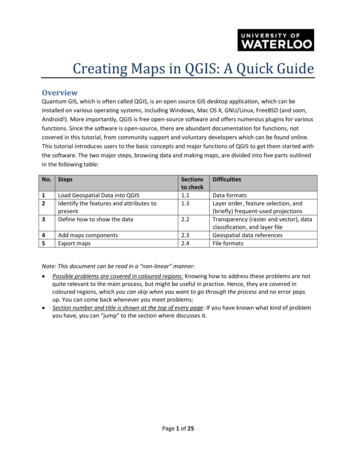
Creating Maps in QGIS: A Quick GuideOverviewQuantum GIS, which is often called QGIS, is an open source GIS desktop application, which can beinstalled on various operating systems, including Windows, Mac OS X, GNU/Linux, FreeBSD (and soon,Android!). More importantly, QGIS is free open-source software and offers numerous plugins for variousfunctions. Since the software is open-source, there are abundant documentation for functions, notcovered in this tutorial, from community support and voluntary developers which can be found online.This tutorial introduces users to the basic concepts and major functions of QGIS to get them started withthe software. The two major steps, browsing data and making maps, are divided into five parts outlinedin the following table:No.Steps123Load Geospatial Data into QGISIdentify the features and attributes topresentDefine how to show the data45Add maps componentsExport mapsSectionsto check1.11.32.22.32.4DifficultiesData formatsLayer order, feature selection, and(briefly) frequent-used projectionsTransparency (raster and vector), dataclassification, and layer fileGeospatial data referencesFile formatsNote: This document can be read in a “non-linear” manner: Possible problems are covered in coloured regions: Knowing how to address these problems are notquite relevant to the main process, but might be useful in practise. Hence, they are covered incoloured regions, which you can skip when you want to go through the process and no error popsup. You can come back whenever you meet problems;Section number and title is shown at the top of every page: If you have known what kind of problemyou have, you can “jump” to the section where discusses it.Page 1 of 25
Table of Contents1. Browse Geospatial Data . 31.1. Load data. 31.2 Add a Basemap - Loading Goggle Maps . 61.3. Browse Geographic Features . 82. Mapping . 122.1. Distinction between Geospatial Data and Map Components . 122.2. Key Options of Geospatial Data Representations . 122.2.1. Layer Order and Transparency. 132.2.2. Symbology and Label . 152.2.3. Annotations. 192.3. Map Layout and Map Components . 202.4. Export Maps . 23Page 2 of 25
1. Browse Geospatial Data1.1. Load dataTo launch QGIS in Windows, click Start All Programs Quantum GIS Brighton QGIS Desktop 2.6.0.Along with version numbers (2.6.0 in this case), QGIS also adds a different name to each version, whichis where we get “Brighton” from in the folder name (version 1.5.0, for example, was named “Tethys”).The main windows of QGIS can be divided into five regions shown in Figure 1.Controls andMenusAdd DataOptionsFile CatalogueData ViewPaneLayersPaneFigure 1 - Structure of the Main Window of QGISIn the file catalogue, browse to the folder where data are stored, and drag the files from that folder intothe data view pane to add data.Alternatively, click the Add Vector Layerbutton to add geospatial data (Figure 2), which opens theAdd vector layer dialog in a new window (Figure 3).Page 3 of 25
Add VectorLayerFigure 2 - The Main Window: Add Vector Layer ButtonFigure 3 - The Pop-up Window to "Add Vector Layer"From here you can browse to the file you want to work with by clicking the Browse button just like anyother file explorer dialog in Windows. The default file filter is *.shp file (Figure 4), but you can also workwith other files types such as *.kml (Google Earth), *.tab (MapInfo), and more.Page 4 of 25
Add Raster Data: QGIS explicitly differentiates between vector and raster data format. Toadd raster data, use the Add Raster Layerbutton. The main reason is that raster data issupported via another open source module called GDAL, which adds powerful operations forraster data processing.Add DataFigure 4 - The File Open DialogLoad all data listed in Figure 4 into QGIS. Please click the Open button just like any other file explorerdialogs in Windows to close the dialog. schools dec06.shp: All public school locations in the City of Waterloo WSLSN feb08.shp: Street network in the City of Waterloo zoning feb08.shp: zoning boundaries of City of WaterlooPage 5 of 25
Frequently-used File Formats in QGIS:Feature Data: Feature data are usually organized as points, lines, and polygons in vectorformat.o Shapefile: The most commonly used geospatial data format. Although it appears to beone file in ArcMap, shapefile includes multiple files with the same file name, butdifferent extensions. *.shp, *.dbf, and *.shx are must-have.o Geodatabase: These files are based on Microsoft Access (*.mdb). From userperspective, all kinds of geodatabase are the same, which include multiple layers(different geospatial data) in one geodatabase.o ESRI File Geodatabase: A *.gdb directory can be accessed in QGIS, but not in aconventional way. To add files from your gdb, navigate to Layer Add Layer AddVector Layer. Choose Directory for source type, and browse to your .gdb folder andselect it. You can then choose what layers from the gdb you wish to add.o MapInfo files: The following three are legacy geospatial file formats. MapInfo is thefirst desktop GIS software for Windows. Its files (*.tab) are widely used.o MicroStation files: MicroStation files have the extension of *.dgn, whose vendor is GE.Electricity plants often use it.o ArcInfo: ArcInfo is the previous generation of ArcGIS. Its file (*.e00) are supported inQGIS as well.o Google Earth: *.kml and *.kmz (zipped KML) are Google Earth file formats, which arepopular in Location-Based Service now. Many websites support kml and kmz files.o GML and GeoJSON: Open source geospatial data standard, which is also popular inonline applications.o GPS: The track of GPS records can be imported into QGIS as *.gpx files. This function isvery useful in surveying.o CSV: *.csv files stands for comma separated value, which can be regarded as alegendary spreadsheet file format.o US Census TIGER: US census publishes its data in tiger format, which belongs to“directory” source type rather than “file”.Raster Data: Raster data uses grid to represent a region with values as a “field”. Imagesexplicitly have the parameter of resolution. Typical raster data is:o GeoTIFF: They have the file extension of *.tif. The key difference between normal TIFFfile and GeoTIFF is that GeoTIFF has projection information. Hence, normal TIFF filescannot be correctly added to the desired location.o GeoJPEG: Similar to GeoTIFF, but they have *.jpg extension.o Usage: Raster data can be air photos, satellite images, elevation data (DEM). Butraster data tends to be huge and slow to load.Database Support: Another appealing feature of QGIS is its ability to support various databasevendors. Almost all types of relational database management system (RDBMS) are supportedby QGIS.1.2 Add a Basemap - Loading Google MapsQGIS provides the flexibility of using popular web maps as a base layer (or background), such as Google,Yahoo, and Bing Maps. These are accessed through an external plugin.Page 6 of 25
Too add a Basemap, go to Plugins Manage and Install Plugins, which will open the Installer dialog(Figure 6).Figure 5 - Steps to add a Basemap LayerIn the Plugins window, search for OpenLayers (this can be done by typing “openlayers” in the filter),then select the “OpenLayers Plugin” and click the Install Plugin button.Figure 6 - Plugin Installer WindowOnce the plugin finishes installing, there will be a checkbox checked beside that plugin, indicating theplugin is installed and enabled. Now, base map layers such as OpenStreetMap and Google map layers,can be selected from the Web OpenLayers plugin menu.*Please note that the Figures in this tutorial do not include Basemaps.Page 7 of 25
Brief introduction to geographic information:Vector Data: Vector data contains two parts: a geographic feature on the map (i.e. busstops) and an associated record in the table with all its attributes (i.e. routes, arrivingtimes, etc). The separation of attribute table and geographic feature is critical, becausemost operations in GIS are organized based on this classification. Raster Data: Raster data is a set of cells with values, which is normally added as referencebackground in mapping or included for further analysis. Normally, users will not identify ormodify raster data for mapping purpose. Networks: A kind of typical networks is roads. Finding the nearest way to a destination viaroads is a frequently used operation. Please find more in the further reading if interested. Further Reading: Michael Zeiler, Modeling Our World, ESRI Press, 2nd Edition, 2010. 1.3. Browse Geographic FeaturesMost controls to browse data are located in two tool bars (Figure 7), which are also available under theView menu. If you cannot find this toolbar, go to View Toolbars and check the Map Navigation on.Figure 7 - The Toolbar with Data Browsing ControlsMost icons are intuitive and self-explained. If you are not sure what function it has, hover your mouseover that icon. A pop-up text will show with further explanations.It’s important to note that in QGIS, all layer-related operations must be executed after the target layerhas been selected (i.e. feature identification, feature selection, and attribute table operations).To open the attribute table, you can either right-click the layer and select Open attribute table, or clickthe open attribute table button in the toolbar (Figure 8 & Figure 9).Page 8 of 25
Open AttributeTableFigure 8 - The Pop-up Window with Options on a LayerFigure 9 - Attribute Table WindowThere are many ways to choose a subset of features. By default, Select Single Feature is selected;however, additional options can be seen by clicking the dropdown arrownext to the icon, whichdisplays the different methods of feature selection (Figure 10). Note that Rectangle uses a drag-andrelease drawing action; Polygon draws vertexes with single-clicks and a right-click to finish; Freehand isalso drag-and-release but draws based on your mouse movements; Radius draws a circle around thestarting point but does not at fixed distances.Page 9 of 25
Figure 10 - Selecting Features OptionsAnother way to select features is to select by certain criteria: common attributes, spatial relationships orarithmetic bounds. In the Attribute Table, click on Select Features Using an Expression , which allowsyou to create selection expressions with one or more rules at the same time. (Figure 11)Figure 11 - The "Select Features Using an Expression" WindowWhen you pan the map or zoom in and out, it is quite possible that the navigation will take you awayfrom the layer you’re interested in looking at. When this happens, you can use the Zoom to Layerbutton, which is found on the Map Navigation toolbar and whose icon is a magnifying glass with a bluepolygon. This and other map controls can be classified and summarized as follows:Geographic OperationsAttribute OperationsBrowseRight-click on the layer (Figure 8 and9)Search/IdentifySelectPage 10 of 25
Geospatial Data Projections:The globe is not flat, but a map is. Therefore, any kind of projection used to make the map distortsreal space in some way. Hence, when Google Maps or any other third party layer is included,different projections are likely to be used, leading to a problem of mismatch. To obtain the projection information of a layer (and the map) right-click on the layer, then selectProperties. Projection information is located under the General tab. You can specify (check the projection code) by clicking the Specify CRS button. Frequently usedprojections are:o WGS 84: Used in GPS systems with longitude/latitude measurement. You can find it usingESPG code 4326;o Pseudo Mercator: Used by major online mapping services, including Google, Microsoft,and OpenStreetMap. Its ESPG code is 3857;o UTM zone system: UTM system is often employed in northern country mapping.Waterloo, Ontario, Canada belongs to UTM zone 17N, which can be found wit ESPG:26917. If different layers cannot combine, go to the menu Settings Option, and in the CoordinateReference System (CRS) tab, select a desirable CRS in “Always start new projects with this CRS”and select “Use the project CRS” under “CRS for new layers”. Restart QGIS if there are stillproblems. Mismatch is usually caused by incorrect use of projections. Page 11 of 25
2. Mapping2.1. Distinction between Geospatial Data and Map ComponentsIn QGIS, the mapping process is split into two major categories: production and publishing. Theproduction side (referred to as the Data View) allows for data manipulation (analysis) andrepresentation (symbology); the publishing side (referred to as the Layout View) provides the tools andspace for setting up the final product for printing or otherwise sharing the map (i.e. a map legend, anorth arrow, a scale bar, etc.). Data View displays map allows you to manipulate the layers using tools to do things like changethe layer order, customize symbology, and edit vector data.Layout View is accessed through the Print Composer, which opens in a new window and allowsyou to create the map page for final publication (this topic is covered in detail in section 2.3).Layout ViewData View Window(Map Canvas)Figure 12 - Switch between Data View and Layout View2.2. Key Options of Geospatial Data RepresentationsThe main options for changing geospatial data representations include layer order, layer transparency,symbology, labels, and annotation. Apart from layer order and annotation, all of these are accessedfrom the Properties dialog box, which is accessed by right-clicking on the layer and choosing PropertiesPage 12 of 25
(Figure 13). You then navigate to either the Style (symbology) or Labels tab accordingly (Figure 14). Thevarious options will be covered in the sections that follow.Figure 13 - Pop-up Window of a Layer's PropertySymbologyLabelsFigure 14 - The Properties Window2.2.1. Layer Order and TransparencyThe boundary layer (waterloo city.shp) can be made as “halo” (no fill color) polygons allowing theoverlaying basemap to be visible. The detailed steps will be introduced after the concept of layer order.Please note however, Figures in this tutorial do not include basemaps.Page 13 of 25
Layer OrderQGIS displays geospatial data according to the order in the table of contents: the bottom layer will bedrawn on the screen first and covered by upper layers. Hence, the layer on the top in the table ofcontents will be displayed as the top layer in the map.If two layers belong to the same feature class (i.e. point features), the newly added one will be on top ofthe older one.When a point feature layer is put under a polygon feature layer, the point feature is covered by thepolygon and therefore not visible. You can make such layers temporarily visible by deselecting the boxnext to the layer that’s blocking your view (Figure 15). Alternatively, you can drag layers up and down(on top or beneath) to change their order for display.Drag to change orderVisibilityCheckboxFigure 15 - Layer Visibility and Order ControlLayer VisibilitySometimes you’ll want to have the best of both worlds: show the polygon and the basemap imagery.Reordering layers or turning them on and off won’t satisfy both needs, but layer transparency andhollow symbology can help. Right-click the polygon layer (waterloo city) and select Properties (Figure15). Then switch to the Style tab and you can make polygons hollow by changing the Fill Style from Solidto No Brush. You may also want to increase the Border Width (Figure 16).Page 14 of 25
Symbology TabCustomize hereChange theTransparency BarFigure 16 - Properties of Symbology2.2.2. Symbology and LabelSymbologySymbology is a critical component of map-making, and in QGIS, symbols are classified into three types: Marker symbols (for points) Line symbols (for lines) Fill and Outline symbols (for polygons)Each type of symbol can consist of one or more symbol layers.Right-click the public schools layer and select Properties. Then switch to the Style tab and click on theChange button (Figure 16). The pop-up window contains several different elements.Notice that the Symbol layer type dropdown will give you different categorized symbols. In most cases,you will simply choose a symbol from those available (other than making hollow polygons mentioned in2.2.1). The symbol options will change depending on the type of feature (point, line, or polygon) beingchanged (i.e. lines won’t be an option if you’re changing the symbol of a point feature).Page 15 of 25
Available SymbolLayer TypesCustomizationOptionsCombination ofSymbol LayersSymbol LibraryFigure 17 - Symbology Customization Window with ExplanationsLayer Transparency:An alternative (more generic) way of preventing overlaying is to right-click the layer, select properties(Figure 15), and go to the Style tab (Figure 17). You can freely change the transparency as theparameter (percentage) of “Transparent” (or “Transparency” for raster layers).There may be times when you want to differentiate symbols within a layer based on an attribute of thefeature. For instance, I want to know which schools are public, separate, or for higher education in theschools layer; different types will be marked in colors. To do so, right-click on the school layer, selectProperties, and go to the Style tab, which is the same as shown in Figure 17. However, instead of thedefault Single Symbol option, select the Categorized option from the dropdown menu (Figure 18).1. Click on Single Symbol, and make sure Categorized is chosen;2. From the Column dropdown menu, select Type as the classification method.3. (Optional) Click on the Color ramp dropdown and/or Symbol selector and choose anappropriate color scheme and symbol.4. Click on the Classify button to add all distinct values under the TYPE attribute.Page 16 of 25
Note: You need to change the color before clicking Classify, otherwise the symbols need to be changedmanually one at a time or all deleted and added again after choosing a color scheme. Also, some symbollayers such as SVG Markers are a fixed color and cannot be changed.1234Figure 18 - Classifying Features using ColoursYou may want to change individual symbols rather than use a specific color ramp, in which case simplydouble-click the class you want to change the symbol for. (Figure 19)Figure 19 - Classified Symbols and Further CustomizationLabelsThe labels are an important feature of any map. Labels make your map more useful, informative, andvisually appealing. To add labels to your map, right-click on the layer you’re adding labels to (in thisinstance, choose Public Schools) and select Properties. Then follow the steps below:Page 17 of 25
1. Select the Labels tab and check on (off by default) “Display labels”.2. Choose the attribute you want to display on the map in the dropbox of Field Containing Label(Figure 20).3. Change Font, Font Size and other Placement options, so that it is clearly shown on the map.4. You can click on the Apply button to see the effect until it is satisfactory. Then click on OK tosave your setting and exit.5. (Optional) If you think the added labels are not distinct on the map background, you can make abuffer background around the texts. Please scroll down and check Buffer Labels, which add ahalo around the text of the label (Figure 21).123Figure 20 - Label Setting WindowMask OptionFigure 21 - Change Mask Option for Clearer LabelsPage 18 of 25
Symbology Types and Their Normal UsageSingle Symbol: Mainly used when you just want to mark geographic features on a map.Categorized Symbol: also called Unique Values, gives every possible value of an attribute adistinct user-defined symbol (mainly based on colors). Categorized Symbol can be applied toall kinds of attributes. Graduated Symbol: Graduated symbol marked attributes with decretive numbers in astatistical way, which can only be applied to attributes with numbers. Rule Based: Condenses all the features from a layer with classification with rules that arebased on simple SQL query language. Diagram Overlay: QGIS places multiple-attribute mapping into an independent tab calledDiagrams. Information like the percentage of populations in different age intervals atdifferent locations can be easily shown in this way. 2.2.3. AnnotationsAnnotations look like Labels. The key difference is that annotation can be any text you want to add onthe map, regardless of whether the information has been included in the geospatial data. The tool canbe found in the Attributes toolbar as shown below in Figure 22.Figure 22 - The Text Annotation Tool OptionsFor instance, if you want to add a point showing the location of the University of Waterloo, which is notin the geospatial data, click on the Text Annotation tool and type in your label (Figure 23).Page 19 of 25
Text AnnotationCustomizationText AnnotationFigure 23 - Text Annotation Customization Options2.3. Map Layout and Map ComponentsWhen the geospatial data and its representations are satisfactory, you can add other map componentsin another window via File Print Composer (Figure 26). You can manage multiple composers via File Composer Manager.Key components of a map include: The Title of the map (Purpose/Content); The scale of the map (Measurement); The North Arrow (Orientation); The Legend (how to interpret the map); (Optional) The reference (where you obtain the data).Customize ComponentPropertiesChange Paper SizeFigure 24 - The Map Composer WindowPlease note that, unlike ArcMap, the default page size is A4 (not letter size). Since letter size is morepopular in North America, you might want to change the letter size, which is called ANSI A in QGIS. ThePage 20 of 25
Add new mapbutton adds the Main Map to your Composer window (Figure 24) and is done byclicking and dragging a rectangle on the paper to define display area and extent. Map Titles andCitations can be added by using the Add new labeltool to create text boxes. Click to automaticallycreate a text box and then click on the spot where you want to place the title at. Create a separate textbox for citations.In the Print Composer, you can customize the properties of all components by switching to the ItemProperties tab. For instance, if you want to change the font of the title, click the title first (so that it isselected) and change to the Item Properties tab. There is a button called Font where you can find all theproperties there.The Add new scalebarbutton adds a scalebar to your map. Click on the tool and then select thespot you want the scale to be. You can change map units and Style so that the scale bar is numeric (i.e.1:5,000,000) or different bar/line forms. All of the options can be tested by changing them around.(Figure 25)Unit LabelScale Style DropboxFigure 25 - The Scale Bar (or Text) Property WindowAll maps should have a North Arrow, which can be added using the Add imagebutton. The arrowdoes not automatically align with true north, so be sure to draw it facing the right direction.Another item that virtually all maps should have (unless it’s extremely obvious what the differentcomponents of the map are) is a Legend. This can be added in the same way as other items in that youclick on the Add new legendbutton and adjust formatting as needed. The major options arelocated under Legend items. You can fine tune in other options below Legend items (Figure 26).Page 21 of 25
Major OptionsOther CustomizationOptionsFigure 26 - The Legend Property WindowThe Legend tool automatically generates a legend based on all the layers available for the map – this isdisplayed in the Legend Items. Add/Remove Layers: You can decide the layers to be added to the legend by clicking orto remove.Change the Display Orders: The legend items will be added strictly in the order shown in theLegend Items pane. You can change the order by clicking a layer first and move it up to addormove it down.Change Layer Names: It is easy to find that the name displayed in the legend is difficult tounderstand. For instance, users won’t know what “waterloo city” means. To change the name,you can select the layer, then click the edit buttonname: City Boundary.and change it to a more meaningfulAnother method is to right-click on the “waterloo-city” layer in the Layers pane (Figure 15), andclick Properties. Switch to the General tab and change the name in Display Name. Creating anew Legend will update the layer’s new name. You can use either method to change“waterloo streets” to “Roads”. (Figure 27 & 30)Page 22 of 25
Customize Layer NameFigure 27 - The General Tab to Change Layer NameObscure NamesFigure 28 - An Example of Legend after CustomizationSome Components that are also frequently added: Author of the Map: Users may want to know who creates the map; Data Saved (Created/Modified): The more frequent a region changes, the more important it isfor users to know when the map is created; Coordinate System: The globe is not flat, but a map is. Any kind of projection used to make themap distorts the reality in some way. Hence, it is critical for users to know how reliable theirmeasurements on the map are, especially for pilots and navigators.2.4. Export MapsWhen you are satisfied with everything on the map and are ready to deliver, you can export your map asimages, PDF, SVG, or print a hard copy. All options are under the File menu within the Composer dialog.(Figure 29)Figure 29 - Export Map OptionsPage 23 of 25
You can specify the directory and file name of the map in this dialog. There are more file format optionsavailable in the Save as type dropbox. (Figure 30) The most frequent-used formats are JPEG and PDF.JPEG is a popular graphic file format, which is easy to be inserted into word as a graph, while PDF is bestused for sharing. The printed copy of PDF will be identical regardless of your computer (and printer)environment.Figure 30 - Export Map DialogPlease note that if the purpose of your map is to be shown on screen, 96 dpi resolution is good enough.It is especially true when you want to publish your map online, given that lower resolution maps aremuch smaller, and therefore, easier to transfer via Internet. If you need hard copies of your map, pleasemake sure that the resolution is set to 300 dpi or 600 dpi (Figure 31). Otherwise the output map mightbe obscure.Figure 31 - General Customization on Print ComposerOther than export map to other file formats, you can directly print out hardcopies of your map byComposer - Print. You can also customize page and printer setup via Composer - Page Setup, such asPage 24 of 25
page orientation (portrait and landscape), page size and so on. All these operations are intuitive andvery similar to other applications, such as Microsoft Word.Brief Explanation of Graphic File Formats: SVG file: Scalable Vector Graphics, an open-source vector graphic standard. It is becomingmore and more popular and can be accepted by many vendors; BMP file: BitMap file, which is a mature loss-less uncompressed raster format. The quality isgreat. But its file size tends to be huge. It can be used if you need both high-quality outputand compatibility; PNG file: Portable Network Graphics, which is an open-source standard designed to replaceBMP and GIF. It is a true-color loss-less raster file format. PNG file is slightly larger than JPEG(compressed with quality loss). And some old browsers and operating systems do notsupport PNG files; TIFF file: Tagged Image File Format. A major raster graphic file format provided by Adobe (AIfor vector). Best to be used for raster file editing on Adobe Products, such as Photoshop; GIF file: Graphics Interchange Format. An uncompressed raster file format with 256-colorlimitation. Hence, if your map contains only a few colors (vector-based data), GIF is a goodcandidate. Created by Bonnie Lui 2013, revised and updated by Alex McVitte in February 2015Page 25 of 25
Page 5 of 25 Figure 4 - The File Open Dialog Load all data listed in Figure 4 into QGIS. Please click the Open button just like any other file explorer dialogs in Windows to close the dialog. schools_dec06.shp: All public school locations in the City of Waterloo WSLSN_feb08.shp: Street network in the City of Waterlo