Transcription
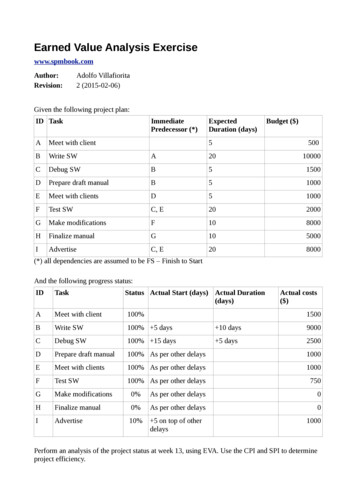
Earned Value Analysis Exercisewww.spmbook.comAuthor:Revision:Adolfo Villafiorita2 (2015-02-06)Given the following project plan:ID TaskAMeet with clientBWrite SWCImmediatePredecessor (*)ExpectedDuration (days)Budget ( )5500A2010000Debug SWB51500DPrepare draft manualB51000EMeet with clientsD51000FTest SWC, E202000GMake modificationsF108000HFinalize manualG105000IAdvertiseC, E208000(*) all dependencies are assumed to be FS – Finish to StartAnd the following progress status:IDTaskStatus Actual Start (days) Actual Duration(days)Actual costs( )AMeet with client100%BWrite SW100% 5 days 10 days9000CDebug SW100% 15 days 5 days2500DPrepare draft manual100% As per other delays1000EMeet with clients100% As per other delays1000FTest SW100% As per other delays750GMake modifications0%As per other delays0HFinalize manual0%As per other delays0IAdvertise10% 5 on top of otherdelays15001000Perform an analysis of the project status at week 13, using EVA. Use the CPI and SPI to determineproject efficiency.
SolutionEarned Value Analysis is discussed in: -09ExecutionMonitoringControl.key.pdfWe organize the solution as follows:1. Drawing the Gantt chart of the plan2. Drawing the Gantt chart of the actual plan (progress status)3. Perform the analysis (plot PV, AC, EV, CPI, SPI)1. Drawing the Gantt chart of the planWe start by drawing the network diagram using the information about immediate predecessors.(This is not stritcly necessary: the Gantt chart can be drawn directly, if you manage to take intoaccount dependencies and durations at the same time, which should not be too complex.)This is shown in the following figure, where we use the AON (Activity on Node) notation:The Gantt chart can now be easily drawn, by taking into account the expected duration of eachactivity. The result is shown in the following diagram (notice that we are assuming the duration tobe expressed in working-days and that we are using a “standard” calendar, in which saturday andsunday are non-working time):
2. Drawing the Gantt chart of the actual plan (progress status)The actual Gantt chart can be drawn by taking into account the information about delays, variationsin duration, and actual completion. The main point of attention (when doing this work manually), istaking into account the constraints. Gantt charting tools, fortunately, can do this for usautomatically.The following figure shows the two plans, the baseline (or initial) plan, shown in the lower part ofeach activity and the actual plan, shown in the upper part of each activity:As it can ben seen, the delay on activity B delays all other activities in the plan. The activitiesmarked in red are in the critical path.3. Perform the analysis (plot PV, AC, EV, CPI, SPI)To perform the assessment, we start by computing and plotting PV, AC, and EV.PV is the sum of planned costs. It is computed by determining for each reporting period, the costassociated to each activity and by summing and cumulating them over time.The following table summarizes the planned costs over time. It is computed as follows: Each column of the table represents one week (we show only the first 13 weeks) The planned costs of each activity is taken from the first table of the question For each activity, we compute the weekly cost (activity cost / duration in weeks) and accruethe cost for each week in which the activity lasts. For instance B has a total planned cost of10000 and a duration of four weeks, from W2 to W5. Therefore we accrue 2500 in weeksW2 to W5 for B. We then compute the cumulative costs, by summing planned expenditure week by week.ABCDEFGHIMeet with clientWrite SWDebug SWPrepare draft manualMeet with clientsTest SWMake modificationsFinalize manualAdvertiseTotalPlanned ValueW1 W2W3W45002500 2500 00 2000 2000 2000500 2500 2500 2500 2500 2500 1000 2500 2500 2500 2500500 3000 5500 8000 10500 13000 14000 16500 19000 21500 24000W12W13 Total5001000015001000100020004000 4000 8000080004000 400028000 32000
AC is the sum of the actual costs incurred into. It is computed by looking at the actual costswhen they took place. Similar to the previous case: For each activity, we look at its actual costs (second table of the question) and split themevenly for the actual duration of the activity, up to the monitoring date (that is, the date inwhich the analysis is performed)The result is shown in the following table:ABCDEFGHIW1 W2Meet with client1500Write SWDebug SWPrepare draft manualMeet with clientsTest SWMake modificationsFinalize manualAdvertiseTotal15000Planned Value1500 1500W3W4W5W6W7W815001500150015001500 1500W912501000W10W11W12125010002501500 15003000 450015006000150075002505001500 1500 2250 22502507509000 10500 12750 15000 15250 16000W13 Total1500900025001000100025075000500 100075016750EV is the sum of the planned costs on the actual schedule. There are different rules forcomputing EV. We use 50%-50% (50% of planned costs when an activity starts, the remaining 50%,when the activity ends.The result is shown in the following table:ABCDEFGHIMeet with clientWrite SWDebug SWPrepare draft manualMeet with clientsTest SWMake modificationsFinalize manualAdvertiseTotalEarned ValueW1 100010005005000 50000500 5500 55000550005500040000 5000 1750 1750 1000 40005500 10500 12250 14000 15000 19000W13 Total500100001500100010000 1000000 4000019000We can now plot all three values together. The result is shown in the following diagram:35000Planned ValueActual CostsEarned 127501225015000 15250150001400019000 1900016000 16750105005500W7W8W9W10W11W12W13
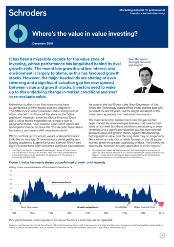
From the data at W13 we can observe the following: PV AC indicates that the project is under budget. However, it might be under budgetbecause of two reasons: it is, in fact, efficient or, alas, it is late (the expenditure has not yetoccurred, because activities did not start). EV PV indicates that the project is late. At W13, in fact, the value we currently producedis the one we should have had at W9.For more precise analyses about the project efficiency, we can compute CPI and SPI, whichmeasure cost efficiency and schedule efficiency.More in details: CPI EV/AC, that is, how many dollars we produce (EV) for each dollar wespend (AC). Clearly CPI 1 is a good sign, while CPI 1 indicates that the project is inefficientand will probably end over budget.The following graphs shows the behaviour of CPI over time. If we do not consider some noise (dueto the 50%-50% rule, which causes, for instance, the peak at W3), we can see that CPI is gettingclose to 1, indicating that the project should end on budget, if the trend is confirmed.2CPI1.831.81.61.41.221.19 1.131.210.9210.730.80.96 0.93 0.980.610.60.33 0.330.40.20W1W2W3W4W5W6W7W8W9W10 W11 W12 W13The SPI index measure the schedule: SPI EV/PV and indicates how much we produce (EV) withrespect to what we thought we would produce. Also in this case SPI 1 is a good sign (ahead ofschedule), while SPI 1 indicates that the project is late. In our example we should expect SPI to be 1, as it is, in fact, shown by the following diagram, which plots SPI over time:1.2SPI1110.80.690.60.680.64 0.64 0.65 0.630.590.520.42 0.390.40.20W10.17W2W3W4W5W6W7W8W9 W10 W11 W12 W13
Earned Value. From the data at W13 we can observe the following: PV AC indicates that the project is under budget. However, it might be under budget because of two reasons: it is, in fact, efficient or, alas, it is late (the expenditure has not yet occurred, because activities did not start). EV PV indicates that the project is late. At W13, in fact, the value we currently produced .