Transcription
Earned Value Management(EVM) Chart AnalysisIntroductionA key component of Earned Value Management (EVM) is analyzing EVM data, charts, andreports to assess cost and schedule performance trends as part of an integrated programmanagement approach. EVM chart and report analysis provides insight into the accuracy of theperformance measurement baseline (PMB) and is useful in determining whether a contractor’sestimate at completion (EAC) is reasonable, or needs to be explained and/or adjusted based onEVM data trends.This job aid provides an overview of the following EVM charts and report: Cumulative Variance Trend chartCost and To-Complete Performance Indexes (CPI/TCPI) chartCost/Schedule Variance Trends chartEstimates at Completion (EAC) chartSix-Period Summary reportEVM 202September 20161
EVM Chart AnalysisCumulative Variance ChartThe Cumulative Variance chart shows the contractor’s predicted variance at completion (VAC),cumulative schedule variance (SVCUM), and cumulative cost variance (CVCUM), plotting time onthe x-axis and dollars in millions on the y-axis. You can use this chart to compare a contractor’spredicted performance against their actual performance.Sample Cumulative Variance Chart Note: This sample Cumulative Variance chart, and other charts in this job aid,display data in a slightly different way than Empower. Depending on the software toolused by your organization, the charts you see outside of the EVM 202 classroommay look different from what you see here or in Empower.EVM 202September 20162
EVM Chart AnalysisHow to Analyze this ChartThe VAC is the cost variance the contractor predicts atthe end of the contract. SCHED (SVcum) and COST(CVcum) are the contractor's data calculations of actualschedule and cost performance. The 0 line is the point atwhich work is exactly at budget and on schedule.If the VAC is positive, then the contractor is predicting anunderrun; their EAC is less than the budget at completion(BAC). If the VAC is negative, then the contractor ispredicting an overrun; their EAC is more than the BAC.Key EVM FormulasVAC BAC EAC Positive VAC Underrun Negative VAC OverrunSV BCWP BCWS Positive SV Finished morework than planned Negative SV Finished lesswork than plannedCV BCWP ACWP Positive CV Underrunning Negative CV OverrunningIf the SVCUM is positive, then the contractor hasaccomplished more work than planned. If the SVCUM isnegative, then the contractor has accomplished less workthan planned. If the SVCUM is trending down, (i.e., the SVCUM line is sloping downward), thenschedule performance is getting worse. Note: Negative SVCUM does not necessarily mean that the contract is behindschedule. You must look at the network schedule to determine if the tasks are on thecritical path before making assumptions about schedule impact. Note: At contract completion, SVCUM will always be 0 because BCWS will equalBCWP.If the CVCUM is positive, then the contractor has spent less than planned to accomplish the work.If the CVCUM is negative, then the contractor has spent more than planned to accomplish thework. If the CVCUM is trending down, (i.e., the CVCUM line is sloping downward), then costperformance is getting worse. In other words, the overrun is increasing or the underrun isdecreasing.To determine whether the contractor’s EAC is reasonable, compare the contractor's VAC to theCVCUM. Based on the CVCUM trend data: If the VAC and CVCUM are approximately the same, then the contractor’s EAC isreasonable.If the VAC is more than the CVCUM and the trends are diverging (i.e., getting fartherapart), then it is less likely the contractor can achieve their EAC. If the trends areconverging (i.e., coming closer together), then the EAC is more likely achievable.Analysis in ActionIn the previous sample Cumulative Variance chart, the contractor is predicting an underrunbecause the VAC is positive (2.3). However, the contractor’s EAC is unreasonable because theCVCUM has consistently been much less than the VAC, and it is trending downward away fromthe VAC. In addition, the VAC and CVCUM trends are diverging, which also indicates that thecontractor's EAC may be unreasonable.EVM 202September 20163
EVM Chart AnalysisCost and To-Complete Performance Indexes ChartThe Cost and To-Complete Performance Indexes (CPI/TCPI) chart shows the contractor’scumulative and current cost performance indexes (CPICUM and CPICUR), and the to-completeperformance index for the BAC and contractor’s EAC (TCPIBAC and TCPIEAC). The chart plotstime on the x-axis and index of dollars on the y-axis. You can use this chart to compare acontractor’s demonstrated efficiency with the efficiency needed to meet a cost target.Sample CPI/TCPI ChartHow to Analyze this ChartThe CPICUM and CPICUR reflect the contractor’sdemonstrated efficiency. The CPICUM is thecontractor’s cumulative cost efficiency, whilethe CPICUR is their monthly cost efficiency. TheCPICUR tends to be volatile so it is not a goodmeasure of total performance.Key EVM FormulasCPI BWCPACWPTCPIBAC Work RemainingBAC BCWPCUM Budget RemainingBAC ACWPCUMTCPIEAC Work RemainingBAC BCWPCUM Budget RemainingEAC ACWPCUMThe TCPIBAC and TCPIEAC reflect the efficiencythe contractor needs to achieve the BAC and their EAC, starting Day 1 of the next month. Note: With regards to TCPI, the smaller the BAC or EAC, the greater the efficiencyneeded to achieve it. Note: In the TCPIEAC formula, you may use the contractor’s EAC or the GovernmentEAC to determine the TCPI for that specific EAC.EVM 202September 20164
EVM Chart AnalysisIf the CPICUM is 1.00, then the contractor’s cost efficiency is as planned. If it is greater than 1.00,the contractor is more than 100% efficient, or more efficient than budgeted. If the CPICUM is lessthan 1.00, the contractor is less than 100% efficient, or less efficient than budgeted. If theCPICUM is trending down (i.e., the CPICUM line is sloping downward), the contractor’s efficiency isgetting worse. If the CPICUM is trending up (i.e., the CPICUM line is sloping upward), theirefficiency is improving.To determine whether the contractor’s EAC is reasonable, compare the CPICUM (efficiencydemonstrated) to the TCPI required to achieve the BAC or EAC (efficiency needed). If the contractor’s CPICUM is greater than the TCPI, then they are more likely to achievethe cost target because they are more efficient than what is needed to meet that target.If the contractor’s CPICUM is less than the TCPI, then they are less likely to achieve thecost target because they are less efficient than what is needed to meet that target.If the trends for CPICUM and TCPI are diverging (i.e., getting farther apart), then thelikelihood of the contractor achieving the cost target is decreasing because the gapbetween the efficiency demonstrated and the efficiency needed is increasing.If the trends for CPICUM and TCPI are converging (i.e., coming closer together), then thelikelihood of the contractor achieving the cost target is increasing because the gapbetween the efficiency demonstrated and the efficiency needed is decreasing.A delta of 10% or more between TCPI and CPICUM is used as an early warning indicationthat the targeted budget could be unrealistic.Analysis in ActionIn the previous sample CPI/TCPI chart, the contractor's CPICUM is 0.929. In other words, forevery 1 spent (ACWP), 0.929 worth of work was accomplished (BCWP). The contractor'sEAC is unreasonable because the CPICUM is less than the TCPIEAC (1.072) and TCPIBAC (1.022).In addition, the difference between the CPICUM and the TCPIEAC is more than 10% (14.3%), andthe difference for the TCPIBAC is nearly 10% (9.3%), which also indicates that the contractor'sEAC may be unreasonable.EVM 202September 20165
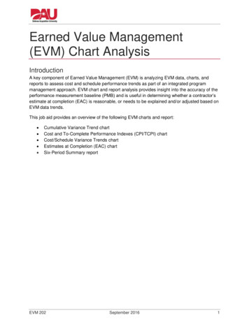
EVM Chart AnalysisCost/Schedule Variance Trends ChartThe Cost/Schedule Variance Trends chart, also known as the cone chart, shows the contractstart and completion dates, the contractor’s SVCUM and CVCUM, the 10% threshold bands, thecontractor and Joint Program Office (JPO) VACs, and management reserve (MR). The chartplots time on the x-axis and dollars in millions on the y-axis. You can use this chart to comparecost and schedule performance trends to the JPO’s and contractor’s VAC.Sample Cost/Schedule Variance Trends ChartEVM 202September 20166
EVM Chart AnalysisHow to Analyze this ChartSimilar to the Cumulative Variance chart, if the VAC ispositive for either the JPO or the contractor, then thatentity is predicting an underrun; their EAC is less than theBAC. If their VAC is negative, then they are predicting anoverrun; their EAC is more than the BAC.If the CVCUM is positive, then the contractor has spentless than budgeted to accomplish the work. If it isnegative, then the contractor has spent more thanbudgeted to accomplish the work. If the CVCUM is trendingdown, (i.e., the CVCUM line is sloping downward), thenperformance is getting worse. In other words, the overrunis increasing or the underrun is decreasing.Key EVM FormulasVACJPO BAC EACJPO Positive VAC UnderrunNegative VAC OverrunVACKTR BAC EACKTR Positive VAC Underrun Negative VAC OverrunCV BCWP ACWP Positive CV Underrunning Negative CV OverrunningSV BCWP BCWS Positive SV Finished morework than planned Negative SV Finished lesswork than plannedIf the SVCUM is positive, then the contractor hasaccomplished more work than planned. If it is negative,then the contractor has accomplished less work than planned. If the SVCUM is trending down,(i.e., the SVCUM line is sloping downward), then schedule performance is getting worse. Note: Negative SVCUM does not necessarily mean that the contract is behindschedule. You must look at the network schedule to determine if the tasks are on thecritical path before making assumptions about schedule impact. Note: If the contractor has a large number of 50/50 work packages, a positive SVCUMcould result from the contractor opening work packages early.To determine whether the contractor’s EAC is reasonable, compare the cost and scheduleperformance trends to the trend required to reach the JPO and contractor estimates (i.e., theVACs) and look for changes in trends. A negative SVCUM trend is often followed by a negative CVCUM trend.Normally, the best a contractor can do is to flatten the CVCUM trend, meaning there areno additional overruns. However, when the CVCUM trend to date is negative, it is rare fora contractor to spend less than planned in the future to cause the trend to improve, ortrack up. For this reason, if the CVCUM trend needs to improve drastically to reach theJPO or contractor VAC, the contractor would need a good explanation for how thischange could occur.Remember: The SVCUM will always trend back to 0 when work is complete becauseBCWP will equal BCWS. This does not mean work will be completed according to theoriginal schedule, only that all work will eventually be completed and earned value (EV)will be achieved.Use of MR is also something to track; early MR use is often an indication of planningproblems.EVM 202September 20167
EVM Chart Analysis The 10% threshold bands are based upon 10% of BCWP and provide perspective onthe relative significance of the cost and schedule variances. The goal is to stay withinthis cone.Analysis in ActionIn previous sample Cost/Schedule Variance Trends chart, the contractor is predicting anunderrun because their VAC is positive. However, the contractor’s EAC is unreasonablebecause both CVCUM and SVCUM have consistently trended downward, and show no sign ofimproving. Moreover, the change required in the CVCUM trend to reach the JPO and contractorVACs is significant, which makes this change unlikely.EVM 202September 20168
EVM Chart AnalysisEstimates at Completion ChartThe Estimates at Completion (EAC) chart shows the BAC, the contractor’s EAC, and one ormore formula-based EACs, plotting time on the x-axis and dollars in millions on the y-axis. Thischart is used to compare a contractor’s EAC to formula-based EAC(s) to determine if thecontractor’s EAC is reasonable.Sample EAC Chart Note: This sample chart displays one formula-based EAC: EACCPI (also known asthe floor EAC), which uses CPICUM as the performance factor. Other charts maydisplay additional EACs, such as the ceiling EAC (EACComposite), which uses CPI*SPIas the performance factor. See the next section for more information about formula-based EACs andperformance factors.EVM 202September 20169
EVM Chart AnalysisHow to Analyze this ChartThe contractor’s EAC is one way to determine whatthe contract may cost compared to the original plan.Formula-based EACs are another way to determinewhat the contract may cost. EACs may be calculated byusing different performance factors (PFs).To calculate a formula-based EAC, substitute anefficiency factor (e.g., CPICUM or CPICUM * SPICUM) for thePF. No one factor is better than another. Choose anefficiency factor based on program history, currenttrends, technical performance, and other programmaticinformation.Key EVM FormulasVAC BAC EAC Positive VAC Underrun Negative VAC OverrunEACPF ACWP BAC BCWPCUMPerformance FactorEACCPICUM ACWP BAC BCWPCUMCPICUMEACComposite ACWP BAC BCWPCUMCPICUM SPICUM The Six Period Summary report pre-calculates several formula-based EACs. See theSix Period Summary Report subsection at the end of this job aid for moreinformation.EACs are used to assist management decision-making and planning. They are frequentlyincluded in reports, such as budget documents, submitted to upper levels of management. If thecalculated EACs differ greatly from the BAC and/or contractor EAC, then the contractor and/orthe Program Management Office (PMO) should be prepared to explain why.Analysis in ActionIn the previous Sample Estimates at Completion (EAC) chart, the contractor is predicting anunderrun because their EAC is less than the BAC. However, the contractor’s EAC isunreasonable b
contractor and Joint Program Office (JPO) VACs, and management reserve (MR). The chart plots time on the x-axis and dollars in millions on the y-axis. You can use this chart to compare cost and schedule performance trends to the JPO’s and contractor’s VAC. Sample Cost/Schedule Variance Trends Chart