Transcription
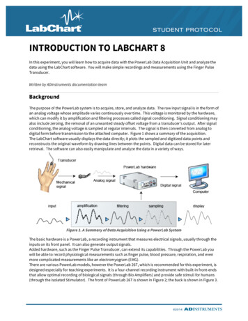
INTRODUCTION TO LABCHART 8In this experiment, you will learn how to acquire data with the PowerLab Data Acquisition Unit and analyze thedata using the LabChart software. You will make simple recordings and measurements using the Finger PulseTransducer.Written by ADInstruments documentation teamBackgroundThe purpose of the PowerLab system is to acquire, store, and analyze data. The raw input signal is in the form ofan analog voltage whose amplitude varies continuously over time. This voltage is monitored by the hardware,which can modify it by amplification and filtering processes called signal conditioning. Signal conditioning mayalso include zeroing, the removal of an unwanted steady offset voltage from a transducer’s output. After signalconditioning, the analog voltage is sampled at regular intervals. The signal is then converted from analog todigital form before transmission to the attached computer. Figure 1 shows a summary of the acquisition.The LabChart software usually displays the data directly; it plots the sampled and digitized data points andreconstructs the original waveform by drawing lines between the points. Digital data can be stored for laterretrieval. The software can also easily manipulate and analyze the data in a variety of ways.Figure 1. A Summary of Data Acquisition Using a PowerLab SystemThe basic hardware is a PowerLab, a recording instrument that measures electrical signals, usually through theinputs on its front panel. It can also generate output signals.Added hardware, such as the Finger Pulse Transducer, can extend its capabilities. Through the PowerLab youwill be able to record physiological measurements such as finger pulse, blood pressure, respiration, and evenmore complicated measurements like an electromyogram (EMG).There are various PowerLab models, however the PowerLab 26T, which is recommended for this experiment, isdesigned especially for teaching experiments. It is a four-channel recording instrument with built-in front-endsthat allow optimal recording of biological signals (through Bio Amplifiers) and provide safe stimuli for humans(through the Isolated Stimulator). The front of PowerLab 26T is shown in Figure 2; the back is shown in Figure 3.
INTRODUCTION TO LABCHART 8Figure 2. The Front Panel of PowerLab 26T1.2.3.4.5.6.7.8.Power indicator light: illuminates when the PowerLab is turned onAnalog output connections: provide a voltage output in the 10 V rangeThis is NOT safe for direct connection to humans.Isolated Stimulator status light: indicates if the Isolated Stimulator is working properly (green) or out ofcompliance (yellow)Dual Bio Amp input: connects a 5 Lead Bio Amp Cable to the PowerLab; reads as inputs 3 and 4Isolated Stimulator outputs: for connecting stimulating electrodes to the Isolated StimulatorIsolated Stimulator switch: turns on/off the Isolated StimulatorPod ports: 8-pin connectors for attaching pods and certain transducers to Input; these supply a DCPower to the pods and transducersTrigger input: can be used to start or stop a recording eventFigure 3. The Back Panel of PowerLab 26T9.10.11.12.13.14.15.16.Audio output connector: standard 1/8'' (3mm) phono jack for sound output of recordings from the BioAmpDigital Output ConnectorEarthing post: used to ground the PowerLab, if grounded power supply is unavailablePower switchPower cord connectorDigital Input ConnectorUSB connector: connects a computer to the PowerLabI2C connector: connects the PowerLab to special ADInstruments signal conditioners called front-endsThe PowerLab should be connected to your computer and turned on. The PowerLab hardware is controlledthrough the LabChart software, so there are no knobs or dials on the PowerLab. LabChart controls thePowerLab, it displays the electrical signals measured by the PowerLab on the computer screen. The displayformat resembles a traditional chart recorder with a scrolling area of the window acting as the paper.2
INTRODUCTION TO LABCHART 8Required Equipment LabChart softwarePowerLab Data Acquisition UnitFinger Pulse TransducerReference GuideThere are various keywords throughout the text. Words appearing in bold are items to click in LabChart. If theword appears in bold and a color, it is referred to in the Student Quick Reference Guide. Use the color dividersin the guide to find the appropriate section for your topic. All purple text appears in the Introduction section, All blue text appears in the Acquisition section, All green text appears in Data Analysis section, All red text appears in the Troubleshooting section.Connecting the Finger Pulse Transducer1.Connect the Finger Pulse Transducer to Input 1 on the front panel of the PowerLab (Figure 4). Place thepressure pad of the Finger Pulse Transducer on the tip of the middle finger of either hand of thevolunteer. Use the Velcro strap to attach it firmly but without cutting off circulation. If the strap is too loose, the signal will be weak, intermittent, or noisy. If the strap is too tight,blood flow to the finger will be reduced causing a weak signal and discomfort. You may need toadjust the strap in the next stage of the exercise.Figure 4. How to Connect the Finger Pulse Transducer with the PowerLab 26T and Finger2.Have the volunteer face away from the monitor. In most experiments, you do not want the volunteer tosee the data while it is being recorded. Make sure the Finger Pulse Transducer cable can still reach thePowerLab while allowing the volunteer to sit comfortably. The volunteer should sit in a comfortableposition and relax. The Finger Pulse Transducer cannot rest on any surface. The volunteer shouldsupport their wrist with their leg and have their fingers hang freely.3
INTRODUCTION TO LABCHART 8Starting LabChart1.2.Start the LabChart software as you would any other computer program.LabChart will appear with the Welcome Center window as in Figure 5. If it doesn’t appear click its icon( ) in the lower left corner of the LabChart window.The Welcome CenterThe Welcome Center is used to manage LabChart files. From here you can create new files, open recentlyrecorded files or open settings files. You can also access many of the commonly used support features ofLabChart.Figure 5. Welcome Center showing the Pulse Settings file for Introduction to LabChart 8The LabChart InterfaceLabChart has a predictable interface focused around the main LabChart window, the menu bar and toolbar atthe top, and the document buttons at the bottom. The various windows for data files exist within this mainwindow.1. From the Welcome Center click the New button below the Recent Files list on the left.2. The default window for a new file is the Chart View. This is divided up into a number of recordingchannels shown as horizontal strips across the screen.3. Various controls are located around the Chart View, as shown in Figure 6. Take time to locate the onesshown and learn their functions. A complete description is given in the Help Center (found in the Helpmenu).4
INTRODUCTION TO LABCHART 8Figure 6. LabChart Interface for the default Chart View windowOpening a Settings FileSettings files provide an easy way to configure LabChart without having to adjust controls every time you recordsomething different.Note: Your instructor has been provided with a settings file called “Pulse Settings” for this experiment. Thisshould be located in LabChart’s Welcome Center (File Welcome Center, and click on the Experiments tab). Ifit is not here, ask your instructor where to find it.1. Close the new LabChart document you opened. Do not save the file if asked.2. Open the settings file “Pulse Settings.” If this file is located in the Welcome Center, click on the settingsfile for this experiment in the right-hand section. This will create a new data file using these settings.3. You should see a modified version of the Chart View window with only one channel visible. Find SmartTile in the LabChart Toolbar to fit the window to your screen, or simply maximize the window withinLabChart using the standard Windows controls.Smart Tile is particularly useful if you have a number of different windows open. It attempts to arrange thevarious open windows for that data file to maximize the available screen space.5
INTRODUCTION TO LABCHART 8The Input Amplifier DialogThrough the Input Amplifier dialog, you can modify signals so they are displayed optimally when you startrecording.Note: If you have a ‘smart’ Pulse Transducer the Input Amplifier menu item will be renamed Pulse Transducer.Smart transducers communicate settings to the PowerLab so that by default they should give an appropriatesignal.1.Select Input Amplifier from the Chart View Channel Function pop-up menu (Figure 7).Figure 7. Channel Function Pop-up Menu2.3.The Input Amplifier dialog will appear with a continuous scrolling signal in the display area (Figure 8).The signal from the Finger Pulse Transducer is highly variable depending on the subject therefore youmay have to adjust the range to view the signal. To adjust the sensitivity of the channel, choose anappropriate range setting from the Range drop-down list in the Input Amplifier dialog. The numberdisplayed in the range menu indicates the maximum input voltage currently selected.Note: Make sure the Finger Pulse Transducer is not touching any surface and is still attached to the volunteer.Refer to “Connecting the Finger Pulse Transducer” above.Figure 8. Input Amplifier Dialog6
INTRODUCTION TO LABCHART 84.5.6.Notice how as you decrease the range the vertical scale changes and the small rhythmic deflectionsthat appear on the signal trace increase in amplitude. Continue to adjust the range setting until thedeflection fills about one half to two-thirds of the data display area (as shown in Figure 8).The signal from the Finger Pulse Transducer has not changed, only the sensitivity of the recordingsystem has. If the rhythmic signal is a series of downward deflections, click in the Invert checkbox toreverse the direction. You do not need to apply the Low Pass filter.Press OK.Creating Digital Voltmeter Mini-windows (DVMs)It is possible to create mini-windows of the Rate/Time and Range/Amplitude variables. The DVMs can be resizedthe same way as other windows, by dragging a corner. This allow you to see the numbers clearly if you arerecording data some distance away from the monitor.1.2.Position the cursor over the Rate/Time in Chart View, as shown in Figure 9. Click-and-drag this area tocreate the DVM. You can then do the same for Range.Once created, you can move the DVMs anywhere on the screen. Note the Range DVM says Chart View –Pulse. This lets you know the values are from the Chart View. When the cursor is in the data channels, the DVMs will display the time and amplitude. When thecursor is elsewhere in the window, the DVMs will display rate and range. An example of these DVMsis shown in Figure 10.There is also a graphing function ( , shown in red in Figure 10) that allows you to view a graph ofa pre-defined period of data, with or without various simple calculations.Figure 9. The Circles indicate where toposition the cursor to create DVMsFigure 10. DVMs7
INTRODUCTION TO LABCHART 8Saving the FileLabChart buffers files to disk in case of a power failure or computer crash but it’s wise to save work frequentlywhen working with any computer. Saving files in LabChart is the same as saving any file on your personalcomputer. If you choose to save your files, the Save As dialog will appear so you can save the file under asuitable name and location. You will want to save the file as a “LabChart Data File (*.adicht).” Your instructorwill notify you of the proper location to save files for this laboratory.Closing the FileIn this experiment, you can leave the file open between exercises. In other experiments, when you are finishedwith a file, you can close it the same way you would files in other programs. If you have any unsaved changes,an alert dialog will appear asking if you want to save them. If your instructor requires you to save the file, or ifyou wish to analyze the results at a later time, click Yes to save the recording as a LabChart data file. If youaccidentally close the file or program, click Cancel to go back to LabChart.Recording DataThe next series of exercises teaches you how to record data, navigate your way around the data, makeadjustments to the file, and add notes to it. Remind the volunteer to face away from the monitor and keep theirhand and fingers still. To begin, you are going to focus on the Chart View; however, each of these features is alsofound in the Scope View, which you’ll explore towards the end.1.Start recording. Record the finger pulse waveform for 20 seconds. Your data trace should resemblethat shown in Figure 11. Note that Start changes to Stop while recording.Figure 11. Example of Waveform Seen with Finger Pulse Transducer2.3.Move the mouse pointer about the Chart View and observe what happens. The values in the Rate/Timeand Range/Amplitude displays change with the location of the pointer and the Waveform Cursor.Move the pointer over the scale at the left of the Chart View. Thepointer changes to point to the right and small arrows appear besideit. When the pointer is over the scale, you can either stretch or move8
INTRODUCTION TO LABCHART 84.5.the scale by dragging the scale numbers or the scale between them. The small arrows beside thepointer indicate what will happen.The Scaling buttons are on the left side of each channel’s Amplitude axis. The button willdouble the vertical scale shown, and the – button will halve the vertical scale shown.Right-clicking in the channel will show several options for displaying data: Auto Scale Channel will automatically adjust the amplitude axis so the maximum value is justlarger than the maximum value of visible data in this channel. Show Points as Dots and Show All Channels with Dots will show you the individual points thePowerLab is sampling.If you changed the size of the data channel, Equalize Channel Heights will make all the datachannels the same size again.Split View inserts a divider vertically in the data creating two separate scrollable regions. Thisallows you to view recorded data while still monitoring new data.“Add Comment, Set Marker, and Add Channel” will be covered later in this exercise.Navigating Data in LabChartThere’s a variety of ways to view a LabChart data file and to navigate around it. You can use the horizontal scrollbar to scroll to different parts of the recording and compress the Time axis so more of a waveform can be seen.ScrollingThe horizontal scroll bar provides the simplest way of moving backwards andforwardsthrough your file and works the same as it would in any other computer program. You can think of yourrecording as a large strip of paper of which only one part can be seen at any one time.View ButtonsBy using the View Buttons at the bottom of the Chart View, you can compressor expand theTime axis to see more or less of a waveform. The left button will compress your data; the right button willexpand it. If you select the ratio button, a pop-up menu appears in which you can choose the new compressiondirectly.Annotating a RecordThe following experiment is divided into a series of exercises. To determine what was done at any particularstage during subsequent review, it’s good practice to annotate each exercise using a comment. In manyexperiments, adding comments will be part of the procedure. You can add comments while you are stillrecording, or after you have finished.1. Start recording.2. Click in the Comments bar at the top of the Chart View. Type “comment 1” or something similar on thekeyboard. Add the comment by pressing Return/Enter or by Add at the right of the Comments bar.The vertical dotted line marks when you added your comment to the recording. If there is enough room, thecomment appears along the dotted line. There is a numbered comment box at the bottom of the vertical dottedline. Right-click this box in the Time axis to change the comment (Figure 12).9
INTRODUCTION TO LABCHART 8Figure 12. Comment Number Pop-up MenuTo add a comment after recording, right-click the data channel on the point you want to annotate. Select AddComment and a dialog like the one in Figure 13 will appear. Use the drop-down list to select the channels inwhich you would like the comment to be located.Figure 13. Add Comment DialogNote: If you want to enter comments quickly while recording, it is possible to press Return/Enter to insert blankcomments. You can go back after you have finished recording to add the description using the “Edit Comment”feature described above.Locating Specific Sections by CommentsThe Commands menu has some other ways you can navigate around your recording. Find brings up the “Findand Select” dialog. Each type of find is based on an initial selection or active point, which serves as a startingpoint for the find. Find Next will perform the find a second time in the direction chosen in the Find and Selectdialog. Go to Start of Data will take you to the beginning of the data file. Go to End of Data will take you to theend of the data file.1. Select Find in the LabChart Toolbar and go to Find Comment. Choose the search direction and entertext from the comment you wish to find. (If the comment is already in the Chart View, the data tracewill not move.) Alternatively, you can go to Comment List () in the LabChart Toolbar and selectthe comment you want to see in the data trace. LabChart will automatically make the comment visible.The Waveform CursorThe Waveform Cursor is a tool that can be used to read amplitude and time values directly from a waveform onscreen. It can be used in Chart View and Scope View.1. Move the pointer over the data trace in the Chart View and move it left to right. A small cross-hairWaveform Cursor appears on the waveform at the same time value as the pointer. As you do this, theRate/Time shows the time at the Waveform Cursor, and the Range/Amplitude shows the amplitude ofthe signal at that time (Figure 14).10
INTRODUCTION TO LABCHART 8Figure 14. Waveform Cursor and PointerUsing the MarkerThe Waveform Cursor is often used in conjunction with the Marker. The Marker ( ) is located at the bottomleft of the Chart View and can be dropped on any part of the waveform to allow relative measurements to bemade. If you move the Marker to the data trace in Chart View, it will be placed on the same spot in the ScopeView, and vice versa.1. Drag the Marker from the Marker Box to a location on the trace and release. The Marker does not haveto be placed exactly on the waveform; it will attach itself to the waveform at the time position youdropped it.2. Move the pointer away from the Marker. When the Marker is in use, the amplitude and time valuesdisplayed are relative to the marked reference point. This means the time and amplitude values arenow displayed as differences ( ) between the Waveform Cursor and the Marker. This is very useful formeasuring the time between events or measuring the relative amplitudes of parts of a waveform.3. As an exercise, measure the amplitude of your finger pulse signal and the time in seconds from peak-topeak (as shown in Figure 15).Figure 15. Making a Peak-to-peak Measurement What is your heart rate based on the peak-to-peak measurement? Enter your measured time valuebelow.60s The heart rate calculated from the time difference shown in Figure 15 would be 60 s / 0.9875 s 60.76 beats perminute (BPM).If you want to remove the Marker from the data trace, either click in the Marker Box to return the Marker homeor drag the Marker back to its home location. 11
INTRODUCTION TO LABCHART 8Adjusting the Sampling RateLook at your data trace in the Chart View. The peaks may not look quite the same as they did in the InputAmplifier dialog. This can be explained in terms of sampling rate. A digital recording system, like the PowerLabsystem, records the value of the signal at regular time intervals, rather than continuously. This is calledsampling. When sampling occurs too slowly, some of the faster parts of the waveform, like the pulse peak, maynot be recorded causing the recorded signal to inaccurately represent the real one. To record a signalaccurately using this technique, the sampling rate must be set high enough that the signal does not vary toomuch between samples.You will be running a macro to adjust the sampling rate.MacrosA macro is a recorded set of commands and operations that can be executed with a single command. If youwant settings to change while you are recording, you can create a macro to automatically change the settingsfor you at a specific time. The settings file you opened for this experiment contains one macro to automaticallyadjust the sampling rate for you. Macros are used in many other LabChart experiments.1.Select the Macro menu from the Menu bar and scroll down to “Sampling Rate.” This is the title of themacro. Have the volunteer relax and wear the Finger Pulse Transducer as before. The macro will doeverything for you – it will even stop recording.Your recording should look something like the one shown in Figure 16. You may need to use the View Buttonsat the bottom of the Chart View, to compress or expand the Time axis to see more or less of a waveform. Theblock boundaries separate the segments of data recorded at different rates. Note the difference between thewaveforms in the blocks and how the signal looks quite different. Essentially, information about the signalshape has been lost at the slowest sampling rate. This demonstrates the need to sample fast enough toadequately represent the signal you record.Figure 16. Waveforms Produced From Different Sampling RatesThe last waveform recorded at 400 samples per second (400 /s) may have a different height to that of the slowerrate recordings. This is because at the faster rate more sample points are taken thereby giving a more accuratereproduction of the signal, including the peak value. Right-click on the data channel and select Show Points asDots to help you visualize the different sampling rates. Right-click on the data channel and select Join Pointswith Line to see the original waveform.12
INTRODUCTION TO LABCHART 8Channel CalculationsLabChart has the ability to calculate various parameters as you record using channel calculations. Thesecalculations can be done in any unused channel. One of the most commonly used calculation is CyclicMeasurements. This allows the automatic detection of various parameters relating to cyclical events that mightoccur in your data.1. Right-click anywhere in the data channel and select Add Channel. A new channel will appear in thedisplay.2. From the Channel 2 Channel Function pop-up menu, select Cyclic Measurements.3. In the Cyclic Measurements dialog (Figure 17), set the Source to Channel 1, the Measurement to Rate,and the Detection Settings Preset to Cardiovascular – Finger Pulse. Small circles (or ‘lollipops’), knownas event markers, will appear above the detected beats (also referred to as pulse peaks). Let’s makethose visible in the Chart View as well by checking Event Markers under Output. They will be usefullater in the experiment. If none of the beats from the source channel are detected, adjust the Minimum peak height bymoving the slider to the left. You want the minimum sensitivity necessary to detect beats but wantto avoid noise from being detected mistakenly. If too many peaks are detected (event markersappear where they should not), move the slider to the right.Figure 17. Cyclic Measurements Dialog with Proper Event Markers Shown4.5.Once you have made appropriate changes to the Cyclic Measurements dialog click OK and note howthe second channel now shows a continuous measurement of pulse rate from the pre-recorded data.With the pulse transducer still attached, click Start and note how after a short delay the cyclicmeasurement channel calculation will update as new data is recorded.Zoom ViewA convenient feature of LabChart is the ability to zoom in on a selected region of data. This allows you to selecta specific area of a signal and look at it much more closely. It also allows accurate measurements to be mademore easily. With Zoom View, you can copy the image onto the Clipboard so it can be pasted into a wordprocessor or graphics file. (The Copy command from the Edit menu changes to Copy Zoom View when the ZoomView is in front.) You can print the image on a connected printer.13
INTRODUCTION TO LABCHART 81.2.Select a rectangular area of data by dragging across the waveform.Now select Zoom View from the LabChart Toolbar. The Zoom View will appear in a new window withthe data you have selected (both the vertical and horizontal extents).3.Use the Marker and Waveform Cursor to measure pulse amplitude and time interval – these valuesappear under the title bar in the Zoom View, as shown in Figure 18.Note: If the Marker was not included in your selection, note that it is duplicated at the bottom left of the ZoomView.Figure 18. Zoom ViewUsing the Zoom View with Multiple Channels1.Drag along the Time axis to select the same portion of all active channels. If all the data is of interest,you can double-click the Time axis to select the entire data trace. Then select Zoom View.Alternatively, there is an advantage to the following method in that it permits you to select only the trace and itsimmediate area, not the empty portions above and below it, thus producing as large an image as possible in theZoom View.2. Select an area in one of the channels. Next hold down the Shift key and drag across a second channelto highlight an area of data in it. You can only highlight data from the same period of time as chosen inthe first channel. Repeat as required for different traces. Once you have highlighted everything youwant, select Zoom View.For either method, once the Zoom View appears, use the stacked and overlay buttons in the upper left corner ofthe window to change the way the data traces are displayed. Refer to Figure 18 if you cannot find these buttons.Deleting DataOccasionally you may want to discard a segment of your data trace or delete some noisy data.Note: If you delete data, this action cannot be undone.14
INTRODUCTION TO LABCHART 81.2.Scroll through your data and find a section that appears excessively noisy. Click-and-drag over thesection to highlight this part of the data trace.You can either press the delete key or go to the Edit menu and select Clear Selection.You will be asked if you want to delete the data from all the channels; choose OK. If you delete data from onechannel, it will be deleted from all the channels automatically to keep the data trace uniform.It is possible to delete an entire block of the data trace by double-clicking on the Time axis and pressing thedelete key.If you delete a portion of the data trace from the middle of the recording, LabChart will insert a blue vertical lineinto the trace, indicating that the data has been broken into separate records (Figure 19). You may want toinsert a comment at this break to indicate that data was deleted.Figure 19. The vertical line shows that data has been deleted (with a comment added)Scope ViewScope View provides a different way of looking at the same data seen in Chart View, appearing similar to thesweeps of an oscilloscope. The advantage of Scope View is that it allows the overlay and averaging of your data.1. Select the Scope View window by clicking the Scope View button on the Toolbar, or clicking the ScopeView window.2.Click Smart Tile again to view the Scope and Chart Views side-by-side.Scope View Block ModeScope View has several modes depending on how you want to view and manipulate your data. The first mode isBlock Mode. This is somewhat analogous to the blocks of data recorded in Chart View.1. Note that the Mode drop-down menu at the top of the Scope View is set to Block. In Block modeLabChart displays each block of recording as a page in the Scope View. You can scroll through each15
INTRODUCTION TO LABCHART 8block of recording already made and switch between blocks being viewed by clicking on each pagein the list on the left. Changing the Time Compression will also change how much of each block isvisible in Scope View, as in Chart View.Figure 20. Scope View in Block mode. Right-click in the Y Axis to Auto Scale your data.Scope View Event ModeEvent Mode is quite different to block mode. It slices the data up based on detected events. You use channelcalculations such as Cyclic Measurements to detect events.1. Using the Mode drop-down menu, select Event mode. First notice how the pages area now includes alot more pages than with Block mode.2. Check the Overlay pages control. Notice that the pulse peaks are aligned with each other, centred attime zero. If the peaks are not aligned, ensure Cyclic Measurements has been correctly set up withthe Cardiovascular – Finger Pulse detection settings, as described on page 15 & 16.3. Click Start and record further finger pulse data. Note how new pages are created as you record.Figure 21. Scope View with Overlay pages4.The contrast of the overlaid traces can be altered using the Overlay Options button (Figure 22). Click onthe button to open the Scope Overlay Options dialog (Figure 23). Move the saturation slider to the16
INTRODUCTION TO LABCHART 8right. Notice how the overlaid traces get darker. Moving the 3D slider to the right offsets the tracesmaking them easier to see.Figure 22. Overlay Optionsbutton5.Figure 23. Overlay OptionsdialogFigure 24. BackgroundColor toggleThe Background Toggle (Figure 24) can be used to change the background color from white to black orvice versa. This can improve the contrast of the overlaid traces.Data PadIn order to facilitate analysis LabChart also has spreadsheet functionality built in to it – the Data Pad. It allowsyou to log parameters measured or calculated from your recorded
The LabChart software usually displays the data directly; it plots the sampled and digitized data points and reconstructs the original waveform by drawing lines between the points. Digital data can be stored for later retrieval. The software can also easily manipulate and analyze