Transcription
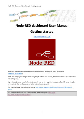
Node-RED dashboard User Manual – Getting startedNode-RED dashboard User ManualGetting startedhttps://nodered.org/Node-RED is a visual wiring tool for the Internet of Things. A project of the JS Foundation(https://js.foundation/).Node-RED is a programming tool for wiring together hardware devices, APIs and online services in new andinteresting ways.It provides a browser-based editor that makes it easy to wire together flows using the wide range of nodesin the palette that can be deployed to its runtime in a single-click.The example below is based on the tutorial rdpart2/The examples described here are available at the following link: https://iotapp.snap4city.org/nodered/nr10/ui1
Node-RED dashboard User Manual – Getting started1. Getting Started by creating a first basic dashboardIn this example we will create a simple flow that sends a random number between 0 and 99 to a simple chart.For that you’ll need an inject node to repeatedly fire every few seconds, a function node to generate therandom number and one of the node-red-dashboard nodes – in this case the chart node.Fig. 1 - Our first exampleDrag and drop the following nodes from the left column in the main area: Inject node (from the input nodes list) Function node (from the function nodes list) Debug node (from the output nodes list) Chart node (from the dashboard nodes list)The “inject” node will change the name in “timestamp” and the “debug” node will change the name in“msg.payload”. Connect the nodes by clicking the small rounded square of each node to have the same resultas in the Figure 1 above.Before we look a how the chart node works, let’s configure the inject node to send a timestamp every 5seconds by setting the payload to timestamp and the repeat field to an interval of 5 seconds. Double click thetimestamp node and set the parameters as in the image below.2
Node-RED dashboard User Manual – Getting startedFig. 2 – Edit inject nodeClick the Done button to confirm. A small circle arrow will appear after the timestamp name.This will act as a repeating trigger. Now we need to set up the function node to generate a randomnumber – we’ll use a simple JS math function to do this:msg.payload Math.round(Math.random()*100);return msg;Double click on the function node and: Insert the name “Random number”Copy the JS math function in the “Function” empty fieldClick Done to confirmThe final result is shown in Fig. 2. This will generate a random number between 0 99 which ispassed to the chart node.3
Node-RED dashboard User Manual – Getting startedFig. 3 - Edit function nodeDouble click the chart node to enter in theconfiguration options. Set the options as inthe Fig. 4.Click the Group field button to add andconfigure a dashboard group (fig. 5).The Tab option allows you to specify whichtab of the UI page you will see the UIelement on – in this case our chart. Thedefault tab is Home – which we are usinghere. If you select the edit button to the rightof the Tab field you can create a new tab andthen select that. However, we’ll use thedefault home for now.The Name field is the standard Node-REDnode name – by default this is chart but youcan set it to anything you like.The Group field allows you to group UIelements – we’ll show you how that workswhen we add another UI element so let’s usegroup “My first dashboard[Home]” for now– of course, you can use any string you like.4Fig. 4 - chart node properties
Node-RED dashboard User Manual – Getting startedFig. 5 - Edit dashboard group nodeClick the “Update” button to confirm the settings and to return to the Edit chart node properties(Fig. 5).The X-asis field allows you to tell the chart how much data it should store and display – the longerthe ‘last‘field is set to, the more data is stored and displayed by the chart. Let’s use a short 5 minswhich will start to throw away the data that is 5 minutes old.Lastly the Interpolate field defines how the chart will interpolate values in between actual datavalues it receives, you can select between linear, step, b-spline and cardinal – which are standardinterpolation algorithms. We’ll use the default linear.Wire these nodes up, hit the Deploy button – check that your debug node is showing that randomvalues are showing. Then head over to your default dashboard page to see the results. By default,you’ll see your UI at:https://{your nodered website}/ui/When you visit that page you’ll see your initial chart as shown below:5
Node-RED dashboard User Manual – Getting startedFig. 6 - The final result2. Add other elements in the UINow we will create a gauge to show the last data value sent. Drag a Gauge node available in thedashboard list of nodes from the UI palette and wire it to the Random Number function node.You will have a result similar to Fig. 7Fig. 7 - Add a new gauge nodeThen double click the Gauge node to open up and let’s configure it as in Fig. 8 and click the Donebutton to confirm.6
Node-RED dashboard User Manual – Getting startedFig. 8 - Edit Gauge nodeWe’ll us the same Tab, home and we’ll also add it to the same group – “My firstdashboard[Home]”. The Min and Max fields allow you to set the min and max values the gauge willshown. Make sure the max is set to 100 which is the most that the random number function nodewill generate. You can also change the Colour gradient to show different colours on the widget, butwe will leave it as default for now.Hit Deploy and then head over to your dashboard and you’ll see that the chart and gauge aredisplayed in a group with the chart now showing the last 5 minutes of data and the gauge the latestvalue.7
Node-RED dashboard User Manual – Getting startedFig. 9 - New gauge addedNow we will add a couple of other UI nodes, a slider node and a text node to show the same data on aslider and as a text string. Drag the slider node and the text node from the dashboard list of nodes (Fig. 10)Fig. 10 - 2 new nodes added (slider and text) Connect the Random number node to the two new nodes (Fig. 11).8
Node-RED dashboard User Manual – Getting startedFig. 11 - the two new nodes (slider and text) are now connected to the Random number node. Double click the slider node and configure a new group name. You need to click “Add newUI group” icon of the Group field, and then click the edit button (Fig. 12).Fig. 12 - Add new ui groupWrite a new group name, for example new group and confirm. Set the new group for the new nodes slider(Fig. 13) and text (Fig. 14) as Group. Click Done button to confirm.9
Node-RED dashboard User Manual – Getting startedFig. 13 - new group association (slider node)Fig. 14 - new group association (text node)You will also need to change the max value to 100 for the slider node to show the correct position of theslider.Deploy the new dashboard. The final result should be as in Fig. 15.10
Node-RED dashboard User Manual – Getting startedFig. 15 - dashboard with two new nodes (slider and text) in a new column (new group)In the dashboard tab beside your debug tab, you can also set the theme and order of the elements. If youdon’t see the dashboard tab, click the menu button at top right corner, then select “View” - “Dashboard”.You can see all the widgets and tabs showing in a tree structure, and you can easily drag the elements tochange the orders that they are presented in the dashboard (Fig. 16).Fig. 16 - Tab and Links pane11
Node-RED dashboard User Manual – Getting started . 8 . Fig. 9 - New gauge added . Now we will add a couple of other UI nodes, a slider node and a text node to show the same data on a slider and as a text string. Drag the slider node and the text node from the dashboard list of node