Transcription
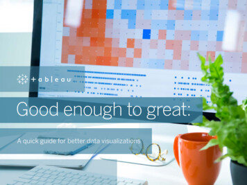
Good enough to great:A quick guide for better data visualizations
ContentsCharts. 4Color. 11Size. 16Text.20Dashboard layout.24Conclusion. 30
Good enough to greatIn today’s world, successful decision-making has everything to dowith turning data insights into action. And because the goal of datavisualization is impact, not numbers, here are five ways to take yourvisualizations from good to great.
Charts Color Size Text Dashboard layout Conclusion1ChartsDon’t get boxed in with chart wizards or just-add-data pre-fab visuals.For great data visualizations, one size does not fit all. Ask yourself:what different kind of visualizations will tell the most truthful story,and best answer the questions at hand?
Comparing categoriesBar charts are best utilized when you have a singlemeasure, and want to compare categories.
Checking progressBullet charts, reference lines, bands, and distributionsfocus attention on targets.
DistributionHistograms and box plots show where your data isclustered, and can compare categories.
Regional analysisVisualize data on geographical maps to answer locational specificquestions, or aid geographical exploration, not just because it looks nice.
Custom shapesUse subject matter shapes to tell a more compelling story.
Make it great withcustom shapesGOODGREATThis visualization shows thenumber of records for differentendangered species listed in Africa,but the animals themselves arelost in the story.
Make it great withcustom shapesGOODGREATBy adding custom shapes to thesame data, this visualizationsuddenly brings the endangeredspecies to life.See this dashboard in action on Tableau Public.
Charts Color Size Text Dashboard layout Conclusion2ColorColor is one of the most powerful aestheticfeatures because it’s an attention-grabber.It’s the first thing we notice, and it canimmediately highlight specific insights oridentify outliers. The data, not personalfavorites or brand colors, should drive theuse of color to make a point.
DifferentiationDon’t use similar colors, or too many colors.Don’t re-use colors for different dimensionsor measures on the same dashboard.
MeasurableDoes the color scale match my data? Does the color move fromlight to dark, or is it stepped to best represent what you’re measuring?
RelatableSemantically-resonant colors help people process information faster.So use yellow to depict bananas, red to represent heat.
Make it greatwith colorGOODGREATThis dashboard contains datafrom 100 observations of globalsurface temperatures ( C) aroundthe world from 1961- 1990.While these visualizations areaccurate, the color red representscooler temperatures, and doesn’tresonate with the informationthe data is trying to portray.
Make it greatwith colorGOODGREATSwapping in semanticallyresonant colors to the samedashboard really heats things up.With a little extra thought intocolor choices and pallets, the datapoints now tell the story theywere meant to tell—and faster.See this dashboard in action on Tableau Public.
Charts Color Size Text Dashboard layout Conclusion3SizeThe bigger the object, the bolder it looks. Bold shapes and colorsmight work well with bar charts and area charts, but they may alsolook gaudy and garish when used in a different chart, like a treemap.Use size to draw emphasis to your key message, not obscure it.
Line and bar chartsIf the difference between data points is very minimal or very great,size may not always be a good encoding tool, as the visuals maybecome hard to read.
Map chartsMark size should be based on the range of values on the map.
Make it greatwith sizeGOODGREATThis visualization shows SanFrancisco Airbnb listing data on amap. Because all of the listings arethe same size and color, even withfilters, it’s hard to differentiatethe value between the listingsat a glance.
Make it greatwith sizeGOODGREATBy pairing color and size withappropriate data measures, thisAirBnB visualization just becameeasier to navigate, and a lot morevaluable. Now people can quicklysee neighborhood and squarefootage differentiation, allowingthem to make better decisionswith their money.See this dashboard in action on Tableau Public.
Charts Color Size Text Dashboard layout Conclusion4TextReadability is essential.Make the most important information stand out.
TitlesKeep them short, but powerful. Convey the point,message or story in the fewest words possible.
LabelsFind the sweet spot. Too many mark labels can be very distracting.Try labeling the most recent mark, or min/max. Save additional andmore detailed information for tooltips.
Make it greatwith textGOODGREATThis data visualization will showyou which Beatle wrote what song.This bar chart is pretty good, butbecause there’s a lot of text, thenames of the albums get cut off—immediately taking away fromthe purpose and the fun of thisvisualization.
Make it greatwith textGOODGREATBecause readability is thisdashboard’s first priority, werearranged the bar chart so thatthe labels are complete. We alsoadded hover highlighting forextra clarity.See this dashboard in action on Tableau Public.
Charts Color Size Text Dashboard layout Conclusion5Dashboard layoutYour dashboard’s purpose is to help guide the reader’s eye throughmore than one visualization, tell the story of each insight, and revealhow they’re connected.The more you employ better dashboard design, your users will discoverwhat’s happening, why and what’s most important. Take into accounthow you’re guiding their eyes across the dashboard. Are you showingthe user where to look next?
Guide the userDon’t leave people high anddry without guidance on howto use a visualization. Tryswapping a filter title withexplicit language directionsabout how to navigate.
Rule of threeDon’t make a lot of important information compete for attention.Most of the time, more than three visualizations on one dashboard istoo many.
Tell a storyIf you need more than one dashboard, or are preparing for apresentation, connect the different visualizations with story points.Tell the narrative of your data with visuals that build on each other,highlight specific insights, and provide additional context, all in oneseamless presentation. It sure beats cutting and pasting static imagesinto a power point.
Make it great withstory pointsGOODGREATThis dashboard shows globalgrowth and developmentindicators, but it has fourvisualizations crammed into asingle place.
Make it great withstory pointsGOODGREATThis is a collection of dashboardsabout global growth anddevelopment, arranged in asequence; each individual view iscalled a story point.See this dashboard in action on Tableau Public.
These story points allow for indicators and insights to be exploredin depth for each visualization in a more organized way. Click on thedashboard to see story points in action.
Charts Color Size Text Dashboard layout ConclusionConclusionGreat visualizations will not only help you understand more aboutyour data, they’ll offer faster, more meaningful answers, and eveninspire others to ask and answer new questions.
Viz of the DayGet inspired every day with one new and amazing datavisualization, delivered right to your inbox. Subscribe toViz of the Day to learn more about visualization best practices.
About TableauTableau helps people see and understand their data. Expressivevisualization enables people to go beyond static charts toquickly analyze, interact with, and share massive amountsof information with each other. With a seamless experiencefrom the PC to the iPad, ask and answer deeper questions, noprogramming skills required.Start your free trial today.
Good enough to great In today’s world, successful decision-making has everything to do with turning data insights into action. And because the goal of data visualization is impact, not numbers, here are five ways to take