Transcription
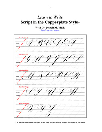
1Learn to WriteScript in the Copperplate Style With Dr. Joseph M. Vitolohttp://www.zanerian.com Thecontents and images contained in this Book may not be used without the consent of the author.
2DedicationThis book is dedicated to my Mother and Father, Anna and Joseph Vitolo for theirunwavering love and support throughout my entire life. Everything I am and haveachieved in my life I owe to them.
3Author’s Bio:Dr. Joseph M. Vitolo is the owner/webmaster for both Zanerian.com and The OrnamentalPenmanship Group on Yahoo. In addition, he is the founder of IAMPETH.com. Dr. Vitolospends most of his spare time studying and promoting the history and art of ornamental andplain cursive penmanship. An expert Engrosser’s script (commonly called Copperplate)and an active member of The International Association of Master Penmen, Engrossers andTeachers of Handwriting (IAMPETH) he has published more than sixty articles onpenmanship/script and lectures extensively around the country on topics ranging fromscience to dentistry to calligraphy. He holds two doctorates: one in Dentistry and a Ph.D. inBiochemistry. Dr. Vitolo currently serves as the Associate Dean for Academic Affairs andAdvanced Education for The Dental College of Georgia at Augusta University.A note from the author: For anyone that feels myfree instructional materials have helped them on theircalligraphic journey I have just one request, please‘Pay It Forward’.
4Table of ContentsWorkshop Handout with Original Instructional Exemplars6Chapter1An Introduction to Understanding Styles of Script112Script in the Copperplate Style ‘Getting Started’153The Oblique Penholder Adjusting Your Premium Oblique Penholder The Proper Positioning of Pen and Paper1921254All about Pen Points (Nibs)285The Lowercase Fundamental Forms316Lowercase Group I Letters (c, e, o, s, a, d, g, q)357Lowercase Group II Letters (i, u, w, t, j, l, f, k)378Lowercase Group III Letters (v, x, r, m, n)409Lowercase Group IV Letters (b, h, y, z, p)4210The Uppercase Letters The Letters B, P and R The Letters F and T The Letters U, Y and X The Letter D The Letters O and Q The Letter E The Letter C The Letters G, L and S The Letters H and K The Letters V and W The Letter Z The Letters I and J The Letter A The Letter M The Letter N4646495051, 755253, 77545556575859616263, 7611Basic Concepts in Letterform Analysis6412Letterform Analysis: ‘The Fundamental Oval’67
5Table of Contents (continued)Chapter13Letterform Analysis: ‘The Symmetry of Curves’7014Letterform Analysis: ‘The Descender Stem Loop and the Baseline Crossing’7215Letterform Analysis: ‘The Key of D’7516Letterform Analysis: “The Slant on N’7617Letterform Analysis: ‘The Leaning Tower of E'7718Advanced Concepts in Copperplate ‘Needle Stitch Script’8019Advanced Concepts in Copperplate ‘Gilded Script’8320Copperplate Numerals85References86
6Copperplate Workshop: Handout*Original exemplars penned by Dr. Joseph M. VitoloPLEASE NOTE: For the purposes of this workshop I will use the termsCopperplate and Engrosser’s script interchangeably.The Exemplars
7Group 2Group 3Group 4
8
9Fundamental Forms: Upper Case Letters136Upper Case B, P, R47 2859101511131412Upper Case F, T Upper Case U, Y, X Upper Case D (atransitional form)ororUpper Case O, Q Upper Case E (first oval transitionalform)Upper Case C (second transitionalform)
10Upper Case G, L, SUpper Case H, K Upper Case V, WUpper Case Z Upper Case I, JUpper Case A Upper Case M Upper Case N
11Chapter 1: An Introduction to Understanding Styles of ScriptIn this chapter we will examine the various styles of pointed pen script and thesometimes-confusing terminology that apply. The samples provided in the referenceimage should allow you to visually compare and contrast the different styles of script.In the United States, the Copperplate style of script is a very popular form of pointed pencalligraphy. It adorns many of the wedding invitations that calligraphers are commissionedto pen. The modern usage of the term Copperplate applies to several styles of shadedscript. Therefore, we will use it as a starting point for this discussion.Historically, Copperplate was the term applied to the English roundhand scrip sowonderfully represented in Bickham's The Universal Penman. This monumental workdisplays the roundhand script from some of the finest historical English writing mastersengraved for printing. Sample 1, originally penned by English writing master JosephChampion, Sr. (1709-1765) was included in Bickham’s book. The specimen illustrates thebeautiful flowing shaded letterforms based on ovals that typify this style of script. It isironic that English roundhand should start off a discussion on pointed pen script since itwas not a pointed pen form. Instead it was executed using a quill pen. Furthermore, weknow from Bickham’s The Young Clerk's Assistant that, contrary to popular belief, thequill was cut to a narrow broad edge and not sharply pointed. Yet these historic letterformsare the basis of the modern ‘Copperplate style’ of calligraphy.The handwritten specimens of English roundhand were engraved for printing purposesonto a ‘copper plate’ by a master engraver Intaglio printing. A book like Bickham's TheUniversal Penman would have originally been printed using this method. Therefore, theeventual use of the term Copperplate for this form of script should not be hard to fathom.Modern Copperplate instructional manuals emulate these letters using a pointed flexiblesteel pen.The earliest usage of the word ‘Copperplate’ applied to English roundhand that I havecome across can be found in Sir Ambrose Heal’s monumental 1931 publication entitled,The English Writing-Masters and Their Copy-Books 1570-1800. However, usage of theterm likely predates this publication. It should be noted that there were several variantsof English roundhand script including a less ornate less shaded hand that was used forday-to- day correspondence.The next calligraphic style we will examine is Engrosser’s script. This form of script issimilar in appearance to English roundhand; however, looks can be deceiving. Severalhistorical terms correctly apply to the script shown in Sample 2 (penned by the author).These include Engrosser’s’ script, Engraver's script and roundhand. Since this style ofscript was used extensively for the calligraphic embellishment of documents, known as‘engrossing’, the term Engrosser's script was applied. For the purpose of this discussion Iwill use the term Engrosser's script when referring to this calligraphic style.
12The progenitor hand for Engrosser’s script was the previously described Englishroundhand. For this reason, the term 'roundhand' is sometimes used to describe this style.However, unlike traditional English roundhand, Engrosser's script is not a form ofhandwriting. In fact, Engrosser's script has been more accurately described as theequivalent of engraving on paper. It developed as an attempt to simulate the exactingroundhand letterforms used by engravers. Hence, the term Engraver's script was also usedto describe this form of script. The oval-based letterforms are literally drawn using apointed flexible steel nib such as the legendary Gillott 303 and a series of interruptedstrokes that are loosely analogous to the ductus in text lettering. Consider that the capital‘S’ seen in the word ‘Script’ (see Sample 2) was executed in four separate strokes.Therefore, a fundamental difference between traditional English roundhand (Copperplate)and Engrosser’s script rests in the execution of the letters, i.e. handwriting versus drawing,respectively.Next, we come to a uniquely American form of cursive handwriting called SpencerianScript. Sample 3A, penned by Platt R. Spencer, Sr. is representative of this hand.Developed in the first half of the 19th century by PR Spencer, Sr. as a shaded form ofcursive handwriting, it was based on the graceful ovals and curvatures he observed innature. Of course, the name Spencerian derives from the originator of the hand, Spencer.The lowercase letters are typically delicate in appearance and less shaded than the forms ofscript previously mentioned. Prior to Spencer’s contribution, handwriting in America wasbased on an English roundhand style as typified in the American instructional books of thetime like Jenkins’ The Art of Writing. The emergence of Spencerian script would usher inthe ‘Golden Age’ of ornamental penmanship in the United States. This period wouldextend through the early portion of the 20th century.Spencerian script, in its original form was executed with a quill pen. The eventualavailability in the mid-late 1800’s of high quality steel pens together with the skill ofproperly trained penmen, both men and women, would lead to a further refinement of thebasic hand by those who came after Spencer. A good example of this refinement can beseen in Sample 3B penned by master penman Earl A. Lupfer (1890-1974), former Principalof The Zanerian College. There were several forms of Spencerian script including moreornate styles, a delicate ‘ladies’ hand, a more rapid monoline style as well as others.Eventually, the artistic ability of the penman together with high quality steel nibs like thelegendary Gillott Principality, the development of the oblique penholder, smoother papersand legendary ink formulations such as Arnold’s Writing Fluid would combine toembellish the basic Spencerian letterforms into a dramatic variant called OrnamentalScript. A wonderful example of this script, penned by master penman HP Behrensmeyer(1868-1948) is shown in Sample 4. Ornamental script can be thought of as a stylized formof Spencerian script. Added to the basic Spencerian letterforms are beautiful swirls andcurls that followed rules of symmetry along with dramatic shades opposing almostinvisible hairlines.
13Is it or is it not handwriting? The short answer to that question is ‘yes’ it is stillhandwriting. However, Ornamental script represents a Spencerian form that floatsgracefully between the realms of handwriting and art. Hence, the term ‘Artistic’ writingwas also used to describe this hand. It is interesting to note that Spencerian script andOrnamental penmanship are undergoing something of a renaissance due primarily to theefforts of master penman Michael R. Sull. The script has even found a foothold inEngland due to the efforts of master penman Brian Walker.The various styles of script were not always used exclusively of each other. In fact, it was acommon practice to use Spencerian/Ornamental capital letters in combination withEngrosser’s script lowercase letterforms to great advantage. This makes it difficult toclassify specimens from past masters into neat categories.The final style we will examine is Business penmanship, also called plain penmanship. It isshould be noted that both English roundhand and Spencerian script were successfullyemployed business hands. However, the style we will be focusing on was developed in thelate 1800’s for teaching in business colleges and eventually in grade schools. Sample 5,penned by master penman EC Mills (1872-1962), is a fine example of this monolinecursive hand. Business penmanship is essentially a non-shaded form of cursive handwritingthat evolved after the development of Spencerian script. Since the style did not requireshading, a flexible pen was not needed. Modern practitioners of the hand can easily useeither a fountain pen or a ballpoint pen to equal effectiveness. I am certain that manycalligraphers will remember being taught a version of plain penmanship such as ThePalmer Method or the Zaner-Bloser Method of writing in school.Hopefully, you should now have a better idea of the basic styles of pointed pen script andthe terminology used to describe them. In the next installment we will examine theimplements used for shaded script in the Copperplate style. Specifically, the obliquepenholder/pointed flexible steel nib and the reasons why they are useful for shaded scriptstyles.PLEASE NOTE: For the purposes of this workshop I will use the termsCopperplate and Engrosser’s script interchangeably.
14
15Chapter 2: Script in the Copperplate Style ‘Getting Started’Video Link: http://youtu.be/gThsMDBtgq0In this Chapter I would like to address the topic of getting started writing script in theCopperplate Style. I will cover pen points (nibs), inks, paper, penholders, guidelines andwhere to find instruction.The first tool needed is a good penholder (Figure 1). For the right-handed calligrapher,using an oblique penholder will be helpful for the reasons covered in detail in Chapter 3.For modern penholder choices please visit the oblique Penholder Gallery on Zanerian.com.Figure 1. The Paper & Ink Arts ‘Fully Adjustable oblique penholder’The next item and perhaps the most critical is the nib (Figure 2A). The nib must have asufficiently flexible point to allow for the formation of shaded down strokes by applyingdownward pressure to the pen. It should also be sharp enough to allow for fine hairlines tocontrast the shades. An example of such a nib is the Leonardt Principal. While it isgenerally acknowledged that modern nibs are not as good as their vintage counterparts,there are still very serviceable modern nibs available. These include:- Leonardt Principal- Gillott 303 (Sharp), 1068A (stiff)- Hunt 22b, 56Those lucky enough to come across vintage nibs should keep their eyes open for and of thefollowing:-Gillott: Principality, 303, 404, 604EF-Esterbrook: A1, 356, 357, 358-Spencerian: 1, 2, 5-Zanerian: Fine WriterThis list is by no means complete but it should serve as a starting point. A good place tolocate vintage nibs is eBay. However, the prices are another matter. Most notably a singlebox (144 nibs) of Gillott Principalities recently sold on eBay for nearly 2,000. This samebox when manufactured almost a century ago sold for 1.75.
16I would like to discuss how to prepare a new nib for ink (Figure 2). New nibs, whethervintage or modern, are coated to prevent oxidation (rust) of the metal. This coating tends torepel ink making the ink bead up (Figure 2B) rather than coating the nib and needs to beremoved.Figure 2. Preparing a new nib to accept ink.There are several approaches to nib preparation. These include quickly flaming the nib andthe use of solvents. Each of these methods presents potential problems. For example,flaming the nib with a match can alter the temper of the metal. The end result would be toalter the flexibility of the nib itself. This especially important to consider when preparingexpensive and hard-to-find vintage nibs like the Gillott Principality or the 303.Furthermore, the use of solvents such as acetone or ammonia instead of flame can work;however, noxious fumes and potentially carcinogenic materials (in the case of somesolvents) are best avoided.It has been said that the penmen of old would simply pop a new nib into their mouth andsuck on it to get it ready for ink. As a dentist, I consider this a bad idea. A very simple buteffective method uses a dry Q-Tip with a small dab of ordinary toothpaste. Gently scrubthe new nib in ONE direction starting from the end opposite the point and stroking towardsthe point. Use a light touch and be sure to treat both top (convex side) and underside(concave side) of the nib. Modern dental abrasives will not harm the nib but willeffectively remove the nib’s protective coating.
17Once the nib is thoroughly washed and dried place it into the oblique holder using a tissuebeing careful not to touch the nib with your fingers since finger oil will repel the ink.Please refer to my previous Chapter that discusses in detail how to place the nib into theoblique penholder and align it. Once inserted, moisten a paper towel with saliva and wipedown the nib top and underside and allow it to dry for a minute or two. The saliva willactually coat the metal with a protein pellicle that helps to render the metal hydrophilic(fluid-loving). The ink should now adhere without any problem. Lastly, be sure the eyeletis cover after dipping the nib in the ink. A properly inked nib is shown in Figure 2C.The next item we must consider is the ink. In pointed pen work, the ink can be a verycritical factor. More importantly to those scribes familiar with text lettering, inks sufficientfor broad pen work may not work well with the flexible pointed pen. If the ink is too thin,it will not allow shade formation. If too thick, it will not flow off the pen. Inks can bethinned (usually with water) or thickened (usually with gum Arabic) depending on the inkformulation. This can be tricky to reproduce from batch to batch. Preparations of stick inksor gouache can be used if diluted to the proper consistency. Don't be afraid to experiment.At this point you’re probably thinking, 'Ok Joe, what is the proper ink consistency?"Luckily, there are modern inks that are ready to go 'right out of the bottle'. This means theyare formulated with the right consistency or viscosity. These inks include McCaffery'sPenman's Inks (all colors), Blot's Iron Gall Ink, Walker's Copperplate Inks and Norton'sWalnut Drawing InksThese inks will give you a good idea of the ink consistency necessary to produce finescript. In general, the faster the pen stroke, the thinner the ink should be. Past masters ofornamental script wrote with a speed and snap that necessitated the use of lower viscosity(thinner) inks. There are less than a single handful of pen artists practicing today whoutilize/mastered that particular style of writing. The inks mentioned above are ideallyformulated for the modern styles of script in the Copperplate style.All of these carefully selected items will be of no avail if the paper won't accommodate thestyle. The broad pen can be used on a wide variety of surface textures. The pointed pen ismuch more finicky. Suitable paper characteristics include resistance to ink bleed fromthinner inks. Meaning the paper has been properly sized. Smoothness of the surface is alsoimportant. It should be noted that the paper should not be too glossy. A little bit of tooth isdesirable but not too much. Using a sharp nib like a Gillott 303, modern or vintage, on arough paper can be a nightmare. Suitable practice paper that I personally use is Rhodiablank paper. Once again, experiment and find what works for you.I highly recommend that you practice using a grid designed for this style of script. Linespacing should be between 3/8" and 1/2" with regularly spaced slant angles of between52-55 degrees. The sample of my script shown in Figure 3 illustrates how these lines areused. The lowercase letter height (Figure 3A) is defined by the header and base lines thatare bordered by two ascender spaces and two descender spaces as indicated in the figure.As a general rule, capital letters like 'B' are approximately three times the lowercase letterheight; however, the capital ‘J’ extends almost five full spaces (Figure 3B).
18Figure 3. The proper use of guidelines for script.Video Link: http://youtu.be/eL B5diIVA4For those with web access, guidelines are available free for downloading on zanerian.comthat can be printed directly onto your practice paper or used under a lightweight paper (24lb. or less). For the novice, they provide a sense of the letter proportions needed for finescript work.Figure 4. Script in the Copperplate style with offhand flourishing penned bythe author.
19Chapter 3: The Oblique PenholderVideo Link: http://youtu.be/6khmcrekXDoWriting script in the Copperplate style using a flexible pointed can be a daunting task. Oneof the reasons for this difficulty is using an oddly shaped pen staff known as the obliquepenholder (Figure 1A, pen made by Michael Sull). For the novice this 'tool' can seem asmystical as a wizard's staff. In fact, the oblique penholder aided the development of themodern day Copperplate styles of script. Unfortunately, a poor quality or improperlyadjusted oblique
the ‘Golden Age’ of ornamental penmanship in the United States. This period would extend through the early portion of the 20th century. Spencerian script, in its original form was executed with a quill pen. The eventual availability in the mid-late 180