Transcription
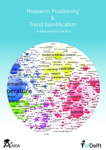
Research Positioning&Trend Identification– a data-analytics toolboxAIDA
Research Positioning&Trend Identification– a data-analytics toolboxB. Ranjbar-Sahraei & R.R. NegenbornOnline material: aida.tudelft.nlVersion 2.2, October 2017
This booklet was produced within the AIDA project.AIDA was an initiative of TU Delft scientific staff in cooperation with TU Delft Library andLeiden University’s Centre for Science and Technology Studies (CWTS). The aim of theAIDA project was to provide TU Delft researchers and faculties with easy-to-use tools forresearch positioning and trend identification.Project leads:Rudy NegenbornHeike ValleryFaculty of Mechanical, Maritime and Materials Engineering, TU DelftFaculty of Mechanical, Maritime and Materials Engineering, TU DelftCore member:Bijan Ranjbar-SahraeiFaculty of Mechanical, Maritime and Materials Engineering, TU DelftCollaborators:Dirk Jan LigtenbeltNees Jan van EckLudo WaltmanResearch Support, TU Delft LibraryCentre for Science and Technology Studies (CWTS), Leiden UniversityCentre for Science and Technology Studies (CWTS), Leiden UniversitySteering committee:Karel LuybenAlenka PrincicPaul WoutersRector Magnificus, TU DelftResearch Support, TU Delft LibraryCentre for Science and Technology Studies (CWTS), Leiden UniversityFirst published in May 2017.This reprint (Version 2.2) is published in October 2017.In order to improve the content, format, and design, this reprint might be updated in the near future.The reader is therefore recommended to use the following link to check whether updated materialis available. Recommendations for corrections and possible improvements should be sent to theauthors.An electronic version of this booklet is available at ght TU Delft 2017Design refinements by Silke PrinsseDisclaimer:The information and visualizations provided in this booklet are for informational purposes only.Although all reasonable efforts have been made to ensure that the information and visualizationsare correct, such is not guaranteed. Any concerns about the concepts, topics or information providedin this booklet should be addressed to the project leads.
ContentsHow to use this booklet . iiThe researcher’s toolbox . iiiStep 1: Data collection . ivStep 2: Analysis . vStep 3: Communication . viEnd-user questions . viiCase studiesCase 1: State of the art overview . 1Case 2: Evolution of research . 2Case 3: Citation impact . 3Case 4: Collaboration profile . 4Case 5: Research positioning . 5Case 6: Research showcasing . 6Case 7: Conference submission profile . 7Case 8: Consortium assembly profile . 8Case 9: Educational program profile . 9Case 10: Organization overview . 10Case 11: Citation networks (1) . 11Case 12: Citation networks (2) . 12Case 13: Journal landscape . 13Case 14: Author landscape . 14Case 15: Ranking . 15Case 16: News overview . 16Case 17: Web media content . 17Case 18: Open-access zone . 18Case 19: TU Delft research profile . 19. 20Case 20: TU Delft collaborators (1). 21Case 21: TU Delft collaborators (2)Useful links . 22AIDA highlights . 23AIDA initiators . 23Community . 24
How to use this bookletThis booklet introduces a toolbox that will help a wide range of end-users – such asPhD candidates, researchers, group leaders, and university policymakers – to positiontheir research and identify important patterns and trends within their domains of interest.The information provided and the case studies presented were developed based on thequestions received from end-users at TU Delft. In compiling this information, extensiveuse was made of the experience of Leiden University’s Centre for Science and TechnologyStudies (CWTS) and the Research Support of TU Delft library. The presentation style ismeant to be visual and easy to use, and to provide practical benefits.In this booklet, we first introduce the researcher’s toolbox, which consists of datacollection, analysis, and communication tools. We then provide a list of frequentquestions that we have received from our end-users and for each question we indicatethe pages in which relevant case studies can be found. Each case study shows someof the methods that can be used to position research and identify trends. We provide asample illustration and its description for each case study. We explain WHAT the casestudy is about, WHY it is important, WHO can benefit from it, and HOW you can replicateit or make similar ones based on the data at hand.For the sake of brevity and simplicity, the HOW section of each case study is abstractand only sketches the approach that you need to follow to replicate the work. Amore detailed description of the HOW for each case study is provided online ataida.tudelft.nl. The online material of each case study provides more informationincluding the original data (whenever possible) and the illustrations in digital format.We encourage you to replicate some of the presented case studies such that you canget similar results as illustrated in this booklet. This will allow you to familiarize yourselfwith the technicalities of each method.Last but not least, the information provided in this booklet is meant to be used as asource of inspiration and only as a complementary solution for research positioning andtrend identification.ii
The researcher’s toolboxThe researcher’s toolbox will help you position your research and identify thepatterns/trends within your research area. The toolbox should be used in threesteps. Step 1 is the data collection step, which will enable you to collect largeamounts of data from the relevant databases. The second step is the analysisstep, which will enable you to objectivelyanalyze the data using easy-to-use bibliometricanalysis tools. Finally, the communication stepwill help you communicate your findings to theoutside world via standard visualization andreporting methods.It is important to consider each round of using these three steps as only oneiteration of the whole process. Depending on the outputs of the analysis and thefeedback received after communication, you should iterate through the samesteps to make the required improvements.Step 1: Data collectionStep 2: Analysis(iterate)Step 3: Communicationiii
Step 1: Data collectionAbout 200 academic databases and search systems are accessiblewithin the network of TU Delft. Although only some academic databasesallow the downloading of large batches of data, the most famous ones– including Scopus and Web of Science – do allow it. Below are some of thepopular platforms that can be used to collect the research data that you mightneed.Scopus provides a subscription-based search tool forresearch output in the fields of science, technology, medicine,social sciences, and arts and humanities. Scopus featuresdifferent tools to track, analyze, and visualize research.Web of Science is an online subscription-based scientificcitation indexing service maintained by Clarivate Analytics.It gives access to multiple databases that reference crossdisciplinary research.Many important journals are indexed by both Scopus and Web of Science. Still, depending on yourdiscipline, you may find one more useful.IEEExplore provides access to Institute of Electrical andElectronics Engineers (IEEE) journals, transactions, letters,magazines, and conference proceedings.ProQuest provides documents from various sources suchas newspapers, dissertations and theses, scholarly journals,and television and radio broadcasts.Mendeley is a reference manager that can help you tomanage your research. The collection of publicationsavailable in Mendeley provides a dataset that is useful foranalysis purposes.iv
Step 2: AnalysisThe analysis of bibliometric data is now easier than ever before thanksto the availability of online analysis tools and standalone software tools.Such tools can answer questions ranging from “Who is the most frequent authorin a set of articles?” and “What are the most frequently used keywords in a setof articles?” to more complex questions such as “What is the state of the art in aresearch domain?”. Some practical analysis tools are introduced below.online toolsThe Scopus platform provides an online analysis tool. Thistool enables the exploration of data regarding publicationyear, source of publication, authorship and various otherattributes. The interface also provides visualization in theform of distribution graphs, and bar and pie charts.The Web of Science platform provides an online analysis toolsimilar to Scopus. This tool provides aggregated statisticson authorship, publication source and year, as well as thefunding source and many other attributes of publications.standalone toolsVOSviewer is a software tool for constructing and visualizingbibliometric networks. This tool also offers a text miningfunctionality that can be used to construct and visualize cooccurrence networks.CitNetExplorer is a software tool for visualizing and analyzingthe citation networks of scientific publications. The networkscan be explored interactively.general purpose toolsVarious general purpose software tools – such as Excel asa spreadsheet program, Python, R, MATLAB, and Java asprograming languages, and Gephi as a network analysis andvisualization tool – can also be used for to analyze data.v
Step 3: CommunicationYou can use various approaches to communicate the results of youranalysis to your audience. Before communication, however, you shouldbe aware of the caveats and limitations of your analysis. Try to transparentlyshare the methodology of data collection and analysis with your audience, andprovide a convenient channel through which they can provide feedback. Beloware some suggestions regarding communication.Add your visualizations to your presentation slides. Suchvisualizations allow you to convey your message more easily.Use your visualizations and the statistics that you’ve extractedfrom your analysis in your research articles. This makes yourresearch outcome more understandable and easier to digest.For examples, check the link ion#papersYour internal project reports provide a perfect mediumto store the analysis results. Each single analysis can besummarized with a set of visualizations and statisticalinformation to be documented in your reports. Check the linkbelow for some cation#reportsPresenting analysis results online in the form of interactiveweb-based visualizations is an effective way to communicatethe findings to a large audience. AIDA provides a web-basedvisualization tool: http://aida.tudelft.nl/WIVOSA great benefit of translating your message into visualizationsis that it broadens its general audience. You can use varioussocial channels to spread your ideas and increase yourvisibility. Visualizations make your message more appealingand memorable.vi
End-user questionsPage numbersRPhDCes andeiG arc datro h esup erPo Le slic adym erak sersThis booklet is meant to answer some of the most frequent questions that end-users – including PhD candidates, researchers, group leaders, and policymakers – have asked. For each question, the pages that providesome insights are listed.xxxxQ1.What is the state of the art in my research area?xxxxQ2.What is the position of my work in relation to the existing work?xxxxQ3.How can I extract emerging trends in a research area?xxxxQ4. HowxxxxQ5. WhichxxxQ6. WhoxxxQ7. Whatare the frequently investigated topics by an arbitrary group of authors?xxQ8. Whatare the scientific origins of my research field?xQ9. Whatkeywords are relevant to my research?xQ10. Which.11,12,13papers should I read to learn a specific topic?Q11. Whichjournals are suitable for my research to be published in?. 1,2,3. 2,11to get a quick overview of what is happening in my field?researchers are my potential collaborators?. 1,4,5,11. 1,2,3. 1,4,14,20are the co-authors of a researcher whom I know?. 4,15. 1. 1,2,11,12. 1,6xxxxxxxQ12.xxxQ13. WhoxxQ14. WhatxxQ15. Howcan I get an overview of the expertise of another research group? . 1,4,9,19xxQ16. CanI have an assistive tool for brainstorming session? . 1,2,3,4,5,11xxQ17. WhichxxQ18.xxQ19. Howcan I showcase the set of articles submitted to a conference or a journal?xxQ20. Howcan I study a consortium assembly and explore the expertise of each member?xxQ21. Howstrong is the collaboration between my group and other research groups? . 4,9,10,20xQ22. 13,15,18How can I study non-bibliometric datasets such as news and policy documents? .16,17are the top authors in my research field?.4,5,11,14is the position of my group in relation to the competitors? . 4,5,20,21journals do the researchers of my group usually publish in? . 13,15What are the dominant research areas that my group should be aware of? . 1,6,11,16,19How can I recommend potential reviewers for a paper/proposal?xQ23. IsxQ24. What. 7,18. 8. 1,4,8the structure of my organization aligned with the research landscape? . 1,10,19projects can be optimally supervised by a selected group of researchers? . 8,9vii
CASE 1:State of the art overviewThis term map shows the state of the art of the cybersecurity field according to the Scopus search for the termcybersecurity. Studies on techniques, applications, and policies are represented by red, blue, and green clusters,respectively.WHATShows the state of the art in a research fieldWHYTo get an overview of a research field, find how different subfields areinterconnected, and find the potential opportunities for bridging thegaps between subfieldsPhD candidates, researchers, group leaders, and policymakersWHOHOW11. Collect your data from an appropriate data source2. Import the data into VOSviewer3. Generate the term map based on text data4. Use the VOSviewer screenshot to export your map
CASE 2:Evolution of researchThis term map shows the state of the art in research on passenger comfort. The overlay color of each circle corresponds to the average publication year of all the papers that include the corresponding term. In this map, the termswith cold colors (e.g. blue) represent the research activities with older average publication year and the terms withhot colors (e.g. red) show the terms with more recent average publication year.WHATIllustrates the evolution of a research area over timeWHYTo understand the trend of research from the past to presentWHOPhD candidates, researchers, group leaders, and policymakersHOW1. Collect your data from an appropriate data source2. Import the data into VOSviewer3. Generate the term map based on text data4. Use the overlay visualization feature to color the circles with theaverage publicvation year corresponding to the terms5. Use the VOSviewer screenshot to export your map2
CASE 3:Citation impactThis term map shows the state of the art in research on concrete. The overlay color of each circle corresponds tothe average citation impact of all the papers that include the corresponding term. In this map, the terms with coldcolors (on the right) represent the research activities with lower number of citations compared to the terms withhot colors (on the left).WHATDistinguishes the terms that have made a higher citation impact thanthe other termsWHYTo understand the subareas with higher citation impactWHOPhD candidates, researchers, group leaders, and policymakersHOW1. Collect your data from an appropriate data source2. Import the data into VOSviewer3. Generate the term map based on text data4. Use the overlay visualization feature to color the circles with thecitation impact corresponding to the terms5. Use the VOSviewer screenshot to export your map3
CASE 4:Collaboration profileThis co-authorship map shows the names of authors who are publishing papers in a specific domain. The size ofthe circles corresponds to the number of papers each author in the publication list has published, and the linksbetween the circles show co-authorships of papers.WHATReveals co-authorship patternsWHYTo determine the role of researchers within their research team andidentify active research teamsWHOPhD candidates, researchers, group leaders, and policymakersHOW1. Collect your data from an appropriate data source2. Import the data into VOSviewer3. Generate the co-authorship map based on bibliographic data4. Use the VOSviewer screenshot to export your map4
CASE 5:Research positioningThis term map visualizes the topics that are being covered by the publications of a group of researchers activein the logistic research area. The circles with hot colors (e.g., yellow and red) represent the expertise area of aspecific researcher.WHATIndicates what terms the research outcome of a researcher is focused onWHYTo understand the focus area of a researcher and to find the focal areafor potential collaborationWHOPhD candidates, researchers, group leaders, and policymakersHOW1. Collect your data from an appropriate data source2. Generate a corpus and a score file such that in the score file youindicate whether or not each of the corpus file documents belongs tothe author in question3. Generate the term map based on text data (i.e., corpus and score files)4. Use the overlay visualization feature to color the terms such thatthe color indicates how often the term is mentioned in the author’spublications5. Use the VOSviewer screenshot to export your map5
CASE 6:Research showcasingThis term map was generated based on articles written by TU Delft researchers that in their title or abstract includewords such as brain or neuro. The colors of circles are determined by the modularity algorithm of the software,which gives the terms that frequently co-occur the same color.This case study was carried out by Michiel E. Munnik, MSc. For more information, visit brain.library.tudelft.nl.WHATVisualizes all or a subset of an organization’s research outcomeWHYTo give audiences an objective overview of the organization’s researchoutcome and allow them to search through the research articles usingthis visualizationResearchers, group leaders, and policymakersWHOHOW1. Collect the data corresponding to the research outcome you’reinterested in from an appropriate data source2. Import the data into VOSviewer3. Generate the term map based on text data4. Use the VOSviewer screenshot to export your map5. You can use the AIDA web interface to show the results on yourwebsite6
CASE 7:Conference submission profileThis term map visualizes the terms that appear in the titles and abstracts of articles submitted to a conference.The large circles indicate which terms are mentioned more frequently. The terms that are closer to each other andhave the same color (which is automatically determined by the software), are terms that co-occur very frequently.Data for this case study is provided by Dr. Mladena Lukovic.WHATProvides an overview of the articles (or abstracts) submitted to aconference or journalWHYTo enable conference participants to navigate through the termsmentioned in the submitted papers, and to trace the terms back to thesubmitted articlesGroup leaders and policymakersWHOHOW71.Collect the data (authors, titles, and abstracts) of articles submitted to theconference2. Import the data into VOSviewer3. Generate the term map based on text data4. Use the VOSviewer save button to export the map file in txt format5. You can use the AIDA web interface to show the results on yourwebsite
CASE 8:Consortium assembly profileThis term map visualizes the topics that are being covered by the publications of members of a consortium. Ascan be seen, in this case the expertise areas are relatively diverse and the term clusters are not tightly connectedto each other.WHATIllustrates the expertise areas of the members of a consortiumWHYTo determine the expertise area of consortium members and identifytheir common interestsWHOGroup leaders and policymakersHOW1. Collect the data of articles published by members of the consortium2. Generate a corpus and a score file such that in the score file youindicate which author(s) wrote each of the articles3. Generate the term map based on text data (i.e., corpus and score files)4. Use the overlay visualization feature to color the terms such that thecolor indicates how often the term is mentioned in the publications ofan arbitrary author5. Use the VOSviewer screenshot to export your map8
CASE 9:Educational program profileThis term map visualizes the topics that are being covered by the publications of teachers involved in the TU Delftinterfaculty program MSc Transport, Infrastructure & Logistics. These teachers have diverse backgrounds andwork in different faculties. It would be useful to compare this map with the subject map that should be covered bythe educational program and by the research projects that the students carry out.WHATShows the research activity of the teachers involved in an educationalprogramWHYTo determine the expertise area of teachers involved in an educationalprogram, which enables the improvement of project proposals and thefinding of strong and weak pointsPolicymakersWHOHOW91. Collect the data of articles published by the teachers involved in theeducation program2. Generate a corpus and a score file such that in the score file youindicate which author(s) wrote each of the articles3. Generate the term map based on text data (i.e., corpus and score files)4. Use the overlay visualization feature to color the terms such that thecolor indicates how often the term is mentioned in publications of anarbitrary author5. Use the VOSviewer screenshot to export your map
CASE 10:Organization overviewThis term map was generated based on the research articles written by researchers in an organization that iscomposed of various departments. Three clusters shown in blue, red and green show the terms that frequentlyco-occur. This map provides an overview of the organization’s research area and positions the work of each department within the organization.WHATIllustrates the research areas covered by an organizationWHYTo identify the expertise and potential collaborations within an organizationWHOGroup leaders and policymakersHOW1. Collect the data of articles published by researchers of an institute2. Import the data into VOSviewer3. Generate the term map based on text data4. Use the VOSviewer screenshot to export your map5. You can use the AIDA web interface to show the results on yourwebsite10
CASE 11:Citation networks (1)This citation network illustrates a set of books and papers published between 1991 and 2016. The top circle represents the book Applied Nonlinear Control, written by J.J. Slotine and W. Li in 1991. The other circles representthe “successor publications” of the book that were published in the following years, have cited the book and havereceived a high number of citations. Note that the vertical axis represents the year of publication.WHATDepicts the citation network of a set of articlesWHYTo identify the literature on a research topic or explore the publicationoeuvre of a researcherWHOPhD candidates and researchersHOW1. Collect your data from the Web of Science platform2. Import the data into CitNetExplorer software tool3. Use the drill down, expand and analysis features to study the network4. Use the CitNetExplorer screenshot to export your map11
CASE 12:Citation networks (2)In this citation map, each circle corresponds to an important paper represented by the last name of first authorand year of publication. The size of circles corresponds to the number of times the paper has been cited. As canbe seen, the colors of the map, which are assigned automatically, show clusters of papers which have cited eachother frequently.WHATDepicts the citation network of a set of articlesWHYTo identify the key publications that are cited frequently with other articles, as well as articles that act as a bridge between different topicsWHOPhD candidates, researchers, and group leadersHOW1. Collect your data from an appropriate data source2. Import the data into VOSviewer3. Generate the citation map based on bibliographic data4. Use the VOSviewer screenshot to export your map12
CASE 13:Journal landscapeThis journal landscape was generated by considering the bibliographic coupling between journals related to thefield of microbiology. In this map, journals that reference multiple common third journals in their bibliographies (listof references) are connected to each other. As can be seen, the colors of the map, which are assigned automatically, show two clusters of journals that have a high bibliographic coupling.WHATShows how frequently research articles from different journals reference common third journalsWHYTo gain a better understanding of the similarity of journalsWHOPhD candidates, researchers, group leaders, and policymakersHOW1. Collect your data from an appropriate data source2. Import the data into VOSviewer3. Generate the bibliographic coupling map in journal level based onbibliographic data4. Use the VOSviewer screenshot to export your map13
CASE 14:Author landscapeThis author landscape was generated by considering the co-citation of different papers published in the field ofmicrobiology. In this map, the authors who are mentioned in the bibliographies (list of references) of the papers areshown, and every pair of authors who frequently co-occur in the bibliographies of the same papers are connectedto each other. The authors connected to each other or positioned in close vicinity of each other do not necessarilywork together, but are active in the same type of research.WHATShows how frequently the articles of different researchers are co-citedby the same articlesWHYTo gain a better understanding of the author landscape in a field froman intellectual point of viewWHOPhD candidates, researchers, group leaders, and policymakersHOW1. Collect your data from an appropriate data source2. Import the data into VOSviewer3. Generate
- a data-analytics toolbox . AIDA was an initiative of TU Delft scientifi c staff in cooperation with TU Delft Library and Leiden University's Centre for Science and Technology Studies (CWTS). The aim of the AIDA project was to provide TU Delft researchers and faculties with easy-to-use tools for