Transcription
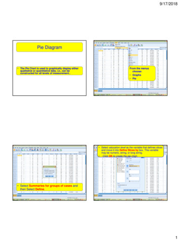
9/17/2018Pie Diagram The Pie Chart is used to graphically display eitherqualitative or quantitative data, i.e., can beconstructed for all levels of measurement.From the menuschoose: Graphs Pie Select education level as the variable that defines slicesand move it into Define Slices by box. This variablemay be numeric, string, or long string. Click OK to create the pie chart. Select Summaries for groups of cases andthen Select Define.1
9/17/2018 The pie chart reveals thatmost respondents primaryschool educated.Glancing at the chart, itwould appear that onlyabout a quarter of therespondents are noteducated at all. You can edit charts in a variety ofways. For this sample pie chart, wewill: Add a title. Remove the small category of"missing" data. Display percentages for theremaining categories in the chart.From the Chart Editor menuschoose: options Title The first thing we'll do is add a title:Double-click the pie chart to open it in the Chart Editor.2
9/17/2018 Enter Education level A descriptive title is now displayed above the piechart.From the Chart Editor menus choose: Edit properties Sometimes you need to remove somecategory such as none data. To dothat:3
9/17/2018 The category of none data has been removed fromthe pie chart, leaving only four categories. Exclude none and click Apply. Open 3 Non-smokers selected cases file Select AnalyzeStem and Leaves Display4
9/17/2018Transfer the Non smokers Systolic bloodpressure variable into the dependent listPlots: to display the variable (s) graphically.Statistics: to display the statistics of the variable (s).Both: to display both plots and statistics.5
9/17/2018Time Plot6
9/17/20187
9/17/2018Pareto8
9/17/2018Scatterplots Scatterplots are typically used to explore the relationshipbetween two continuous variables. It is a good idea to generate a scatterplot, beforecalculating correlations. The scatterplot will give you an indication of whether yourvariables are related in a linear (straight-line) orcurvilinear fashion. Only linear relationships are suitable for correlationanalyses. The scatterplot will also indicate whether your variablesare positively related or negatively related. The scatterplot also provides a general indication of thestrength of the relationship between your two variables.Click on Simple and then DefineProcedure for creating a scatterplot9
9/17/2018dependentvariableIndependentvariableYou can also haveSPSS mark each of thepoints according tosome other categoricalvariable (e.g. Gender).Move this variable intothe Set Markers by:box. This will displaymales and femalesusing different markers.Males and females aredisplayed using differentmarkers.10
9/17/2018Boxplots Boxplots are useful when you wish tocompare the distribution of scores onvariables. You can use them to explore the distributionof one continuous variable or alternativelyyou can ask for scores to be broken down fordifferent groups. You can also add an extra categoricalvariable to compare (e.g. males andfemales).11
9/17/2018For creating boxplots based oncategorical variableMove yourcontinuousvariable into theVariable box. The output generated from this procedure.Move yourcategoricalvariable into theCategory axisbox.Click on OKClick on ID andmove it into theLabel casesbox.This will allowyou to identifythe ID numbersof any caseswith extremevalues12
9/17/2018Interpretation of output from Boxplot Any scores that SPSS considers are outliers appear as little circles witha number attached (this is the ID number of the case).Outliers are cases with scores that are quite different from the remainderof the sample, either much higher or much lower.SPSS defines points as outliers if they extend more than 1.5 box-lengthsfrom the edge of the box.Extreme points (indicated with an asterisk, *) are those that extend morethan 3 box-lengths from the edge of the box13
ways. For this sample pie chart, we will: Add a title. Remove the small category of "missing" data. Display percentages for the remaining categories in the chart. The first thing we'll do is add a title: Double-click the pie chart to open it in the Chart Editor. From the Chart Editor menus choose: options Title